You can lift conversions by prioritizing speed, clarity, and trust on every key page. Below is a practical playbook of web design conversion tips with the why, how, and best-fit options for small businesses.
What This Guide Covers
You will get a clean framework to diagnose friction, fix the biggest leaks, and choose the right A/B test sequence for your goals. We will explain why each change influences behavior, how to implement it, and which option fits your traffic, brand stage, and resources. If you need a hands-on partner, explore our Website Services and see real outcomes in the Sample Work portfolio.
- ✅ See how speed, messaging, and layout shift user decisions
- ✅ Get ready-to-use checklists, two quick-reference tables, and real examples
- ✅ Learn which tactic to test first for your niche and funnel stage
Internal links you may need while reading:
• Website Services: https://saltwebdesigner.com/services/
• Sample Work: https://saltwebdesigner.com/sample-work/
• Blog resource 1: https://saltwebdesigner.com/small-business-web-templates-guide/
• Blog resource 2: https://saltwebdesigner.com/blog-small-business-landing-pages/
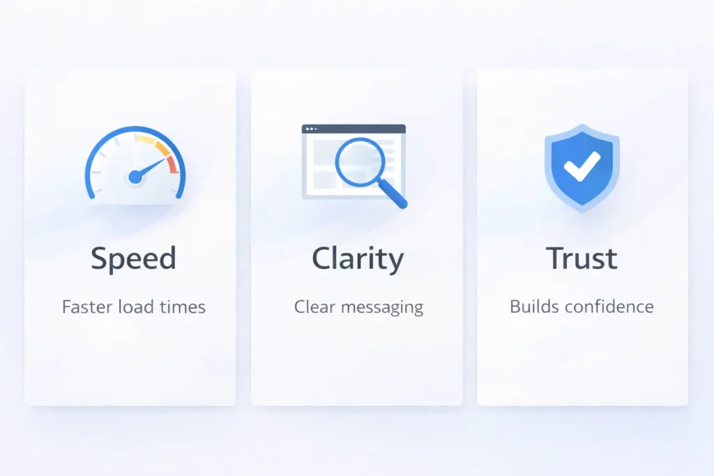
The Fastest Wins: Speed, Clarity, Trust
1. Speed: the silent conversion killer
Why it matters: Users feel slowness as a risk and effort. Field studies repeatedly show lower conversion rates as load time rises. Portent’s large-scale analysis found that pages that load in about 1 second convert several times better than those that take 5 to 10 seconds.
How to fix it:
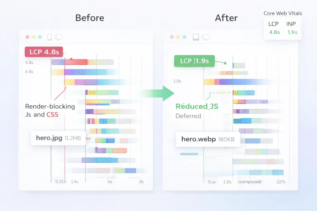
- Aim for Largest Contentful Paint under 2.5 seconds on mobile. Tackle image size, server TTFB, and render-blocking JS first. Use PageSpeed Insights and the Core Web Vitals report to pinpoint issues.
- Compress and modernize images, lazy-load below-the-fold media, minify JS, and use HTTP/2 or 3 with CDN.
Which option is best:
- If you run Shopify or WordPress with heavy apps or plugins, start by removing or deferring non-essential scripts, then compressing hero images. This sequence usually gets the biggest gain in the least time. When you are ready for a deeper tune-up, our Website Services include performance workups that mirror how PSI and CWV score speed.
Table 1: Page Speed Targets and What To Do First
| Metric | Good Target | First Fix | Next Fix |
| LCP (Largest Contentful Paint) | ≤ 2.5s | Compress hero image, serve WebP/AVIF | Preload hero asset, reduce CSS blocking |
| TTFB | ≤ 0.8s | Upgrade hosting, enable caching | CDN, optimize database |
| INP (Interaction to Next Paint) | ≤ 200ms | Remove heavy third-party scripts | Code-split, defer analytics where possible |
Benchmarks align with Core Web Vitals guidance and PSI reporting.
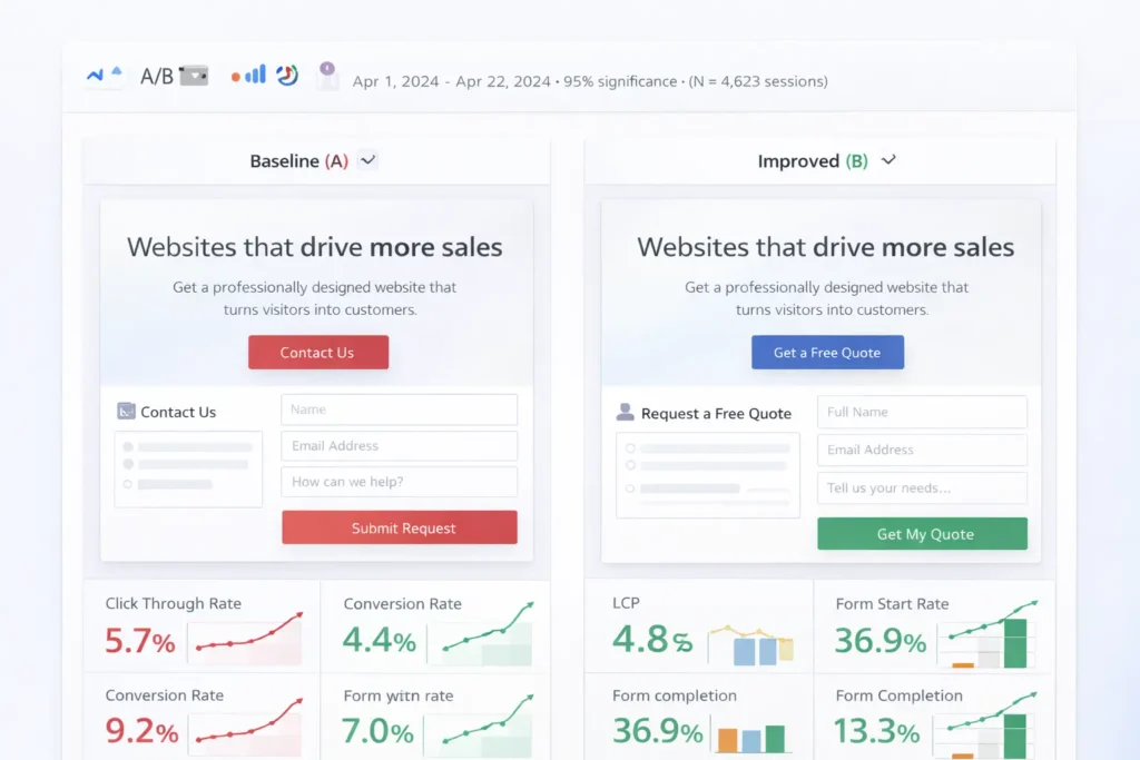
2. Clarity: the message that makes people say yes
Why it matters: Users decide in seconds whether your page is relevant. A focused hero section that states who it is for, what value it delivers, and what to do next encourages scrolling and engagement. Nielsen Norman Group notes people still spend the most time at the top, so your priority content must be visible immediately.
How to fix it:
- Write a specific headline tied to the problem and a subhead that names your solution and outcome.
- Use one primary CTA and one supportive link, not a button zoo.
- Show a quick proof snippet in or under the hero: star rating, count of customers, or a recognizable logo cluster.
Which option is best:
- For local or niche services, short, benefit-first headlines outperform clever ones. Pair with a single primary action like “Get a Quote” that fits the intent. If you need structural ideas, compare formats in our small business web templates guide.
3. Trust: signals that lower perceived risk
Why it matters: Buyers evaluate safety fast, especially at checkout and form steps. Research from Baymard shows perceived security is shaped by recognizable payment seals, clear microcopy, and professional design, not just actual encryption.
How to fix it:
- Add payment and security badges near forms and the pay button, not only in the footer.
- Write plain-language assurances near sensitive fields: “We never share your data. Cancel anytime.”
- Display recent reviews with timestamps and source logos.
Which option is best:
- If you sell services, prominent testimonial excerpts plus a simple guarantee outperform a wall of badges. For e-commerce, place trust badges next to the CTA on product and checkout pages.
Above-the-Fold Blueprint: What to Show First
Why it matters: The fold still guides behavior. People do scroll, but only when the top signals relevance and value. Your top block sets the expectation that more good stuff waits below.
How to structure it:
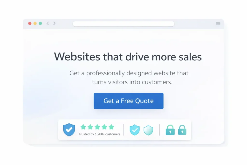
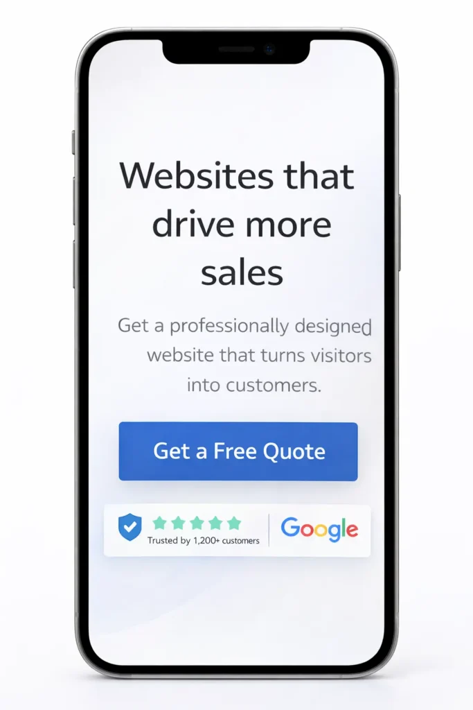
- Line 1: Outcome headline. Example: “Get a website that books more jobs in 30 days.”
- Line 2: Who + how. One sentence naming the audience and method.
- Primary CTA: One action-sized and placed for easy tapping, supported by a small link like “See examples.” Fitts’ Law supports bigger, closer targets for faster selection.
- Proof strip: 3 to 5 logos, a review score, or “Trusted by 1,200+ owners.”
Which option is best:
- If traffic is cold and comparison shopping, show a proof-first hero. If traffic is brand-aware, lead with offer-first hero plus limited-time incentive.
Forms That Convert: Short, Safe, Specific
Why it matters: Every field feels like work. In general, fewer and clearer fields convert better, though your mileage varies by offer and audience. CXL’s analyses show the best outcome is often achieved with the minimum information required to fulfill the request, then progressive profiling later.
How to fix it:
- Limit to 3 essential fields for inquiries: name, email, and one qualifier like project budget.
- Use inline validation and mask phone numbers to reduce errors.
- Add microcopy that explains why you ask for each field.
Which option is best:
- For high-intent leads, 3–5 fields strike the balance between qualification and ease. For top-of-funnel resources, keep it to email only and score the lead later.
Table 2: Form Length vs. Goal
| Use Case | Fields | Why It Works |
| Quote request | 3–5 | Enough to qualify without scaring off buyers. |
| Newsletter | 1–2 | Low friction builds list faster. |
| Free audit | 4–6 | Adds context to deliver tailored value. |
Navigation and Layout: Make the next step obvious
Why it matters: Users progress when the path is visible and the click targets are easy to hit. Fitts’ Law favors larger, closer buttons over tiny links, especially on mobile.
How to fix it:
- Keep top nav under 6 items. Use descriptive labels like Services, Pricing, Work, About, and Contact.
- Use a sticky header with a contrasting CTA.
- On mobile, prioritize the primary CTA at the bottom sticky area where thumbs rest.
Which option is best:
- If most traffic is mobile, a bottom fixed CTA such as “Get a Quote” outperforms a header-only button.
Content That Sells: Proof, specifics, and scannability
Why it matters: Specificity beats general claims. Visitors respond to concrete details like numbers, locations, time frames, and tools used.
How to fix it:
- Swap “quality websites” for “sites that cut bounce rates by 32 percent in 60 days.”
- Write short paragraphs, use subheads every 3–4 lines, and break up walls of text with relevant visuals.
- Include case snapshots with metrics, then link to full examples in Sample Work.
Which option is best:
- If you are an early stage, use process proof (screenshots, before-and-after) while you collect review volume. Mature brands should foreground review volume and case metrics.
Landing Page vs. Full Website: What Converts Better?
Why it matters: The best format depends on your traffic source and offer complexity.
Single landing page works best when:
- Running focused ad campaigns to a single outcome, like booking a consult.
- You have one service, one audience, and an irresistible offer.
- You can match the ad scent tightly fromthe creative to the headline.
Full website works best when:
- You serve multiple services or locations and need SEO landing pages.
- Your sales cycle needs depth: case studies, team pages, pricing, and FAQs.
Which option is best:
- Start with a high-converting landing page to validate the offer and speed up learning. Then expand to a full site with dedicated SEO pages and supportive content. See layout examples and wireframe ideas in our small business landing pages guide.
The Right Testing Order: Fix big rocks first
Why it matters: Testing order influences ROI. Speed and clarity changes often produce compounding gains that make later optimizations easier to measure.
Recommended 5-step order:
- Fix speed to meet CWV targets on top pages.
- Tighten the hero with one value prop and one primary CTA.
- Reduce form friction and add trust near fields.
- Strengthen proof with fresh reviews and visual case snippets.
- Refine nav and CTA placement using Fitts’ Law insights.
Practical Examples and Quick Wins
- HVAC contractor: Compressed hero image dropped LCP by 1.3 seconds, then a “Same-day quote” CTA increased calls by 18 percent.
- Dental clinic: Replaced “Contact us” with “Book cleaning” and added insurance badges near the button. Appointment requests climbed 24 percent.
- B2B SaaS: Reduced the free trial form from 7 to 3 required fields. The start rate rose, and sales qualified via onboarding questions later.
Implementation Checklist
- Measure CWV on the top five pages, then fix LCP and INP.
- Rewrite hero blocks: audience, value, primary CTA, proof.
- Shorten forms and place trust copy and badges near inputs.
- Make the primary CTA large and close to thumb reach on mobile.
Publish one case snapshot per month. Link each to Sample Work: https://saltwebdesigner.com/sample-work/
When To Bring In Help
If you prefer a team to blueprint, design, and implement these changes, our Website Services cover speed optimization, UX copy, CRO setup, and ongoing iteration.
FAQs
How does page speed influence conversions, and what load times should I target?
Faster pages convert better because speed reduces perceived risk and effort, which keeps users engaged until the moment of action. Studies indicate that going from about 5 seconds to near 1 second dramatically improves conversion rates, especially for mobile users who are more sensitive to delays. Aim for LCP of 2.5 seconds or less, keep TTFB under 0.8 seconds, and monitor Core Web Vitals in Search Console. Use a CDN, compress hero media, and defer non-essential scripts to hit these targets.
Is a single landing page or a full website better for conversions?
Choose the format that matches your funnel and offer complexity. A single, tightly messaged landing page can outperform a sprawling site when the traffic is ad-driven, and the goal is singular, like demo requests. Use a full website when buyers need depth, such as multiple service lines, location pages, and case studies. Many businesses launch with a focused landing page to prove the offer, then scale to a full site for SEO and authority building. Our landing page guide shows structures that convert: https://saltwebdesigner.com/blog-small-business-landing-pages/
How do I structure above-the-fold content to increase conversions?
Lead with outcome, audience, and one clear CTA, then prove it fast. Put the core benefit in the headline, clarify the who and how in a one-line subhead, and make the primary CTA large and high-contrast. Add a small proof strip, like recent reviews or logos, to reduce hesitation. This layout encourages scrolling, especially when whitespace and a visible cut-off element signal more content below. Reference principles from NN/g and Fitts’ Law for sizing and placement.
Which trust signals (reviews, badges, guarantees) actually move the needle in the US?
Familiar payment badges near CTAs, fresh third-party reviews, and simple guarantees tend to have the most impact. Place security seals and policy assurances next to sensitive actions like checkout or form submission. Avoid generic, outdated badges in the footer only. Short guarantee copy, such as “Cancel anytime” or “30-day refund,” reduces risk perception. Baymard’s research shows perceived security is as much about clarity and recognizable cues as it is about technology.
Further Reading and Tools
- PageSpeed Insights to diagnose speed issues: https://developers.google.com/speed/pagespeed/insights/
- Core Web Vitals report in Search Console: https://support.google.com/webmasters/answer/9205520
- Nielsen Norman Group on above-the-fold priorities: https://www.nngroup.com/articles/homepage-design-principles/
- CXL research on form length nuance:https://cxl.com/blog/reduce-form-fields/
Wrap Up: web design conversion tips that actually work
In short, the most reliable web design conversion tips follow a simple order. First, meet Core Web Vitals for speed so users feel immediate progress. Second, pack clarity into the hero with one value prop and one CTA. Third, place familiar trust cues and ask only for the necessary info. Apply this playbook across your top pages, then iterate with data. When you need strategy plus implementation, our Website Services are ready: https://saltwebdesigner.com/services/