Web design landing page tips help you win attention fast. Keep the hero simple, load quickly, and point to one CTA so visitors know what to do in seconds.
If your landing page makes visitors think too hard, they bounce. The cure is a lean, conversion-first page that explains value fast, guides attention, and feels effortless to use. Below, you will learn why each element matters, how to execute it step by step, and which option works best in common scenarios. You will also see real-world examples, test ideas, and a simple measurement plan so you can improve results every week.
Why landing pages win or lose in 8 seconds
Most visitors decide to stay or leave within a blink-and-it ’s-gone moment. In that window, your page must answer three questions: What is this? Is it for me? What do I do next? When your copy, layout, and speed resolve those questions fast, you reduce friction and build trust. When they do not, no ad budget can save the session.
From a business perspective, a strong landing page is a profit lever. It lowers cost per acquisition, improves quality leads, and gives you a controlled environment for A/B testing messages before rolling them across your entire site.
If you need help implementing these fundamentals on your site, see our streamlined Web Design Services and browse Sample Work to visualize how the pieces fit together.
Above the fold: what to show and what to cut
Your top section is not a brochure; it is a decision engine. Keep only what helps a first-time visitor say yes to scrolling.
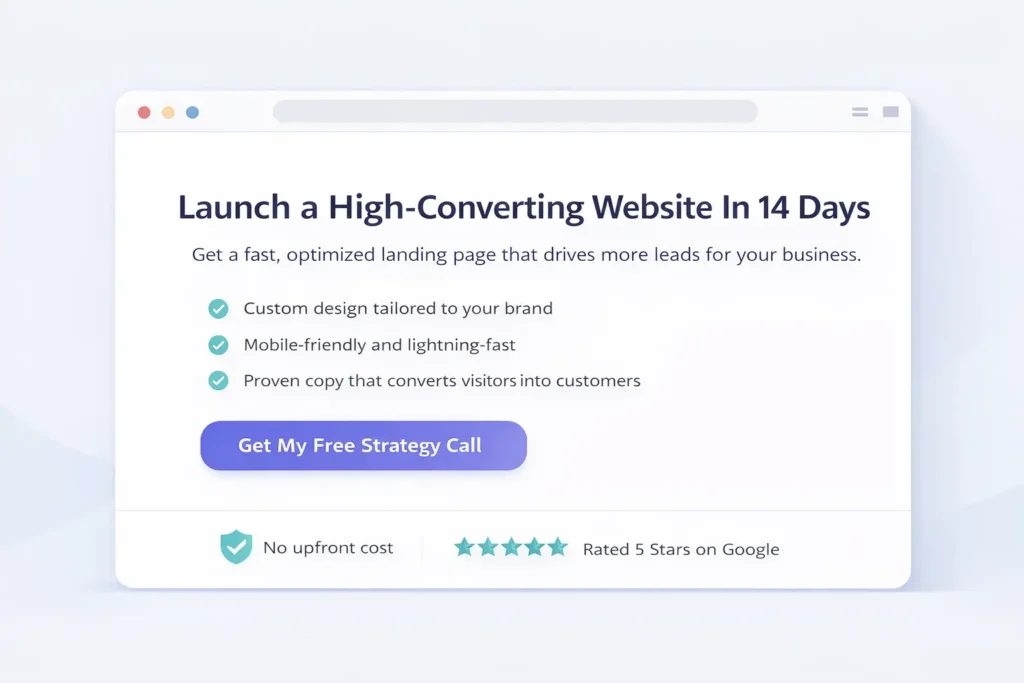
The essential blueprint
| Above-the-Fold Element | Purpose | Practical Example |
| Clear value proposition | Instantly tells visitors what they get | “Launch a fast, sales-focused site in 14 days” |
| Specific subhead | Clarifies outcome or audience | “For local service businesses that want more booked calls” |
| Single primary CTA | Guides the one action that matters | “Get a Free Strategy Call” |
| Visual that shows the outcome | Builds context and trust | Mockup of finished website on phone and desktop |
| Supporting reassurance | Handles top objection | “Launch a fast, sales-focused site in 14 days.” |
Use short, concrete words. Avoid vague phrases like “innovative solutions” or “next-level experiences.” If you need inspiration on what users notice first, NNGroup’s research on above-the-fold attention is consistently useful and grounded in eye tracking studies; explore it to sanity-check your design choices (Nielsen Norman Group).
Copy that converts: say less, mean more
Clarity beats cleverness. Write for scanners first, readers second.
- Headline: Promise a concrete outcome.
- Subhead: Add the who or the how.
- Bullets: Three quick benefits that align with the CTA.
- CTA microcopy: Reduce anxiety by stating what happens next, for example “Takes 60 seconds, no credit card.”
A reliable method is the “Problem, Promise, Proof, Proposal” flow. Open with the visitor’s pain, present the result, show you can deliver it, then make a simple ask. If you need content structure examples tailored to conversion, see Web Design Content Strategy for deeper guidance on voice, hierarchy, and tone.
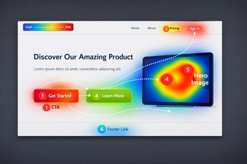
Visual hierarchy: guide the eye, guide the clicks
Hierarchy tells visitors where to look next. Use one dominant headline, one standout button, and generous white space to isolate decisions. Group elements by proximity, not by decoration. Restrict your color palette so your CTA color is unique on the page. Pair one display font with a readable body font and keep line length within 50–75 characters to improve comprehension.
When in doubt, set a typographic scale that avoids loud jumps:
- H1 36–48 px
- H2 28–32 px
- Body 16–18 px
- Button text 16–18 px, bold
Speed, mobile, and accessibility: the silent multipliers
A page that looks good but loads slowly is leaving money on the table. Run your page through Google PageSpeed Insights and fix the highest-impact items first: compress hero images, serve next-gen formats, and defer noncritical scripts. Target a Largest Contentful Paint under 2.5 seconds and a Total Blocking Time near zero.
On mobile, reduce motion that fights readability, increase tap targets to at least 44 px, and keep forms single-column. For accessibility, ensure a 4.5:1 color contrast ratio, include descriptive alt text, and use semantic headings in logical order. These improvements lift conversions for everyone, not just assistive tech users.
Before tweaking copy, run the page through PageSpeed Insights to spot heavy images and scripts that slow the hero on mobile.
Social proof that actually reassures
Testimonials, logos, review counts, and third-party ratings are powerful when they are specific and verifiable. Replace generic praise with context: problem, process, result. Include a name, title, and a small headshot to humanize the quote. If you are gathering proof from clients, link to case studies. For landing pages aimed at booked calls, highlight outcomes like “41 percent lift in calls in 60 days” rather than fluffy adjectives.
For inspiration on framing proof around conversion, study evidence-backed examples and testing write-ups from CXL. Their archives show how different placements and formats influence behavior in the wild.
Forms that get finished
Short forms convert. Ask only what you will use in the first conversation. Single-column forms with clear labels, inline validation, and a visible privacy note outperform crowded, two-column layouts. If you must ask for more, split the form into two steps and place the highest friction fields second.
Use button microcopy that mirrors intent: “Get My Audit” performs better than “Submit” because it reminds the user of the reward. If your team handles small business sites, this is a quick win: reduce fields today, watch completion rates rise this week. For basic UX housekeeping on maintenance and reliability beyond launch, the essentials in Small Business Website Maintenance keep forms and pages healthy over time.
Navigation: less is more
Landing pages work best with minimal or even no top navigation. If you include it, keep links to the essentials only. Remove competing CTAs and off-ramps that pull visitors away from the main goal. Put your legal links in the footer, keep your primary CTA sticky on mobile, and reserve secondary CTAs for users who need more evidence, like “See Pricing” or “View Case Studies.”
Which layout should you choose?
Different goals require different layouts. Here is how to decide.
| Goal | Best Layout Choice | Why It Wins |
| Book more calls | Short page, sticky CTA, trust badges near form | Reduces friction and focuses on a single action |
| Sell a low-ticket product | Longer page with problem-agitate-solve, benefits, guarantee, FAQs | Handles objections and builds enough momentum to buy now |
| Qualify enterprise leads | Modular page with outcomes, process, ROI snapshot, proof grid, short discovery form | Shows capability and reduces perceived risk without overwhelming users |
If your priority is speed to market, a short page with crisp copy and a strong hero is best. If your audience needs detail, expand with proof and FAQs, but keep the one-goal rule.
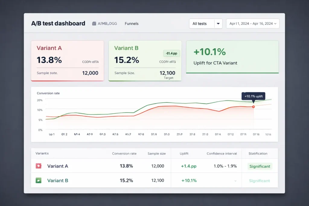
How to test quickly and learn what actually moves the needle
Testing is not about perfect experiments; it is about disciplined learning. Start simple: test one change per section so you can attribute results. Useful early tests include:
- Headline specificity vs brevity
- Single CTA vs CTA plus secondary link
- Short form vs two-step form
- Static hero image vs short explainer video
Set your guardrails with a simple weekly review. Track primary conversions, scroll depth, and click maps. Use GA4 to set your main event, and keep a spreadsheet log of variants, dates, traffic, and outcomes. If you want a structured guide to persuasive tweaks that often win, the ideas in Web Design Conversion Tips map neatly to A/B test hypotheses you can run in a week.
How to measure, attribute, and iterate
Connect your page to Google Analytics 4 and mark your target event as a conversion. Add UTM parameters on ad and email links for source clarity. If you run paid traffic, create separate pages for each campaign so your message and audience stay aligned. Heatmap tools help you see dead zones and rage clicks so you can trim distractions. Consider server-side tracking if you rely heavily on performance marketing and want more consistent attribution.
For ongoing education on speed and performance, Google’s developer guides and PageSpeed Insights documentation provide up-to-date techniques you can apply without a rebuild.
Real examples: two simple rewrites that lifted the response
- A local services firm changed its headline from “Professional Websites For Businesses” to “Get More Booked Calls In 14 Days With A Fast, Local Business Website.” Combined with changing “Submit” to “Get My Plan,” the completion rate rose by double digits in a week.
- An eCommerce landing page removed four home-page style links from the header, added a single testimonial near the add-to-cart area, and cut form fields from seven to three. Result: more checkouts without increasing ad spend.
These are not magical tricks. They are basic web design landing page tips applied with care.
A practical build checklist you can complete in a day
- Define one success metric and one CTA
- Write a plain-language headline that names the outcome
- Trim your form to essentials and add microcopy under the button
- Add one testimonial with a measurable result
- Compress and lazy-load images, then recheck with PageSpeed
- Hide or simplify global navigation on the page
- Set GA4 conversion and create a weekly test cadence
If you want a partner who has shipped many of these pages in tight timelines, review our Sample Work and then claim a slot via Web Design Services.
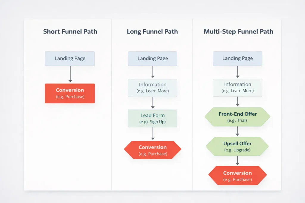
When to use long pages, short pages, or multi-step funnels
- Short page: best for warm traffic and simple offers like “book a call” or “download the checklist.”
- Long page: best when the visitor needs education to feel confident, such as premium services or new products.
- Multi-step funnel: best for segmenting by intent, like asking a single qualifier first, then routing to the right form or offer.
The best option is the one that reduces uncertainty for your audience with the least cognitive load. Start short. If analytics show users hunting for details, layer in proof and FAQs. That’s the safest way to keep momentum without bloating the page.
Common design mistakes to avoid
- Crowded hero sections with competing CTAs
- Decorative animations that hide slow load times
- Stock photos with no relevance to the outcome
- Walls of text with no scannable subheads
- Forms that ask for a budget or timeline before trust is earned
A simple internal rule helps: if an element does not make the main action more likely, remove it or demote it.
Implementation notes and useful references
If you are validating a new page, ship a working version first, then optimize. Leverage component libraries so you can make changes fast. Use a design token for your primary CTA color so it stays consistent. For evidence-based UX and research, Nielsen Norman Group has decades of practical findings. For testing tactics and mini case studies, CXL’s articles give you ready-to-run ideas. For performance, PageSpeed Insights and Web.dev guidelines are your go-to checklists. And if you want help translating this into a polished build, our team at Web Design Services can take it from brief to launch with a focus on speed, clarity, and measurable outcomes.
Frequently Asked Questions
What are the must-have elements of a high-converting landing page?
A high-converting landing page requires a clear value proposition, one primary CTA, proof, and speed. Start with a headline that promises a concrete outcome, add a subhead that clarifies the who or how, then place a single, contrasting CTA. Support it with relevant proof, like a quantified testimonial and trust badges. Keep the hero visual simple and outcome-focused. Finally, compress images and minimize scripts so your page loads fast on mobile, where most visitors arrive.
How should I structure content above the fold for maximum clarity?
Prioritize message, then motion, then detail. Put a specific headline at the top, followed by a short subhead and one dominant CTA. Use a visual that shows the result the visitor wants, not just a decorative image. Add a small reassurance line under the CTA to neutralize fear, such as “No spam. Cancel anytime.” Avoid secondary links and carousels that split attention. This compact structure sets expectations and earns the next scroll, which is the true goal of the fold.
Which design mistakes most often hurt conversions on landing pages?
The most harmful mistakes are clutter, mixed goals, and slow load. Clutter creates decision fatigue, mixed goals dilute your message, and slow load kills intent before users even see your headline. Other pitfalls include form fields you do not need, vague testimonials with no outcomes, and CTAs that describe work instead of reward. Fixing these is usually simple: reduce elements, choose a single CTA, compress media, and rewrite your button to promise value.
How do I track and systematically improve a landing page’s performance?
Define one main event, log every change, and test one thing at a time. In GA4, mark your target event as a conversion, for example, “Lead Submitted” or “Call Booked.” Add UTM tags to every ad and email link so channel data stays clean. Use a weekly test cadence: run an A/B test on a headline, form length, or CTA microcopy and collect enough sessions to decide. Keep a spreadsheet that lists variants, dates, traffic, and results. Over a month, this habit compounds into meaningful gains.
Wrap Up: Web Design Landing Page Tips That Stick
If you remember only one thing, remember this: the highest converting pages answer what, who, and next in seconds, and then get out of the way. Keep one goal, keep copy concrete, keep load times low, and support your promise with proof. Apply these web design landing page tips for a week, and you will see clearer analytics and more confident leads.