A web design content strategy defines the message, structure, and actions on every page before you design. Use a web design content strategy to align user intent, SEO, and business goals so the site launches right the first time.
Most redesigns fail because content is treated as filler after the layout is set. In this guide, you will learn why content must lead design, how to build a messaging architecture that flows into UX, and which pages to prioritize for B2B results. We’ll also show internal linking patterns, on-page structures, and practical templates so you can move from strategy to draft to launch without guesswork.
Throughout, we’ll reference real-world page structures you can adapt immediately. If you’re starting from scratch, begin with your core pages and a lean style guide, then iterate based on analytics and sales feedback.
Internal resources you may find helpful while planning and reviewing drafts:
• Portfolio examples of effective messaging and layout: Sample Work
• Service architecture and offer positioning: Web Design Services
• Company overview and contact paths: Salt Web Designer
Related how-to articles for greater improvements:
• Landing page structure ideas you can copy: Web Design Landing Page Tips
• Local visibility and trust signals: Local SEO Web Design Tips
• Budget planning for scope control: Web Design Cost for Small Business
Why Content Must Lead The Design
Content decides the job of each page
Good interfaces are clear because the words are clear. Your value proposition, proof, and call to action determine what the layout must emphasize. When copy is defined first, you avoid decorative sections that dilute focus and increase bounce.
Content reduces rounds of rework
Teams that draft before wireframing typically cut revisions by half. Designers place elements with confidence because the headline length, proof modules, and CTA states are known up front. Developers code fewer one-off components because section types are standardized.
Content clarifies measurement
When you define the page goal and micro-conversions, the analytics setup becomes straightforward. You can trace whether the H1 promise, social proof, and CTA are moving users to the next step. This provides an objective basis for iteration rather than subjective opinions.
For a deeper perspective on why copy and IA guide UX, see the usability fundamentals of content-first design by Nielsen Norman Group. You can also explore practical content design standards in the GOV.UK content design guidance, which shows how consistent patterns make pages easier to scan and act on.
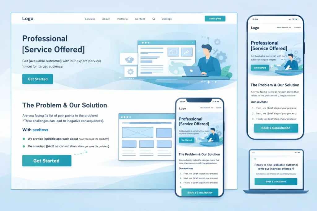
The Core Model: Aligning Message, Task, and Evidence
A basic model you can use on any primary page:
- Promise: A crisp headline that states the outcome in the customer’s words.
- Problem framing: One paragraph that shows you understand the cost of inaction.
- Solution snapshot: What you do and how it works in two or three steps.
- Proof: Evidence blocks like logos, short outcomes, or brief testimonials.
- Path: A single primary CTA and one secondary safety-net action.
- Objections handled: Pricing clues, timelines, or guarantees to reduce friction.
- Next step: Reinforce the CTA with context, not pressure.
Notice how little of this is visual gimmickry. The visuals highlight the message and proof. That is content leading design in practice.
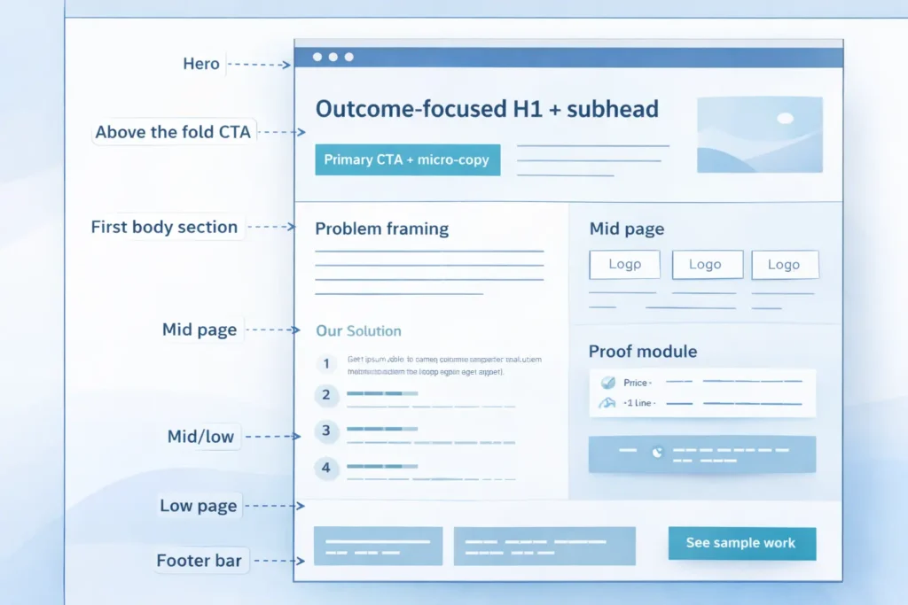
Table 1: Content Blocks To Use And Where They Fit
| Page Area | Content Block | Purpose | Notes |
| Hero | Outcome-focused H1 + subhead | Set the promise quickly | Aim for 8–12 words in H1 |
| Above the fold CTA | Primary CTA + micro-copy | Make the next step obvious | Pair with social proof nearby |
| First body section | Problem framing | Build relevance | 60–90 words, no jargon |
| Mid page | Solution steps | Reduce ambiguity | 3 steps, each 12–18 words |
| Mid/low | Proof module | Create trust | Logos, 1–2 line outcomes |
| Low page | Objections answered | Remove friction | Address price, time, risk |
| Footer bar | Secondary CTA | Offer a low-commitment path | Examples: “See sample work” |
How Content Flows Into UX And SEO
Information architecture that mirrors buyer tasks
Group pages by the tasks buyers actually perform: understand the offer, validate trust, estimate cost, then commit. Folders and menus should mirror that journey. Avoid clever names. Clear beats cute.
On-page structure that matches search intent
Map one primary intent to one URL. If people search “website redesign for SaaS,” the page should open with that phrase, outline the SaaS-specific challenges, include SaaS outcomes, and present a CTA relevant to SaaS buying committees. Do not dilute with general content.
Internal linking that reinforces topical clusters
Link down from overview pages to focused subpages, and back up to summaries. Use short, descriptive anchors that match the destination’s H1. For example, a Services overview can link into “UX Audits,” while each audit page links back to “Web Design Services” to signal hierarchy. See how this looks in practice by reviewing structure and anchors across Web Design Services and the examples in Sample Work.
Which Pages To Build First For B2B
Start narrow. Launching a concise, high-quality set of pages outperforms launching a bloated site with thin content. Prioritize:
- Home: Positioning, quick proof, clear paths to Services and Contact.
- One Services overview: A concise index of offers, each summarized with outcome, who it’s for, and next step.
- Two to four high-intent service pages: Built using the core model and tailored to industry or use case.
- About: Credibility, approach, team. Keep it outcome-focused.
- Contact: Simple, with context on response times and what to prepare.
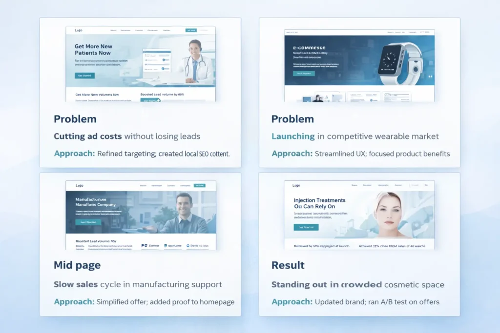
- Portfolio or Case Studies: 3–5 strong examples with problem, approach, measurable result.
If you have to choose just two to go live in week one, pick the top service page and a strong portfolio overview like the ones in Sample Work. Add the rest in planned sprints.
Table 2: Minimal B2B Launch Set With Goals And KPIs
| Page | Primary Goal | Secondary Goal | 30-day KPI |
| Home | Route to Services | Capture contact interest | 45–55 percent to Services |
| Services overview | Route to top service pages | Qualify fit | 30 percent clickthrough |
| Service page A | Book consult | Download brief/checklist | 2–4 percent form starts |
| Portfolio overview | Build trust | Deepen engagement | +25 percent time on page |
| About | Humanize brand | Route to Contact | 10 percent to Contact |
| Contact | Form submits | Calendar bookings | Conversion rate baseline |
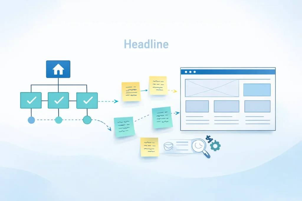
How To Build Your Messaging Architecture In One Week
Day 1: Jobs to be done interviews
Ask 3–5 recent customers what pushed them to act, what almost stopped them, and what changed after working with you. Capture exact phrases.
Day 2: Draft your promise and proof
Write five potential H1s for your top service based on quotes from Day 1. Pick the clearest, not the cleverest. Assemble three proof snippets with specific outcomes.
Day 3: Outline top pages
For each page, sketch the seven content blocks from the core model. Note exact word counts. This forces clarity.
Day 4: Produce first-pass copy
Write fast, then cut. If a sentence does not help the user act, remove it. Keep paragraphs short.
Day 5: Wireframe with real copy
Place your draft into simple wireframes. If something does not fit, fix the copy first. Structure should serve meaning.
Day 6: Stakeholder review
Ask reviewers to mark only what is unclear or unconvincing. They should not rewrite. Limit feedback rounds.
Day 7: Finalize and prep for dev
Lock copy, finalize components, assign CTAs, and confirm analytics events. Only then move to high-fidelity design.
For landing page specifics, see structure cues you can adapt fromWeb Design Landing Page Tips. If your audience is local-first, use the checklist in Local SEO Web Design Tips to align NAP, map embeds, and review modules.
Practical Examples And Tips You Can Steal Today
- Replace feature lists with outcome bullets tied to a metric. Example: “Cut RFP turnaround by 40 percent” beats “Streamlined process.”
- Move a single testimonial above the fold on service pages if it directly reinforces the H1 promise.
- Label CTAs with the next step. “See sample work” or “Get a pricing outline” is clearer than “Learn more.” See examples in Sample Work.
- Insert micro-FAQ accordions on service pages to address pricing, timeline, and deliverables.
Use short internal links inside body copy, not just in buttons. For instance, mention how your Web Design Services handle migrations safely.
Content And SEO: Connect Without Sounding Robotic
Write for humans, then map to search. Here is a simple approach:
- Capture exact customer phrases from calls and discovery forms.
- Group phrases by intent. Those become your page topics.
- Use one primary phrase in the H1 and first paragraph.
- Add two or three semantically related phrases where they naturally fit in subheads and body.
- Use descriptive anchors for internal links.
- Write meta titles and descriptions that state the benefit plainly.
Avoid keyword stuffing. If a sentence looks unnatural when you read it aloud, cut the keyword and keep the meaning. You can still rank by covering the problem thoroughly, providing proof, and making the next step crystal clear.
Governance: Keep Content Fresh Without Chaos
- Assign an owner to each page. The owner updates the page quarterly with new proof and resolves outdated claims.
- Create a changelog in your CMS. Record what changed and why.
- Track KPIs per page in a lightweight dashboard. When a page dips for two months, schedule a review instead of guessing.
When To Expand The Site
Once your minimal set hits baseline KPIs, add:
- A pricing or “How we estimate” explainer to prequalify leads.
- A detailed case study format with data snapshots and a short video.
- A comparison page if prospects consistently ask how you differ from a known alternative.
- Targeted landing pages for your highest-intent industries or regions.
As you scale, ensure internal links always point back to the closest overview page, preserving a clear topic cluster. This is simple to maintain and works well with analytics.
FAQs
1. What is a web design content strategy?
The short answer: it is the plan that decides what each page says, proves, and asks the user to do before any layout choices are made. A strong strategy defines your page goals, the key messages that support those goals, and the proof that reduces risk for the buyer. When you start with words, your wireframes and components naturally follow, and collaboration among writers, designers, and developers becomes faster and clearer.
2. Why does content strategy matter before wireframing?
Because copy determines structure. If you draft after wireframing, you will stretch or shrink messages to fit boxes, not user needs. Leading with content locks the promise, proof, and CTA first, which informs which components you need and in what order. This prevents generic sections, shortens reviews, and produces layouts that emphasize what the buyer actually came for.
3. How do I connect content strategy with SEO without sounding robotic?
Start with intent, then layer in language. Interview customers to learn the exact problems and phrases they use. Map each intent to a single page and write naturally using those phrases in headlines, early paragraphs, and link anchors. Add supporting terms where they make sense. Avoid stuffing. When pages are focused, useful, and internally linked within a clear cluster, search performance follows without awkward wording.
4. What pages should every B2B site prioritize first?
Launch a lean set that can actually convert. Publish a focused Home page, a Services overview, two to four high-intent service pages, an About page, a Contact page, and a Portfolio with three strong examples. This set covers discovery, proof, and action. Add pricing, detailed case studies, and comparison content once analytics show steady traffic and initial conversion.
5. How do I plan content for different buyer stages?
Match page jobs to stages and keep the next step obvious. Early-stage pages clarify problems and outcomes with light proof and ungated resources. Mid-stage pages dive into approach, scope, and timelines with stronger proof. Late-stage pages handle risk and logistics with pricing signals, guarantees, and direct booking. Each page should have one primary CTA that fits the stage and one gentle secondary option.
Putting It All Together: A 30-Day Plan
Week 1: Interviews, promise, proof, and page outlines.
Week 2: First-pass drafts for Home, Services, and the top service page.
Week 3: Wireframes with real copy, stakeholder review, and edits.
Week 4: Final copy, visual system, development handoff, analytics, and launch.
During this month, tie micro-goals to each page. For example, aim for a 30 percent clickthrough from Services to a top service page in the first 30 days. If you miss, revise the summary blocks and tighten the proof.
Where To Get Help Or See Patterns In Action
If you want a review of your page outlines or you’re ready to move into production, check the approach and examples here:
• Strategy, UX, and build: Salt Web Designer
• Offers and delivery: Web Design Services
• Proof in action: Sample Work
For additional reading that deepens this article’s guidance, explore:
• Nielsen Norman Group’s content-first principles for usability fundamentals.
• GOV.UK content design guidance for simple, repeatable standards you can adapt.
Final Notes And Next Steps
You now have a lightweight process to plan pages, wireframe with real copy, and launch a site that is aligned to buyer intent from day one. Keep measurement simple. Track only the actions that show progress toward meetings and proposals, then iterate your proof and CTAs first before redesigning whole sections.
When you are ready to apply this, start with your highest-intent service. Draft the seven content blocks, wireframe with those words, add two proof snippets, and publish. Then make internal links from your Home and Services pages to that new page using descriptive anchors to strengthen your topical cluster.
Conclusion: web design content strategy that actually ships
Design becomes straightforward when content decides the structure. By leading with messaging and proof, building a minimal launch set, and linking pages in tight clusters, you will see faster routes to qualified leads and clearer analytics. Use web design content strategy to map intent to pages, keep copy human, and let the layout serve meaning. Then grow the site in measured steps, guided by outcomes, not opinions.