Why my website is not getting leads usually means traffic, offer, and UX are out of sync. Align those four elements and leads increase fast.
“No leads” usually points to one or more of these gaps: people arriving who never intended to contact you, pages that make it hard to act, an offer that feels risky or unclear, or broken tracking that hides wins. This guide follows the same conversion-focused format you’ll find in our templates: crystal-clear URL and meta, a quick intro answer, scannable sections, two helpful tables, and a practical FAQ.
Quick diagnostic: 90-second checkup
Use this table to spot the most common blockers fast.
| Symptom on the page | Likely cause | Fastest fix |
| Lots of visits, almost no form submissions | Traffic intent mismatch | Adjust keywords and ad audiences to pain-first terms. Add a “Who this is for” block at top. |
| High time on page, low clicks on CTA | Weak or buried value prop | Move a sharp benefit headline and CTA above the fold. Add 3 proof bullets next to CTA. |
| Plenty of clicks, abandoned forms | Friction and anxiety | Reduce fields to essentials. Add privacy note and trust badges. Offer a short, no-risk step. |
| Few return visits | Offer not memorable | Add a one-page downloadable checklist with branded follow-up email sequence. |
| Numbers look flat across channels | Tracking not set up | Add a one-page downloadable checklist with a branded follow-up email sequence. |
Why websites stop generating leads (and what to do)
Below are the root causes, the “why,” and the corrective actions that actually move the needle.
1. Traffic intent is off
If visitors arrive researching “what is” content, they rarely book a call. You need comparison, cost, and outcome keywords, not just informational ones. Rework titles and meta to reflect buying signals like “pricing,” “package,” “near me,” and “hire.”Action: Refresh your key service pages via a simple content path: problem framing, solution snapshot, proof, outcomes, and next step. If you need a model for this, see our post on Web Design Content Strategy: Simple Path to Pages that Convert for the exact on-page flow.
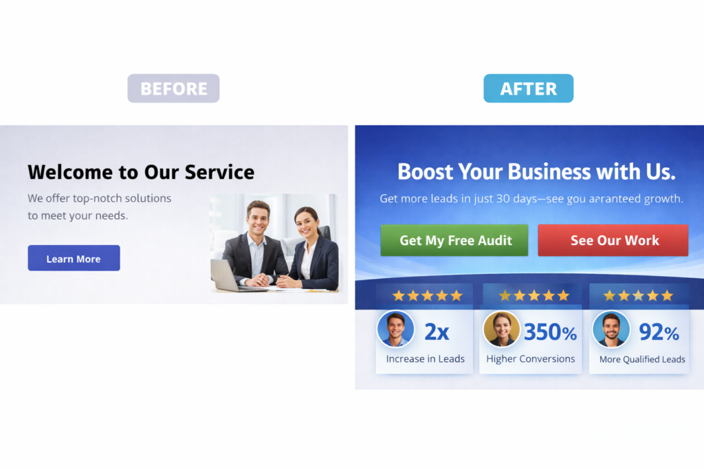
2. Value prop is unclear above the fold
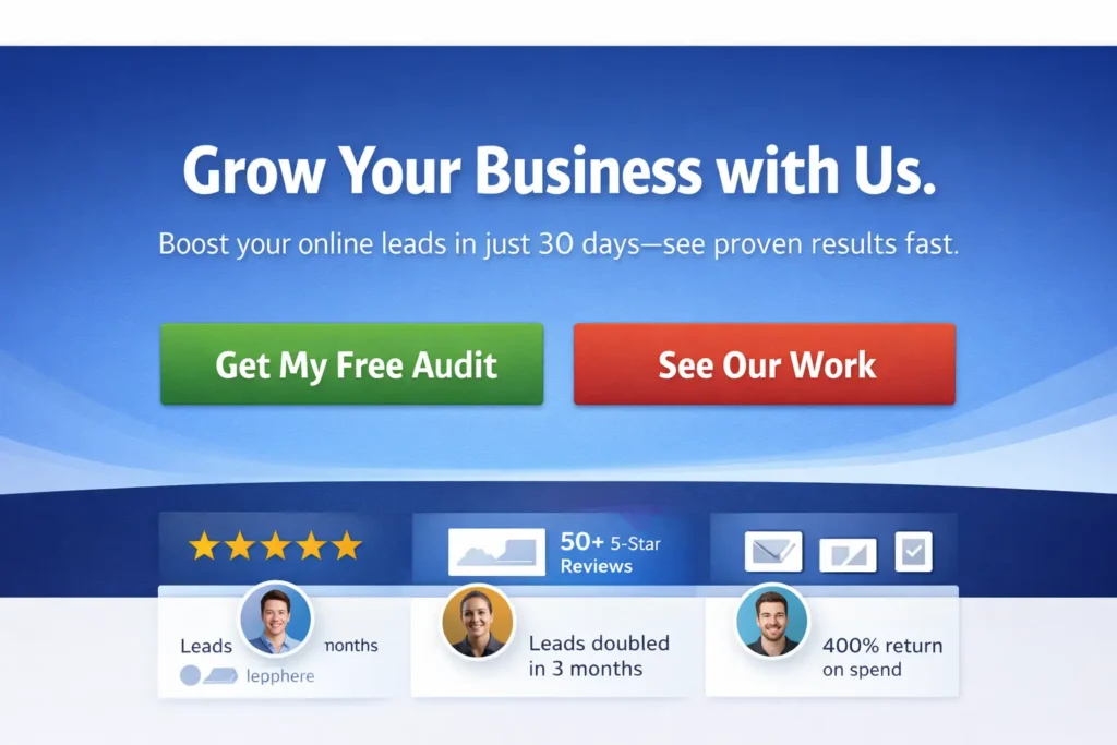
People scan the first screen in seconds. If your headline says what you do but not the outcome, conversions dip. Pair a benefit headline with a single, specific CTA and 2 or 3 proof elements: client logos, a brief testimonial, or a quantified result.
Action: Rewrite hero section to answer: “What outcome do I get, in what time frame, with what proof?” Then place a primary CTA and a safety-net CTA like “See Sample Work.”
3. The offer feels risky or oversized
A full consultation can feel heavy. A lighter first step converts better: a 15-minute fit call, a homepage teardown video, or a 5-point audit PDF. Add a no-pressure line like “No sales pitch, just practical advice.”
Action: Create one low-commitment lead magnet and one micro-offer. Gate the PDF with name + email only. Mention time to value on the button, for example, “Get the 3-day mini audit.”
4. Friction in the form and navigation
Extra fields, unclear labels, and jumpy layouts cause drop-offs. Map your form to the minimum data needed to respond within one business day.
Action: Trim to name, email, project type, and budget range. Add a line under the button: “We reply in 24 hours.” Keep the navbar visible but quiet near the form.
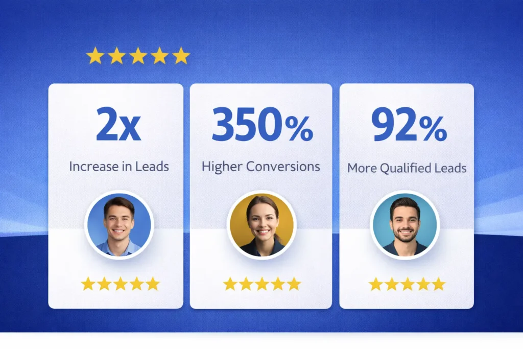
5. Missing trust: proof, process, and people
Show 3 proof types together: outcome quote, recognizable logo, and a “how we work” 3-step graphic. Humanize with a small founder photo near the form.
Action: Borrow visual hierarchy patterns from proven content layouts: concise intro, scannable subheads, and a clear conclusion that repeats the call to action. This structure mirrors the high-performing templates we use, which place quick answers up top, then deeper sections, then an FAQ.
6. Tracking is incomplete or noisy
If GA4 does not see your goals, you cannot improve them. Define events for form_submit, phone_click, mailto_click, and chat_start. Mark the ones that matter as conversions and verify in real time. For reference, see Google’s official guidance on conversions and event configuration from Analytics Help, and benchmark your landing page rates with HubSpot’s resources so your targets are realistic.
7. Slow or inconsistent follow-up
Leads decay quickly. Under 10 minutes for first reply beats next-day response by a wide margin. Use an autoresponder that sets expectations and shares a scheduling link.
Action: Send an immediate confirmation email with 2 helpful links and a calendar link. Then make sure a human reply follows shortly with one customized question.

How to fix it: a focused 7-step plan
The “how” below is designed to be executed in under two weeks for most small business sites.
Step 1: Clarify the offer
Write a 20-word outcome statement and a 3-bullet proof set. Add one micro-offer for people not ready to talk yet.
Step 2: Rebuild the hero
Benefit headline, one-sentence explainer, primary CTA, proof bar. Keep the hero under 140 words. Add a “See Sample Work” secondary CTA that scrolls to your portfolio.
Step 3: Restructure the service page
Use a simple, repeatable block order: Problem, What We Do, How It Works, Results, Pricing Signals, FAQs, CTA. For expert help or a done-for-you build, our Web Design Services can handle strategy, wireframes, and implementation.
Step 4: Strengthen brand cues
Consistent color, type scale, and image treatment increase perceived quality and trust. Our guide on Web Design Branding Tips shows quick wins you can apply in one afternoon.
Step 5: Add a low-risk lead magnet
Create a 1-page “Website Lead Teardown” checklist. Gate it with a short form. Use email to nurture with 3 practical tips over 5 days.
Step 6: Fix analytics
In GA4, define events and mark key ones as conversions. Test each event with a dummy submission. Name events in lower_snake_case and keep labels consistent across forms.
Step 7: Tune speed and mobile UX
Compress hero images, lazy-load below-the-fold assets, and ensure buttons are at least 44px high with clear labels like “Start my teardown.”
Which option is best for your situation?
This is where teams waste cycles. Pick the lane that matches your current state and constraints.
| Situation | Best option | Why this wins now | What to measure first |
| Getting traffic but no inquiries | Service page refresh plus micro-offer | You already have attention. Reduce risk and clarify value to convert it. | Hero CTR to CTA and form completion rate |
| New site or low traffic | Content + local SEO package | You must earn qualified visits while building authority and trust | Organic sessions with buying-intent queries |
| Good leads but slow cycles | Nurture emails + scheduler | Shortens time to call with automated reminders | Time from form to booked call |
| Paid ads failing | Retargeting + offer test | Warm visitors convert better. Test 2 offers side by side. | Shortens the time to call with automated reminders |
For hands-on help with any track above, start at Salt Web Designer and request a teardown.
Real-world examples and practical tips
- Microcopy that converts: Replace “Submit” with “Get my 5-point teardown” or “Book my 15-minute fit call.” Add a short reassurance line under the button, like “No spam. We reply within a day.”
- Budget ranges without scaring leads: Use a light filter in the form like “Under 3k, 3–8k, 8k+.” This qualifies without anchoring.
- The 2-CTA pattern: Primary action for high-intent users, secondary soft action for fence-sitters.
- Proof where it matters: Put logos and a one-line outcome right next to the form, not buried in the footer.
- Accessibility edge: 16px base font or larger, strong color contrast, and clear focus states help everyone and quietly boost trust.
- Support that keeps pages sharp: If you prefer an ongoing partner, our Web Design Support Service keeps content fresh, fixes UX drift, and iterates based on data.
14-day blueprint to get leads flowing
Days 1–2: Finalize offer statement and micro-offer. Draft hero copy and proof.
Days 3–4: Rebuild hero and form. Trim fields. Add trust elements.
Days 5–7: Write or refresh 2 key service pages using a consistent structure and embed a native, short form.
Day 8: Create your 1-page checklist lead magnet. Design a simple landing section with a form.
Days 9–10: Implement GA4 events and conversions. Set up a retargeting audience of site visitors in your ad account.
Days 11–12: Add a 3-email nurture with a scheduler link and answers to the top three objections.
Days 13–14: Launch a light retargeting campaign to the checklist. Review early metrics and adjust hero copy and CTA if CTR is under 2.5 percent.
This stepwise approach mirrors our template logic: quick answer up top, then progressively deeper guidance, and a concluding call to action, plus FAQs to reduce lingering friction.
Measurement that matters
Track four core numbers weekly:
- Qualified sessions from buying-intent terms or warm retargeting.
- Hero CTR to the primary CTA.
- Form completion rate on service pages.
- Lead-to-call rate within 72 hours.
Use GA4 to define events and conversions and confirm via real-time debugging. If you’re unsure about the naming or setup, follow Google’s guide on marking events as conversions in GA4. Then compare your page performance against industry norms using HubSpot’s landing page conversion benchmarks to set realistic targets and iterate.
Conclusion
Final takeaway: why my website is not getting leads is a solvable alignment problem. Match traffic intent with a crystal-clear offer, reduce friction on the page, prove credibility near the form, measure the right events, and reply fast. Keep the plan small, ship it in 14 days, and refine weekly.
Frequently Asked Questions
Why is my website not generating leads?
Most lead droughts come from misalignment between traffic intent, page experience, offer clarity, and follow-up speed. If visitors arrive researching, but your page sells, they bounce. If your hero is vague or your form has too many fields, they quit. Add a low-risk micro-offer, cut form friction, strengthen proof, and ensure GA4 tracks form_submit, phone_click, and chat as conversions so you can improve what matters.
How do I get more leads on my website?
Start by tightening your above-the-fold value proposition and pairing it with a single primary CTA and a lighter safety-net step. Then improve your traffic mix so more visitors are in a buying mood. Use retargeting for warm visitors and add an email nurture that delivers value within 24 to 72 hours. Measure hero CTR, form completion, and booked calls. Iterate every 7 days, not every 7 months, and your pipeline will rise.
How to get 1000 visitors a day to your website?
Quality beats raw volume for leads, but scalable traffic comes from three levers: content that targets commercial terms, local SEO for intent near you, and paid retargeting to warm audiences. Publish comparison and pricing pieces, optimize your Google Business Profile, and run a light retargeting campaign. As volume grows, guard conversion rate by keeping the page fast, reducing form friction, and testing one micro-offer at a time.
Why am I getting no leads?
It usually means your first step asks for too much commitment, or your page fails to make the outcome obvious. Replace “Book a consultation” with “Get a 5-point homepage teardown in 48 hours,” cut your form to four fields, and place proof next to the CTA. Verify that GA4 counts a thank-you visit or phone click as a conversion. Follow up within ten minutes with a scheduling link and one custom insight from their site.