If you’re thinking, “My website looks unprofessional,” you’re probably right to act now. Visitors judge credibility in seconds; small visual and UX mistakes quietly reduce trust, leads, and sales.
This guide shows the exact red flags that make sites feel amateur, how to fix them step by step, and which path fits your budget and timeline. You’ll also see real-world examples, quick wins, and a comparison table to choose the smartest option today.
What “unprofessional” actually looks like to your visitors
Perception is shaped by visual clarity, consistent branding, fast loading, and frictionless navigation. When any piece feels off, trust drops. Here’s what visitors subconsciously read as “unpolished”:
- Messy layout or cramped spacing
- Inconsistent fonts, colors, and button styles
- Low-quality or mismatched images
- Confusing navigation labels or too many menu items
- Slow pages, layout shifts, or popups that interrupt
- No clear value proposition above the fold
- Missing trust markers like SSL, testimonials, or a portfolio
A design that looks “fine” to you can still leak conversions if hierarchy, contrast, and motion don’t guide the eye. That’s why even small changes in spacing, type scale, and button states often produce outsized gains.🔗 Browse real project outcomes on Sample Work for benchmarks and layout patterns that signal quality to buyers.
Quick self-audit: spot the credibility killers in 10 minutes
Use this table to scan your homepage and one key landing page. Tick every issue you see, then apply the paired fix.
| Red Flag (What users feel) | Where to look | Fast Fix (Today) | Better Fix (Next sprint) |
| Headline doesn’t say what you do | Above the fold | Rewrite to “We [do X] for [audience] in [location].” | Test 2 variants with different benefits and social proof |
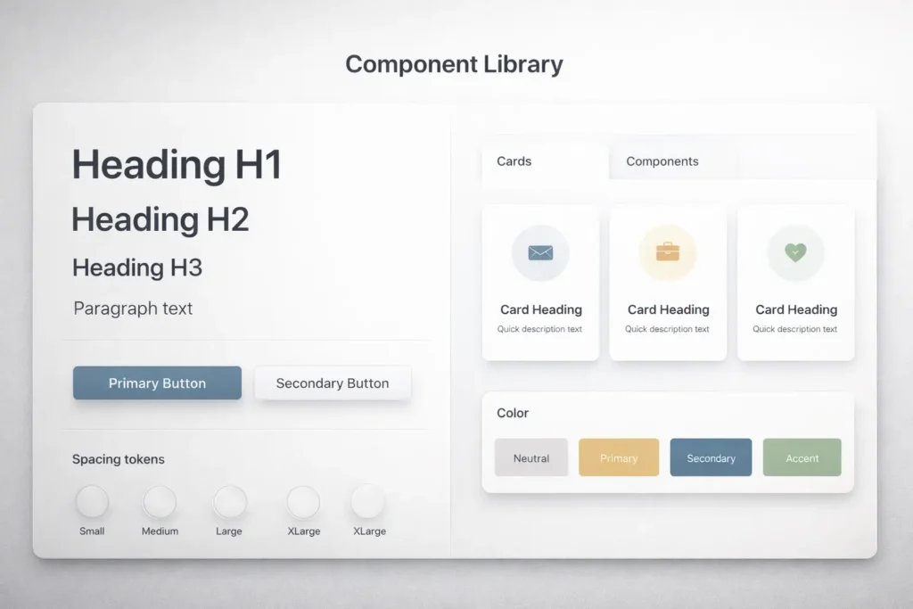
| Typographic clutter | Headers, paragraphs | Limit to 2 font families, set 8–12 px spacing between sections | Create a type scale: H1 36–48, H2 28–32, body 16–18 |
| Inconsistent buttons | CTAs across pages | Standardize one primary color, one hover state | Build a mini design system with tokens and components |
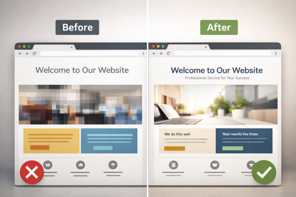
| Stocky or blurry images | Hero, features | Replace top 3 images with crisp, relevant visuals | Commission brand photography or custom illustrations |
| Slow above-the-fold load | Hero, scripts | Compress hero image, lazy-load below-the-fold media | Audit third-party scripts and inline critical CSS |
Tip: Run PageSpeed Insights to surface speed and Core Web Vitals issues, then prioritize fixes that improve Largest Contentful Paint and Cumulative Layout Shift. A faster, stable page “feels” more professional to users and search engines alike (see Google’s guidance on Core Web Vitals).
External reference: Google’s web.dev for Core Web Vitals best practices.
External reference: Nielsen Norman Group for usability and credibility research.
Why websites feel amateur even when they “look okay.”
1. Visual hierarchy is missing
If text sizes don’t clearly rank information, the eye works to find meaning. Professional sites use a visible ladder of headings, scannable bullets, and consistent spacing that leads to the call-to-action.
2. Brand signals aren’t consistent
Mismatched colors or CTA styles make a site feel stitched together. A simple token set for colors, spacing, and radii instantly brings harmony.
3. Trust and proof are not visible
Logos, ratings, and testimonials need to sit near key decisions, not hidden on a separate page. Microcopy around forms also matters: “We’ll reply within 1 business day” builds certainty.
4. Speed debt and layout shift
Unoptimized hero images, render-blocking scripts, and popups that shove content down break flow. Visitors equate smoothness with professionalism.
🔧 Need help turning this audit into a sprint plan? See Web Design Support Service for monthly improvements that stack up.
How to fix the most common issues step by step
Step 1: Clarify the above-the-fold story
- Write a headline in one line: what you do, for whom, and the key benefit.
- Keep a single primary CTA. Remove competing buttons from the hero.
Step 2: Normalize type, spacing, and buttons
- Choose 2 fonts max. Set a consistent type scale and line heights.
- Apply a spacing rhythm: small, medium, large.
- Define one primary button style and one hover state across the site.
Step 3: Replace weak visuals
- Swap any blurry images. Choose photography that shows your product in context, not generic concepts.
- If you must use stock, match lighting, color temperature, and angle across images.
Step 4: Speed first, then flourish
- Compress hero media, lazy-load below the fold, and defer noncritical scripts.
- Audit third-party tags. Remove anything not tied to a clear business outcome.
- Address Core Web Vitals. Stable, quick pages get better engagement and rankings.
Step 5: Put proof within reach
- Add 3 short testimonials near your pricing or contact CTA.
- Surface logos and quick stats like “4.9★ from 120+ clients.”
- Show a small portfolio grid on the homepage and link to detailed case studies.
Which option is best: DIY polish, template refresh, or pro redesign?
Use the table below to match your situation with the most effective path.
| Strategy, custom design system, optimized funnels, portfolio, and proof revamp | Cost | Time to launch | Best when | What you get |
| DIY polish | Low | 1–2 weeks | You have a working site with small inconsistencies | Quick uplift: cleaner type scale, better hero copy, compressed media |
| Template refresh | Medium | 2–4 weeks | Your layout is dated but content is solid | Modern UI kit, consistent components, improved mobile responsiveness |
| Professional redesign | Higher | 4–8 weeks | Messaging, IA, and brand need a reset | Strategy, custom design system, optimized funnels, portfolio and proof revamp |
Why this matters: Many sites don’t need a ground-up rebuild. A focused refresh often moves the needle faster and preserves SEO equity. When funnels or brand fit are unclear, a pro redesign pays back in conversion lifts and fewer support inquiries.
Not sure where you fit? Review recent client outcomes on Sample Work and note which structure is closest to your needs.
Practical examples that immediately lift perceived quality
- Rewrite the hero: “Custom kitchen remodels in Perth that add value and light.” One primary CTA: “See projects.”
- Show proof early: Add a strip of 5 brand logos under the hero with a caption like “Trusted by 120+ homeowners.”
- Tighten the menu: 5 top-level items max. Use plain-English labels.
- Standardize cards: Same image ratio, same button, same padding.
- Form polish: Fewer fields, instant error messages, privacy note under the submit button.
- Footer trust: Business address, phone, certification badges, and a final CTA to contact.
🔗 If traffic exists but leads don’t, align UX with messaging using Why My Website Is Not Getting Leads and Why My Website Is Not Converting for deeper funnel fixes.
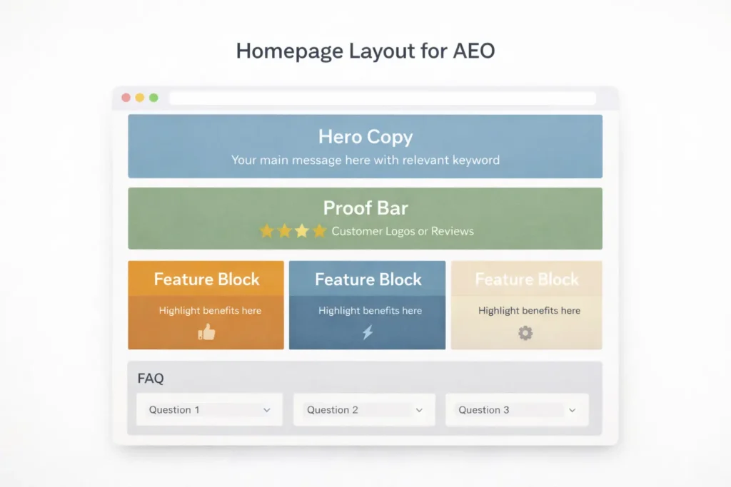
SEO, AEO, and local signals that elevate professionalism
A polished site also answers questions the way search engines and assistants expect.
- Answer concisely up top. Your first two sentences should directly resolve the user’s query.
- Use descriptive subheads that map to search intent.
- Include structured data where relevant (Organization, Product, FAQ).
- Reinforce E-E-A-T with a real byline, credentials, and contact info.
- Keep location cues consistent across the footer, contact page, and Google Business Profile.
- Internal links should be natural and help users continue their journey, like Salt Web Designer and Web Design Services.
Speed and UX: small technical wins with big perception gains
- Compress media: Target <200 KB for hero images. Use next-gen formats.
- Prevent shifts: Set width and height on images and reserve space for embeds.
- Limit popups: Delay or trigger on intent rather than on page load.
- Mobile first: 48 px tap targets, readable body size, and sticky primary CTA on key pages.
- Accessibility basics: Sufficient color contrast, focus states, and descriptive alt text.
Use Google’s PageSpeed Insights and web.dev checklists to identify bottlenecks and prioritize fixes that influence user-perceived performance. NN/g’s research summaries are also helpful for quick heuristics on scanning patterns and trust.
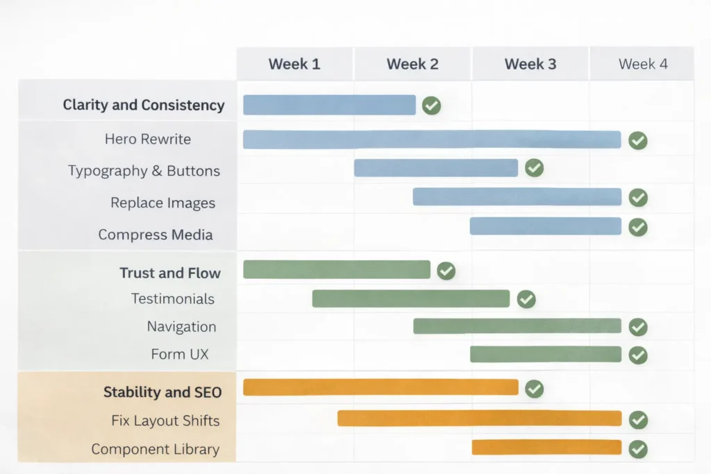
Implementation roadmap, you can start this week
Week 1: Clarity and consistency
- Rewrite hero headline and subhead.
- Standardize typography and buttons.
- Replace the top 3 images.
- Compress media and lazy-load below the fold.
Week 2: Trust and flow
- Add testimonials near key CTAs.
- Tighten navigation and remove redundant pages.
- Improve form UX and microcopy.
- Add a mini portfolio grid on the homepage.
Week 3–4: Stability and SEO
- Fix layout shifts and script bloat.
- Build a component library to keep future pages consistent.
- Publish a detailed case study and add an FAQ schema to your top landing page.
- Align internal links from high-authority pages to your money pages.
When to bring in a pro (and what you should expect)
Consider expert help if any of these are true:
- You can’t explain your value in one sentence
- Your analytics show good traffic but poor conversion
- Your pages shift, stall, or break on mobile
- Your brand visuals don’t match your market position
A solid partner will map your goals to a measurable plan, not just “make it pretty.” Expect an audit, strategy, wireframes, a component-based design system, and a rollout schedule. See how this looks in practice on Sample Work and choose the approach that mirrors your goals.
If you prefer iterative improvements, a Web Design Support Service can roll out upgrades without taking the site offline.
Real-world internal linking that boosts both UX and rankings
Link from:
- Blog posts that diagnose funnel issues → Web Design Services
- Portfolio pages → relevant service pages and the contact section
- High-traffic posts, such as Why My Website Is Not Getting Leads → Web Design Services using action-oriented anchors like “improve conversions.”
- Homepage proof section → Sample Work case studies
This creates guided paths that feel intentional and professional, while giving search engines clear signals about page relationships.
Case mini-study: from “meh” to memorable in 14 days
Situation: Service business with a dated WordPress theme, slow hero image, and vague hero statement.
Actions: Rewrote hero, standardized buttons, compressed media, added 3 proofs above pricing, reduced menu from 8 to 5 items, and re-ordered sections by intent.
Outcome: Bounce rate down, time on page up, and a measurable lift in form starts within two weeks.
Want a similar outcome tailored to your offer? Start with a light audit via Salt Web Designer and turn insights into a two-week sprint plan.
Closing thoughts
If you’ve been saying “my website looks unprofessional,” now you know the exact reasons and the clearest fixes. Start with copy clarity, component consistency, and speed. Then layer in trust and structured internal links. Whether you polish, refresh, or redesign, the most “professional” site is the one that loads fast, reads clearly, and proves your value near every CTA.
For ongoing wins, keep iterating in short cycles and measure results weekly. Professionalism is the sum of small decisions repeated across every page.
Frequently Asked Questions
What makes a website look unprofessional?
Inconsistent typography, uneven spacing, slow loading, and weak imagery are the biggest tells. Visitors expect a clear headline above the fold, legible text, consistent button styles, and fast, stable pages. Add missing trust markers near decisions, like testimonials and case links. Clean up your navigation labels and limit top-level items. Replace blurry stock photos with crisp, context-rich visuals. These changes immediately raise perceived quality.
How to fix a website not displaying properly?
Start by testing on mobile and multiple browsers, then isolate layout shifts and script conflicts. Set fixed dimensions on images, lazy-load below the fold, and remove any render-blocking scripts. Validate your CSS and check for plugin conflicts if you use a CMS. Use responsive units, larger tap targets, and a fluid grid so content adapts to screen sizes. Once stable, standardize components and retest with real users to confirm the fix under real conditions.
How do I get my website more visible?
Answer the core query in your first two sentences, then support it with clear subheads, proof, and internal links. Add structured data where relevant, optimize titles and meta descriptions, and write scannable copy that matches search intent. Improve page speed and stability to meet Core Web Vitals. Secure citations from reputable directories and feature authentic reviews. Link naturally to key pages like Web Design Services and showcase successes on Sample Work to strengthen both UX and SEO.
What to do if a website is not working properly?
Create a quick incident checklist: reproduce the bug, capture screenshots, and roll back the most recent change. Check hosting status, error logs, and third-party scripts. If you’re on WordPress, disable recently added plugins and re-enable one by one. Clear caches, invalidate CDNs, and test on a clean browser profile. Document each step so fixes are repeatable. When in doubt, engage a support plan like Web Design Support Service to resolve issues without guesswork.