Website trust issues make visitors hesitate and hurt conversions. Here is how to identify what is breaking trust and the exact steps to fix it so users feel safe to contact you or buy.
If people do not trust your site, they will not act. Trust is earned with fast, secure pages, consistent branding, transparent policies, and visible proof that real people stand behind the business. This guide follows a simple path: understand the psychology behind hesitation, run a quick diagnostic, then choose the highest impact fixes for your situation.
Start with expert help when time is tight. See our conversion-focused web design and compare website design & development services.
What “Trust” Really Means On A Website
Trust on the web is the moment a visitor believes three things:
- The site is safe to use,
- The offer is credible,
- The outcome is clear and worth it.
That belief is formed within seconds. Visual clarity, recognizable security signals, and social proof remove doubt. Vague promises, broken layouts, and technical warnings create friction.
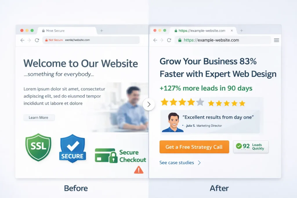
Quick win: Put a specific value proposition, a primary action, and at least one credibility signal above the fold. A small before-and-after benchmark like “+38% more demo requests in 60 days” works well.
Read how traffic that does not convert often traces back to confidence gaps in this related post: why your website is not getting leads.
Table 1: Fast Checks That Resolve Most Trust Friction
| Area | What users see in seconds | What to check | Pass criteria |
| Security | Padlock, no warnings | Valid TLS cert, HTTPS redirect, HSTS | All pages load over HTTPS, no mixed content |
| Identity | Clear who you are | Logo, name, legal entity, physical address | Header + footer identity consistent |
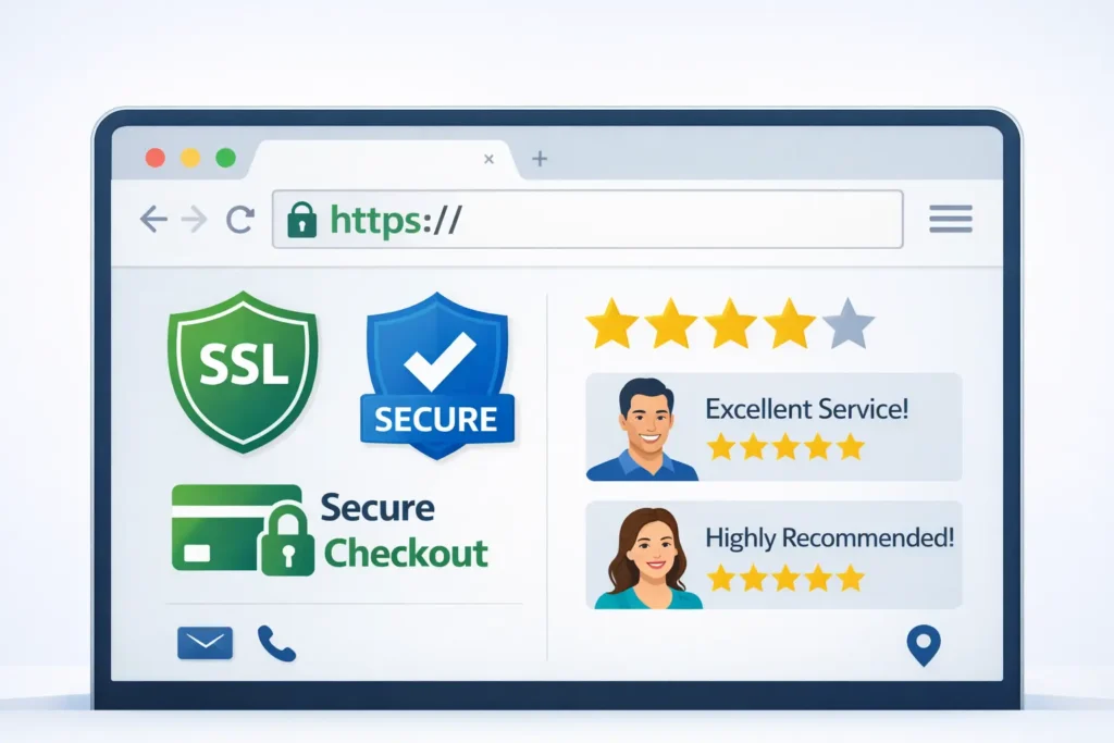
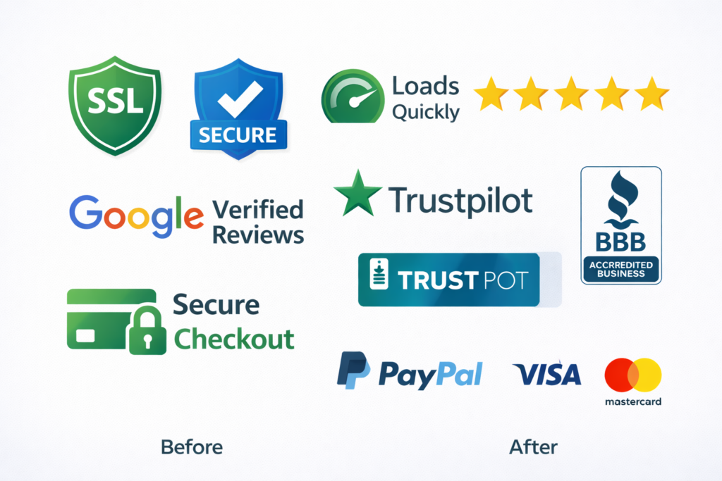
| Proof | Evidence you deliver | Stars, testimonials, case studies, client logos | At least 1 proof element above the fold |
| UX polish | Feels legit | Spacing, alignment, contrast, and mobile fit | No layout breaks below 375px width |
| Speed | No waiting | Largest Contentful Paint | LCP under 2.5s on mobile |
If any cell is red during your audit, conversions will suffer until you fix it.
Why Do Website Trust Issues Happen?
1. Technical red flags
Expired SSL certificates, mixed content, or suspicious popups trigger browser and user alarms. Studies show people equate security warnings with scam risk. Even a single “Not Secure” label can slash form completions.
2. Credibility gaps
Stocky visuals, vague headlines, and missing last-mile details, like pricing context or delivery timelines, keep visitors in “maybe later.” People need relevance and proof more than flamboyance.
3. Friction in the path
Unclear CTAs, long forms, and surprise fees create fear of being trapped. Trust increases when steps are predictable and reversible.
4. Inconsistent signals
Incongruent fonts, off-brand colors, or mismatched contact details make a site feel thrown together. Consistency implies care, and care implies reliability.
Deep dive into confidence blockers and lead loss: why your website is not getting leads.
Even with SSL, badges, and reviews in place, visitors can still bounce due to clarity, speed, and offer issues. See reasons visitors leave and fixes for the full breakdown.
How To Diagnose Trust, Fast
Run this 15-minute diagnostic before changing anything:
A. Browser health check 🔍
Open your homepage and top landing pages in an incognito window on mobile and desktop. Look for the padlock, scan for “Not Secure,” and test key routes, like pricing or checkout.
B. First-glance test
Show a colleague your above-the-fold for 5 seconds and ask:
- What do we offer, for whom, and what happens next?
- What proof did you notice?
If they cannot answer, your message and proof need work.
C. Form test
Measure the time to submit your primary form. If it takes more than 60 seconds or requests sensitive data too early, trim it. Offer a lighter step, like “Get pricing range by email,” then escalate.
D. Speed test
Run PageSpeed Insights and note mobile LCP and CLS. Improve images and fonts first. Lazy load below-the-fold media and preconnect critical domains for quick gains.
E. Policy and identity check
Verify business name matches footer, privacy policy, and contact page. Add a real address and a phone number or live chat hours.
The Fix List: From Highest To Lowest Impact
1. Establish Technical Safety Signals
- Force HTTPS globally, renew the TLS certificate automatically, and set HSTS.
- Remove all mixed content so no insecure resources load.
- Add a lock icon and “Secure checkout” note near payment and forms.
Use the official guidance on HTTPS configuration from Google to avoid common pitfalls and “Not Secure” labels. This resource also explains how browsers evaluate secure connections (external reference: Google Search Central, HTTPS as a ranking signal).
2. Put Proof Where Eyes Go First
- Add a one-sentence outcomes proof above the fold.
- Show three authentic testimonials with names, roles, and logos.
- Link to numbers-driven projects: case studies with numbers.
3. Clarify Your Offer And Next Step
- Rewrite the hero with a direct benefit, target audience, and CTA.
- Use a primary CTA and a friction-light secondary action like “See examples.”
- Reduce form fields to essentials. Offer a calendar link after submission.
4. Eliminate UX Whiplash
- Standardize font pairings and button styles.
- Keep spacing consistent and protect tap targets on mobile.
- Remove full-screen popups on first load. Replace with a gentle banner.
5. Transparency That Lowers Anxiety
- Publish pricing context or at least a range.
- Explain timelines, refunds, and data handling in simple language.
- Add an “Our process” section that shows steps, duration, and deliverables.
When you need a partner to implement, start with our maintenance & care plans or jump to a local website design team for a guided rebuild.
Table 2: Match Your Symptom To The Right Fix
| Symptom you see | Likely trust root cause | Fastest fix | Verification tip |
| High bounce in 3 seconds | Security or message mismatch | Force HTTPS, rewrite hero for clarity | Compare bounce and time on page after deploy |
| Cart or form abandonment | Anxiety at payment or data step | Add badges, simplify form, state guarantees | Watch drop-off by field, record sessions |
| “Looks scammy” feedback | Inconsistent visuals or stock imagery | Standardize styles, swap images for real photos | Run another 5-second test after changes |
| Few repeat visits | Low perceived value or weak onboarding | Add welcome email, resources, and “how it works.” | Track return visitors and email CTR |
Which Option Is Best For You?
- If your analytics show instant exits, prioritize technical safety. Without security, every other improvement is ignored. This delivers the biggest immediate lift because it removes browser-level warnings.
- If users stay but do not act, prioritize proof above the fold. Social proof and sample results convert attention into intent.
- If people start forms but drop, prioritize form and checkout clarity. Shorten the form, add inline reassurance, and recap benefits on the submit page.
- If leads are unqualified, prioritize message precision. Add the who, what, and for whom. Clarify industries, budgets, and timelines.
When in doubt, fix security first, proof second, friction third. That order protects revenue and compounds results.
How To Communicate Trust On Each Page Type
Home
Promise, proof, path. Pin your core claim, add a mini case study with a number, and point to your most profitable action.
Services
Explain outcomes, process, and timelines. Add FAQs that address risk. Link to examples that mirror the visitor’s use case.
Pricing
Anchor expectations with ranges or packages. Make comparisons simple, and explain what drives costs up or down.
Checkout or Lead Form
Remove distractions. Reassure with a short privacy statement, payment badges, and a guarantee. Auto-confirm with a clear next step.
About
Show the humans. Real photos, certifications, and a short origin story turn a company into people prospects can trust.
Need help sequencing changes for the most gain in the least time? Explore pricing & service plans or talk to our small business web design experts.
Practical Examples You Can Ship This Week
- Add a slim sticky bar on mobile that shows star rating and “Over 1,200 projects delivered.”
- Place a testimonial with a measurable result right under the hero.
- Replace stock photos with your team and real customers.
- Add a short “No spam, unsubscribe anytime” note under newsletter forms.
- Create a “How we protect your data” mini section that links to your privacy policy.
- For e-commerce, show delivery ETA, returns window, and total cost before payment.
Essential Trust Signals To Add Or Upgrade
- Valid TLS, padlock visible, HSTS enabled
- Company address and phone number, live chat hours
- Verified business profiles on Google and major directories
- Plain-language privacy, terms, and returns pages
- Case studies with real names, roles, logos, and metrics
- Third-party badges, where appropriate, like payment providers
- Accessibility and mobile responsiveness that feel considered
For a deeper technical reference on phishing, spoofing, and safe browsing cues your users rely on, review the CISA guidance on recognizing malicious websites. It maps well to consumer instincts and helps you preempt false positives in your UI copy.
Speed And Stability Are Trust
Visitors equate speed with competence. Images should be modern formats, sized for breakpoints, and lazy-loaded. Prefetch fonts, limit scripts, and defer noncritical tags. Stability matters too. Avoid content shifts that move buttons while users are tapping.
Tip: If LCP is stuck above 2.5s, compress your hero image to under 150 KB, serve it as WebP or AVIF, and preload only critical resources.
Content That Builds Credibility
- Teach, do not tease. Write guides that solve the entire problem, not half.
- Use numbers. “Reduced acquisition cost 23 percent” beats “got better results.”
- Show your work. Link to artifacts like proposals, timelines, or before-after galleries: portfolio highlights.
- Stay consistent. Same voice, same style, same promise across pages.

Common Website Red Flags To Eliminate
- HTTP pages or expired certificates
- Vague or missing contact details
- Overlays that block content on first load
- Broken image links or inconsistent logos
- Long forms without context or progress
- Surprise fees or unclear shipping
- Duplicate or thin content that looks spun
- Grammar errors and placeholder text
If any of these are present, tackle them before running new campaigns. Paid traffic amplifies both strengths and weaknesses.
Step-by-Step Mini Playbook
- Fix HTTPS, strip mixed content, and enable HSTS.
- Rewrite the hero with problem, solution, and outcome in one sentence.
- Place a top testimonial or micro case study above the fold.
- Reduce the primary form to 3 to 5 fields and add privacy reassurance.
- Standardize headings, button styles, and spacing scale.
- Compress hero media, preload only what is critical, and lazy load the rest.
- Add a simple “How it works” block with 3 steps and timeframes.
- Put refunds or guarantees near pricing and checkout.
- Add an after-submit page with next steps and scheduling.
When you are ready for a measurable lift, book a conversion lift program or review client results.
FAQs About Website Trust
Why is my website not trusted?
Most “not trusted” messages come from security or identity problems, like an expired SSL certificate, mixed content, or a mismatch between your domain and the certificate. Browser warnings lower confidence quickly. Fix this by enforcing HTTPS across every page, renewing TLS automatically, and removing insecure resources. Then add visible identity and social proof so users see a real business behind the site. Aim for a clear hero message and at least one proof element above the fold.
What are common website red flags?
Red flags include lack of HTTPS, missing contact details, aggressive popups, and generic or broken visuals. Long, intrusive forms without privacy context, inconsistent branding, and unclear pricing also trigger doubt. Eliminate these early. Add a verified address and phone, use human photos, and show real customer outcomes. Improve page speed and stability so users experience a smooth, predictable path from landing to action.
How to check the trustworthiness of a website?
Start with the padlock and URL, then validate the business identity and proof. Confirm the site loads over HTTPS, look for a consistent company name, and review policies. Check third-party profiles, search for real reviews, and scan for clear pricing, delivery, and refund information. Use PageSpeed Insights to gauge competence signals like speed. For sensitive actions, verify payment badges and look for a privacy statement near the form or checkout.
What does a beside a website mean?
The padlock means the browser has an encrypted connection to the site using a valid TLS certificate. It does not guarantee the business is honest. It only protects data in transit between your browser and the server. Real trust combines encryption with identity, proof, and transparency. Look for a full set of trust signals: named testimonials, clear policies, and accurate company details positioned where decisions happen.
Wrapping Up: Solving Website Trust Issues
You can fix website trust issues by proving safety with HTTPS, proving credibility with outcomes, and removing friction in the path to action. Start with security, add proof above the fold, and clarify steps. The best option for the fastest lift is usually a technical trust cleanup paired with a strong, specific testimonial near your main CTA. If you need an experienced team to ship this quickly, talk to our UX + CRO web team.
External References For Deeper Learning
- Google Search Central on HTTPS and secure sites, including common misconfigurations that trigger warnings.
- CISA guidance on spotting malicious websites and user-facing safety cues for nontechnical audiences.
To prevent browser warnings and lift conversions, follow Google’s checklist on securing your site with HTTPS and HSTS so every page loads over HTTPS and mixed content is removed.
For user-facing safety cues and red-flag examples you can mirror in your copy, review CISA’s guidance on spotting phishing and suspicious websites, and bake those tips into your FAQ and form microcopy.