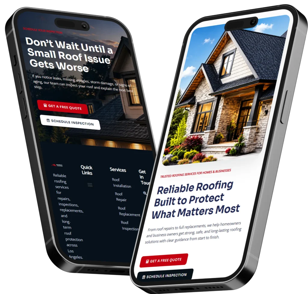
A lead generation landing page is a focused page built to collect inquiries, calls, or form submissions from people who are already interested in your offer. It works best when the page has one goal, one audience, one clear promise, and one next step.
If your current site gets traffic but not enough inquiries, this type of page usually performs better than sending visitors to a general homepage because it removes distractions and keeps the visitor moving toward a single action.
A lot of small businesses lose leads because their pages try to do too much at once. They send visitors to a full website navigation, several services, multiple offers, and vague messaging. That creates friction. A page designed only for lead capture solves that problem by narrowing the path. Instead of asking people to explore, it asks them to act.
This matters even more when you are running ads, local SEO campaigns, or referral traffic. Visitors coming from those channels already have intent. They do not need a homepage tour. They need a fast explanation of what you do, why it matters, and how to get started. That is why businesses that invest in conversion-focused web design often see stronger performance from dedicated pages than from broad website traffic alone.
Why a focused page converts better
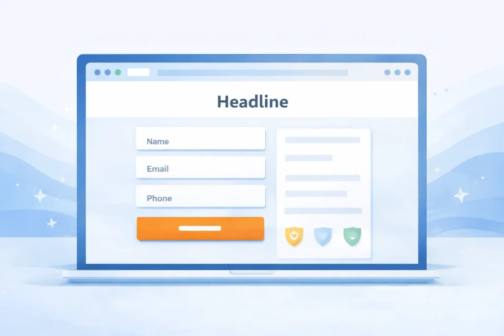
A landing page is not just a shorter version of your website. It is a decision page. Its job is to reduce hesitation and make the next step feel simple.
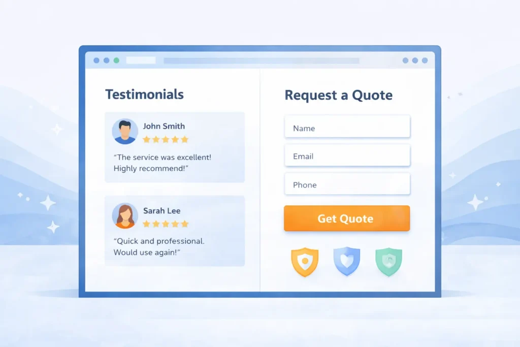
When a page converts well, it usually does five things in the right order. It names the problem, presents the offer, shows why the business is credible, reduces objections, and gives the visitor a clear action to take. That sequence matters because visitors are making a fast judgment. If they do not understand what you offer in a few seconds, they bounce.
For local service businesses, the biggest conversion lifts often come from message clarity rather than design alone. A stronger headline, a more specific offer, fewer form fields, and proof like testimonials or case samples can change page performance quickly. It is also why a page should match the traffic source. If someone clicked an ad about redesigning a service website, the first screen should talk about redesigning a service website, not introduce every service you offer.
| Page Element | What It Should Do | Common Mistake |
| Headline | State the core benefit fast | Sounds clever but not clear |
| Subheadline | Explain who it is for and what happens next | Too generic or broad |
| CTA button | Tell the user exactly what to do | Weak text like “Submit.” |
| Form | Collect only the needed details | Asking for too much |
| Social proof | Reduce risk and build trust | Hidden too far down |
A strong page also supports SEO better when it is tied to one search intent. That does not mean stuffing keywords. It means aligning the title, headings, copy, FAQs, and supporting links around one problem. If you want this page to help both rankings and conversions, keep the topic tight and the promise obvious.
What should be on the page
The best-performing pages are usually simple, but not thin. They give enough information to help someone say yes without forcing them to dig around.
Start with a headline that answers the visitor’s first question: what is this page about, and why should I care? Then support it with a short subheadline that clarifies the service, timeline, or result. Your first call to action should appear above the fold.
From there, build the page in a natural buyer sequence:
✅ problem or pain point
✅ solution and offer
✅ proof and examples
✅ process and expectations
✅ final call to action
This structure works because it mirrors how a real prospect thinks. First, they want relevance. Then they want confidence. Then they want a low-friction next step.
A short “who this is for” section can help qualify traffic. That way, visitors self-identify instead of forcing your sales process to do all the filtering. This is especially useful for local businesses, agencies, consultants, contractors, and niche service providers.
You can also strengthen the page by linking to deeper trust pages when needed. For example, if someone wants to see past work before reaching out, a natural link to your portfolio highlights gives them that option without taking over the main conversion path.
Which page type is best for your offer
Not every business needs the same kind of landing page. The best format depends on what the visitor needs before they are ready to convert.
If your service is simple and urgent, a short page often works well. If your offer is a higher ticket, more customized, or more competitive, you usually need a longer page with more proof. This is where strategy matters more than templates.
| Page Type | Best For | Why It Works |
| Short-form lead page | Emergency services, local bookings, simple offers | Faster decision, less friction |
| Long-form service page | Higher-ticket services, custom quotes, web projects | More room for proof and objection handling |
| Quiz or assessment page | Businesses that need qualification | Personalizes the next step |
| Multi-step form page | Services with stronger intent traffic | Makes longer forms feel easier |
For most service businesses, the best option is a long-form service landing page with a short form and one primary CTA. It gives you enough space to explain value, address objections, and pre-qualify leads without overwhelming the visitor.
That is especially true if your traffic comes from search. Search visitors often need more context than ad traffic. They compare options, look for credibility, and scan for proof before they fill out a form. If your business is trying to generate better inquiries instead of just more clicks, this format is usually the strongest choice.
How to write copy that drives inquiries
Good landing page copy is not about sounding impressive. It is about reducing uncertainty.
That starts with a headline that makes a specific promise. Instead of “We build beautiful websites,” a better line might focus on the outcome: more calls, more booked consultations, more qualified leads, or a cleaner conversion path. Specificity improves confidence.
After the headline, use short sections that answer the next questions visitors naturally have:
Why should I trust you?
What exactly do I get?
How long does it take?
Is this right for my business?
What do I do next?
This is also the right place to blend internal links naturally. If someone is deciding whether your offer fits their business, a related guide, like landing page for small business helps support that decision. And if they are dealing with visibility issues too, a supporting resource like why my website does not rank gives helpful context without disrupting the main page’s focus.
One useful writing rule is this: every section should either increase desire or decrease doubt. If it does neither, cut it.
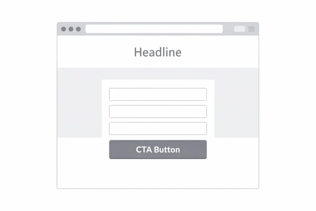
Design choices that improve conversions
Design matters, but mostly because it affects clarity and trust. A landing page should feel easy to scan, easy to understand, and easy to act on.
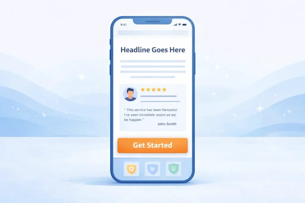
That means strong visual hierarchy, enough white space, readable mobile typography, and a CTA that stands out without looking aggressive. It also means using real proof. Testimonials with names, brief case examples, recognizable trust signals, and specific outcomes all outperform vague praise.
On mobile, spacing becomes even more important. Many small business pages lose conversions because the mobile version is cluttered, slow, or difficult to submit. That is one reason a cleaner build from a team offering website design & development services often improves results beyond simple cosmetic updates.
Your CTA should also match buyer intent. “Book a strategy call” works when the visitor is warm. “Get a free quote” works when pricing is expected. “Request a free audit” works when the visitor needs a diagnosis before commitment. The page should not force one CTA style on every offer.
SEO and AEO elements that help this page rank
To improve Rank Math performance and increase visibility in both search and AI-generated answers, this page should be built for clarity, not just density.
Use one primary topic, a clean URL, one H1, descriptive H2s, internal links to closely related pages, and FAQs written in direct language. This gives search engines and AI systems a stronger structure to interpret.
It also helps to include concise answer-style sentences near the top of the page and in the FAQ section. That improves extractability. AI systems and search snippets often favor short, direct responses that clearly define a topic before expanding on it.
A few practical optimization moves can make a real difference:
✅ Keep the opening answer concise
✅ Make CTA text specific
✅ Use one main offer per page
✅ Add proof close to the form
✅ Support the topic with related internal links
✅ Include FAQ content that answers high-intent questions
Another overlooked factor is lead handling. A page can look polished and still underperform if nobody responds quickly when forms come in. Research commonly cited in lead response studies has shown that speed matters sharply, and Harvard Business Review has also emphasized that companies often respond far too slowly to online leads.
Legal and trust considerations
Lead generation is not illegal, but deceptive collection practices, misleading claims, and non-compliant outreach absolutely create risk. The FTC states that lead generation businesses must make truthful, substantiated claims and avoid misleading people about who they are, how information will be used, or what a consumer will receive. The FTC also notes that laws such as the FTC Act and Telemarketing Sales Rule can apply to lead generation activities.
This matters even more if your page collects phone numbers for call or text follow-up. The FCC closed the so-called lead generator loophole and clarified that telemarketing robocalls and robotexts require prior express written consent on a one-to-one, seller-by-seller basis. The FCC’s one-to-one consent rule took effect on January 27, 2025.
That is why trust language on your form matters. If you ask for phone numbers, be clear about what happens next. Add simple consent language where appropriate, avoid vague pre-checked wording, and make your privacy expectations obvious. For readers who want the official source, the FCC one-to-one consent rule is worth reviewing.
Practical tips to improve lead quality, not just quantity
A page that gets lots of low-quality form fills is not a win. Better lead quality usually comes from smarter framing.
Ask for just enough information to qualify without exhausting the visitor. Name who your service is for. Mention starting price ranges if budget mismatch is common. Clarify your timeline. Show real outcomes. These small filters help attract people who are ready for the right next step.
You can also increase quality by matching the offer to the funnel stage. Cold traffic may respond better to a free audit or downloadable checklist. Warmer traffic may be ready for a consultation or quote request. Higher-intent search visitors often convert better when they see proof near the form, such as testimonials, logos, mini case results, or a short project gallery.
| Optimization Move | Why It Helps | Best Use Case |
| Shorter form | Reduces friction | Cold and mobile traffic |
| Pricing guidance | Filters poor-fit leads | Service businesses |
| Testimonials near CTA | Increases confidence at the decision point | All high-intent pages |
| Faster follow-up system | Improves contact rates | Inbound lead campaigns |
| One clear offer | Prevents confusion | SEO and paid traffic |
Key takeaway
A page built for lead capture should not try to be everything at once. It should speak to one audience, promote one offer, and guide one action clearly. When the message, design, trust signals, and follow-up process all work together, conversion rates usually improve.
If your goal is to rank better, convert better, and qualify better, a well-structured lead generation landing page is one of the most practical assets you can build for your business.
Frequently Asked Questions
What is a lead generation landing page?
A lead generation landing page is a focused web page designed to turn visitors into inquiries or prospects. Unlike a regular homepage, it removes extra distractions and centers the visitor on one action, such as booking a call, requesting a quote, or filling out a form. Its purpose is not to explain everything about a business. Its purpose is to guide one specific type of visitor toward one specific next step.
Is lead generation illegal?
Lead generation itself is legal, but the way you collect and use consumer information must follow advertising, privacy, and outreach rules. Problems start when businesses use deceptive claims, unclear disclosures, or non-compliant calls and texts. The FTC says lead generators must be truthful and avoid misleading people, and the FCC has tightened consent rules for telemarketing robocalls and robotexts. That means honest messaging, proper disclosures, and compliant consent practices are essential.
What is the 5-minute rule for leads?
The 5-minute rule for leads means you should respond to a new inquiry within five minutes whenever possible. The idea is simple: intent is highest right after someone submits a form, requests a quote, or asks for help. Older lead response research has shown a major drop in contact and qualification odds when businesses wait longer, and HBR has also highlighted how slowly many firms respond to online leads. In practice, this means instant notifications, fast routing, and a follow-up system that does not rely on memory alone.
Is Leadpages worth the money?
Leadpages can be worth the money if your priority is launching pages quickly without a custom build. It is usually a strong fit for businesses that need templates, fast deployment, and easy testing. It may be less appealing if you need deeper customization, stronger brand control, or a page that is tightly integrated into a full website strategy. Leadpages currently lists paid plans starting at $37 per month, with higher tiers that add more capacity and features, so the value depends on whether speed or flexibility matters more for your business. For more details, see the official Leadpages pricing.