A call to action website works best when every button, section, and message leads visitors toward one clear next step. The strongest CTAs feel specific, timely, and easy to trust, so users know exactly what happens after the click.
If your website gets traffic but not enough inquiries, purchases, or booked calls, the issue is often not traffic alone. In many cases, the real problem is that the page does not guide people well enough. A visitor lands on the site, scrolls a bit, feels mildly interested, then leaves because the next step is either too vague, too early, or too easy to ignore.
That is why CTAs matter so much. They are not just buttons added at the bottom of a page. They are part of the entire conversion path. A good CTA strategy shapes what users see first, how benefits are explained, where trust signals appear, and when the offer is introduced.
If you want a site that turns attention into action, it helps to look at CTA performance through three lenses: why people click, how strong CTA placement works, and which CTA types fit different pages best. That structure makes the advice easier to apply, whether you run a service business, a local company, or an e-commerce brand.
Why Website CTAs Matter More Than Most Businesses Realize
Many websites lose leads because they rely on generic wording like “Learn More,” “Submit,” or “Get Started” without enough context. Those buttons are not always wrong, but they often underperform when the surrounding copy does not explain the value of clicking.
A CTA works when it reduces hesitation. That means it should answer the quiet questions people have while browsing:
- What do I get next?
- Is this for me?
- How much effort will this take?
- Can I trust this business?
- What happens after I click?
When those questions stay unanswered, visitors delay action. When the page answers them clearly, conversion friction drops.
This is also why great CTA performance is tied to page structure, not just button color. Google’s people-first content guidance emphasizes helpful, useful content built for real users, while Google’s SEO documentation also highlights the importance of descriptive text and crawlable internal links. On the UX side, Nielsen Norman Group has noted that specific link labels and clearer action wording help users understand what they are clicking, and that generic “Get Started” language can create confusion when it lacks context.
That means the best-performing CTA strategy usually combines three things:
| CTA Element | What It Does | Why It Improves Conversions |
| Clear action wording | Tells users exactly what to do next | Removes uncertainty and hesitation |
| Strong nearby benefit copy | Explains the value of clicking | Gives the action a reason to matter |
| Placement near trust signals | Reinforces safety and credibility | Helps visitors feel ready to commit |
A website that converts rarely depends on one clever phrase. It usually wins because the page builds momentum naturally. The CTA simply becomes the obvious next move.
For brands that want stronger performance from the start, studying growth-driven web design can help frame CTA decisions around user behavior instead of guesswork.
How a High-Converting CTA Actually Works
A CTA becomes effective when it appears at the right moment with the right promise. That may sound simple, but it changes how you should write and place CTAs throughout a website.
Start with intent, not the button
Before writing button text, define the page goal. A homepage CTA should not sound the same as a pricing-page CTA. Someone reading a blog post is in a different mindset from someone comparing services. The more closely the CTA matches that intent, the stronger the response.
For example, a homepage visitor may respond well to:
- Book a Free Consultation
- See How We Build Lead-Generating Sites
- Get a Custom Quote
A blog reader may be more likely to click:
- Read the Full Guide
- See Real Conversion Examples
- Learn How to Improve Your Landing Page
The wording changes because the awareness level changes. One user is ready to talk. Another is still researching.
Support the CTA with the right copy
Strong CTA copy usually includes one of these angles:
- A result
- A speed benefit
- A low-risk promise
- A practical next step
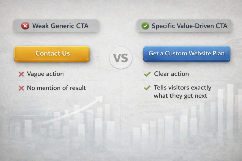
Compare these:
Weak CTA: Contact Us
Stronger CTA: Get a Custom Website Plan
Weak CTA: Submit
Stronger CTA: Request Your Free Audit
Weak CTA: Learn More
Stronger CTA: See What Makes a Website Convert
The second version in each example works better because it tells users what they gain, not just what they do.
Use primary and secondary CTAs together
Not every visitor is ready for the same commitment. That is why pairing a primary CTA with a secondary CTA works so well.
A common structure looks like this:
| Visitor Readiness | Best CTA Type | Example |
| Ready to buy or inquire | Primary CTA | Book a Call |
| Interested but cautious | Secondary CTA | View Services |
| Still researching | Low-commitment CTA | Read Case Studies |
This keeps the page useful for more than one visitor type. Instead of forcing everyone into one action, you give them the next best step.
That is also why many service businesses perform better when they combine direct response CTAs with education-based internal links. For example, someone not ready to contact you yet may respond better to a related article, like a website that converts visitors or how to get leads from your website.
Which CTAs Work Best on Different Website Pages
Not every page should ask for the same action. One of the biggest conversion mistakes is repeating the same CTA on every page without adjusting it to user intent.
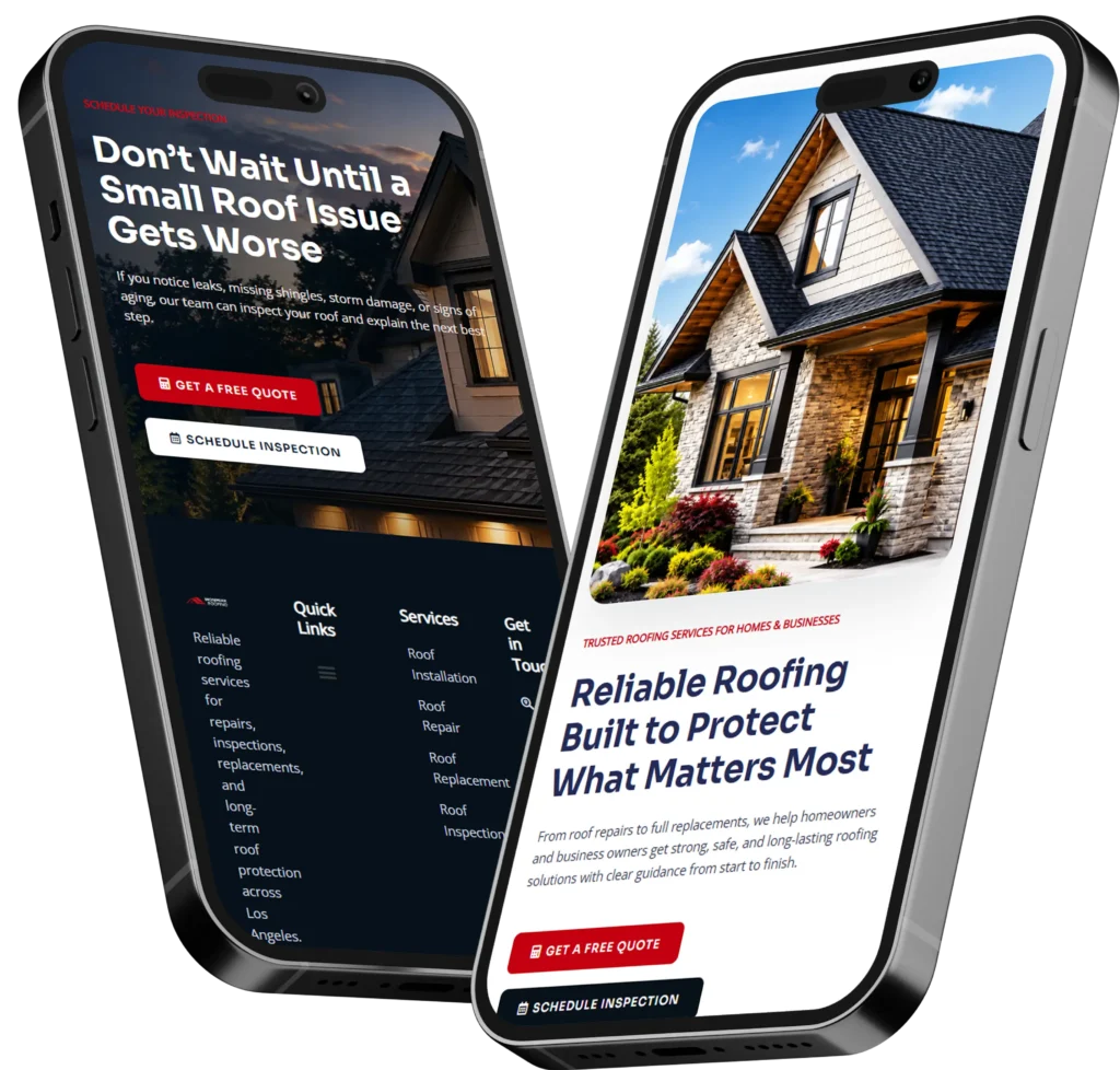
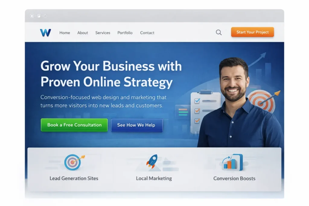
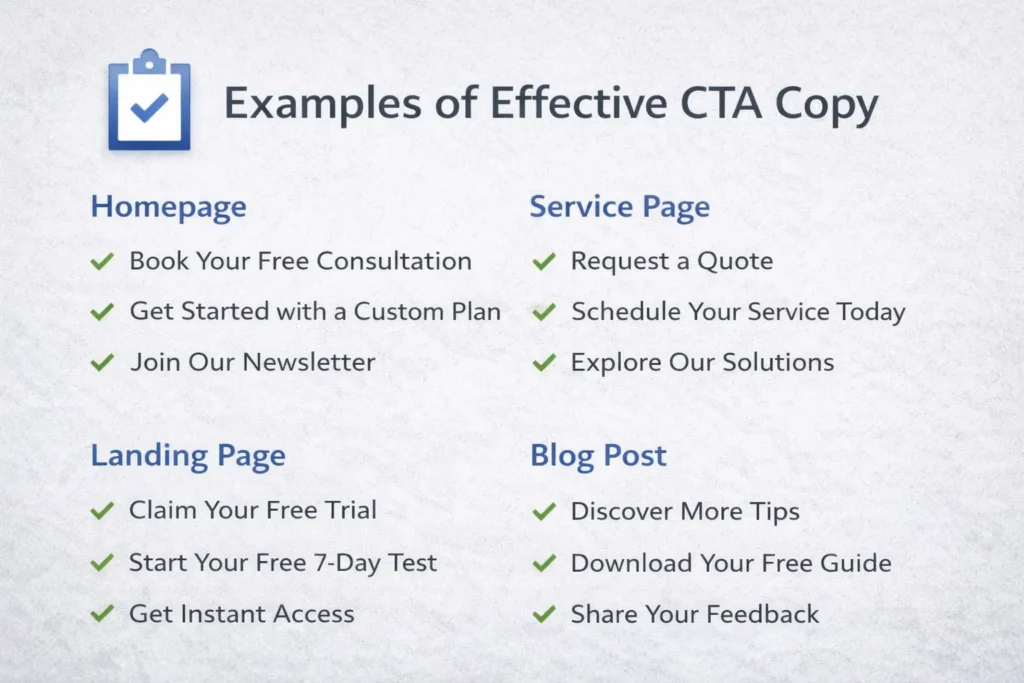
Home page CTAs
Your homepage usually needs one strong primary CTA and one softer secondary CTA. The main goal is clarity. Visitors should know what you do, who you help, and what they should click next within a few seconds.
A strong homepage setup often looks like this:
A headline that states the outcome, a short supporting paragraph, a primary CTA tied to action, and a secondary CTA for those who need more context.
Good homepage CTA examples include:
- Book Your Free Discovery Call
- Start Your Website Project
- See Our Process
The homepage is rarely the place for too many competing offers. If everything is important, nothing feels important.
Service page CTAs
Service pages need CTAs that connect the offer to a likely business result. This is where clearer intent-based phrasing usually beats generic language.
Instead of ending a service page with “Contact Us,” a better option may be:
- Request a Website Redesign Quote
- Talk to Us About Your Next Build
- Get Expert Help with Your Site
These work because the user already understands the topic of the page. The CTA should continue that momentum instead of resetting it.
This is where linking naturally to your own offer pages also helps users move deeper into the site. A service-focused internal link, such as website design & development services makes sense when readers want to explore the offer before taking action.
Landing page CTAs
Landing pages should reduce distractions and keep the CTA tightly aligned with the campaign promise. If the ad says “Get More Leads,” the page and button should reinforce that exact value path.
Good landing page CTA traits include:
- One main action
- Minimal navigation distractions
- Strong proof nearby
- Benefit-led copy above the fold
- Repeated CTA placement throughout the page
This is one reason lead generation pages often convert well when the CTA is repeated after major trust-building sections instead of appearing only once at the top or bottom.
Blog post CTAs
Blog CTAs should feel like the natural next step after the information, not a hard interruption. A reader who has just learned something useful is more likely to click an offer that continues that journey.
That can mean:
A related service link, a guide, a sample gallery, or a free audit offer.
HubSpot’s examples around CTA strategy regularly show how different CTA types can support different stages of the buyer journey, from educational clicks to conversion-focused offers.
Common CTA Mistakes That Quietly Hurt Conversion Rates
A lot of websites do not fail because they lack CTAs. They fail because the CTAs are poorly matched to user behavior.
1. Asking too early
If your page asks for a consultation before explaining the value of the service, people often leave. Visitors need enough clarity and trust before they feel ready.
2. Using vague words
“Click Here” and “Submit” rarely create excitement. They are functional, but they are not persuasive. Specific language performs better because it makes the next step feel concrete.
3. Giving too many choices
If a page offers five equally prominent actions, the user has to stop and evaluate instead of moving naturally. That pause often reduces clicks.
4. Placing the CTA too far from the benefit
A CTA should usually appear after a strong benefit statement, proof point, or objection-handling section. When the action is disconnected from value, it feels premature.
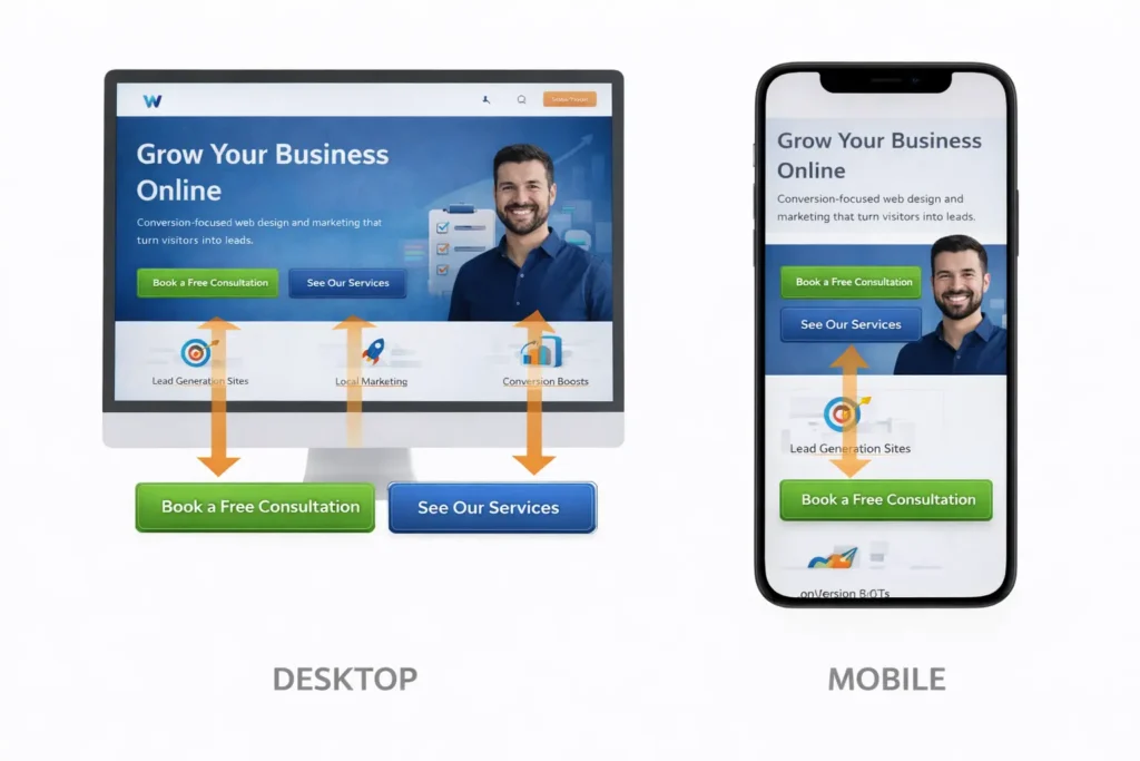
5. Ignoring mobile behavior
A CTA that looks fine on desktop may be buried or awkward on mobile. Shorter buttons, better spacing, and cleaner layout matter a lot for mobile conversions.
6. Treating design as the only fix
Button color matters far less than message clarity, page structure, and trust. A bright button with weak copy still struggles.
How to Improve CTA Performance Without Redesigning Your Whole Site
The good news is that you do not always need a full rebuild to improve conversions. Small, strategic changes often make a noticeable difference.
Start with your top pages. Look at the pages that already get traffic but do not generate enough leads. Then review these areas:
| What to Review | What to Ask | Simple Improvement |
| Hero section | Is the next step obvious in 5 seconds? | Clarify the headline and primary CTA |
| Button text | Does it explain the value of clicking? | Replace vague labels with benefit-led copy |
| Section flow | Does the CTA appear after trust-building content? | Move or repeat CTA after proof sections |
| Mobile layout | Is the CTA easy to see and tap? | Shorten spacing and improve button visibility |
| Internal links | Do readers have a lower-commitment next step? | Add related blog or service links naturally |
One practical method is to rewrite each CTA using this formula:
Action + outcome + clarity
Examples:
- Book a Call to Plan Your Website
- Get a Custom Quote for Your Redesign
- View Services for Small Business Growth
This structure feels more useful because it explains both the action and the expected result.
Another strong tactic is adding microcopy below the CTA. A short line such as “No pressure, just a quick strategy chat” or “Response within one business day” can reduce hesitation and make the click feel safer.
If you are trying to improve a lead-generation page in particular, reviewing a page model like a lead generation landing page strategies article can help you see how offer clarity, trust, and CTA placement work together.
Practical CTA Examples You Can Adapt Right Away
Businesses often overcomplicate CTA writing. In reality, the best options are usually simple, specific, and connected to the user’s goal.
For service businesses:
Book a Free Consultation
Get a Website Quote
See Our Service Plans
Start Your Project
For redesign offers:
Request a Site Review
See What Your Website Needs
Get a Redesign Recommendation
Fix What Is Blocking Conversions
For informational pages:
Read the Full Guide
See More Examples
Compare Your Options
Learn What Works Best
For e-commerce:
Shop the Collection
See Best Sellers
Add to Cart
Claim Today’s Offer
Nielsen Norman Group’s usability guidance around clear labels supports this same principle: specific link text helps users understand what they will get before they click.
You can also strengthen this article naturally with external references such as Google’s people-first content guidance and Nielsen Norman Group’s advice on better link labels, both of which align with clearer user-focused CTA writing.
Final Take on a Call to Action Website
A strong call to action website does not rely on louder buttons. It converts because the message is clear, the value is easy to understand, and each page gives visitors a logical next step. When your CTAs match intent, reduce friction, and sit in the right places, more of your traffic turns into real business results.
Frequently Asked Questions
What is an example of a call to action on a website?
A strong website call to action example is “Book a Free Consultation” because it tells the visitor exactly what to do and what they get next. It works better than vague labels like “Submit” or “Click Here” because it reduces uncertainty. The best examples are specific, action-based, and tied to a clear benefit. Other good options include “Get a Custom Quote,” “See Our Pricing,” or “Start Your Project.” The right one depends on the page goal and how ready the visitor is to take action.
What is a call to action for a website?
A call to action for a website is a prompt that guides visitors toward the next step you want them to take. That could be booking a call, requesting a quote, buying a product, reading another page, or joining an email list. It is usually shown as a button, text link, banner, or form prompt. A good website CTA is not just visual. It also fits the page, supports the visitor’s intent, and makes the next action feel easy, useful, and low risk.
What are examples of call to action?
Examples of call to action include “Buy Now,” “Get a Free Estimate,” “Book a Demo,” “Download the Guide,” and “View Our Services.” Each one works in a slightly different way depending on where the user is in the decision process. Some CTAs are direct and sales-focused, while others are softer and more educational. The best example is the one that matches the page intent, explains the value clearly, and feels like a natural next step instead of a forced push.
What is a CTA in social media?
A CTA in social media is the phrase or prompt that tells followers what to do after they see your post, ad, or video. It could be “Shop Now,” “Read More,” “Send Us a Message,” or “Tap the Link in Bio.” Social media CTAs need to be especially clear because attention is shorter and users move quickly. The strongest ones connect directly to the content they just viewed and give them one simple action to take without confusion or extra effort.