The best landing page layout is one that matches search intent fast, removes distractions, and moves visitors toward one clear action. When the page structure is easy to scan, and every section supports the same goal, conversions usually improve along with content quality signals for search.
A landing page is not just a shorter homepage. It is a focused decision page. Someone clicks an ad, a search result, an email, or a social post because they expect one specific answer. If the headline is vague, the offer is buried, or the layout makes people work too hard to understand what comes next, they leave. That is why layout matters so much. It shapes attention, trust, and momentum in the first few seconds.
If you are building or improving a page for lead generation, service inquiries, or product signups, start with a structure that keeps visitors moving in a straight line from interest to action. A good page should answer three questions quickly: what is this, why should I trust it, and what should I do next?
What Makes a Landing Page Layout Effective
A high-converting landing page layout works because it respects how people scan online. Users usually look for visual clarity, a strong value proposition, and cues that reduce uncertainty before they commit. Clear purpose and strong calls to action are central to effective page design, while descriptive links and content that helps people first also support usability and search performance.
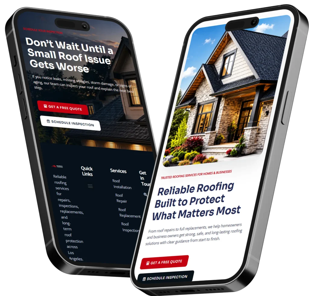
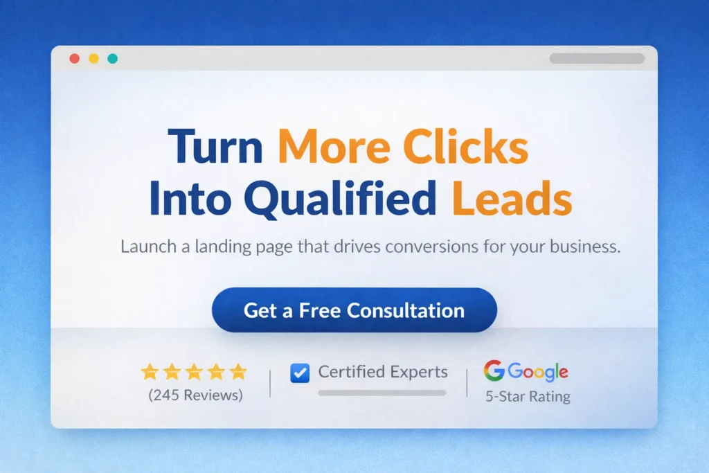
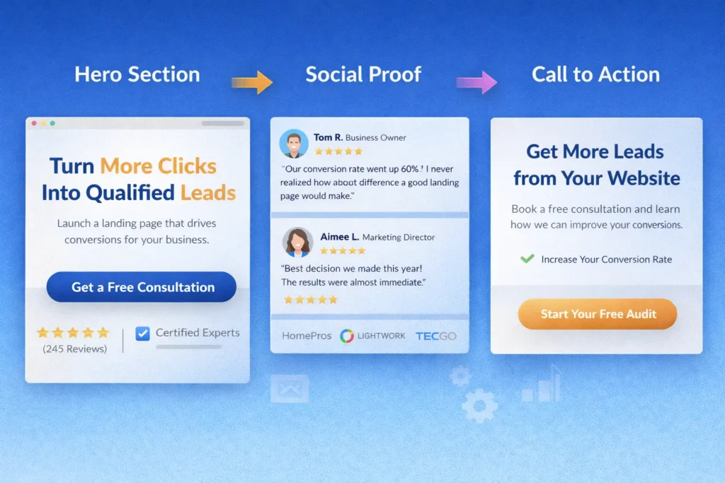
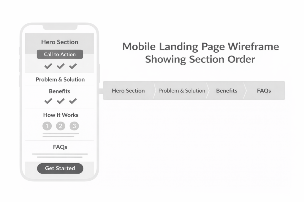
That means your page should not begin with a wall of text. It should begin with a focused promise. The hero section needs a headline that states the benefit, a short supporting line that explains the offer, and a CTA that feels like the logical next step. If you offer web design, for example, the visitor should instantly know whether you build brochure sites, redesign conversion pages, or create lead generation systems for local businesses.
This is also where many businesses lose traction. They build a visually nice page, but the layout is organized around the company rather than the visitor. A strong landing page does the opposite. It organizes content around what the visitor needs to believe before saying yes.
Here is a simple way to think about it:
| Section | What the visitor needs | What your content should do |
| Hero | Clarity | Explain the offer and primary benefit |
| Social proof | Confidence | Show reviews, logos, results, or case studies |
| Problem and solution | Relevance | Prove you understand the pain point |
| Features or process | Understanding | Show how it works without overwhelming |
| CTA block | Direction | Make the next step easy and obvious |
When this sequence is tight, the page feels natural. Visitors do not need to guess where to look next.
For businesses that want a cleaner strategy behind the design itself, conversion-focused web design gives a good benchmark for how a service site can guide users from interest to inquiry.
Why the Right Structure Helps SEO and Conversions
SEO and conversions are often treated like separate goals, but on landing pages they work best together. Search engines want content that is helpful, easy to understand, and aligned with user needs. Visitors want the same thing. Google’s guidance continues to emphasize people-first content and strong page experience rather than content built only to chase rankings.
That means a better layout can support both ranking potential and conversion performance in practical ways:
✅ It improves scannability, which helps users find answers faster
✅ It keeps the content aligned with one topic and one intent
✅ It reduces friction before the CTA
✅ It supports stronger engagement with proof, FAQs, and clear messaging
✅ It gives search engines a more coherent page to understand
The mistake many pages make is trying to do too much at once. A landing page should not act like a full sitemap, a brand story, a blog archive, and a pricing catalog all on one screen. It should support one user journey.
For example, if someone searches for help improving conversions, they likely want practical direction, proof that you can solve the problem, and a simple path to contact you. In that case, linking out to everything in your menu is not helpful. Guiding them toward one action is.
If you want to see how messaging affects performance after the click, this related read on how to build a website that converts visitors fits naturally with the layout decisions covered here.
Which Sections Should Be Included on a High-Converting Landing Page
The best-performing layouts are not always the longest. They are the most complete for the decision being made. A visitor should see enough to trust you, but not so much that the page feels bloated.
1. Hero Section
This is where attention is either captured or lost. Your hero should include:
- a benefit-led headline
- a short supporting sentence
- one primary CTA
- a visual that reinforces the offer
A weak hero says what you do. A strong hero says what the visitor gets.
Instead of “We design websites,” a stronger version is “Turn more clicks into qualified leads with a landing page built to convert.”
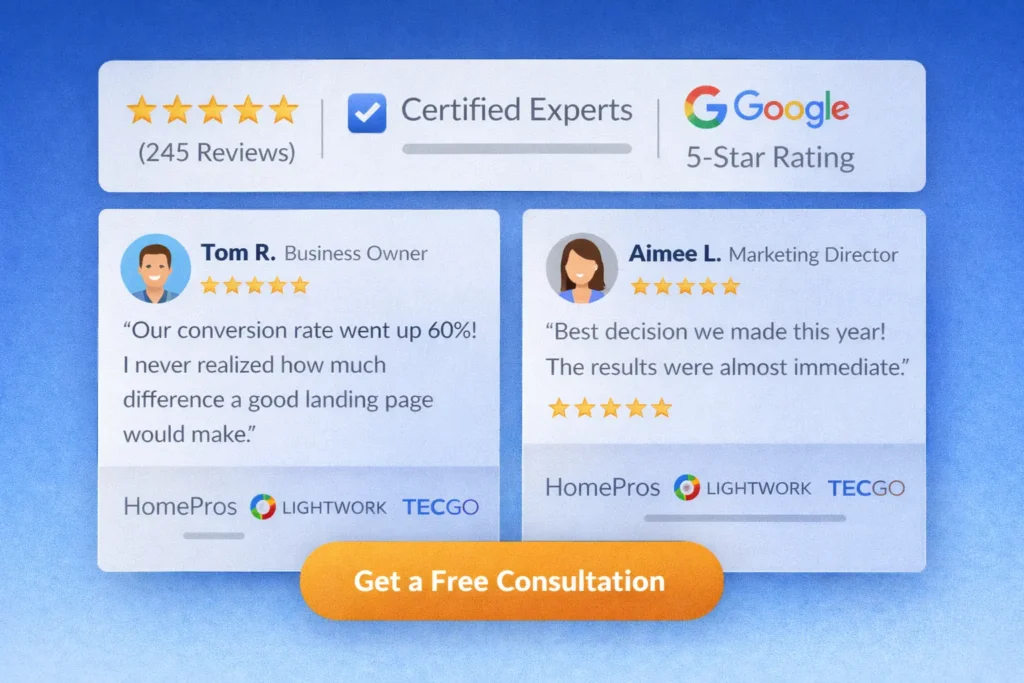
2. Trust Layer
Right below the hero, give people a reason to believe you. This might include testimonials, client logos, star ratings, certifications, or a quick result snapshot. Trust signals matter because visitors are still asking themselves whether your claims are real.
3. Problem and Solution Section
This section should name the pain point clearly. Speak to the cost of a weak page: wasted traffic, poor form fills, confusing navigation, weak calls to action, or low-quality leads. Then show how your solution resolves those issues.
4. Benefits Before Features
Features matter, but benefits close the gap between interest and action. Explain what changes for the visitor. Faster decisions. Better lead quality. Cleaner mobile experience. Fewer distractions. Higher conversion potential.
5. Process or How It Works
This helps remove uncertainty. A visitor may like your offer but still hesitate because they do not know what happens next. A short three-step process works well here. Keep it practical and easy to scan.
6. FAQ Section
FAQs are useful because they answer objections in a natural way. They can also strengthen relevance by covering intent-based follow-up questions. Google’s people-first guidance supports creating content that genuinely helps users complete their tasks, and a good FAQ does exactly that.
7. Final CTA
Your closing CTA should feel like a logical summary, not a sudden sales push. Remind the reader what they gain, reduce hesitation, and make the next step easy.
How to Choose the Right Layout for Your Business
The right landing page structure depends on what you sell, how aware your audience is, and how much trust they need before acting.
A local service business usually benefits from a straightforward layout with a strong hero, trust badges, service benefits, sample work, FAQs, and a contact CTA. A more expensive or complex offer may need deeper proof, more educational content, and stronger objection handling.
Here is a useful breakdown:
| Business type | Layout priority | Best focus |
| Local service business | Fast clarity and trust | Hero, reviews, process, form CTA |
| High-ticket service | Education and proof | Problem, case studies, FAQs, consultation CTA |
| E-commerce campaign page | Product confidence | Benefits, visuals, reviews, shipping info, buy CTA |
| Lead magnet page | Simplicity | Headline, benefits, preview, short form |
For web design and lead generation businesses, the biggest wins often come from simplifying the page rather than adding more blocks. Too many layout sections can make a visitor feel like they are being asked to do extra work. In most cases, fewer stronger sections convert better than many average ones.
That is also why your anchor text matters. Descriptive links help users understand where they are going, which improves usability and supports accessibility best practices.
If you are planning a redesign, website design & development services can work as a natural internal path for readers who are already comparing options.
A Practical Example of a Better Landing Page Flow
Imagine a business offering website redesign for small local companies.
A weak version of the page might open with a generic headline, add a stock photo, then jump into broad company history. The CTA is vague, and the testimonials are hidden far below the fold. The result is friction.
A stronger version would look like this:
Hero: clear promise about getting more leads
Trust strip: review stars, client count, or short credibility points
Problem section: why existing sites fail to convert
Solution section: how the redesign fixes clarity, speed, and CTA flow
Proof section: before and after outcomes or portfolio examples
Process section: audit, redesign, launch
FAQ section: pricing, timeline, what is included
Final CTA: book an audit or request a quote
That sequence keeps the visitor in decision mode. Every section answers the next obvious question.
If you want visual proof to support that sequence, directing readers to portfolio highlights is a smart way to reinforce trust without cluttering the main message.
Common Layout Mistakes That Hurt Performance
Some pages fail not because the offer is weak, but because the structure gets in the way.
One common mistake is leading with design flair instead of clarity. A headline that sounds clever but says nothing useful may look polished, but it forces the user to decode your message. Another mistake is using multiple CTAs with different goals. If the page asks people to call, book, read three blogs, browse a gallery, and compare plans all at once, action gets delayed.
Another issue is poor content sequencing. Trust placed too late, benefits hidden below technical features, or an FAQ stuffed with filler can make the page feel heavier than it should.
A few practical tips help here:
✅ Keep one primary CTA visible throughout the page
✅ Use section order based on objections, not company preference
✅ Put proof earlier if your market is skeptical
✅ Make buttons specific, not generic
✅ Write links and labels so people know what comes next
For more ideas on CTA clarity, how to get leads from your website pairs well with landing page structure, because lead generation depends on both message and next-step design.
External Resources That Add Helpful Context
If you want to strengthen this topic with trusted references, two good supporting resources are Google’s people-first content guidance and Nielsen Norman Group’s article on descriptive links and better link labels. Google’s guidance reinforces that helpful, user-centered content supports search visibility, while NN/g explains why generic links weaken user confidence and information scent.
These external references fit naturally in a Rank Math-friendly article because they extend the topic without competing with your main message. They add context, credibility, and relevance.
A Smarter Way to Build Your Page Going Forward
If your current page gets traffic but does not convert well, start by reviewing the structure before rewriting everything. Often, the fastest gains come from improving order, simplifying the message, and tightening the CTA.
Ask these questions:
- Does the first screen explain the offer in under five seconds?
- Is the CTA obvious and specific?
- Does the page prove trust early enough?
- Are the sections arranged in the order a buyer thinks?
- Is there any content that belongs on another page instead?
This is where strategy beats decoration. A page that looks modern but feels unclear will underperform. A page with a simple design and strong structure often wins because it reduces decision friction.
Final Take on Choosing the Right Structure
The right page structure is not about adding more blocks. It is about putting the right message, proof, and CTA in the right order for the visitor you want to convert. When your content is people-first, easy to scan, and focused on one outcome, both SEO and conversion performance have a stronger foundation.
If you are refining your best landing page layout, start with clarity, support it with proof, and remove anything that distracts from the next step. That is usually where better rankings, better leads, and better conversion rates begin.
Frequently Asked Questions
What layout tends to convert better on a landing page?
The strongest landing page layout is usually the one that removes confusion fastest. In most cases, that means a clear hero section, one primary CTA, trust signals near the top, a concise explanation of the offer, and a closing CTA after proof and FAQs. Pages convert better when visitors do not have to search for the value or wonder what to do next. The layout should feel like a guided path, not a puzzle.
What sections should a conversion-focused landing page include?
The most useful landing page sections are the ones that answer visitor doubts in order. A typical structure includes the hero, social proof, a problem-solution section, benefits, process, FAQs, and a final CTA. Some businesses also benefit from adding sample work or a mini case study. The key is not adding every possible block. It is choosing the sections that help your audience trust you and act with less hesitation.
Why does landing page structure affect SEO and conversions?
A strong layout improves both discoverability and decision-making. Search engines want content that is helpful, relevant, and easy to understand, while users want clarity and momentum. When your sections are logically organized, your page is easier to scan, easier to interpret, and more likely to satisfy intent. That can improve engagement signals, keep users on the page longer, and create a smoother path to conversion at the same time.
How should I pick the right layout for my own business?
The right layout depends on your offer, audience, and level of buyer awareness. A simple local service page may only need a headline, reviews, benefits, FAQs, and a form. A higher-ticket service often needs deeper proof, stronger objection handling, and a more detailed process section. Start by identifying what a visitor must believe before taking action, then build the page in that order. That approach usually leads to a cleaner structure and better performance.