High converting website design is a website approach built to guide visitors toward one clear action, such as booking a call, requesting a quote, or making a purchase. It works best when your pages are clear, fast, trustworthy, mobile-friendly, and focused on user intent rather than just looking impressive.
A beautiful site can still underperform if it confuses people, hides the next step, or asks for too much too soon. The strongest-performing websites reduce friction, match what visitors expect to see, and make the decision process feel easy.
If your goal is more leads, more booked calls, or more sales from the same traffic, design has to do more than impress. It has to support conversion.
Why Website Design Affects Conversions More Than Most Businesses Realize
Many business owners assume conversion problems come from weak traffic. Sometimes that is true. But often the bigger issue is what happens after someone lands on the site.
A visitor decides very quickly whether your website feels relevant, credible, and easy to use. If your headline is vague, your layout feels cluttered, or your CTA gets lost, people leave before they ever learn how good your offer is. Nielsen Norman Group notes that homepages should guide users clearly toward their goals while reflecting the brand and available offerings. That principle matters because confusion lowers action.
This is why smart companies invest in structure before styling. A site that answers the visitor’s first question, shows proof early, and offers a low-friction next step usually performs better than a visually flashy site with weak hierarchy.
That is also where website design & development services can make a measurable difference. When design choices are tied to user behavior, not trends alone, every section has a job.
What Makes a Website Convert Better
A converting website usually gets five things right.
First, it is clear. The visitor understands what you do, who it is for, and what to do next within seconds. There is no guesswork and no need to scroll around to piece the offer together.
Second, it is relevant. If someone clicks through from Google or an ad, the page matches the promise that brought them there. Message match is one of the fastest ways to reduce bounce and improve action.
Third, it builds trust early. Testimonials, recognizable clients, case studies, review signals, guarantees, and real photos all help lower perceived risk. Even simple trust elements can help visitors feel more comfortable moving forward.
Fourth, it removes friction. Fewer form fields, cleaner navigation, stronger hierarchy, and faster loading pages reduce the effort required to take the next step. Shopify notes that even small improvements to copy, layout, and page elements can lift conversion performance.
Fifth, it creates momentum. Each section should lead naturally to the next. Good design does not dump information onto the page. It helps users progress from curiosity to confidence.
The Core Pages That Influence Conversion Rate the Most
Not every page carries the same weight. Some pages have a much bigger impact on whether your website produces leads or not.
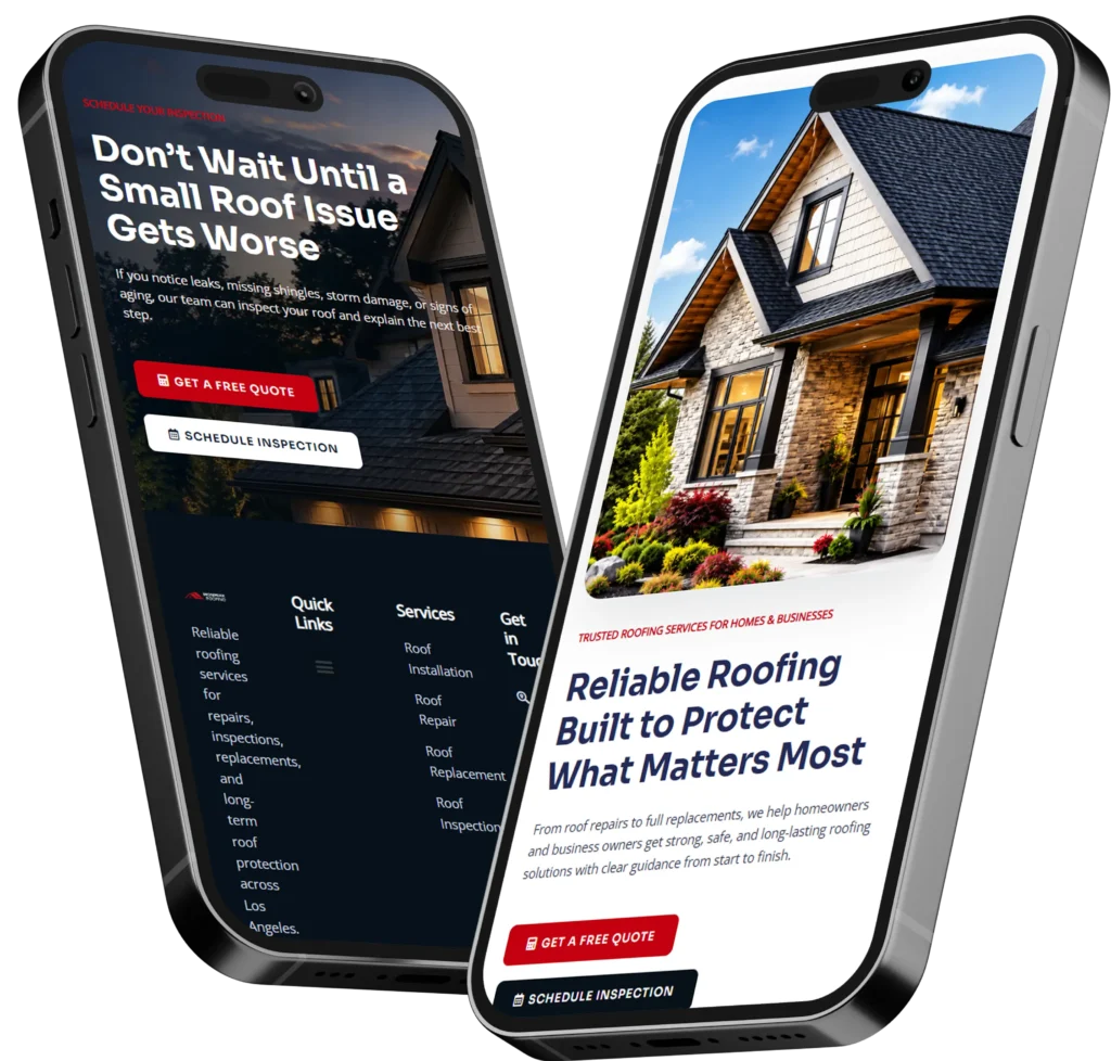
Homepage
Your homepage should confirm that visitors are in the right place. It is not meant to say everything. It is meant to direct attention and create confidence. A strong homepage usually includes a clear headline, a simple value proposition, one primary CTA, and quick proof that you are legitimate. Nielsen Norman Group highlights clarity and guidance as core homepage principles, which align directly with conversion-focused design.
Service Pages
Service pages often do the heavy lifting in lead generation. These pages should explain the problem, the offer, the process, what makes your approach different, and what action to take next. The best service pages are detailed enough to answer objections without overwhelming the visitor.
Contact or Inquiry Page
A lot of businesses lose conversions here. The form asks too much, the page lacks reassurance, or the next step is unclear. A simple explanation of what happens after submission can increase completion because it removes uncertainty.
Landing Pages
Landing pages often outperform general pages because they stay focused on one goal. Unbounce reports a median landing page conversion rate of 6.6% across industries based on a large benchmark dataset, showing how focused pages can create stronger performance than broad, unfocused experiences.
You can see how layout choices influence action in this guide to best landing page layout.
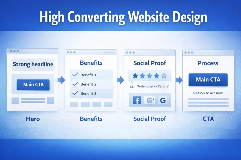
How to Structure a High-Converting Page
The easiest way to think about conversion-focused structure is this: answer the visitor’s questions in the order they naturally ask them.
| Page Section | What the visitor is thinking | What your page should do |
| Hero section | Am I in the right place? | State the offer clearly and show the main CTA |
| Benefits section | Why should I care? | Translate features into useful outcomes |
| Proof section | Can I trust this business? | Add testimonials, results, logos, or examples |
| Process section | What happens next? | Make the next steps feel simple and low risk |
| CTA section | Should I take action now? | Repeat the action with a clear reason to act |
This order matters because people rarely convert from design alone. They convert when the page helps them feel informed, safe, and ready.
One practical tip is to check whether every section earns its place. If a block looks attractive but does not answer a question, reduce hesitation, or support the CTA, it may be weakening the page instead of helping it.
Design Elements That Usually Lift Conversion Performance
Design details shape behavior. Here are the elements that most often improve results when handled well.
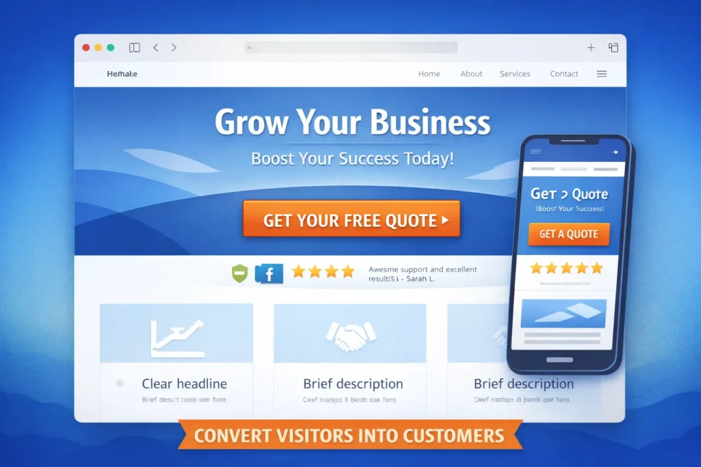
Clear headlines
A headline should explain the offer, not try too hard to sound clever. Clarity almost always beats wordplay in high-intent pages.
Strong calls to action
Your CTA should tell people exactly what happens next. “Book a discovery call,” “Get a quote,” or “See pricing” usually works better than a vague “Learn more.” HubSpot’s CTA guidance centers on using CTAs to direct visitors toward key pages and conversion actions.
If you want to tighten the button strategy and CTA placement, read call to action website.
Visual hierarchy
Important information should stand out first. This means better spacing, clearer headings, contrast, and consistent button styling. Users should never have to hunt for the next step.
Mobile responsiveness
A site that looks polished on desktop but feels frustrating on mobile will lose conversions fast. Since so much traffic now comes from mobile devices, friction on smaller screens can quietly damage results across the funnel.
Fast load speed
Visitors are less patient than most brands assume. Slow pages create a drop-off before the design even has the chance to do its job.
Trust signals
Case studies, testimonials, before-and-after examples, certifications, guarantees, and real contact details reduce uncertainty. They are especially important for service businesses where the sale depends on confidence.
If you want to show real examples instead of speaking in generalities, link visitors to your project gallery.
What a High-Converting Website Often Looks Like in Practice
A high-converting site usually does not feel overloaded. It feels focused.
The homepage opens with a direct promise. The navigation is simple. The service pages explain the offer in plain language. The forms are easy to complete. Trust elements show up before the visitor needs to dig for them. Buttons are visible without becoming aggressive. The mobile version feels just as intentional as the desktop version.
That does not mean every site looks minimal. It means every design choice supports a decision.
For a local service business, this may look like a strong hero, location-specific trust signals, a short services overview, a process section, testimonials, and a quote request CTA.
For an e-commerce site, it may mean better product hierarchy, stronger product imagery, clearer benefit-driven copy, reviews near the purchase area, and fewer checkout distractions.
For a lead generation site, it may mean fewer navigation options and more emphasis on the primary inquiry path.
This is where high converting website design becomes more than a visual style. It becomes a business system built around action.
Is a 2.5% Conversion Rate Good?
It can be, depending on your industry, traffic source, offer, and page type.
Shopify notes that average ecommerce conversion rates commonly fall around 2.5% to 3%, while its broader benchmarks also show variation by industry. That means 2.5% may be acceptable for some websites, especially if the traffic is cold or the offer is higher priced. But it is not a number you should judge in isolation.
For landing pages, the picture can look different. Unbounce reports a median conversion rate of 6.6% across industries for landing pages, with top-performing pages going much higher. So if a focused landing page is sitting at 2.5%, that may point to issues in the offer, message match, design, or CTA flow.
The better question is this: are you converting the right traffic at a profitable rate, and do you know where users are dropping off?
| Scenario | How to read a 2.5% conversion rate |
| Broad traffic to a general website | Often decent, but still worth improving |
| Highly targeted service landing page | May be underperforming |
| High-ticket or complex offer | Could be reasonable if the lead quality is strong |
| E-commerce with weak trust or mobile UX | Often a sign that friction is costing sales |
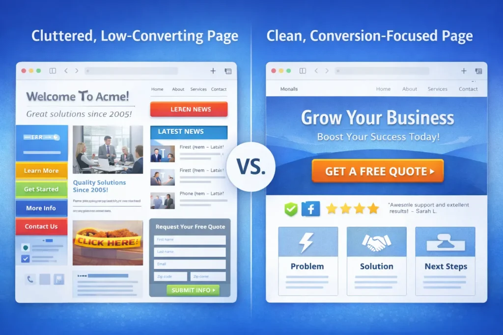
Common Reasons a Website Fails to Convert
Sometimes the problem is not traffic volume. It is friction.
A vague headline is one common issue. If the first screen does not explain what you do clearly, visitors leave.
Another issue is weak CTA placement. Businesses often include a button, but bury it after too much content or phrase it too softly.
Poor navigation also creates leaks. If users are unsure where to go next, many simply stop exploring.
Generic copy is another blocker. Saying you offer “quality solutions” or “excellent service” does not help visitors picture outcomes. Stronger websites speak to real problems, practical wins, and what the process feels like.
Then there is proof. A page without reviews, examples, or clear credibility cues asks the user to trust without evidence.
One of the simplest ways to diagnose this is to walk through your site like a new visitor and ask: What would make me hesitate here?
Which Website Type Usually Converts Best?
The website with the highest conversion rate is usually not the one with the most pages. It is the one with the clearest path.
Focused landing pages often convert best because they reduce distractions and align closely with one offer. They are built for one audience, one action, and one message. That focus can outperform broader websites that try to serve too many goals at once. Unbounce’s benchmark data supports the idea that concentrated landing page experiences can produce strong conversion outcomes.
That said, the best website type depends on what you are selling.
A service business may convert best with a homepage plus tightly written service pages.
An e-commerce brand may convert best by optimizing collection pages, product pages, and checkout.
A consultant or coach may get better results from a streamlined personal brand site with one booking CTA repeated strategically.
So the best option is not universal. The best option is the structure that matches buyer intent with the least friction.
For more lead-gen strategy beyond design, this related guide on how to get leads from your website fits naturally with this topic.
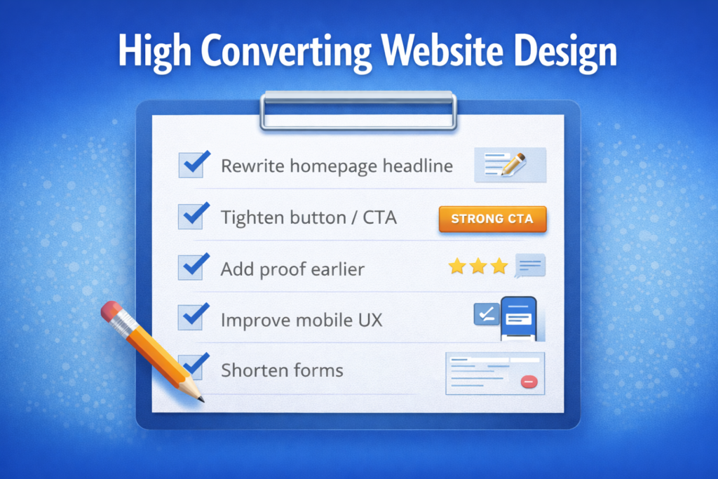
Practical Improvements You Can Make This Month
You do not need a full rebuild to improve performance. Some of the highest-impact changes are surprisingly manageable.
Start by rewriting your homepage headline so it says what you do and who it is for.
Next, shorten your forms. Remove anything you do not truly need for first contact.
Then review your CTAs. Make sure each major page has one clear primary action.
Add proof closer to decision points. Testimonials should not live only on a separate page.
Review mobile spacing, button size, and tap targets.
Finally, study one benchmark source and one usability source as part of your CRO process. The Unbounce Conversion Benchmark Report can help you compare performance ranges, while Nielsen Norman Group’s homepage design principles are useful for simplifying the user journey.
Final Take on High Converting Website Design
High converting website design is not about adding more effects, more pages, or more trendy visuals. It is about creating a smoother decision path so the right visitor can understand the offer, trust the business, and take the next step without friction. When clarity, proof, structure, and CTA strategy work together, conversion becomes easier and more predictable.
If your website gets traffic but not enough inquiries, the smartest move is often not more traffic first. It is improving the experience that your current visitors already see.
Frequently Asked Questions
What makes a high-converting website?
A high-converting website is clear, trustworthy, and easy to act on. It tells visitors exactly what the business offers, gives them a reason to believe it, and makes the next step feel simple. That usually means a strong headline, visible CTA, mobile-friendly layout, fast loading pages, and proof placed near decision points. When users do not have to guess what to do, conversions usually improve.
Is a 2.5% conversion rate good?
A 2.5% conversion rate can be good, but only in the right context. For e-commerce and some broader website traffic sources, that number can fall within a normal range. For focused landing pages, it may leave room for improvement because benchmark data shows median landing page rates can be higher. The best way to judge it is against your traffic quality, margins, sales cycle, and page type rather than treating one number as universal.
Which website has the highest conversion rate?
The highest-converting website is usually the one with the clearest offer and least friction, not necessarily the fanciest design. In many cases, focused landing pages perform best because they remove distractions and push one action. Still, the ideal structure depends on the business model. A service company, an e-commerce store, and a local business may each need different page types to convert well. The consistent theme is relevance, clarity, and ease of action.
What does a high-converting website look like?
A high-converting website looks focused, organized, and reassuring. It usually has a clear headline at the top, simple navigation, strong visual hierarchy, proof like testimonials or case studies, and CTA buttons that are easy to find. It also performs well on mobile and avoids clutter that slows down decisions. Instead of trying to impress with everything at once, it guides the visitor calmly toward one logical next step.