My website is not mobile-friendly. Here’s how to test it fast, fix the layout, and choose the best option for your platform.
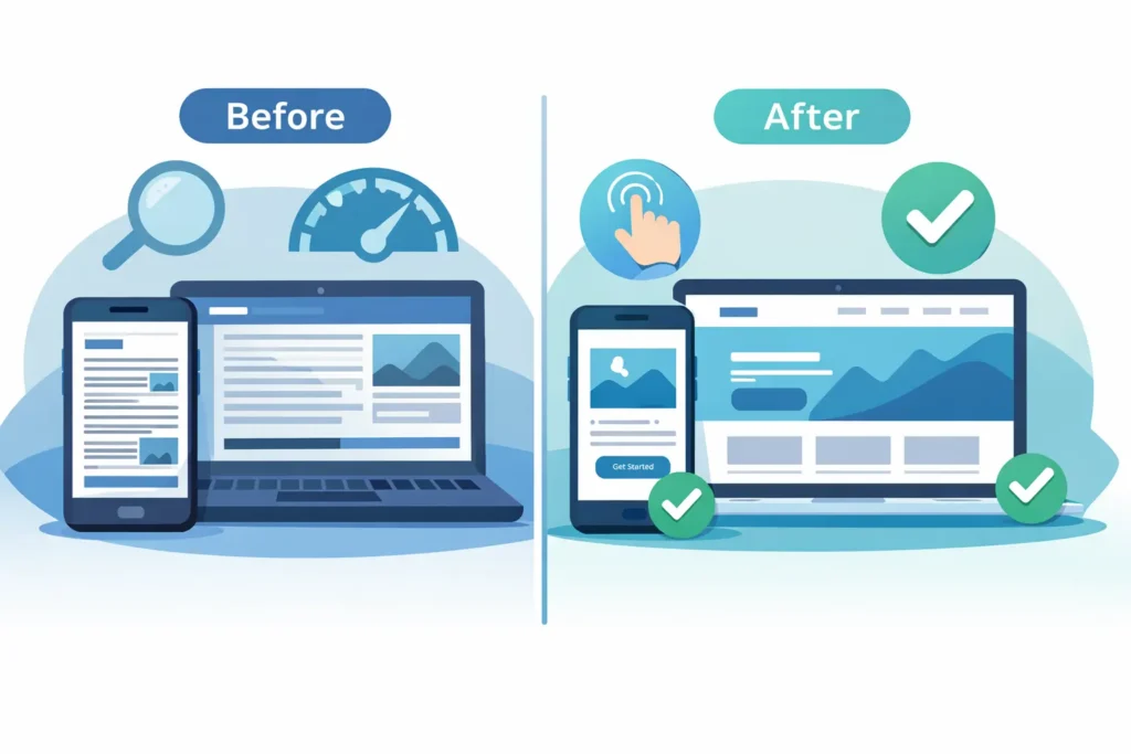
If you’re thinking “my website is not mobile-friendly,” the fix is usually achievable with structured checks and a few targeted updates. Start by testing, then apply responsive changes that fit your platform and goals.
What “Mobile Friendly” Actually Means
Being mobile-friendly means your pages adapt to small screens, load quickly on cellular networks, and present content and actions without pinching or zooming. This includes readable typography, touch targets that are easy to tap, layouts that reflow on different breakpoints, and media that scales correctly. It also means forms work without friction, and navigation remains clear on any device.
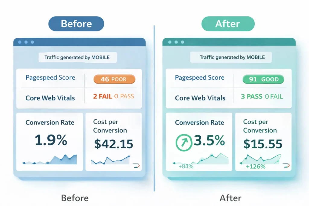
A site that fails on phones hurts conversions, rankings, and ad performance. People bounce when they cannot read or tap easily. Search engines prioritize usable, fast pages on mobile. If “my website is not mobile-friendly,” expect lower leads, higher costs per click, and fewer sales until you address it.
Validate your pages with Google’s mobile-friendly basics and tests to confirm text size, tap targets, and viewport settings.
For layout patterns and performance tips, review the web.dev’s responsive design fundamentals and apply the components that fit your theme.
Quick reality check
- Legible text at 16 px baseline or larger.
- Adequate tap targets near 44 px.
- Flexible grid or container queries that respond to viewport size.
- Images and embeds that scale using max-width: 100%.
- Minimal layout shift as assets load.
Why Mobile Friendliness Drives Revenue, SEO, And AEO
Mobile users often arrive with high intent. If your checkout, scheduler, or contact flow is painful on a phone, you lose revenue. Search engines evaluate usability signals from mobile devices. For Answer Engine Optimization, concise and scannable on-device experiences increase the chance your results are selected or summarized by assistants.
Three business outcomes you can influence
- Conversion rate improves when content is readable, and CTAs are one tap away.
- Organic visibility rises when page experience, CLS, and LCP meet thresholds.
- Lower acquisition costs follow from reduced bounces and stronger engagement.
For strategic help, you can connect with our growth-driven web design team to align UX and CRO with technical fixes. Or if you already know what you need, book a free website audit checklist, and we will send prioritized actions.
How To Confirm The Problem In 10 Minutes
Do these quick checks from your phone and desktop. Keep notes on what fails.
- Run a mobile-friendly check. Use Google’s guides and testing tools to validate text size, tap targets, and viewport settings. This confirms if templates need changes and points to specific elements to fix. Pair this with performance guidance on responsive design from web.dev for deeper context.
Helpful resources: Google’s Mobile-Friendly basics and testing guidance, and web.dev’s responsive design fundamentals. - Open your top landing pages on a real phone. Try to complete the main conversion. If you struggle to scroll, tap, or complete a form, your customers will too.
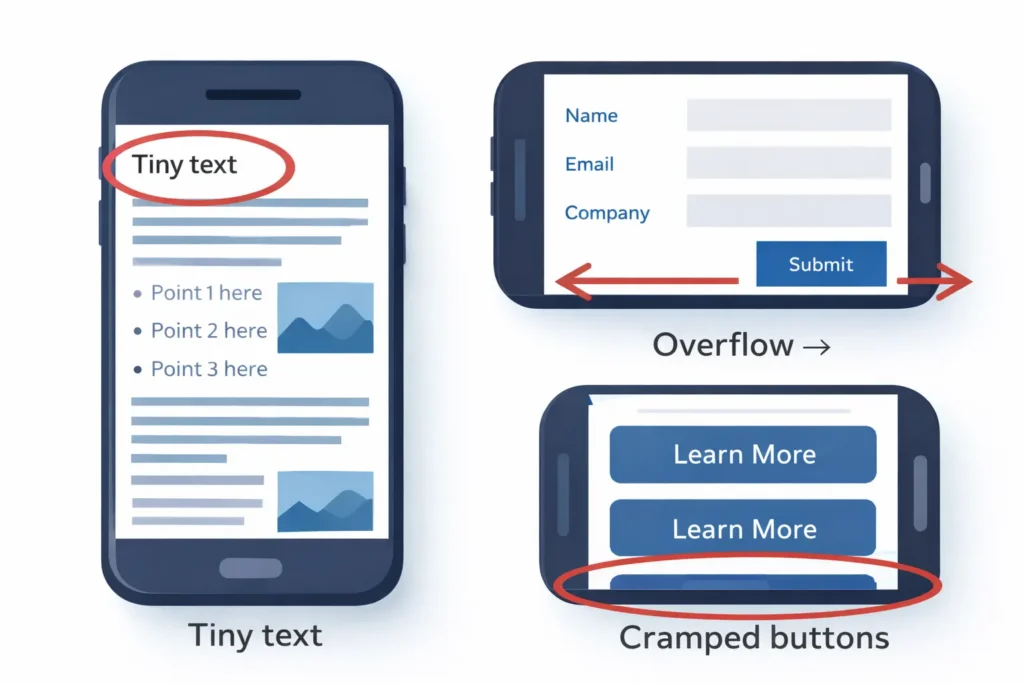
- Check font and spacing. Body text below 16 px is a red flag. Buttons should feel comfortably tappable with a thumb.
- Watch for horizontal scrolling. If you can drag the page sideways, the grid or an element is fixed-width.
- Inspect images and iframes. Any media that overflows the container needs responsive rules.
- Measure speed and stability. Slow, jumpy pages on a cellular signal are not ready for mobile conversions.
Tip: Document three screenshots per page you test. Mark issues with circles or arrows. This speeds up implementation.
Root Causes When “My Website Is Not Mobile Friendly”
- Fixed-width layouts using pixel widths instead of responsive containers.
- Missing viewport meta tag, so the browser scales incorrectly.
- Legacy themes with outdated breakpoints or no container queries.
- Unoptimized images that load huge files on small screens.
- iframes or tables wider than the viewport.
- Third-party widgets that inject fixed elements.
- Custom CSS overrides that undo responsive rules.
- Form fields and menus are not sized for touch or obscured by sticky bars.
Table 1: Symptoms → Likely Cause → First Fix
| Symptom on Phone | Likely Cause | First Fix |
| Text is tiny or zoom required | Missing viewport meta or small base font | Add <meta name=”viewport” content=”width=device-width, initial-scale=1″>, set body to 16 px |
| Sideways scroll | Fixed widths or overflow from images/iframes | Use fluid containers, max-width: 100% on media, audit widgets |
| Buttons too small | Old CSS, no mobile size tokens | Use min-height 44 px and generous padding |
| Images blurry or slow | No responsive srcset | Add srcset and sizes, compress to modern formats |
| Layout jumps on load | CLS from images or ads | Pre-size media, reserve space, limit late-injected content |
| Menu hard to use | Non-responsive nav | Implement mobile nav with clear hierarchy and tap targets |
The Fix Plan: How To Make Your Website Mobile Friendly
Below is a practical rollout plan that balances speed with quality. You can do this in phases over one to two sprints.
Phase 1: Stabilize The Layout
- Add the viewport meta tag sitewide.
- Enforce a fluid container system. If you use a framework like Bootstrap or a utility system like Tailwind CSS, standardize container widths and spacing tokens.
- Normalize typography with a 16 px base and 1.5 line-height.
- Make buttons 44 px tall minimum with adequate spacing.
Phase 2: Fix Media And Components
- Apply max-width: 100% to images, videos, and iframes.
- Implement responsive images with srcset and sizes.
- Convert carousels and hero banners to fluid height with aspect ratio utilities.
- Rebuild the primary navigation for small screens, then test on real devices.
Phase 3: Optimize Speed On Cellular
- Compress images to AVIF or WebP.
- Preload the main font, use system fonts when possible.
- Defer noncritical scripts and inline critical CSS for above-the-fold content.
- Limit or lazy-load third-party widgets.
Phase 4: Validate Conversions
- Test forms, checkout, and booking flows on a real phone.
- Ensure error states and labels are readable.
- Make primary actions a single prominent tap with sticky or repeated CTAs.
For done-with-you help, see our before-and-after projects to compare layout and conversion lifts after mobile improvements.
Platform-Specific Guidance
WordPress
- Switch to a modern, responsive theme or update your current theme’s breakpoints.
- Audit page builder sections for fixed columns. Replace with fluid grids.
- Replace heavy sliders with a responsive hero image or a lightweight slider that respects container width.
- Use an image optimization plugin that creates multiple sizes and serves WebP or AVIF.
Shopify
- Choose a theme from the current Online Store 2.0 family with strong mobile defaults.
- Reduce app bloat that injects fixed elements. Test after each uninstall or update.
- Configure product images with proper aspect ratios and zoom that respects device width.
- Make the add-to-cart sticky on mobile and ensure it does not block content.
Custom Stacks
- Adopt CSS container queries or a mobile-first grid.
- Establish tokens for spacing, radius, and font sizes.
- Add integration tests that emulate common viewports so regressions are caught before release.
Which Option Is Best For You
Choosing the best path depends on your timeline, budget, and current tech.
- Theme refresh works if your design is close, but the code is outdated. Fastest win if you can accept minor layout changes.
- Component rebuild is right when your brand and information architecture are solid, but the UI atoms are not.
- Full redesign fits when you are also repositioning offers, rewriting copy, or your analytics show deeper funnel issues.
Recommendation for most small teams: start with a theme refresh plus a targeted component rebuild. This captures 80 percent of the value quickly, then you can iterate.
If you want a strategic handoff, we can get a free website audit that outlines exactly which path will return the highest ROI in your case.
Practical Examples You Can Apply Today
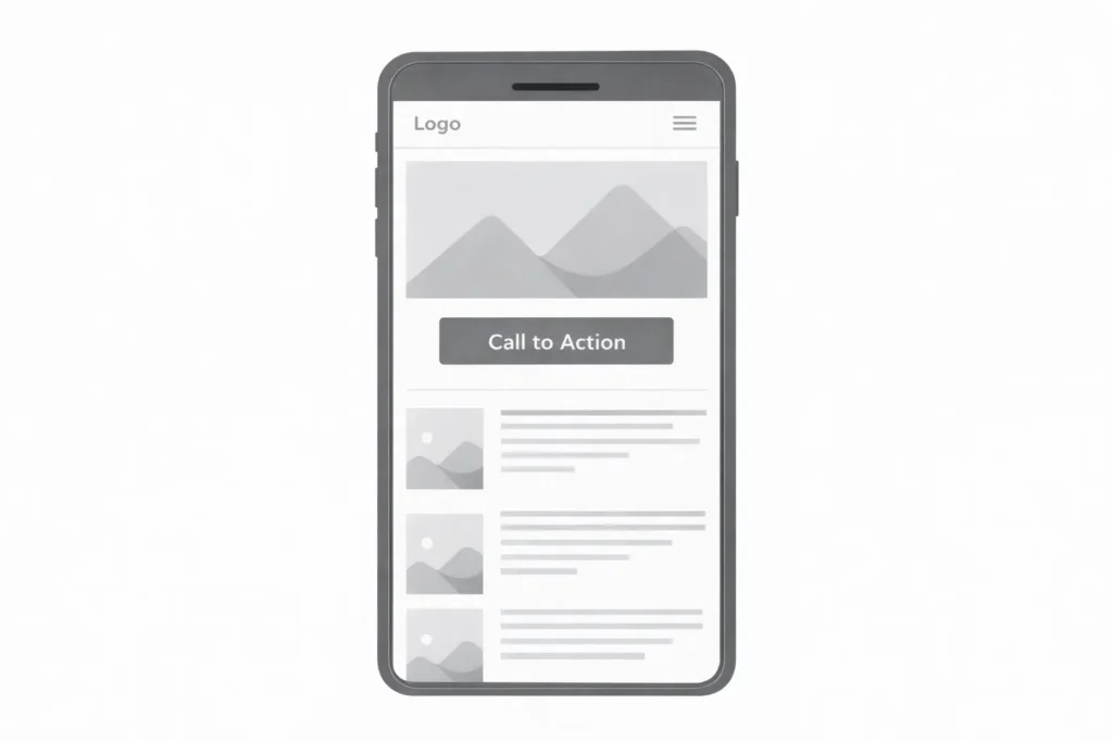
- Homepage hero: Replace text over busy images with a solid or translucent overlay, raise contrast, and keep headline under two lines on phones.
- Pricing tables: Stack features into accordion sections for small screens, then show a compact comparison at tablet widths.
- Forms: Use native inputs, turn off full-screen pickers where not needed, and sequence multi-step forms to reduce friction.
- Blog posts: Use 18 to 20 px body text, 28 to 32 px H2, short paragraphs, and supportive subheads that help Answer Engines extract key info.
Table 2: Mobile Typography And Spacing Cheatsheet
| Element | Mobile Size | Notes |
| Body text | 16 to 18 px | 1.5 line-height improves scanability |
| H2 | 28 to 32 px | Keep headings short and meaningful |
| Buttons | 16 px text on 44 px height | Minimum target sizes for thumbs |
| Inputs | 16 px | Prevents zoom on iOS when focusing fields |
| Spacing | 16 to 24 px vertical rhythm | Space groups for clear sections |
Troubleshooting Edge Cases
- Embedded maps or booking widgets: Wrap in a container with overflow hidden and apply a responsive aspect ratio. Test scroll trapping.
- Complex tables: Convert to stacked cards on mobile, keep the full table for desktop.
- Fixed headers and sticky bars: Ensure they do not cover crucial content or CTAs. Provide enough content padding-top.
- Popups: Use small, dismissible banners instead of full-screen modals on initial visit.
RankMath-Friendly Enhancements
- Use a concise H1 that reflects the main question and intent.
- Place a direct answer in the first two sentences so assistants and rich results can extract it.
- Add structured subheads that map to how, why, and which-option questions.
- Keep paragraph length short to medium for mobile readability.
- Link to authoritative references naturally to reinforce topical depth. For example, consult Google’s mobile guidance and web.dev’s responsive patterns as you plan fixes.
- Add internal links that deepen engagement: if your website isn’t bringing customers, read our insight on improving funnels, and if your site feels slow, address latency and payloads before scaling traffic.
Internal resources to continue learning:
- See why some sites stall on leads in the website, not bringing in customers.
- Find performance bottlenecks in why my site is slow.
Step-By-Step Mini Playbook
- Baseline test on your three highest-traffic pages and record mobile issues.
- Patch the viewport and container system to eliminate sideways scroll.
- Normalize text and buttons to the sizes listed above.
- Make media responsive with CSS and srcset.
- Trim scripts and compress images for cellular speed.
- Rebuild nav and form components for tap comfort.
- Retest on devices and compare against the baseline.
If you want expert hands to ship this quickly, chat with our growth-driven web design team, or jump straight into getting a free website audit for a prioritized worklist.
Frequently Asked Questions
How do I make my website mobile-friendly?
The fastest path is to apply a responsive container system, set a 16 px base font, add the viewport meta tag, and size tap targets to 44 px. Then ensure images and embeds scale with the container, trim heavy scripts, and retest on real devices. Start with your top landing pages and fix issues that block conversions, such as unreadable text, cramped buttons, and hard-to-close pop-ups. Doing these steps stabilizes your layout and often lifts conversions right away. If you still think “my website is not mobile-friendly,” follow the mini playbook above and validate after each phase.
How to get a non-mobile version of the website?
Use desktop view toggles in your mobile browser or add developer overrides, but do this only for testing, not as a user experience. Chrome, Safari, and Firefox let you request the desktop site from the menu. Developers can emulate desktop in-browser dev tools to check how layouts scale. For regular visitors, forcing a desktop on a phone is poor usability. The better approach is to deliver a responsive design that preserves content parity so people never need to switch views to accomplish a task.
How to convert a website to mobile responsive?
Refactor layout into fluid containers, introduce breakpoints or container queries, and make all media flexible. Start by adding the viewport meta tag and converting fixed pixel widths into percentages or responsive units. Implement a mobile-first CSS strategy with modular components so headings, buttons, and forms adapt at common breakpoints. Finally, compress media, defer noncritical scripts, and validate on popular devices. If your stack is dated, a theme refresh plus component rebuild is often the most efficient path.
How to make a website think I’m on mobile?
Use your browser’s device emulation tools or set a mobile user agent string to simulate mobile rendering for testing. In Chrome DevTools, toggle device emulation to preview different viewports and DPR values. Extensions and command-line flags can spoof a mobile user agent for deeper checks. This is for diagnostics only. You should design responsively so your site works regardless of user agent or window size, reducing brittle dependencies on device detection.
Final Verdict: Turn “My Website Is Not Mobile Friendly” Into Wins
When you say “my website is not mobile-friendly,” you are usually a sprint or two away from a measurable turnaround. Validate the problem with quick tests, stabilize your layout, and fix media and components with a mobile-first approach. Optimize for speed on cellular, then retest conversions on real devices. If bandwidth is tight, ourgrowth-driven web design specialists can ship a focused plan, and our get a free website audit will prioritize the exact fixes that matter most.