If your website is not bringing customers, the cause is usually a mix of weak targeting, low trust, and confusing next steps.
You can reverse this by tightening audience fit, strengthening credibility, and clarifying your offer and calls to action.
What “Bringing Customers” Really Means
Traffic alone is not the goal. “Bringing customers” means your site consistently turns anonymous visitors into qualified leads, booked calls, or sales. That requires three things working together:
- the right audience,
- a web experience that builds trust,
- a clear, low-friction path to convert.
When any one of these is weak, the whole funnel leaks.
Fast 10-Minute Diagnostic: Find Your Biggest Leak First
Use this quick check to identify the most common failure point. If you answer “no” to any row, you have a priority fix.
Table 1. “Where Are We Leaking?” Snapshot
| Layer | Quick Question | What “Good” Looks Like | Red Flag You’ll See |
| Targeting | Are 70%+ of visitors in your ideal geography, industry, or intent segment? | Search queries, referrers, and landing pages map to your ICP | Lots of irrelevant keywords or social traffic with high bounce |
| Trust | Can a stranger understand who you serve, proof you deliver, and why you’re safe to choose in 10 seconds? | Clear headline, subhead, social proof above the fold | Vague promises, thin proof, stocky visuals |
| Offer | Is there one primary action that feels safe and valuable? | Single primary CTA with a strong give, like a diagnostic or sample | Competing CTAs, gated pricing with no context |
| UX | Can users reach the CTA in one scroll on mobile? | Sticky button, scannable sections, 2-3 nav items | Deep menus, wall of text, slow or shifting layout |
| Speed | Is Largest Contentful Paint under 2.5s on mobile? | Lean hero, optimized images, fast hosting | LCP above 3s, CLS jumps |
| Follow-Up | Do you respond within 15 minutes during business hours? | Automated confirmation and human follow-up | Leads sit for hours, no nurture sequence |
👉 If your biggest gap is Targeting, fix traffic sources first. If Trust or Offer scores “no,” fix the page before buying more clicks.
Why Your Website Isn’t Converting (And How To Fix Each Cause)
1. Misaligned Targeting: The Right People Never See You
Why it hurts: Wrong-fit visitors cannot become customers, no matter how pretty the page is.
How to fix: Align search terms, ads, and content to buying intent. Use negative keywords, focus on commercial modifiers like “pricing,” “agency,” or “near me,” and route campaigns to the most relevant landing page, not the homepage.
Which option is best when: Your analytics show high bounce from a few irrelevant queries. Tighten those first, then expand.
Pair targeting improvements with a focused services page like website design & development services to capture commercial intent.
2. Thin Trust Signals: Visitors Don’t Believe You
Why it hurts: People buy when they trust. Missing proof and unclear identity create hesitation.
How to fix: Add precise social proof, not fluff. Place “who we serve” and “what outcomes we create” above the fold. Use logos, quantified results, and 2-sentence case studies. Reference established credibility research to guide placement and clarity (see usability findings from Nielsen Norman Group).
Which option is best when: You already get decent traffic but few form fills. Elevate trust before scaling spend. A visual reel like portfolio highlights shows proof without making users dig.
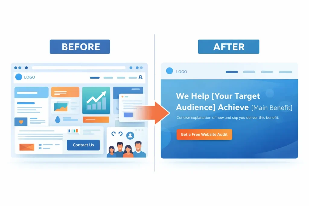
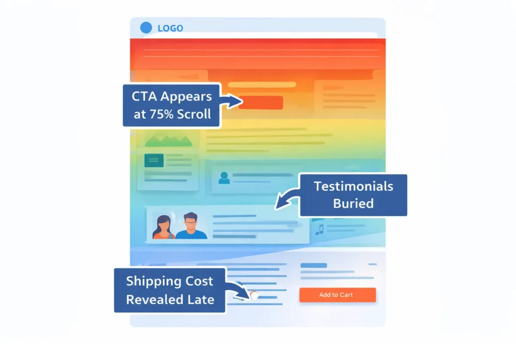
3. Weak Offer and CTA: No Clear Next Step
Why it hurts: Generic “Contact us” creates uncertainty. People prefer a clear, low-risk step with immediate value.
How to fix: Replace “Contact” with one primary CTA that gives value, such as “Get a free website audit,” “Book a 15-minute scope call,” or “See pricing options.” Keep one main button throughout the page and repeat it at logical breaks.
Which option is best when: You sell services with consultative sales cycles. A friction-light CTA like get a free website audit increases hand-raises.
4. Slow Mobile Load and Janky Layout
Why it hurts: Speed and stability strongly correlate with conversions. Long loads and layout shift kill trust and attention.
How to fix: Compress images, defer non-critical scripts, serve next-gen formats, and test Core Web Vitals. Google’s PageSpeed Insights offers direct, prioritised fixes you can ship this week.
Which option is best when: Your Largest Contentful Paint is over 3 seconds and mobile bounce is high. Tackle LCP first, then CLS and INP.
5. Muddled Messaging: Users Don’t See Themselves
Why it hurts: If your headline could belong to any competitor, it will not earn attention.
How to fix: Write a specific headline: “Conversion-focused websites for local home service companies,” followed by a single, benefit-driven subhead. Name your ICP explicitly and state your revenue or lead metric.
6. No Follow-Up Engine
Why it hurts: Even warm hand-raises go cold if you reply late or inconsistently.
How to fix: Auto-confirm with expectations, then respond within 15 minutes during business hours. Add a 5-day nurture sequence that answers objections and showcases proof. Use a calendar link to skip email ping-pong.
If you need a partner to execute, talk to a team that builds sites to convert, like growth-driven web design.
The Simple Messaging Framework That Converts
Use this four-block layout on your homepage or landing page:
- Who you help + primary outcome
- Why your approach works with one quantified proof
- What they get in one tight package grid
- What to do next with a single button and a micro-offer
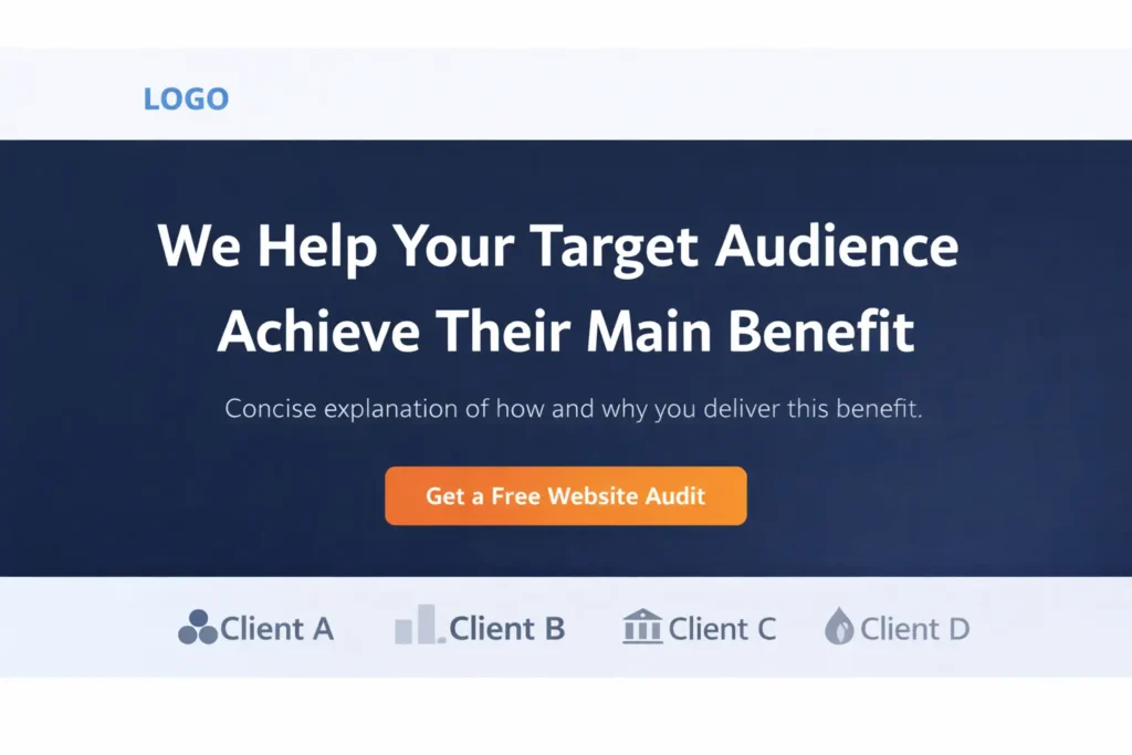
Example Above-the-Fold Copy You Can Steal
- Headline: “Websites that turn visitors into booked calls for local service brands”
- Subhead: “We blend UX and CRO to lift conversions, usually 20 to 40 percent in 60 days”
- Proof: “See real redesign outcomes” → link to portfolio highlights
- Primary CTA: “Get a free website audit”
Your Traffic, UX, and Sales Must Align
When traffic sources, on-page experience, and sales follow-up pull in the same direction, you earn compounding gains. When they fight each other, you stall. Use this table to align teams around the same KPI.
Table 2. “One Funnel, One KPI” Alignment Map
| Funnel Stage | Owner | KPI To Watch | Practical Tip | Fix Priority |
| Traffic | Marketing | Qualified sessions, not just sessions | Bid on high-intent terms with pricing or service modifiers | High |
| Page | Web/UX | Conversion rate to primary CTA | Remove secondary CTAs above the fold on mobile | Highest |
| Trust | Copy/Brand | Proof density in first screen | Add quantified case study and client logos in hero | High |
| Speed | Dev | Mobile LCP under 2.5s | Compress hero image to under 120 KB | High |
| Follow-Up | Sales | Time-to-first-touch | Add auto-reply and book-a-call link | Highest |
Practical Fixes You Can Ship This Week
- Rewrite your hero to call out your ICP and outcome in one sentence.
- Replace “Contact” with a value-first CTA like “Book a 15-minute scope call.”
- Move proof up. Put a fast logo strip and one 2-sentence case study above the fold.
- Trim your nav to two or three links. Every extra choice creates drift.
- Speed pass. Compress hero images, lazy-load below-the-fold media, and remove unused tracking scripts.
- Mobile first review. Read every section on your phone. If the primary CTA takes more than one scroll to find, fix it.
Need help turning these into a live uplift plan? Start with a conversation at conversion-focused web design.
Real-World Mini Examples
- Local trades company: Replaced “Contact us” with “Get a fixed-price quote in 24 hours,” moved testimonials to the hero, trimmed seven menu items to three. Result: call requests up 35 percent within 30 days.
- B2B services firm: Shifted ad groups to “service + pricing” and “near me,” created a short “What happens next” section with timeline and guarantees. Result: cost per lead down 28 percent, close rate up due to clearer expectations.
These are exactly the kind of improvements you will find in our portfolio highlights.
What To Do If You Already Have Traffic But No Sales
If you have traffic, start at the page, not the channel. Audit the page with a trust and clarity lens, then validate with data:
- Look at scroll maps. If 70 percent drop before your offer, your offer is too late or unclear.
- Compare mobile vs desktop conversion rates. If mobile is half of desktop, prioritize mobile fixes.
- Segment new vs returning visitors. If only returning visitors convert, your message is not clear enough for first-timers.
For deeper trust polish, see:
- Internal guide: Why My Website Looks Unprofessional (+ Fixes)
- Internal guide: Website Trust Issues: The Practical Fix-It Guide
SEO and AEO Moves That Help You Rank And Win the Click
- Answer the core question in the first two sentences. You did that at the top, which supports answer-engine optimization and snippets.
- Use the exact query three times in natural language to reinforce relevance: you will see website not bringing customers in the hero, mid-page, and in the wrap-up below.
- Add an FAQ block with clear, standalone answers.
- Link smartly to related resources and proof pages so users and crawlers see topic depth.
- Keep your content scannable with short paragraphs, tables for comparisons, and a single dominant CTA.
For additional reading on trust and usability, consult reputable, evergreen resources like Nielsen Norman Group’s credibility guidelines and Google’s PageSpeed Insights recommendations for Core Web Vitals. These help you prioritize fixes that search engines and users reward.
When To Redesign vs When To Incrementally Optimize
Incremental optimization is best when your structure is sound but specific elements are weak: hero clarity, proof placement, or speed. Ship weekly gains, watch conversions climb, then revisit bigger design moves later.
Redesign is best when your brand, information architecture, and templates no longer support your ICP. If navigation is sprawling, components are inconsistent, and adding proof breaks layouts, a redesign will often be faster than endless patches.
If a redesign is on the table, review your options and timeline with a team that can plan the migration without losing SEO, like redesign and migration services.
What Success Looks Like In 30, 60, 90 Days
- 30 days: New hero, proof-first layout, single CTA, mobile speed pass. Expect early lift in form fills and booked calls.
- 60 days: High-intent keyword reshuffle, fresh service landing page, add 2 quantified case studies. Expect steadier lead flow and lower CPL.
- 90 days: Nurture sequence, retargeting with proof tiles, and ongoing CRO tests. Expect compounding gains and clearer forecasts.
To benchmark your progress, compare pre- and post-changes using identical lookback windows and the same attribution model.
Frequently Asked Questions
What is the 10 5 3 rule in customer service?
The 10-5-3 rule is a simple proximity cue that boosts perceived warmth and trust, which lifts conversions. At 10 feet, make eye contact and smile. At 5 feet, offer a verbal greeting. At 3 feet, engage directly and offer help. Applied to websites, this maps to visual greetings at “first view,” a clear headline within the first scroll, and a direct invitation to act near CTAs. Brands that operationalize this rhythm online reduce bounce and increase micro-engagement, which increases the odds that a visit becomes a lead or sale. Bring that same intentionality to your live chat prompts and form confirmations. Aim for timely, human responses that mirror in-person hospitality so users feel guided, not pushed.
Why am I not attracting clients?
You are likely not attracting clients because your targeting, proof, and offer are misaligned with your ideal buyer’s intent. Start by auditing acquisition to remove irrelevant keywords and placements. Next, rebuild your hero to name the ICP and the outcome, then elevate proof with quantified case studies. Replace generic “Contact” with a give-first CTA such as a free audit or pricing overview. Finally, accelerate response time to under 15 minutes and add a short nurture sequence. These steps close the most common gaps that cause “traffic but no leads,” especially on mobile. Track improvement by monitoring conversion rate and time-to-first-touch side by side.
What is the 2 2 2 rule in sales?
The 2-2-2 rule encourages consistent, spaced follow-up so warm prospects do not cool off. After first contact, follow up in 2 hours, then 2 days, then 2 weeks with fresh value each time. Online, pair this with a three-email sequence: instant confirmation with a scheduling link, a 2-day case study showing quantified results, and a 2-week check-in with an FAQ and a low-commitment next step. The goal is helpful persistence, not pressure. Prospects who were busy on day one often respond on day four when you make it easy to act. Use calendar invites and templates so the cadence is automatic, and keep each touch brief and specific.
Why am I not getting orders on my website?
You are likely losing orders to either friction or uncertainty at the decision point. Test a single-page checkout, reduce required form fields, and enable guest checkout if you run ecommerce. For services, show pricing ranges or starter packages to de-risk the click. Add trust signals where the decision happens: badges, short guarantees, and “what happens next” copy near the button. Ensure mobile LCP under 2.5 seconds and remove layout shifts that move buttons as users tap. Finally, clarify shipping or delivery timelines, and provide a visible support option. These moves reduce abandonment and turn intent into action.
Additional Resources To Deepen Trust And Speed
- External reference: Nielsen Norman Group on web credibility and trust for evidence-based placement of proof and clarity cues.
- External tool: Google PageSpeed Insights to measure and prioritize Core Web Vitals fixes that affect conversions.
Plus, explore two related internal reads for practical fixes:
- Sales Website: Traffic But No Sales? Here’s What To Fix
- Website Trust Issues: The Practical Fix-It Guide
Wrap-Up: Turn a website not bringing customers into a steady lead engine
You now have a checklist to diagnose leaks, a page framework that states who you serve and the outcome you deliver, and a plan to align traffic, UX, and follow-up. Apply the quick wins this week, then iterate. Websites that clearly target an ICP, show real proof, load fast on mobile, and offer a single valuable next step will consistently convert. When in doubt, keep it simple and customer-first. If you want experienced eyes and hands on the build, start here with our studio.