If you’re thinking, “my website is outdated,” you’re probably right. Outdated sites lose traffic, leak conversions, and become harder to maintain. This guide shows you why that happens, how to update step by step, and which option fits your budget, timeline, and goals.
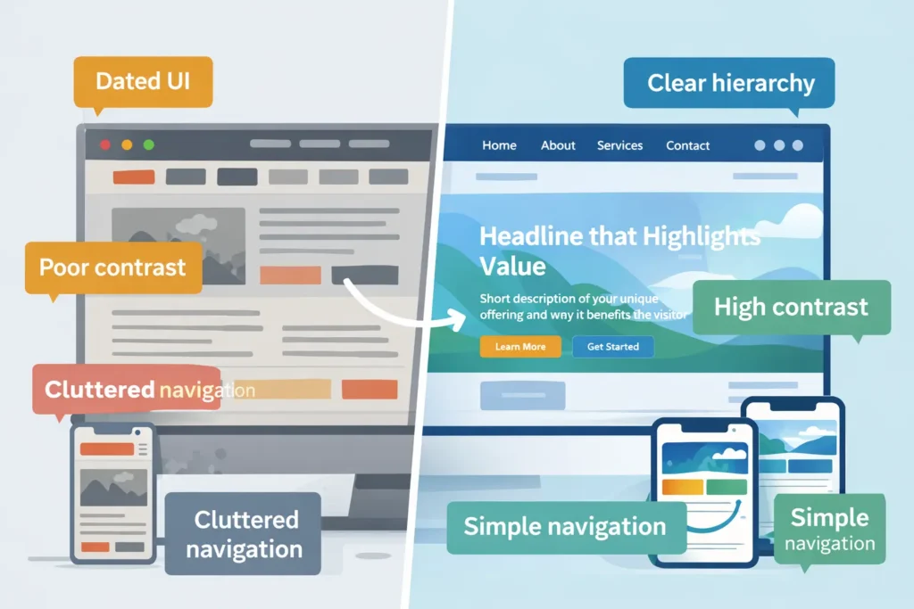
An outdated website is any site that can’t meet modern user expectations for clarity, speed, mobile experience, accessibility, and trust. Even if the design still looks “fine,” small gaps compound into lost traffic, lower conversions, and higher support costs.
Quick reality check (5 minutes)
- Open your site on a phone. Can you complete a top task in under 3 taps without pinching or zooming?
- Run a free Core Web Vitals test (e.g., from Google’s developer resources at web.dev). If LCP is above 2.5s or CLS is jittery, you’re losing visitors.
- Compare your messaging to the top 3 competitors. Who makes value obvious in the first 5 seconds?
If two or more fail, it’s time to update.
Why websites become outdated
- Shifting user standards. Patterns evolve quickly: sticky headers, clear CTAs, and scannable sections are the norm, not a bonus.
- Search updates. Helpful content, page experience, and structured data influence how you appear and how rich your snippet looks.
- Tech debt. Plugins stack up, themes get abandoned, and small hacks slow your stack.
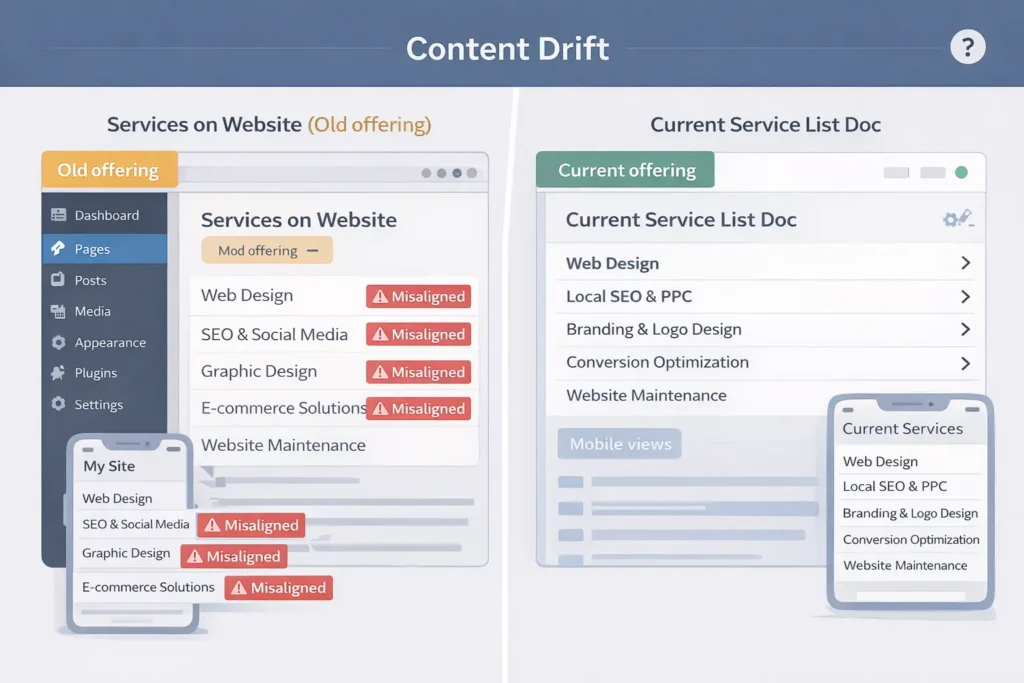
- Content drift. Offers, pricing, and proof fall out of sync with your current business.
Check your field data against Core Web Vitals guidance and prioritize fixes for LCP, CLS, and INP.
Signs your site is outdated (and what that actually costs)
| Signal you’ll see | Measurable impact | Why it happens | First fix |
| Hard-to-read typography, low contrast | Lower time on page, higher bounce | Old styling tokens, small font sizes | Apply an 8pt scale, raise body text to 16–18px, fix color contrast |
| Slow mobile pages (LCP > 2.5s) | Fewer indexed pages, ad spend waste | Bloated images, render-blocking JS | Compress images, defer non-critical JS, lazy-load below-the-fold |
| “Hamburger soup” nav on mobile | Fewer product page visits | Deep IA, overlapping menus | Flatten nav, add task-based links, use 1–2 primary CTAs |
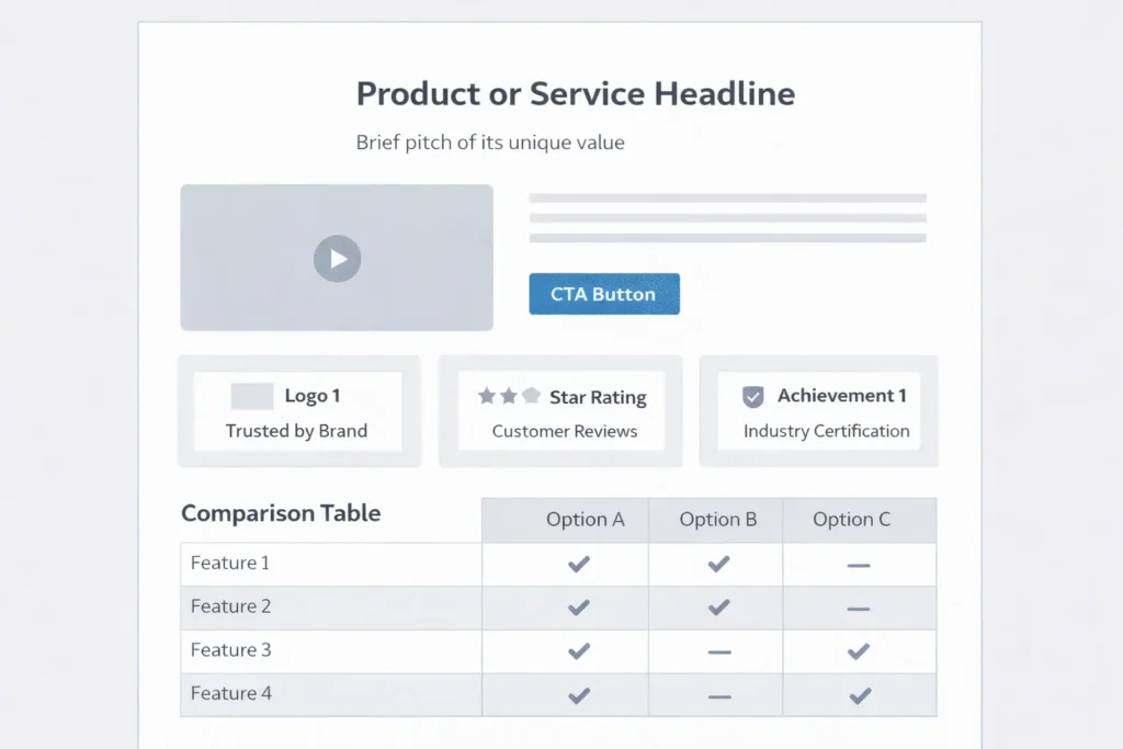
| No trust blocks (logos, stats, reviews) | Lower lead quality and rate | Missing social proof | Add proof near CTAs: logos, star ratings, numbers |
| Inconsistent tracking | Blind spots in ROI | Unstructured events | Define 3–5 events: “view pricing,” “start checkout,” “submit lead.” |
This table helps you connect surface-level “old look” symptoms to actual losses. When stakeholders ask why a redesign matters, show the impact column.
How to update an outdated website: a 3-phase playbook
Phase 1: Stabilize in 7–14 days
- Speed: Optimize images, preload key fonts, defer third-party scripts, and simplify above-the-fold.
- Clarity: Rewrite hero headline to answer “Who is it for, what do I get, how is it different?” in one line.
- Proof: Add 3 quick wins: client logos, a single quantified result, and 1 testimonial.
- Tracking: Implement event tracking for your primary conversion plus 2 assist events.
Get expert help if you want a fast, low-risk uplift: growth-driven web design and redesign, and migration services.
Phase 2: Modernize UX in 30–45 days
- Navigation re-map: Card sort top tasks, then ship a flatter IA with action labels.
- Component system: Build a mini design system with tokens for spacing, colors, type, and buttons.
- Conversion surfaces: Add comparison blocks, pricing highlights, and objection-handling FAQs on key pages.
- Accessibility: Meet WCAG basics. Clear focus states, alt text, proper heading hierarchy.
Structure pages and menus using research-backed patterns from the Nielsen Norman Group to improve task completion.
Phase 3: Scale content and CRO in 60–90 days
- Editorial ops: Topic clusters aligned to search intent and customer jobs.
- Experiment cadence: 1 A/B test per sprint on headlines, offers, or layout.
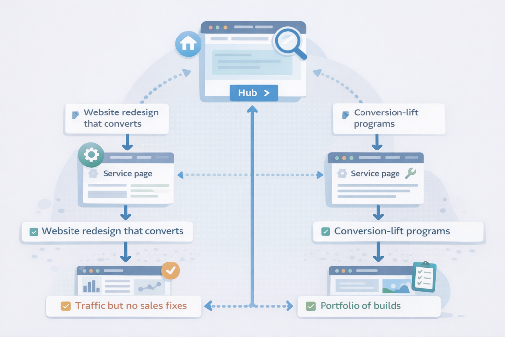
- Internal linking: Surface bottom-funnel posts wherever purchase intent is high. Try: traffic but no sales fixes and blog not bringing customers tips.
- Technical depth: Use structured data for products, FAQs, and how-tos to improve rich results.
Which option is best for your situation?
There isn’t a single “right” move. Choose based on website size, risk tolerance, and timelines.
| Path | Best for | Pros | Cons | Typical timeline |
| Refresh (keep CMS, update UX, content, performance) | Small to mid sites with decent foundations | Fast wins, low risk, preserves SEO equity | Limits deeper IA and schema changes | 4–8 weeks |
| Redesign (new IA, components, visuals) | Brands needing clearer positioning and conversion lift | Clean slate, modern patterns, better CRO | More stakeholder time, broader QA | 8–12 weeks |
| Replatform (move to faster stack) | Legacy themes, plugin bloat, and poor Core Web Vitals | Performance, security, maintainability | Content migration, possible SERP volatility | 10–16 weeks |
Which option is applicable and best?
- If your vitals are passable and content is current, Refresh.
- If messaging is unclear and flows are clunky, Redesign.
- If you’re fighting plugin conflicts and slow hosting, Replatform.
To see tangible outcomes before committing, review real examples in our before-and-after projects. Then map those patterns to your pages and metrics.
The 80/20 update list you can ship this month
- Rewrite hero + subhead to promise a clear outcome and who it’s for.
- Compress imagery to next-gen formats and cap hero images near 150–250KB.
- Rationalize buttons to one primary CTA per screen.
- Surface proof: 3 logos + 1 quantified result near top.
- Trim scripts: remove unused trackers and chat widgets on checkout/lead pages.
- Fix internal linking to money pages and key guides. Start with website redesign that converts and this SOP on why my site is slow.
- Add the FAQ schema to your top 3 pages to improve snippet real estate.
- Harden accessibility: label forms, add descriptive alt text, fix focus order.
Practical examples and checklists
Example: Service firm with “quiet” pricing page
- Problem: No contrast, dense paragraphs, technical jargon, weak proof.
- Fix: Replace paragraph blocks with scannable bullets, add 3 plan cards, 1 ROI stat near the CTA, and a short FAQ that handles the top objections.
- Outcome: 22–35% lift in contact form starts, faster time to value.
Example: E-commerce brand with slow category pages
- Problem: Heavy carousels, non-critical scripts above the fold.
- Fix: Lazy-load carousels, inline critical CSS, postpone analytics until user interaction.
- Outcome: LCP from 4.0s to 2.2s; category entrances up, and CPCs down.
Mini audit checklist
- Page feels scannable on mobile
- 1 clear CTA above the fold
- Proof within the first scroll
- Image weight < 250KB hero, < 100KB common components
- CLS is stable on load
- Forms use helpful error text, not cryptic codes
For inspiration on outcome-focused changes and to evaluate partners, explore our portfolio of builds. Then scope your own must-win pages and sequence updates with sprints.
Technical guardrails that protect rankings and revenue
- Preserve URLs for top-traffic pages or 301 to equivalent content.
- Migrate in phases to limit volatility. Launch sections, verify KPIs, then proceed.
- Keep metadata and structured data aligned to intent and page type.
- Measure what matters: impressions and click-through for target queries, conversion rate per template, and top task completion on mobile.
Pair those guardrails with a supportive stack and continuous care. If you want help choosing and sequencing, talk to our local website design team.
Shortlist of trustworthy resources to go deeper
- Use Nielsen Norman Group’s research on clarity and interaction patterns to benchmark usability improvements.
- Review Core Web Vitals guidance from Google to prioritize speed work and reduce layout shift.
Budgeting and ROI, made simple
- Under $5K: Focus on refresh tasks and content clarity on 3–5 pages.
- $5K–$20K: Full redesign of key templates, improved IA, A/B infrastructure, and analytics.
- $20K+: Replatform with performance budgets, component library, and content migration.
Typical ROI drivers: improved conversion rate, lower acquisition cost through higher quality scores, and reduced maintenance overhead.
Internal linking blueprint for GEO/AEO
- City and service pages should reuse consistent components, use task language in H2s, and link to related services and case studies.
- Place 2–4 contextual links per 1,000 words to money pages and proof pages. Begin with conversion-focused web design and pricing & service plans.
- From content hubs, link bottom-funnel posts such as website traffic but no sales, and blog not bringing customers.
Frequently Asked Questions
How do I update an outdated website?
Start with a refresh that fixes speed, clarity, and proof, then schedule a phased redesign. Begin by compressing images, deferring non-critical scripts, and simplifying the hero copy. Add trust blocks near CTAs and enable conversion tracking. Next, flatten navigation, apply a component library, and ship structured data. If plugins or hosting block progress, plan a replatform to a modern stack. End each sprint with a test and a measurable KPI.
What makes a website outdated?
A site is outdated when it fails modern expectations for speed, mobile usability, accessibility, and clear value. Typical signs include slow LCP, jittery layout, tiny fonts, low contrast, and unclear messaging. Missing trust elements, dated visuals, or hard-to-use menus also signal age. Under the hood, plugin bloat, abandoned themes, and inconsistent analytics amplify the problem. If two or more of these appear, plan a refresh or redesign.
How can I get my old website back?
Use the Internet Archive to retrieve content and layouts, then rebuild only what still serves your goals. Export text, images, and URLs from archived snapshots. Map those to your current IA and redirect legacy URLs to equivalent pages. Preserve strong content and retire low-value pages. If you lost rankings after a theme change, audit titles, headers, and internal links before rolling back wholesale; often, a targeted restore performs better.
How to tell if a website is outdated?
Run a 3-step test: mobile task completion, Core Web Vitals, and messaging clarity. First, complete a key task on a phone in under 30 seconds. Second, check LCP, CLS, and INP with a field-data tool and fix anything in the “needs improvement” or “poor” ranges. Third, read your hero line: can a new visitor tell who it’s for, what they get, and why it’s different in one glance? If not, it’s time to update.
Where to add images for maximum impact
- Hero before-and-after on the homepage to spotlight clarity and trust improvements.
- Speed audit screenshot on a performance or services page to make the invisible visible.
- Wireframe of the new template on a redesign announcement post to set expectations.
- Case study KPI chart on a proof page to anchor claims with numbers.
Next steps if you’re thinking, “my website is outdated”
- Bookmark this playbook and assign Phase 1 tasks this week.
- Review outcomes similar to yours in our project gallery.
- If you want a scoped plan tailored to your goals, book a short call for pricing & service plans, or start with a free mini-audit via our start your project here page.
Bottom line: If you’re saying “my website is outdated,” fix speed and clarity first, then modernize UX, and choose the path—Refresh, Redesign, or Replatform—that matches your constraints. You’ll protect rankings, lift conversions, and reduce long-term costs.
External references used in this guide
- Web performance and Core Web Vitals guidance from Google’s developer resources at web.dev (for prioritizing LCP, CLS, INP fixes).
- Usability patterns and clarity research from Nielsen Norman Group (for scannability, navigation, and task completion heuristics).