People leaving my website is usually caused by slow pages, unclear value, and friction that kills trust. The fastest wins are speed, focused messaging, and simple paths to act.
Visitors don’t bounce randomly. They leave when a page doesn’t load fast enough, the offer isn’t obvious, or the path to the next step is cluttered. In this guide, you’ll learn the exact signals that trigger exits, the fixes that move the needle, and how to prioritize the work so you can keep more of the right users on site and turn them into leads or customers.
Growth-driven web design can help you turn hard-earned traffic into results, but you can start with the step-by-step playbook below.
Visitors bounce for different reasons—speed, clarity, trust, or weak offers. If your site looks professional but isn’t converting, see why a polished site still fails to convert for the fast fixes that actually move the needle.
Why People Are Leaving My Website
Most exits stem from speed, unclear value, or friction in forms and navigation. Use the checks below to confirm what’s happening on your pages and apply the matching fix in minutes.
Quick Summary: What’s Causing Drop-offs
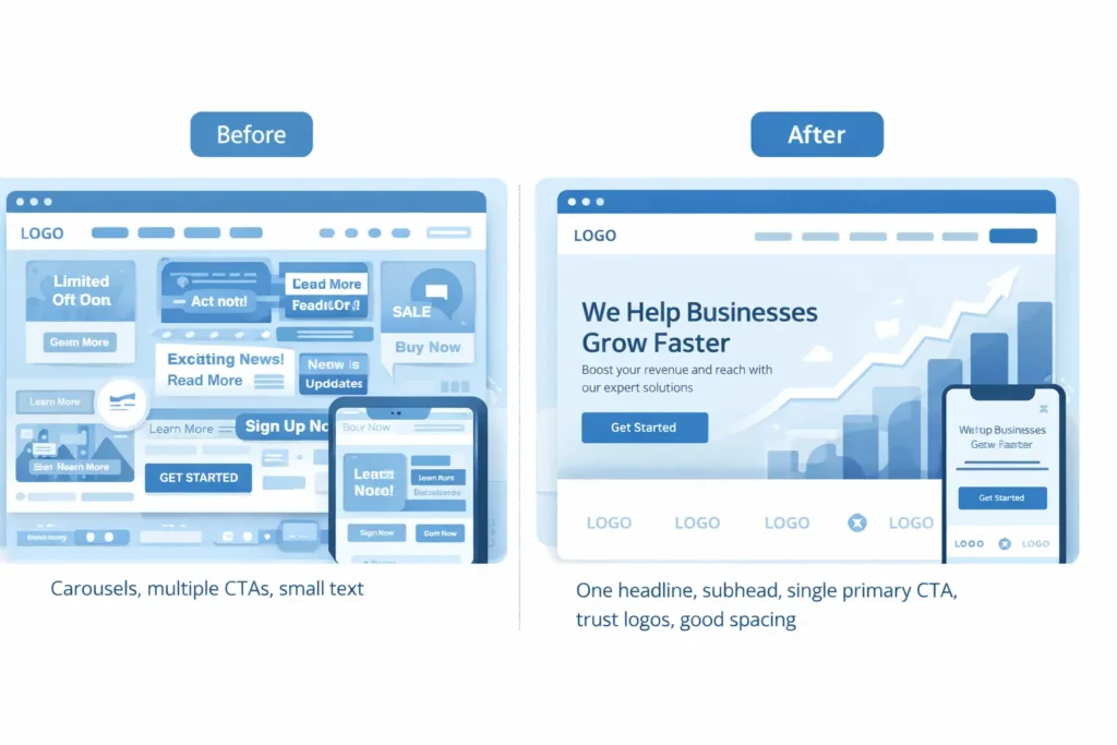
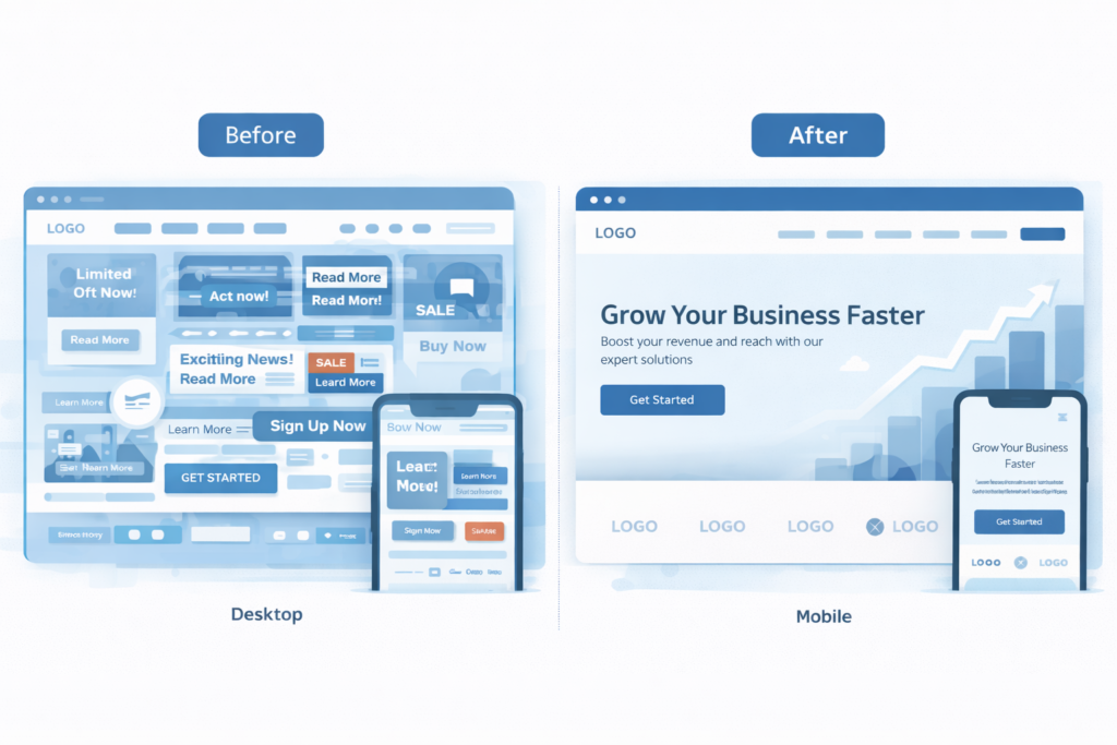
- Speed is the first impression. If above-the-fold content doesn’t paint within 2 seconds, attention slips and scroll rates collapse.
- Messaging must answer three questions at a glance: What is this? Is it for me? What should I do next?
- Trust is visual and immediate. Real logos, real testimonials, and proof of outcomes reduce anxiety.
- Navigation should be a shortlist, not a catalog. Fewer, clearer choices increase forward movement.
- Mobile is the default. Thumb-reachable CTAs and readable type retain users who normally “check and bounce.”
Tip: Review the two tables below, then use the “90-Minute Retention Sprint” to apply fixes in one working session.
Table 1: Fast Diagnosis — Why Are People Leaving?
| Mobile bounce is higher than desktop | Likely root cause | Where to confirm | Quick win |
| High exits on landing page with low scroll depth | Hero doesn’t answer “for me?” or loads slow | Scroll map and Core Web Vitals | Rewrite headline to name audience and outcome; compress hero image |
| Big drop between PDP and cart or lead form | Anxiety, hidden fees, weak proof | Session replays and form analytics | Add shipping/price clarity, bullets of guarantees, 2–3 testimonials |
| Mobile bounce higher than desktop | Tap targets, layout, font size | Mobile screenshots and tap maps | Increase body font to 16–18 px, make CTAs 44 px tall |
| Lots of site search, little conversion | Info scent mismatch, jargon | Site search terms report | Add “how it works” explainer and glossary links within copy |
| Returning users bounce quickly | Didn’t see a change or new blockers | Date-segmented journeys | Add “What’s new” module, pin a concise benefits recap on the homepage |
Why People Leave: The Psychology In Plain English
Cognitive overload: Too many choices and walls of text sap decision energy.
Uncertainty and risk: Missing proof or unclear pricing triggers defensive exits.
Broken momentum: Every extra field, modal, or step is a chance to leave.
Mismatch of intent: Traffic source promises one thing, the page delivers another.
Delay pain: Humans avoid waiting; a slow First Contentful Paint feels like a broken promise.
That’s why your first priority is speed and clarity. Only then should you layer persuasion and detail.
The 90-Minute Retention Sprint (Do This Today)
- 15 minutes: Speed triage. Compress hero images, lazy-load below-the-fold media, and remove nonessential scripts from the first screen. Target sub-2-second LCP.
- 20 minutes: Message clarity. Rewrite the hero to name the audience, the outcome, and the next step. Add a single primary CTA.
- 15 minutes: Trust block. Add 3 short, specific testimonials with names and outcomes; include 4–6 recognizable client logos.
- 15 minutes: Navigation trim. Reduce top nav to 5 items or fewer. Add a “Start here” item that points to your highest converting path.
- 10 minutes: Mobile pass. Increase line height, enlarge CTA buttons, ensure above-the-fold text is readable without zoom.
- 15 minutes: Form friction. Cut form fields by half, add inline field hints, and show a privacy reassurance line under the email field.
Want a partner to implement and iterate? See our conversion lift programs for structured UX and CRO improvements tied to measurable outcomes.
Table 2: Fix The Leak — Which Improvement Fits Your Case
| Use case | Why this fix works | What to change | Example copy or setting |
| Services page with high bounce | Visitors don’t see how you solve their exact problem | Add a “Who we help” module above the fold | “For SaaS, B2B, and local service brands needing more demos in 30 days” |
| Product page with high exits after image gallery | Info gap between pictures and proof | Add short outcomes bullets with micro-testimonials beneath gallery | “Saved 4 hours a week, +18% orders” |
| Add short outcomes bullets with micro-testimonials beneath the gallery | Education without a next step | Insert content-matched CTA and lead magnet | “Download the 7-part homepage checklist” |
| Checkout or lead form abandonment | Anxiety and effort are high | Offer guest checkout, progress bar, autofill, and trust badges | “Secure 256-bit SSL. Only 2 steps left.” |
| Home page losing mobile users | Above-the-fold text too dense | Replace paragraph with 2-line benefit and one button | “Launch faster. Convert more. Get a free website audit.” |
How To Apply Each Fix In Detail
1. Speed: Small Files, Fewer Requests, Earlier Paints
- Convert hero images to modern formats and cap initial image weight.
- Load analytics and chat after the main content.
- Inline critical CSS for the first screen, defer the rest.
- Limit animation to micro-states. Heavy motion delays paint and distracts from calls to action.
If you prefer a done-for-you tune-up, our conversion lift programs include speed optimization, accessibility passes, and iterative A/B testing that compound over time.
2. Messaging: Clarity Before Cleverness
A user should know in two seconds what you sell, who it helps, and the next step. Use this fill-in-the-blank to draft your hero:
We help [audience] achieve [outcome] with [offer], so they can [result].
[Primary CTA]
Then scaffold the rest of the page with these blocks: “Who it’s for,” “How it works,” “Outcomes with proof,” “Pricing or next step,” “FAQs.”
3. Trust: Show Real Proof, Not Vague Praise
- Add full names, roles, and company logos to testimonials.
- Show real numbers where possible: time saved, revenue lift, response rate increases.
- Use plain security and privacy statements near forms.
- Put guarantees where the user hesitates, not buried in footers.
For deeper context on trust heuristics and credibility, see the classic UX research from Nielsen Norman Group, and complement it with Core Web Vitals documentation for performance confidence. You can reference those resources while planning your trust and speed roadmap.
4. UX Flow: Fewer Choices, Straighter Paths
- One primary CTA per screen. Secondary actions are okay, but keep them visibly subordinate.
- Group related information into concise sections with descriptive subheads.
- Use predictable labels. “Pricing,” “Features,” and “Contact” beat cute names every time.
- On mobile, keep the thumb zone in mind; place the main CTA within easy reach.
5. Intent Match: Align Source Promise With Page Content
For ads and emails, mirror the headline, benefit, and visual from the source on the final landing page. If the promise is “free demo in 24 hours,” the first thing a user should see is the “Book your demo in 24 hours” headline, not a generic About section.
Practical Examples You Can Steal This Week
- Home page hero rewrite: “Marketing agency” becomes “We help local home-service businesses get 30% more booked jobs in 60 days.”
- Lead magnet: Turn your pricing FAQs into a one-page PDF. Gate it with name and email, not company and phone.
- Sticky CTA: On mobile, use a persistent “Get a free website audit” button instead of relying on a top-of-page CTA.
- Exit intent for blog: Offer a checklist specific to the post topic rather than a generic newsletter.

Why, How, and Which: Choosing The Best Option For You
Why this matters: Every exit before a micro-commitment wastes paid spend and organic effort. Retention multiplies ROI because it improves the yield on the traffic you already have.
How to act: Start with the 90-Minute Retention Sprint. Then schedule weekly 60-minute cycles to ship one improvement at a time, measured against a single metric like homepage scroll to 50 percent or Services CTA clicks.
Which option is best:
- If speed metrics are red, prioritize technical fixes first.
- If users scroll but don’t click, prioritize messaging and trust elements.
- If users click CTAs but abandon forms, prioritize form simplification and reassurance.
- If only blog traffic is failing to convert, add content-matched CTAs and a simple, relevant lead magnet.
When you’re ready to turn improvements into a continuous system, talk to our case studies with numbers to see how similar businesses comped their wins, or start a project with our conversion lift programs.
Internal Resources From Our Blog
- Read the full diagnostic on low-converting pages here: why my website is not getting leads.
- For messaging examples and offer clarity, also see: why your website is not getting leads guide.
RankMath-Friendly External Resources To Deepen Your Fixes
- Page experience and Core Web Vitals guidance from Google helps you prioritize speed metrics and stabilize layout shifts.
- Research on credibility and trust signals from NN/g clarifies which proof elements reduce anxiety and bounce.
The Retention Checklist
- Page loads key content in under 2 seconds on 4G
- Headline names the audience and outcome, with one clear CTA
- Social proof and recognizable logos above the fold
- Primary CTA repeats every 1–2 viewport heights
- Forms ask only for must-have fields and show privacy reassurance
- Mobile spacing, font sizes, and buttons are comfortable for thumbs
- Navigation is short, predictable, and supports the main path
Keep this taped to your monitor. Ship one improvement every week.
Frequently Asked Questions
Why is my website traffic suddenly dropping?
The most common cause is a change in acquisition or site experience that breaks the promise users expected. Examples include slower load times after a redesign, an ad campaign targeting broader but less qualified audiences, or a navigation change that buries key pages. Verify by comparing traffic sources week over week, checking Core Web Vitals, and reviewing landing pages for intent match. Fixes typically start with speed, then message clarity, then restoring clear paths to your primary CTA. Aim to isolate one variable at a time and re-measure.
What are common website red flags?
The biggest red flags are slow first paint, unclear “what this is for,” and thin or generic proof. Add to that crowded navigation, inconsistent button labels, stocky imagery that doesn’t show outcomes, hidden fees, and forms asking for more than needed. On mobile, cramped text and hard-to-tap buttons drive exits. A quick audit should surface these within minutes: look at the first screen on a real phone, scroll maps for early drop-offs, and top exit pages. Prioritize a cleaner hero, specific proof, and a simpler path to action.
How long do people stay on a website before leaving?
Most bounces happen in the first 8–12 seconds when users decide if the page is relevant and usable. If the hero answers the right questions quickly and loads fast, users keep scanning. If not, they leave immediately, and later sections never get seen. Raise early engagement by making above-the-fold text readable, cutting carousels, compressing hero media, and focusing each screen on one job to be done. Improving that initial impression is the highest-leverage fix for retention.
How to get 1000 visitors a day to your website?
Pair compounding content with conversion-ready pages so traffic isn’t wasted. Start with a topical map and publish helpful posts that answer real search intents, then interlink them to service pages with relevant CTAs. Add a lightweight lead magnet and email capture on the blog. Promote new content through focused channels like niche communities or targeted ads to seed discovery. As you scale, refresh top posts quarterly and keep technical performance in the green so growth doesn’t stall. The quality of your conversions matters more than raw sessions.
Putting It All Together
If people leaving my website is the problem, work the playbook in order: speed, message clarity, trust, and flow. Measure the first screen experience, then earn the next scroll with one CTA per view and proof near every decision. Within a week of steady iteration, you’ll see lower bounce, higher engagement, and more assisted conversions.
When you’re ready to go further, partner with our growth-driven web design approach to build, test, and learn continuously. Or jump straight into our conversion lift programs for hands-on improvements that translate into revenue faster.
Outcome: Fewer exits, stronger sessions, faster wins. That’s how you solve people leaving my website and turn attention into action.
Speed reference
For a quick benchmark on performance, review Core Web Vitals and target LCP under 2.0s, CLS under 0.05, and INP under 200ms.
Trust/credibility reference
When improving proof and reassurance, use this checklist of credibility elements that increase trust to guide what you place near CTAs.