The most effective web design branding tips focus on clarity, consistency, and credibility. Use a simple visual system, strong messaging, and trust cues to make people choose you.
Your website is often the first real interaction with your brand. If the visuals, voice, and layout say the same thing, visitors feel confident and act faster. Below you’ll find why design-led branding works, how to apply it step by step, and which option fits your current stage. You’ll also see practical examples, two quick-reference tables, and FAQs to help you put this into action today.
Need a partner to plan and build a brand-first site? Explore our web design services at Salt Web Designer.
Why a Branding-Led Website Wins
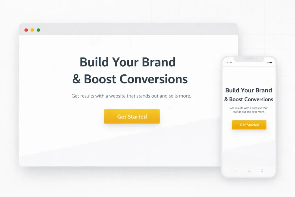
A brand-first site does three things at once: it helps people recognize you, trust you, and understand your offer. When visuals, voice, and flow match the promise you make elsewhere, your pages feel intentional rather than improvised. That makes the choice to contact you feel safe.
Recognition. A repeatable color palette, type system, and image style become a pattern visitors can spot in a second. Recognition shortens the path to recall in search results, social feeds, and referrals.
Trust. Real client proof, consistent tone, and tidy UI decisions create the sense that details matter to you. Visitors don’t have to guess what will happen next, which reduces friction and bounce.
Clarity. People act when they understand the benefits and next steps. Pages that prioritize scannable headlines, descriptive buttons, and clean spacing remove the noise that hurts conversions.
Want to see how a cohesive identity looks in action? Browse our portfolio and sample work.
For evidence behind these trust patterns, see usability research on credibility.
How To Apply Brand-First Design On Your Site
1. Nail Your Visual Identity System
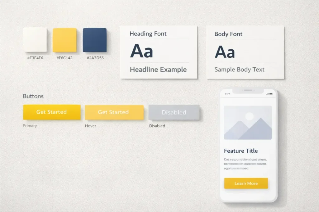
Pick three parts and stick to them everywhere: a primary color with two accents, a two-font stack, and a clear image style.
- Color. Choose one hero color for CTAs and two supporting accents for highlights and backgrounds. Check contrast so text is readable for everyone.
- Type. Use one display family for headlines and a legible sans serif for body text. Set base sizes and line-height for scannability.
- Images. Decide your look: product-on-light backgrounds, natural lifestyle shots, or illustrations. Keep lighting, crop, and filter consistent.
Practical tip: build a one-page brand sheet with hex codes, type sizes, button states, and sample cards. Tape it next to your screen. If a new element doesn’t match the sheet, redesign it.
2. Align Voice With Visuals
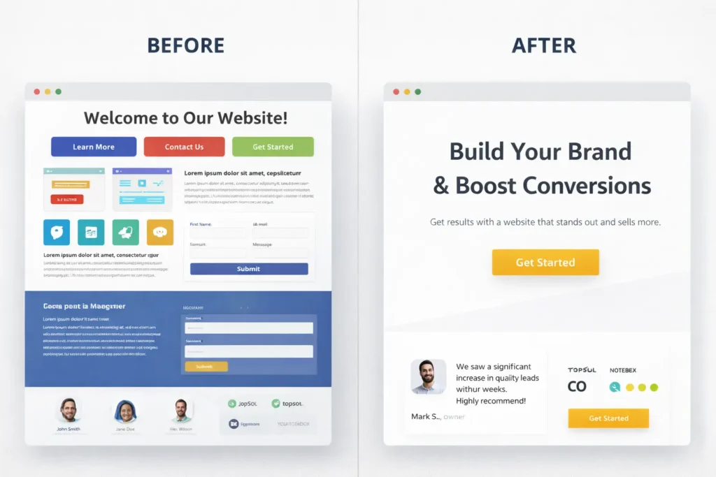
Your tone should match your visuals. If your look is minimalist and premium, use short, confident lines. If your look is warm and local, use friendly, helpful language. Write headings that deliver a benefit, not internal jargon.
Tiny rewrite example:
- Before: “Comprehensive Digital Solutions”
- After: “Get a site that brings in ready-to-buy leads”
3. Design Layouts That Guide Decisions
Use a predictable content rhythm across pages so returning visitors feel at home.
- Hero: outcome headline, supporting proof, one primary action.
- Value section: three proof-backed benefits.
- Evidence: testimonials, logos, numbers.
- Offer: plans or next step.
- FAQ or objections: answer quickly, with links to deeper pages.
- Footer: branded and helpful, not bloated.
Spacing drives clarity. If everything is loud, nothing is heard. Set comfortable spacing scales and reuse them. Visitors notice the calm.
4. Strengthen Navigation And Microcopy
Keep top-level nav to 5 items or fewer. Use labels customers say, not org-speak. For buttons, combine a verb with the value: “See pricing and timelines,” “Book a free consult,” “Get the checklist.”
Add microcopy near forms that answers the two quiet questions: What happens next, and how long will it take? This single change boosts completion rates because it reduces uncertainty.
5. Bake In Accessibility From Day One
Accessible design is good design. Maintain text contrast, ensure keyboard navigation, label form fields, and provide descriptive alt text for images. Accessibility helps more visitors use your site and builds brand equity over time.
6. Let Performance Support Your Promise
Slow sites feel sloppy. Compress images, preload key fonts, and avoid heavy scripts you don’t need. A fast, smooth site communicates operational excellence and improves conversions.
Why, How, And Which Option Is Best For You
Why this works: it matches visitor expectations with brand signals at every scroll. People decide with their eyes in seconds, then look for proof to confirm the feeling.
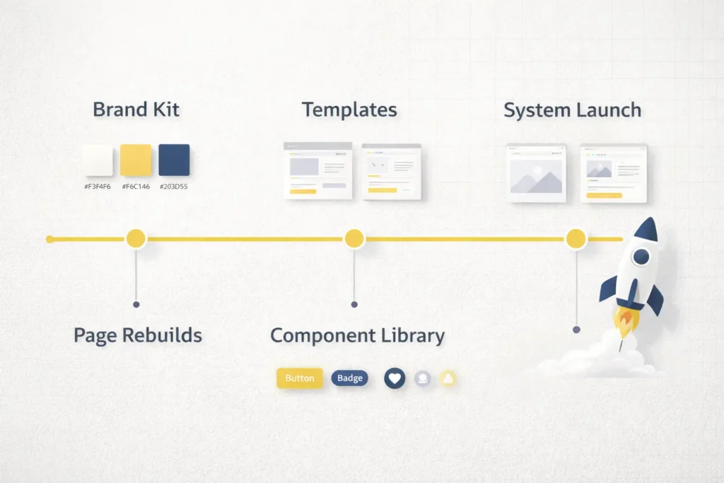
How to make it stick: document your system and apply it consistently across templates. Build once, reuse everywhere.
Which option to choose depends on your stage, goals, and timeline. The table below maps common scenarios to the moves that deliver value fastest.
Table 1: Brand Goals Mapped To Design Moves
| Brand Goal | Most Effective Design Move | Real-World Example |
| Look premium without confusion | Reduce color count to one primary CTA color, tighten spacing, and simplify hero copy | A boutique agency shifted to a single accent color and benefit-led headline. Inquiries rose because the page felt calmer and high-end. |
| Improve lead quality | Add proof blocks near CTAs and refine form microcopy to set expectations | A service firm added testimonial sliders near the contact form. Fewer unqualified inquiries, more serious prospects. |
| Increase recall in local search | Reuse color, icon style, and city-specific imagery consistently | A local contractor used the same palette and skyline photos across the homepage and service pages. Recognition improved in map packs. |
| Shorten decision time | Standardize the layout rhythm so visitors learn the pattern | A SaaS site kept the same section order across feature pages. Users scanned faster and clicked primary CTAs more often. |
For deeper planning on copy and structure, see our internal resource on web design content strategy.
Practical, Doable Plays You Can Ship This Week
- Create a one-sheet brand kit. Include hex codes, type scales, button styles, link states, icon rules, and card variants. Share it with anyone who touches your site.
- Refactor your CTA buttons. Pick a single hero color and apply it to all primary CTAs. Change copy to combine verb + value. Remove secondary buttons in heroes.
- Rebuild one high-value page using a consistent rhythm. Keep the hero short, follow with three benefit cards, then proof, then a clear next step.
- Add trust-on-demand. Put testimonial blurbs or star ratings within 200 pixels of each form. If you sell services, add a short “What happens next” note below the button.
- Use local cues where it matters. If you serve a region, include place names and imagery in the hero and footer. Support with content like this internal guide on local SEO web design tips.
Color And Type Choices That Convert
Color psychology is often overstated, but clarity is not. Your primary color should make CTAs stand out against your backgrounds. Keep supporting colors for highlights only. Ensure text contrast meets readable standards, so your content works for everyone.
Validate your palette with the WCAG color contrast guidelines to keep CTAs readable across devices.
For inspiration on contrast and legibility guidelines, review industry standards and apply them to your palette. Keep display fonts for headlines while body text stays legible at small sizes. Avoid decorative scripts for paragraphs, especially on mobile.
Quick check: Open your homepage on a phone. Do your buttons look tappable and readable in sunlight? If not, adjust color contrast and size.
Your Roadmap: Which Option Fits Your Stage
Different stages call for different scopes. Use the table to choose the right path now, then plan a deeper revamp later.
Table 2: Stage-Based Options, Focus, And Typical Investment
| Your Stage | Primary Focus | What To Ship | Typical Timeline | Who Should Own It |
| Early-stage or rebrand pilot | Systemize the basics | One-sheet brand kit, updated hero, unified buttons, proof near forms | 2–4 weeks | In-house with a design partner |
| Growing with traction | Consistency across key pages | Rebuild 3–5 revenue pages with shared components and patterns | 4–8 weeks | Web designer + copywriter |
| Established brand, multiple offers | Design system and templates | Full component library, page templates, performance pass | 8–12 weeks | Product owner + agency |
| Multi-location or complex services | Scalable content and local signals | Location templates, structured proof, accessible patterns | 12+ weeks | Internal team + long-term partner |
Curious what this looks like end-to-end. Check our web design services for scoped packages and clear timelines.
Smart Linking And Content Architecture
Internal linking is a branding tool. Use descriptive anchor text, not “click here.” Connect related posts to your core pages so visitors can dive deeper without feeling lost. A clean cluster strengthens topical authority and keeps your brand voice consistent across touchpoints.
As you plan content, emphasize problems your audience already feels, then show outcomes with examples and proof. For small businesses, this balance of empathy and evidence is often the difference between a bounce and a booking.
If you need a benchmark for page usability and credibility, study trusted usability research and adopt the patterns that align with your brand’s promise. Keep improving based on what your analytics tell you, not on trends alone.
Frequently Asked Questions
1. What are the most important web design elements that influence brand perception?
Clear hierarchy, consistent visuals, and visible proof shape brand perception the fastest. Start with a clean hero that states the outcome, use a repeatable palette and type system, and place testimonials near key actions. Add helpful microcopy around forms so users know what happens next. Keep pages fast and accessible. These choices send one message: you take quality and details seriously.
2. How do I align website visuals with our brand voice without redesigning everything?
Update the system, not every page, then cascade the changes. Build a one-sheet kit with colors, type scales, buttons, and card styles. Swap in the new components on your highest-traffic pages first. Rewrite headlines to express a clear benefit in your brand’s tone. Replace stock images with your chosen image style. Over a few sprints, the site will feel unified without a full rebuild.
3. What’s the best way to choose brand colors for a site that converts?
Pick one primary CTA color and ensure strong contrast against backgrounds. Use two supporting accents for highlights only. Test on mobile in bright light and in dark mode if you support it. Keep text readable and avoid color-only signals for states. Tie imagery and icons to your palette so the whole page feels connected. When CTAs are the highest-contrast element, clicks become easier.
4. How can small businesses improve brand credibility through layout and content?
Show proof early and explain the next step in plain language. Put logos, star ratings, or short testimonials close to your hero and forms. Use simple sections that show outcomes and add a short “What happens next” line near CTAs. Keep navigation focused, avoid clutter, and ensure pages load quickly. A calm, predictable layout makes you look established without bloating the site.
5. Which metrics show that branding-focused design changes are working?
Watch a mix of clarity and trust indicators: time on page, scroll depth, CTA clicks, form completion rate, and assisted conversions. Track brand search volume and direct traffic for recall. Compare the first-visit conversion rate before and after design passes. If bounce rates fall on high-value pages while qualified inquiries rise, your branding choices are doing their job.
Additional Resources To Deepen Your Work
Reinforce your learning with credible, practical guides on usability and accessibility so your brand choices support real people in real contexts. Adopt the patterns that match your promise and skip the rest. When you pair strong identity with proven usability, you earn both recall and revenue.
Closing Thoughts: Web Design Branding Tips That Actually Ship Results
Branding only works when it is experienced, not just documented. Start with a simple system, apply it to the pages that drive revenue, and keep polishing based on real user behavior. If you want help building a consistent identity that people trust and remember, our team can map your next steps and deliver the components you can reuse everywhere.
Explore examples of cohesive identity in action in our portfolio and sample work, and see how we scope projects in web design services.