A website that converts visitors makes the next step obvious, reduces hesitation, and gives people enough proof to act. It turns traffic into inquiries, bookings, and sales by aligning message, design, speed, and trust signals on every key page.
For small businesses, that usually means clear positioning, stronger calls to action, faster load times, fewer distractions, and pages built around intent instead of guesswork.

If your site gets traffic but too few leads, the problem is rarely just “more design.” It is usually a conversion gap. Visitors land on a page, scan for relevance, look for proof, and decide whether the next click feels worth it. If any part of that path feels confusing, slow, or risky, they leave.
That is why conversion-focused web design matters. A beautiful site can still underperform if the messaging is vague, the forms are too long, the mobile layout feels clunky, or the offer is buried under too many options.
For businesses that want stronger results, working with conversion-focused web design or reviewing your current website design & development services can help you spot where visitors drop off and why. It also helps to study your own project gallery so your next redesign is grounded in real outcomes, not trends.
Why do some websites get traffic but fail to convert
A lot of websites are built to “look complete” rather than to guide decision-making. They have a homepage, services page, contact page, maybe a blog, but they do not create momentum.
The first issue is weak positioning. If a visitor cannot tell within a few seconds who you help, what you do, and why your offer is different, they will not keep working to figure it out. The second issue is friction. Too many menu options, vague buttons, long forms, and wall-of-text sections force people to think harder than they should.
There is also the trust problem. Buyers compare fast. They look for proof like testimonials, sample work, guarantees, recognizable processes, and a consistent brand experience. Nielsen Norman Group notes that homepages should guide users toward their goals with clarity and precision, rather than relying on vague presentation alone.
Google also recommends strong page experience and good Core Web Vitals because real-world loading performance, interactivity, and visual stability affect how people experience a site. Google states that Core Web Vitals are used by its ranking systems, while also emphasizing that page relevance still matters most.
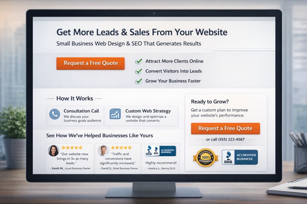
What a high-converting website actually does
A high-converting site does not try to say everything at once. It helps one audience take one next step on one page.
That starts with a message match. If someone searches for a web designer for a small business, they should land on a page that speaks directly to small business goals, timeline, pricing expectations, and outcomes. If the page feels generic, conversion drops.
It also requires a visible CTA. Buttons should not sound like filler. “Learn More” is often too weak when “Book a strategy call” or “Get a free website audit” is more specific. That does not mean every page needs the same CTA, though. A homepage might move people to a service overview, while a service page should move them closer to contact or booking.
Then comes proof. People want reassurance that your process works. Screenshots, case studies, testimonial snippets, measurable before-and-after improvements, or even a short “what happens next” section can lower perceived risk.
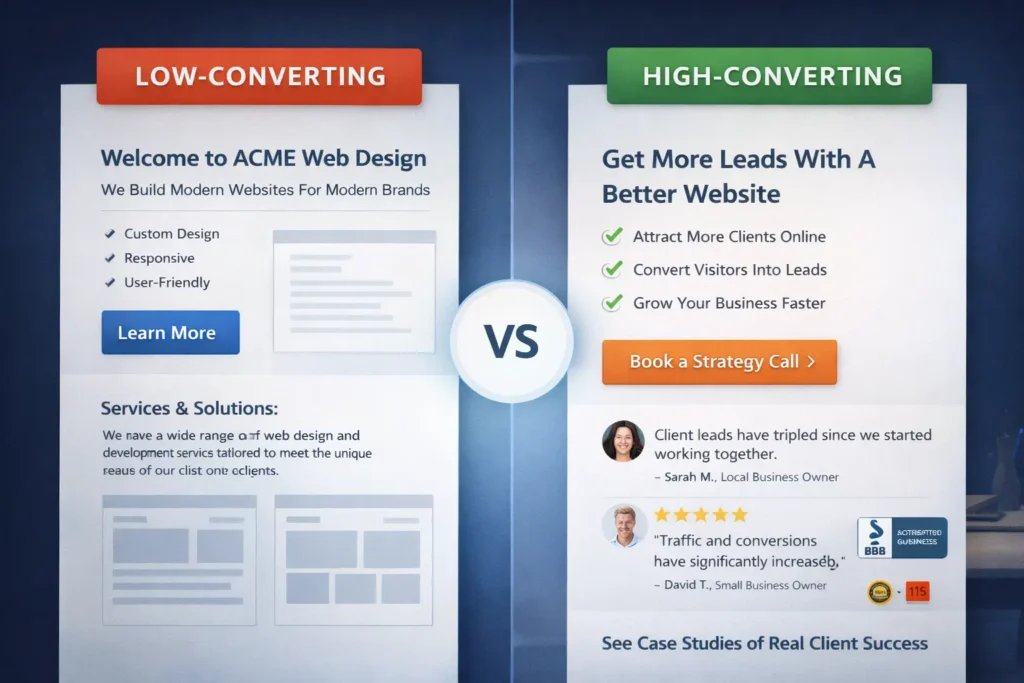
Quick comparison table ✅
| Element | Low-converting version | High-converting version |
| Headline | General and brand-focused | Specific and benefit-led |
| CTA | “Learn more” | “Request a quote” or “Book a call” |
| Layout | Crowded and unfocused | Clear sections with one main path |
| Trust | Little proof | Testimonials, samples, process, FAQs |
| Mobile UX | Hard to scan | Easy tap targets and short sections |
| Forms | Too many fields | Short, relevant, easy to complete |
How to design pages that move visitors to action
Design should support decisions, not decorate them. That starts above the fold. Your first screen should answer three things quickly: what you do, who it is for, and what the visitor should do next.
A strong hero section usually includes a sharp headline, one sentence of context, one primary CTA, and a small trust layer below it. That trust layer can be a short review excerpt, a list of client types, or a note about project delivery and turnaround.
Next, structure the page around natural objections. Instead of writing broad paragraphs, think about the questions visitors silently ask:
Will this work for my business?
How is this different from alternatives?
What is included?
How long does it take?
What happens after I contact you?
Answering those questions in sequence keeps people moving. It also improves scannability, which matters on mobile.
A practical model is this:
Problem → outcome → process → proof → CTA
This is why pages that convert well often feel simple. They are not missing information. They are arranged in the order buyers need.
If your current site has mixed messages, unclear sections, or old pages that no longer reflect your offer, a targeted redesign often works better than patching random blocks. That is one reason many businesses start with redesign and migration services instead of trying to fix a poor conversion page by page.
Which pages matter most for conversions
Not every page carries the same conversion weight. Many businesses spend too much time polishing low-impact pages while ignoring the pages that influence revenue.
The homepage is important, but it is not always the top converter. In many cases, your service pages, landing pages, and contact page do more of the heavy lifting. A blog can support conversion too, but only if it leads readers somewhere relevant.
Here is the order I would prioritize for most service-based businesses:
Page priority table
| Page Type | Main Job | What to improve first |
| Homepage | Clarify brand and direct traffic | Headline, CTA, trust, navigation |
| Service page | Convert intent into inquiry | Offer clarity, outcomes, FAQs, and proof |
| Landing page | Capture focused traffic | One offer, one CTA, minimal exits |
| Contact page | Remove final friction | Short form, response expectations |
| Blog post | Support awareness and intent | Internal links, CTA relevance, readability |
Your related blog content should not sit isolated. It should support the money pages. For example, a post like why your website does not rank can naturally feed readers into your core services. A topic like lead generation landing page strategies can move readers toward a conversion-focused redesign or lead capture audit.
That internal path helps users and strengthens topical relevance, which is useful for SEO and for on-page engagement.
The role of speed, UX, and trust in higher conversions
Many business owners separate SEO from conversion, but users do not. They experience one website, one session, one impression.
If your page shifts while loading, buttons jump, or content takes too long to become interactive, users lose confidence. Google defines Core Web Vitals around loading performance, interactivity, and visual stability, and recommends that site owners achieve good results for user experience and search success.
That does not mean speed alone will save a weak offer. It means slow, unstable pages make a good offer harder to trust.
UX matters the same way. Nielsen Norman Group highlights the homepage as a critical page that should guide users with clarity and precision. When navigation, copy, and page hierarchy fail to do that, visitors feel friction before they ever reach your contact form.
Trust signals also deserve more attention than most sites give them. Useful proof can include:
✅ one-line testimonial snippets near CTAs
✅ sample work previews linked to fuller portfolio pieces
✅ response-time expectations on contact forms
✅ process steps that reduce uncertainty
✅ real photos of the team or work environment
These details make a site feel safer to act on. That is especially important for local businesses and service providers, where trust is often the real conversion driver.
How to convert website visitors into leads
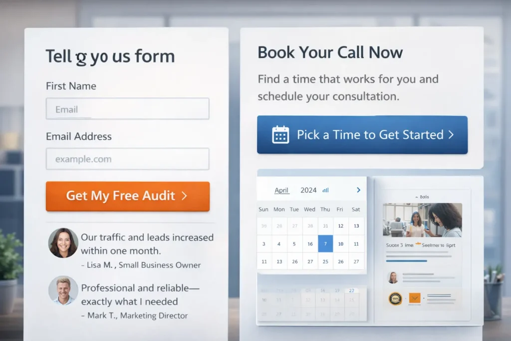
Lead generation becomes easier when the ask matches the visitor’s intent. Someone ready to buy may book a call. Someone still comparing options may prefer a quote request, audit, checklist, or sample review.
This is where many websites lose leads. They only offer one high-commitment CTA, usually “Contact us,” and assume every visitor is ready for it.
A better approach is to create conversion layers. Your service page can have a primary action like consultation booking, and a softer secondary action like a free audit or portfolio review. HubSpot recommends testing form placement and keeping form length aligned with the value of the offer, rather than asking for more than necessary too early.
In practical terms, that means:
A homepage CTA can direct people to your best-fit service page.
A service page CTA can offer a consultation or audit.
A blog CTA can offer a related next step tied to the article topic.
A contact form should ask only for what your sales process truly needs.
If your goal is lead generation, forms should feel like progress, not paperwork.
What is a good conversion rate for website visits?
The honest answer is that a good conversion rate depends on traffic source, offer quality, buyer intent, and page type. A service page, homepage, and dedicated landing page should not be judged by the same baseline.
That said, broad benchmarks are still useful as context. Unbounce reported a median landing page conversion rate of 6.6% across industries based on Q4 2024 benchmark data. Hotjar notes that conversion rates often vary by industry, with 2% to 5% generally considered good in many contexts, while HubSpot cites Statista data showing average ecommerce conversion rates are under 2%.
So if your business website converts at 1%, that may be fine for a cold traffic campaign with a premium service and long sales cycle. If a targeted landing page for a warm audience converts below 2%, you likely have room to improve the offer, page clarity, or CTA path.
The better question is not just “what is good?” but “where are people dropping off?” That is where audits matter more than averages.
Common fixes that improve conversion faster than a full rebuild
You do not always need a total redesign to improve results. Sometimes the highest-impact gains come from tightening a few core areas.
A stronger headline can improve message match faster. Rewriting generic hero copy into audience-specific language often changes bounce behavior quickly. Simplifying navigation can help too. If people see too many routes, they delay action.
Another fast win is reducing form fields. If your contact form asks for company size, budget, timeline, goals, phone number, and project details before trust is established, you may be filtering out good leads too early.
You can also improve conversion by strengthening the section right before the CTA. A testimonial, “what happens next” note, or mini case result can help hesitant buyers cross the line.
Here is a simple before-and-after example:
Before: “We create beautiful websites for modern brands.”
After: “We design small business websites built to generate more inquiries, better leads, and faster trust.”
The second one is clearer, more outcome-led, and easier to connect to business value.
External resources that strengthen this topic naturally
When you want to go deeper, it makes sense to reference trusted resources that align with page quality and conversion logic. Google’s guide to Core Web Vitals is useful for understanding performance and page experience in practical terms. For form optimization, HubSpot’s overview of llead form best practices is a helpful companion if you want to test form length, placement, and friction.
These kinds of sources support topical trust without pulling readers away from your main point.
Final thoughts on building stronger conversion pages
The best-performing business websites are not the ones with the most animations, the longest copy, or the fanciest layouts. They are the ones who make decisions easy. They say the right thing, to the right person, at the right moment, then back it up with proof.
If your traffic is steady but leads feel inconsistent, start by reviewing the pages that carry buying intent. Clarify the offer, strengthen the CTA, shorten the path, and remove obvious friction. Those changes often do more than a visual refresh alone.
A website that converts visitors is built around relevance, trust, and momentum. When those three work together, your site stops acting like a brochure and starts acting like a sales tool.
Frequently Asked Questions
How to design a website that converts visitors into customers?
Design for clarity before style. A converting website should make the offer obvious, show who it is for, and guide people toward one clear next step. That means using a strong headline, specific service benefits, visible calls to action, trust-building proof, and a page structure that answers objections in order. Good design supports decision-making. It should not make visitors work harder to understand your value.
How to convert website visitors into leads?
Turn interest into a low-friction next step. Most visitors do not become leads because the ask feels too big, too vague, or too early. Offer a CTA that matches intent, such as a quote request, free audit, or consultation. Keep forms short, place them near trust signals, and explain what happens after submission. When the path feels simple and low-risk, lead conversion usually improves.
What is a good conversion rate for website visits?
A good conversion rate depends on the page type and traffic quality. For many websites, 2% to 5% can be a useful general target, while focused landing pages may perform higher depending on the offer and audience. The more important metric is whether your own conversion rate is improving over time and whether the leads are qualified. Benchmark context matters, but page intent matters more.
How to turn visitors into customers?
Move people from curiosity to confidence. To turn visitors into customers, your website needs more than traffic. It needs a strong message match, clear service positioning, proof that you can deliver, and a next step that feels worth taking. That usually means better service pages, simpler navigation, faster mobile performance, and stronger follow-up after the inquiry. Conversion happens when clarity and trust meet timing.