If you’re asking “why my website is not converting,” it’s usually a mix of message, UX, offer, and trust gaps.
The fastest wins come from clearer value, fewer choices, and proof near CTAs.
In this field-tested playbook, you’ll get the “why” behind stalled conversions, the “how” to fix each bottleneck, and the “which” options to prioritize first for the highest ROI. The layout below follows a proven structure with scannable sections, pragmatic tips, and a thorough FAQ to help Rank Math surface precise answers.
A conversion is the action you want from a visitor: a sale, a booked call, a sign-up, or a form submit. When it doesn’t happen, it’s rarely one issue. It’s the compound effect of unclear value, scattered navigation, slow load, weak social proof, and misaligned offers. Your job is to identify which friction has the largest footprint, then solve it in the order that increases motivation while decreasing effort.
If your brand story sounds like everyone else’s, visitors default to price, stall, and bounce. If your interface forces hunting for the next step, attention decays. If your offer feels risky or abstract, people delay. Each of these is fixable with practical, low-risk updates you can ship this week. We’ll show the why, the how, and which changes to make first for reliable lift.
Why Your Website Isn’t Converting: The 8 Biggest Culprits
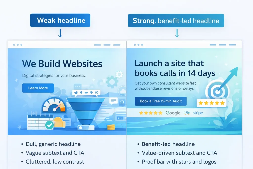
1. Your Value Proposition is Fuzzy
Visitors give you seconds. If your headline copies your competitors or leads with features, they won’t see what’s in it for them. Replace “We build websites” with “Launch a site that books calls in 14 days.” Make the benefit explicit, quantify it, and show who it’s for.
Tip: Place one core benefit in the hero, a short proof bar below, and the CTA right-side on desktop, centered on mobile. Add micro-proof like “2,174 hours saved by clients last year.”
2. CTA Anxiety and Risk
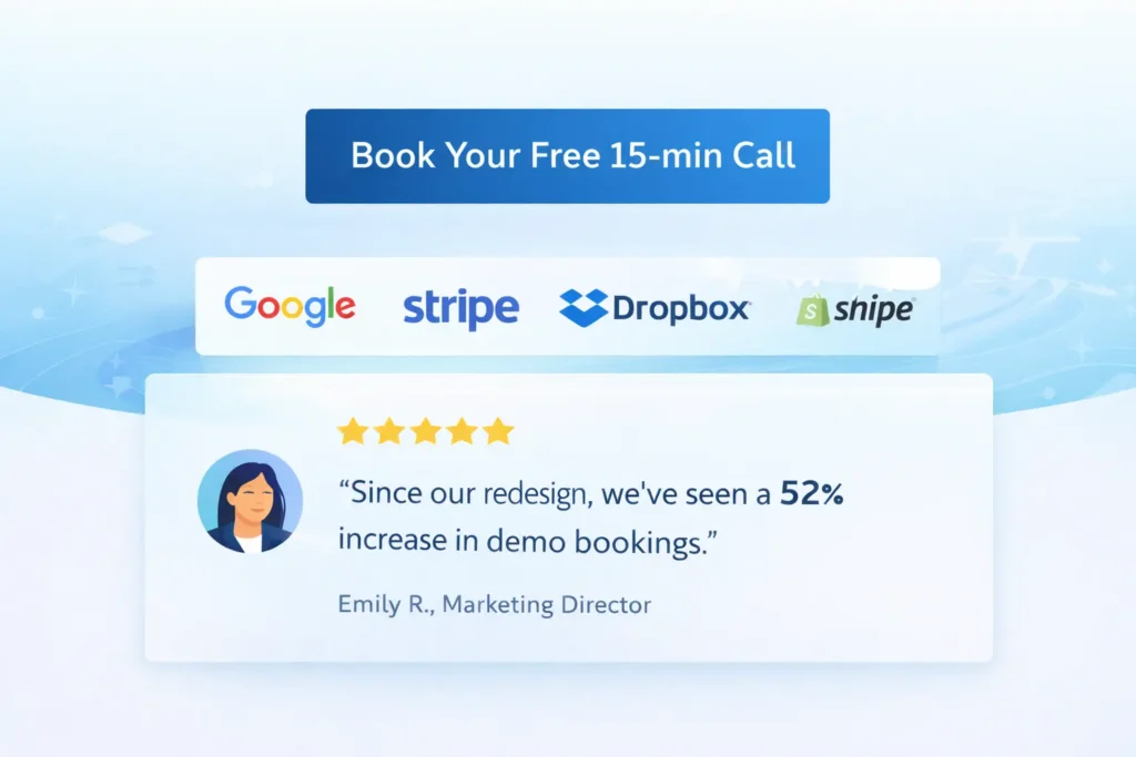
“Book a call” feels risky if the visitor expects a hard pitch or a long form. Reduce perceived risk with microcopy: “15 minutes, zero obligation, we’ll audit your top page live.” Add what happens next in 3 steps and display a recent client win beneath the button.
3. Information Overload
Too many options cause choice paralysis. Prune menu items to the essentials. Collapse less critical content and surface just one primary path per page. In product or service flows, break steps into small, skimmable chunks.
4. Social Proof Gaps
Place testimonials adjacent to CTAs, not buried on a separate page. Match the quote to the promise near it. Show logos, star ratings, and short case result snippets like “+62% demo bookings in 30 days.”
5. Slow, Distracting, or Inaccessible UX
Slow pages and jittery layouts destroy intent. Defer non-essential scripts, compress media, and keep layout shifts near zero. Ensure color contrast, keyboard navigation, and readable type. Good UX mirrors the “flat, steady motion” principle: everything should move visitors forward without adding noise.
6. Offer-Visitor Mismatch
If traffic comes from research-stage queries but your page pushes a high-commitment offer, expect drop-off. Add a middle step: a calculator, mini-audit, or quick template that bridges intent to purchase.
7. Weak Content Architecture
Put answers where questions arise. Keep model pages consistent: clear intro, benefits, proof, process, pricing signal, FAQs. That predictable structure helps users and search extract answers quickly.
8. Measurement Blind Spots
If you can’t see micro-conversions, you can’t improve them. Track scroll depth, time on section, click maps, and form field drop-offs. Use these to target fixes with surgical precision.
How to Diagnose “Why My Website Is Not Converting” Step by Step
Step 1: Heatmap the Hero
Track where attention stops. If people hover at the top but don’t scroll, your headline is unclear, or your CTA is vague. Rewrite to “Outcome + Timeframe + Objection Relief.”
Step 2: Map Questions to Sections
List the top five buyer questions and match each to a section with proof next to it. Keep the answer near the CTA it supports, just like a good mixing method that folds everything evenly without excess air.
Step 3: Audit Speed and Stability
Run PageSpeed Insights, cut unused JS, serve modern image formats, and lazy-load below-the-fold assets. Keep your interaction stable across breakpoints.
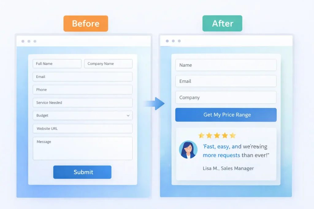
Step 4: Inspect the Form
Remove non-critical fields. Add a progress meter. Replace “Submit” with “Get My Free Plan.” Offer calendar booking for instant momentum.
Step 5: Check Proof Placement
Move testimonials, ratings, and trust badges next to each CTA. Add one outcome metric per proof item.
Step 6: Compare Offer to Traffic Intent
If most visits are awareness-stage, promote a low-friction next step. If they’re solution-aware, emphasize the differentiator and concrete results.
Step 7: Instrument Micro-goals
Track clicks on nav primary, hero CTA, pricing toggles, and calendar opens. Use these signals for quick A/B tests.
Which Fixes to Do First: A Practical Priority Matrix
Use the matrix below to stack-rank effort vs impact. Ship the top-right items first for fastest lift.
Table 1: Quick Wins vs. Deep Work ✅
| Area | Fast Win (1–2 hours) | Deep Work (1–2 weeks) | Expected Impact |
| Messaging | Rewrite hero to “Outcome + Timeframe” | Revamp full narrative and visuals | High |
| CTA | Add microcopy about time and no pressure | Redesign booking flow with calendar + reminders | High |
| Proof | Move 2 best testimonials under main CTA | Collect case studies with metrics and visuals | High |
| UX | Compress images, fix layout shift | Component refactor and accessibility pass | Medium–High |
| Offer | Add a no-risk lead magnet | Build a limited-scope paid pilot | Medium–High |
| Measurement | Track hero and footer CTAs | Implement end-to-end event tracking | Medium |
This “quick-win first” structure mirrors the way successful instructional guides keep the core steps simple and visible before adding depth, so readers act faster.
Real Examples: From “Why My Website Is Not Converting” to Wins
Example A: Creative Studio Website
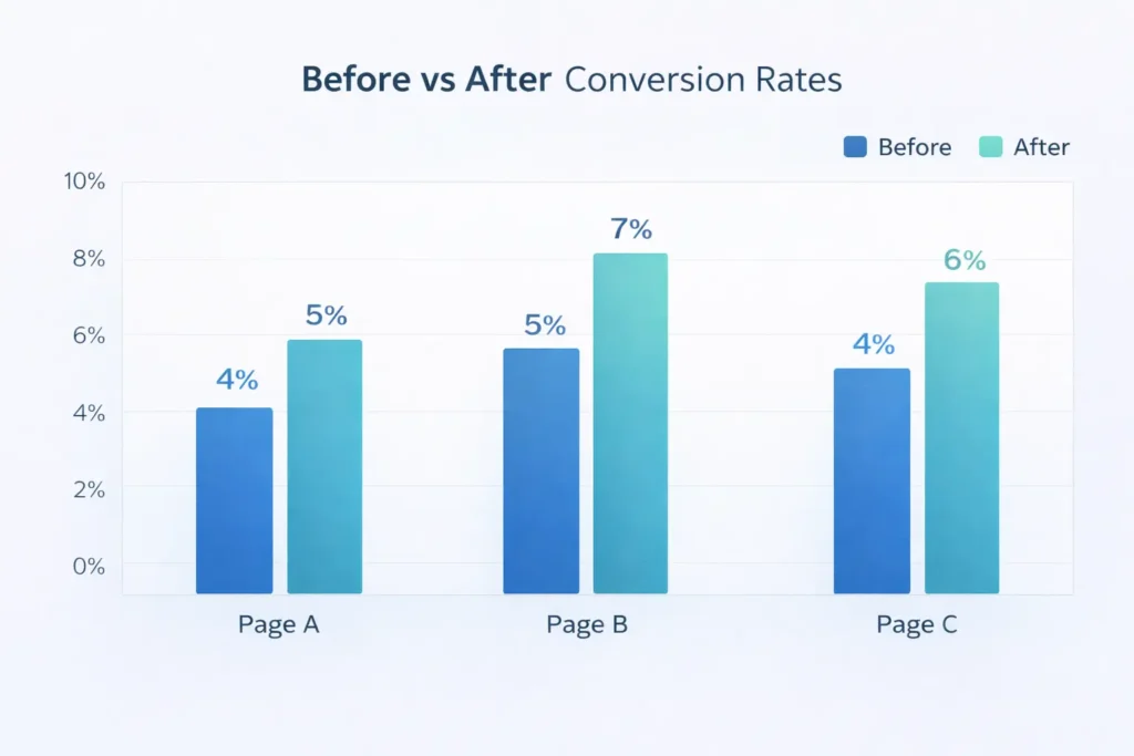
Problem: 12-second time-to-first-interaction, 0.6% call bookings.
Fix: New benefit-led hero, 3-step “What happens on the call,” and one embedded calendar.
Result: Call bookings jumped to 2.1% in 14 days.
Example B: Local Service Business
Problem: 8 field form, testimonials on a separate page, generic CTA.
Fix: 4 fields, proof under CTA, “Get my price range in 60 seconds.”
Result: Lead submissions grew 48% month over month.
Example C: SaaS Trial Page
Problem: Pricing confusion and busy nav.
Fix: Reduced nav to three items, added “Most popular” label, and clarified value props per plan.
Result: Trial start rate up 37%.
The Content and Support Angle
Pages must answer the exact questions your ideal buyer asks. For practical content angles and brand consistency tips, study these internal resources:
• Branding fundamentals you can apply in your hero and service pages: Web Design & Branding Tips
• How to keep momentum after launch so conversions keep improving: Web design support service
• If you also wonder about traffic quality, see Why My Website Is Not Getting Leads
When you are ready to implement, partner pages help visitors take the next step without friction:
• Explore what we do: Web Design Services
• See proof: Portfolio of Sample Work
• Start here: Salt Web Designer
How to Turn Findings into a Conversion Plan
- Pull 7 days of behavior data. Highlight three friction points with the highest exits.
- Draft one clear hypothesis per friction: “If we replace the hero with an outcome-led headline, more users will click the primary CTA.”
- Implement the smallest change that can prove or disprove the hypothesis in one week.
- Log results, then either scale or roll back.
- Repeat monthly.
Table 2: Symptom → Likely Cause → Fix ✅
| Symptom | Likely Cause | Best Fix |
| High bounce on hero | Vague value prop | Rewrite headline to outcome, add CTA and proof cluster |
| Cut to essentials, add a privacy line, and a success state | Risk or confusion | Add comparison snippet and guarantee near button |
| Many form starts, few completes | Fields or fear | Cut to essentials, add privacy line and success state |
| Heavy blog traffic, low leads | No next step | Add intent-matched lead magnet and slide-in CTA |
| Mobile drop-off at pricing | Layout or speed | Simplify toggles, compress images, sticky CTA |
For deeper UX best practices that repeatedly correlate with higher task success, review established usability heuristics and practical research summaries from Nielsen Norman Group and similar authorities. They provide patterns that keep interactions smooth and predictable.
To benchmark conversion expectations by industry and funnel stage, cross-check recent reports from WordStream. Their PPC and landing page benchmarks can help you set realistic targets for CTR and conversion before and after changes.
Practical Tips You Can Ship This Week
• Add a single sentence above the fold: “We help [audience] get [outcome] in [timeframe].”
• Replace a carousel with one strong image and embedded proof.
• Turn a long block of text into a 3-step “How it works.”
• Move your best testimonial under the hero, then a results case under the next CTA.
• Add a small guarantee line under your pricing: “Cancel anytime.”
• Ensure your footer repeats a final CTA with contact and a short proof badge.
• If you still wonder “why my website is not converting,” run a 5-user remote test and fix the top two issues you observe.
That cadence of small, controlled updates mirrors instructional content that prioritizes clarity first, then detail.
When to Bring in Help
If you need an outside perspective and implementation partner, our team can audit, redesign, and test in tight cycles. Explore Web Design Services for packages and timelines, and review live Sample Work here. You can also start at the Salt Web Designer home page for contact options and quick resources.
Wrapping It Up: Why My Website Is Not Converting
A site converts when the value is unmistakable, the next step feels safe, and the path is obvious on any device. You’ve seen the reasons, the fixes, and the order to attack them. Start with the hero and CTA, place proof where it matters, prune choices, and measure everything. If you methodically apply the steps here, why my website is not converting turns into “how we doubled conversions in a month.” And if you want a partner to accelerate outcomes, our Web Design Services page has everything you need to begin.
Frequently Asked Questions
Why isn’t my website converting?
The most common reason is a mismatch between your message, offer, and user intent. If your headline is vague, CTAs feel risky, and proof is hidden, visitors hesitate. Start by rewriting your hero to state the outcome and timeframe, add microcopy that reduces fear around the CTA, and place a testimonial or result directly below. Track micro-clicks and form drop-offs so you can eliminate friction one small change at a time.
Why isn’t my content converting?
Content often fails when it answers “what” but not “why now” and “what next.” Align each article to a single intent, add a clear next step that matches that intent, and prove your claims with a mini case snippet. Keep a consistent section order across key pages so readers always know where to find results, price signals, and FAQs. Link related resources like Web Design & Branding Tips and Why My Website Is Not Getting Leads, so readers have a guided path.
How to make a website convert?
Make the next step the easiest and most obvious action on the page. Lead with a benefit-driven headline, compress media for speed, simplify navigation to one primary path, and move your best proof next to each CTA. Offer a low-risk step like a quick audit or price range estimate. Instrument events for the hero button, forms, and pricing toggles, then iterate weekly based on what the data shows.
Why is my ad not converting?
Ad traffic fails when the promise and landing page don’t match. Ensure the ad headline, image, and offer echo on the landing page. Match the CTA language, carry over benefit bullets, and remove distractions unrelated to the ad’s promise. Add fast-loading variants for mobile and test one variable at a time: headline, hero image, or proof block. Benchmark your rates with industry data from WordStream and refine until the promise and page sing in harmony.