A gym membership website should make it easy for people to understand your plans, trust your brand, and take action without friction. When the message is clear and the booking path feels simple, your site can support memberships, tours, trials, and local search visibility at the same time.
Many gym sites lose leads because they look fine but force visitors to hunt for pricing, class details, or the next step. The stronger approach is to guide people from interest to action with a cleaner structure, more useful proof, and fewer decision points.
Why this kind of site matters for growth
A membership site is not just a digital brochure. It is part sales page, part front desk, part local search asset, and part trust builder. Someone visiting your site may be comparing you with two or three nearby gyms, looking for pricing, checking class variety, or deciding whether your brand feels welcoming enough to try.
That is why the page order matters. The copy matters. The buttons matter. Even the small details, like whether a visitor can view the schedule before filling out a form, affect whether that person stays or leaves.
A strong site does three things well. First, it explains the offer quickly. Second, it reduces hesitation with social proof, visuals, and transparent information. Third, it gives every visitor a logical next step, whether that is joining online, booking a tour, starting a free pass, or asking a question.
When those pieces work together, your website stops being a passive asset and starts helping your team sell every day.
What should each core page do?
Not every gym needs dozens of pages. Most need a tighter structure with pages that each carry a clear job.
| Page | Main Goal | What to Include |
|---|---|---|
| Home | Create trust and move visitors to action | Clear headline, short value proposition, preview of plans, social proof, location info, primary CTA |
| Memberships | Help people compare options fast | Simple plan layout, inclusions, which option fits, FAQs, and join button |
| Classes or Services | Show variety and relevance | Schedule preview, class types, coaching details, beginner-friendly guidance |
| About | Build confidence | Story, team photos, mission, facility highlights, brand tone |
| Contact or Visit | Remove final hesitation | Map, hours, parking details, contact options, tour CTA |
The home page should not try to explain everything. It should prove relevant fast and send people toward the next page with intent. Your memberships page should do the heavy lifting for decision-making. Your classes or service page should answer the question, “What can I actually do here?” And your visit page should make showing up feel easy.
This is also where internal link placement helps. When a visitor is reading about conversion-focused design ideas, it makes sense to lead them toward relevant proof and implementation. A natural way to do that is by pointing them to your project gallery once they are ready to compare layouts and user flow examples.
Why visitors join or leave in the first scroll
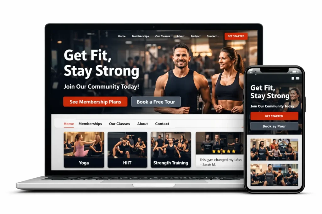
The first screen of your site should answer four silent questions immediately: What is this place, who is it for, where is it, and what should I do next?
If your headline is vague, your hero image feels generic, or your buttons are buried, visitors start working too hard. That is when they leave and keep searching. A good hero section is specific enough to feel local and relevant. Instead of broad language, focus on what the visitor actually wants: better training, flexible memberships, beginner support, class variety, coaching, or a clean place to work out near home or work.
The call to action matters just as much as the message. “Get Started” is acceptable, but more direct options usually do more work. “See Membership Options,” “Book a Free Tour,” and “Start Your Trial” tell the user exactly what happens next.
Trust signals should appear early, too. This can be a short review snippet, a trainer credential, a photo of the facility, a local landmark reference, or a note about what makes your gym different. The goal is not to overload the page. It is to reduce uncertainty before the visitor has to scroll too far.
A lot of gyms also benefit from showing a short preview of plans on the home page. Not the full pricing breakdown, just enough to tell people that memberships exist, there are options, and they can click for more detail. That keeps the first scroll useful without making it crowded.
How to present membership plans without creating confusion
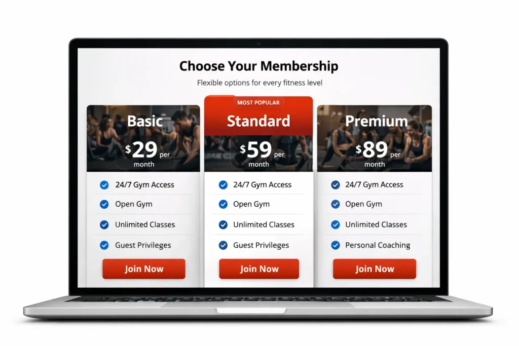
The memberships page is usually where a good lead becomes a paying member, or where a ready buyer disappears. The reason is simple: people want clarity more than cleverness. If plans are hard to compare, full of hidden differences, or wrapped in vague labels, the page adds friction instead of reducing it.
Start with a small number of planned paths. For example, you may have one plan for open gym access, one for classes, and one for premium coaching support. That is easier to scan than seven similar-looking cards with subtle differences. Make sure each plan answers three things clearly: what is included, who it suits best, and what the next step is.
It also helps to label plans in plain language. Visitors should not need to decode branded package names just to know whether they can attend classes, bring a guest, or pause membership. Small notes like “best for beginners,” “best for busy schedules,” or “best for accountability” can guide people without making the page feel pushy.
A strong plan section usually works better when it includes:
✅ what is included
✅ whether there is a contract or a flexible option
✅ any joining fee or trial details
✅ the next action, such as join, inquire, or book a visit
Transparency builds momentum. If you do not want to publish exact pricing, you can still explain the structure clearly. For example, you can say that plans are monthly, tiered by access level, and available with optional coaching add-ons. That still helps the visitor evaluate fit.
Which option works best for different gym models
The best site setup depends on how your gym actually sells. A boutique studio, a strength gym, and a larger membership club do not need the same primary flow.
| Gym Type | Best Primary CTA | Best Secondary CTA | Why It Works |
|---|---|---|---|
| Boutique studio | Book a class | View membership plans | Class-first intent is usually strongest |
| Traditional gym | View memberships | Book a tour | Visitors often compare value and facility quality |
| Coaching gym | Book a consultation | Learn about programs | Higher-ticket offers need more trust before purchase |
| 24/7 access gym | Join online | See access details | Convenience and speed are major selling points |
This is where strategy matters more than design trends. If your gym closes most sales after a tour, your site should support that reality instead of forcing instant checkout. If your business thrives on recurring class attendance, your booking experience should be obvious from the start. If you sell transformation programs, the site should educate first and convert second.
A lot of owners try to copy what another gym is doing, but what works best depends on your offer, your local competition, and how your team closes. The website should reflect your real sales process, not an imagined one.
For ideas on how lead-focused pages are framed for the fitness niche, your related content can support both readers and internal topical relevance. In this case, linking to gym website that gets leads makes sense because it extends the same decision journey without breaking context.
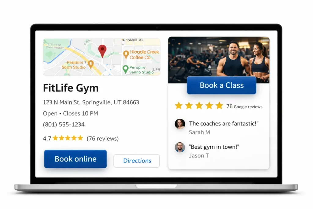
How local SEO and AEO support more memberships
Ranking higher is rarely about stuffing pages with one phrase. It is about clarity, helpfulness, structure, and intent alignment. If someone searches for gyms near them, membership plans, trial access, or local classes, your site needs to answer that need better and faster than the next result.
Start with page titles and headings that reflect how real people search. Your homepage should target the location and core offer. Your memberships page should focus on membership intent. Your classes page should cover class-related queries. This keeps search engines and users aligned.
Then think in answer-first format. AEO works well when your page gives clean, extractable responses to common questions. That means direct opening paragraphs, clear H2s, visible FAQs, and copy that solves search intent without fluff. The first section of each page should feel quotable and easy to pull into summaries.
Local relevance matters too. Mention your service area naturally. Show the facility. Add trainer names if they are a selling point. Use location-specific language where it is helpful, not forced. Make sure your business name, address, phone number, and key pages stay consistent.
For external authority support, two resources fit naturally in this topic. If you want the site to follow cleaner search fundamentals, use Google’s SEO Starter Guide as a reference for crawlability, page clarity, and search basics. If booking is part of your local acquisition strategy, connect your preferred URL through Google Business Profile booking links so searchers can move from discovery to action with less friction.
You can also strengthen internal topical relevance by connecting this page to your related content. A useful next read here is fitness website booking, especially if your offer depends on class reservations, tours, or online scheduling as part of the conversion path.
How design choices increase conversions after traffic arrives
Traffic alone does not create memberships. The page has to make the next action feel obvious, credible, and low effort. That usually comes down to better visual hierarchy and less friction.
Whitespace helps because it makes information easier to process. A strong headline helps because it frames value fast. Real facility images help because they remove guesswork. Short sections help because visitors can scan without feeling lost. Repeating the main CTA across the page helps because users do not always convert at the same point.
Forms should stay short. If the goal is to book a tour or claim a free pass, ask only for what you need. Name, email, phone, and preferred time are often enough. Every extra field adds drag.
Design should also support the mobile experience. Many local gym searches happen on a phone, which means buttons need to be thumb-friendly, plan cards need to stack cleanly, and schedule or contact info needs to stay readable without pinching or zooming.
If you are evaluating a rebuild, it helps to compare what an intentional process looks like before making changes. That is where your website design & development services can be placed naturally, because the reader is already thinking about structure, conversion, and implementation rather than just aesthetics.

What to avoid on a membership site
Some weak points show up again and again on gym websites, and most of them are fixable.
❌ vague headlines that could apply to any fitness brand
❌ hidden membership details that force unnecessary back-and-forth
❌ too many competing CTAs in the same section
❌ stock photos that do not reflect the real experience
❌ disconnected booking flows that feel like a different brand
❌ long blocks of copy before the visitor sees a useful next step
Another issue is trying to impress instead of helping. Fancy motion, dark overlays, complex carousels, and oversized sections can look modern but still hurt usability. The goal is not to make the site feel complicated. The goal is to make decision-making feel easy.
The clearest pages usually win because they respect the visitor’s time.
Final Thoughts
The best gym membership website is not the one with the most pages or the flashiest design. It is the one that explains the offer quickly, proves trust early, and gives every visitor a simple path to join, book, or inquire.
When your site is structured around real search intent and real buying behavior, it becomes easier to support SEO, local visibility, AEO extraction, and conversions at the same time. Keep the copy clear, the plans easy to compare, and the next step visible on every important page. That is what turns a fitness site into a growth asset instead of just an online placeholder.
Frequently Asked Questions
1. What should a gym membership website include?
A gym membership website should include clear pricing, membership options, class details, location information, testimonials, and a strong call to action. Visitors should be able to understand what the gym offers within seconds without digging through multiple pages. A well-structured website also needs a mobile-friendly design, simple navigation, and easy access to contact forms or trial sign-up buttons. When these elements are present, the site does a better job of turning traffic into actual leads and members.
2. Should a gym membership website show pricing?
Yes, a gym membership website should clearly show pricing or at least guide visitors to pricing information quickly. One of the biggest reasons users leave a fitness site is that they cannot find membership costs, plan comparisons, or enrollment details. Even if exact rates vary, the website should still explain what affects pricing and what each membership includes. Transparent pricing builds trust and helps reduce drop-off during the decision-making stage.
3. Can a gym membership website help increase memberships?
Yes, a gym membership website can increase memberships when it is built to reduce friction and support fast action. A strong site does more than look modern. It guides visitors from interest to conversion with clear messaging, trust signals, local SEO content, and easy sign-up paths. Features like free trial forms, class schedules, membership comparisons, and location pages help users feel confident enough to take the next step instead of leaving to compare competitors.
4. Why is mobile design important for a gym membership website?
Mobile design is essential because many people visit a gym membership website from their phones. They may be searching for pricing, class times, directions, or trial offers while on the go. If the website is slow, cluttered, or hard to use on mobile, potential members are likely to leave before converting. A responsive mobile layout improves user experience, supports local search visibility, and makes it easier for visitors to join or contact the gym right away.