
An emergency plumbing website should make it easy to call, trust, and book in under a minute. The best version is mobile-first, fast, and built around urgent services, service areas, and one clear next step.
That is why an emergency plumbing website needs a different structure from a standard plumbing homepage. When someone is dealing with a burst pipe, sewer backup, or overflowing toilet, they are not browsing casually. They want proof that the company is real, available, local, and easy to reach. A good design does not make them think. It guides them to the next action right away.
For a web designer, this is where the opportunity becomes clear. Plumbing businesses do not just need a pretty homepage. They need a sales tool that supports local search, removes doubt, and turns pressure-filled visits into calls. That is the angle that helps this kind of content rank and convert.
Why urgent plumbing visitors behave differently
A plumber serving urgent jobs deals with a different kind of website visitor. These people are not comparing ten brands over coffee. They are often on mobile, in a hurry, and looking for reassurance within seconds. That affects every design decision, from the hero section to the footer.
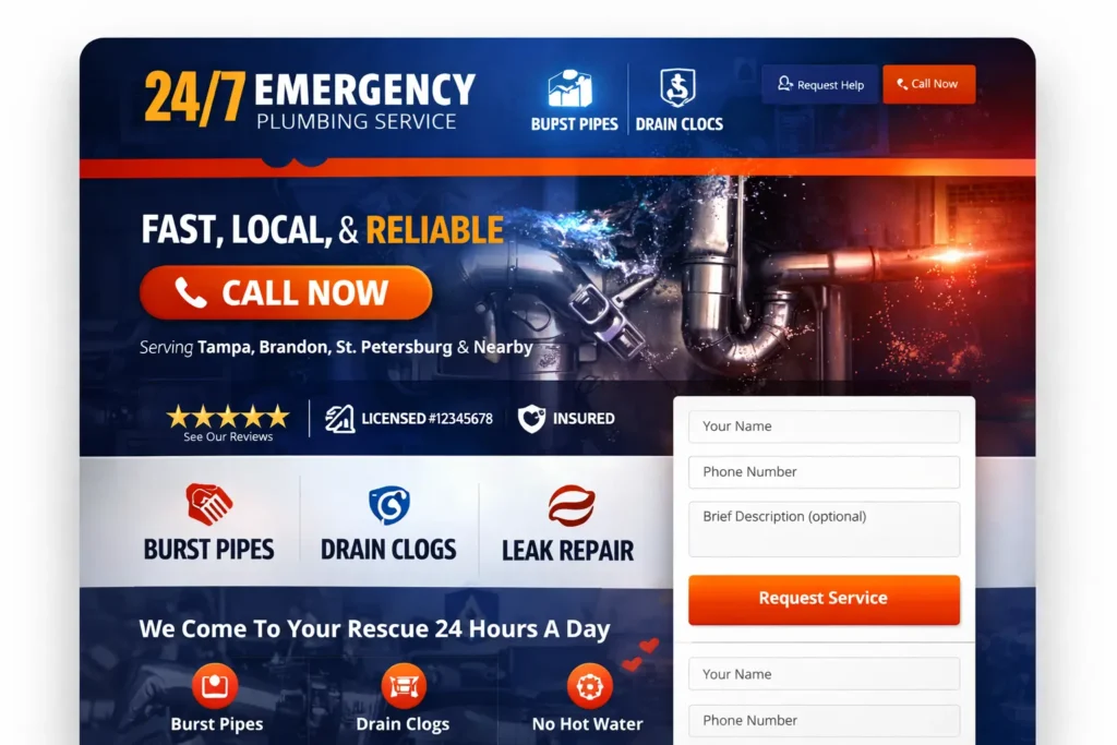
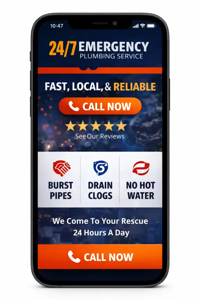
The first thing they need is clarity. If the page opens with a vague slogan or a giant stock image, trust drops immediately. A stronger approach is a headline that says exactly what the company does, where it works, and what the next step is. A line such as “24/7 emergency plumber serving Tampa and nearby areas” is far more useful than “solutions you can trust.”
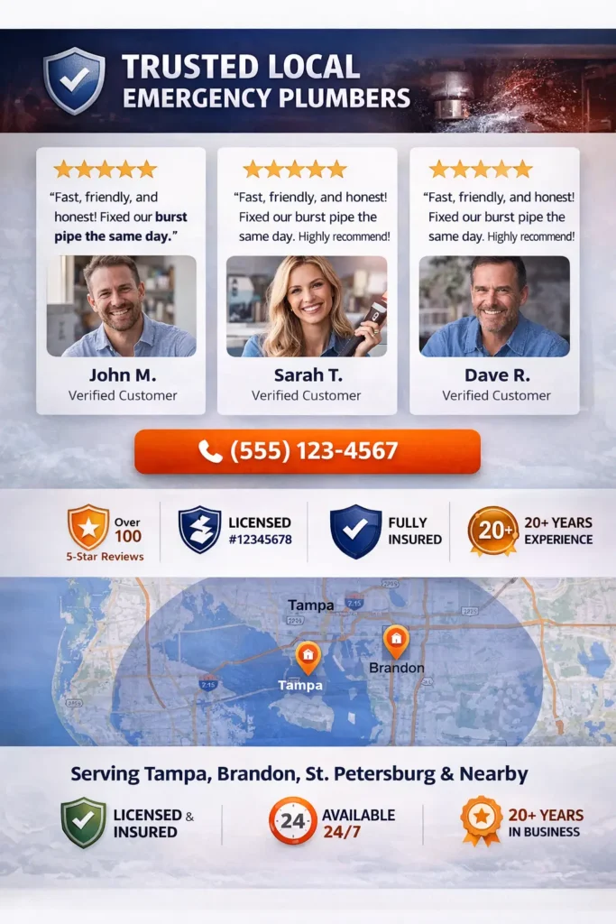
The second thing they need is confidence. Visitors want to know whether the business is licensed, reviewed, nearby, and responsive. That means the design has to surface review snippets, location references, response-time messaging, and a visible phone number above the fold.
The third thing they need is ease. The call button must be obvious. The contact form must be short. The page should not bury the service area, emergency services, or after-hours availability. In this niche, too many clicks feel like friction, and friction costs leads.
If you are building sites for trades, this is also why conversion strategy matters more than decoration. Strong visual hierarchy, clean spacing, and trust-first messaging usually outperform flashy layouts here. If you want a service page built with that logic, explore our website design & development services.
What the homepage should do on the first screen
The best homepage for an urgent service business does not try to say everything at once. It prioritizes the few things a stressed visitor cares about most, then leads them deeper only when needed.
| Homepage Element | What It Should Communicate | Why It Matters |
|---|---|---|
| Main headline | Emergency service, plumbing focus, and service area | Instantly confirms relevance |
| Primary CTA | Call now or request urgent help | Reduces decision time |
| Trust strip | Reviews, license, insured status, and years in business | Calms anxious visitors |
| Availability note | 24/7, same-day, or fast response wording | Answers the biggest objection early |
| Service highlights | Burst pipes, drains, leaks, and water heater issues | Matches real search intent |
| Location proof | Cities served and service-area coverage | Strengthens local confidence |
A homepage like this should open with a clear H1, one supporting sentence, and two action choices. In most cases, the best combination is a click-to-call button plus a secondary request form. That gives both types of visitors a comfortable next step. Some people want to speak immediately. Others want to send details first.
The next block should reinforce trust, not wander into company history too soon. Keep the first screen focused on what the visitor gets: fast help, local coverage, and a simple way to reach the business. Save the deeper brand story for the About page or a lower homepage section.
A smart homepage also previews the main emergency services. Instead of listing every plumbing task under the sun, highlight the issues people search for under pressure. Think burst pipe repair, emergency drain service, no hot water, leak detection, and clogged sewer line support. This is better for usability and stronger for search intent alignment.
Below that, add a short service-area section. This is where a lot of plumbing sites go weak. They mention “serving your area” but never show the actual cities. A tighter version names the core locations clearly and links to relevant service or location pages where appropriate. That supports local relevance and also makes the visitor feel seen.
For inspiration on how this works in the niche itself, your related guide on plumber website design fits naturally here.
How to structure pages for local rankings and real leads
A lot of plumbing websites underperform because they are too shallow. They have one homepage, one contact page, and a generic services page with almost no substance. That structure rarely does enough for strong local visibility or strong conversions.
The better setup is usually a focused homepage, dedicated service pages, and carefully planned location relevance. Service pages let the site speak clearly to actual problems people search for. Instead of one catch-all page, create pages for emergency drain cleaning, burst pipe repair, water heater repair, leak detection, and sewer line issues if those are true offers.
Each service page should answer three things quickly: what the problem is, how the company handles it, and what the visitor should do next. This is where helpful content matters. Generic filler does not do much. Clear, specific copy does. Google’s own people-first content guidance is a good reference point for keeping these pages useful rather than padded.
Location strategy also needs care. Many contractors copy the same page into ten city versions and swap the city name. That usually leads to weak pages. A stronger option is to build city pages only when there is genuine supporting detail, such as service history, local testimonials, neighborhood references, or distinct service notes. Quality beats volume here.
Then connect the website to local visibility assets properly. For service businesses, the service area details in Google Business Profile should be accurate and specific. Google’s own service-area business guidance is worth reviewing because it affects how local businesses present coverage and reach.
This is also where internal linking earns its place. When the homepage points to service pages, and service pages point back to testimonials, FAQs, and contact sections, the site becomes easier to crawl and easier to use. If you want a broader model for this kind of structure, your post on local service website is a strongly related resource.
Which website setup works best for most plumbers
Not every plumber needs the same build, but most do need more than a basic brochure site. The right option depends on how competitive the market is, how many services are pushed hard, and whether local SEO is already part of the growth plan.
| Website Option | Best For | Main Limitation | Best Verdict |
|---|---|---|---|
| One-page site | New businesses with a limited budget | Weak depth for SEO and service targeting | Good only as a temporary start |
| Basic 5-page site | Small plumbing companies with light competition | Can still feel too generic for urgent searches | Better, but often not enough |
| Service-led local site | Plumbers targeting leads from search and maps | Needs stronger planning and copy | Best option for most businesses |
| Large city-page build | Multi-area companies with real local proof | Easy to overdo with thin content | Best only when supported well |
For most plumbing businesses, the best option is the service-led local site. It balances clarity, trust, and search opportunity without creating dozens of weak pages. You get a strong homepage, focused service pages, a conversion-friendly contact path, and enough local relevance to compete more effectively.
This model also gives the business room to grow. New service pages, case-study style blog posts, financing pages, and review content can be added later without rebuilding the whole architecture. From a web designer’s point of view, that makes it easier to sell both the initial build and future expansion work.
A template-only approach can look fine at first glance, but it often fails under pressure because the messaging is not arranged around how emergency buyers behave. In this niche, the best design choice is usually the one that makes urgent decisions feel simple.
Trust elements that reduce hesitation fast
Even a well-structured site can lose leads if it does not remove doubt quickly enough. For emergency services, trust has to be visible early and repeated naturally throughout the page.
Start with the obvious signals. Show reviews near the top, not hidden near the footer. Include real staff or truck photos when possible. Add license and insurance language where relevant. Display service hours clearly. If financing is available, say so. If same-day scheduling is possible, mention it without overpromising.
Then strengthen the middle of the page with proof. Short testimonial blocks work well. So do neighborhood references, before-and-after images, and a simple “what happens when you call” section. Visitors in urgent situations want predictability. The more you make the process feel known, the less resistance they feel.
A few practical trust boosters that work especially well here are:
✅ sticky mobile call button
✅ review snippets beside CTAs
✅ short FAQ near the contact form
✅ service-area confirmation near the footer
These are not flashy additions, but they help people move forward. They also help the site feel intentional rather than generic. If you want to show that kind of work visually, send prospects to your portfolio highlights.
Common website mistakes that cost plumbing leads
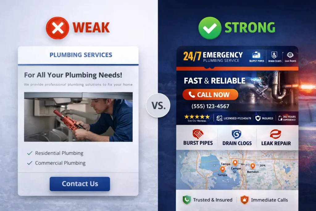
One of the biggest mistakes is leading with branding before urgency. A polished logo and a nice color palette matter, but they do not answer the visitor’s real question: can this company help me now? Design should support that answer, not delay it.
Another common issue is a weak mobile layout. Text is too small, buttons are too far down, or forms ask for too much information. Since urgent plumbing visitors are often on their phones, small usability issues become expensive fast.
Generic stock copy is another problem. Many sites talk in circles with phrases like “quality solutions for all your needs.” That language does not create trust or capture search intent. Clear, problem-based wording performs better because it sounds real and matches how customers think.
Thin location pages also hurt. If every city page says the same thing with only the place name changed, the site starts to feel manufactured. Better pages have unique context, stronger proof, and a reason to exist.
Finally, many plumbing sites treat the blog as an afterthought. That is a missed opportunity. Helpful supporting articles can capture related searches, answer objections, and feed internal links back into service pages. For example, content around emergency drain problems, after-hours call expectations, and water heater failures can support the main conversion pages without feeling repetitive.
📌 A simple rule works well here: every page should either help someone trust the business faster, understand a service better, or contact the company sooner.
Final Take
The best plumbing sites are built for urgency, not just appearance. They speak clearly, load cleanly, support local trust, and make the next action obvious.
If your current site looks fine but still struggles to turn visitors into calls, the issue is usually structure, more than style. A well-planned emergency plumbing website gives stressed visitors the confidence to act now, which is exactly what makes it valuable for both rankings and conversions.
Frequently Asked Questions
1. What should a plumber’s website prioritize if the goal is more emergency calls?
Clear action paths should come first. A plumber website built for urgent leads should make the phone number, service area, and main emergency services visible right away. Visitors in a rush do not want to read long intros or hunt through menus. They want to know whether the company is local, available, and trustworthy. The strongest layouts usually combine a strong headline, a click-to-call button, review proof, and a short contact option above the fold.
2. Is a separate emergency service page better than putting everything on the homepage?
Yes, a dedicated service page is usually the better option. The homepage should introduce the business and direct visitors, but a focused page gives more room to explain specific urgent problems like burst pipes, sewer backups, or no-hot-water issues. That makes the content more relevant for search, easier to internal link, and more persuasive for visitors who land directly on that page instead of the homepage.
3. What design features help a local plumbing company look more trustworthy online?
Visible proof elements make the biggest difference. Trust goes up when the site shows review snippets, service-area references, licensing language, real team or truck photos, and a clear process for what happens after someone calls. Even small details like a sticky mobile call button, fast-loading layout, and clear city references can make the company feel more established. Trust is often what turns a stressed visitor into a real lead.
4. Can a web designer help a plumber rank better without relying only on SEO tricks?
Yes, because a better structure improves both usability and search performance. A web designer can shape page hierarchy, local relevance, internal linking, call-to-action placement, and mobile experience in ways that support ranking and conversions together, for plumbing businesses, that often works better than chasing shortcuts. A well-built site gives search engines a clearer context and gives real users a better reason to stay, trust, and contact the business.