A website design that looks professional uses clear branding, simple navigation, fast loading pages, strong visuals, and obvious calls to action. The best option for most small businesses is a clean custom design because it builds trust quickly and guides visitors toward contacting you.
A professional website is not just about looking “nice.” It should help people understand who you are, what you offer, why they should trust you, and what step to take next. That is why good design blends branding, layout, speed, mobile usability, SEO, and conversion strategy into one smooth experience.
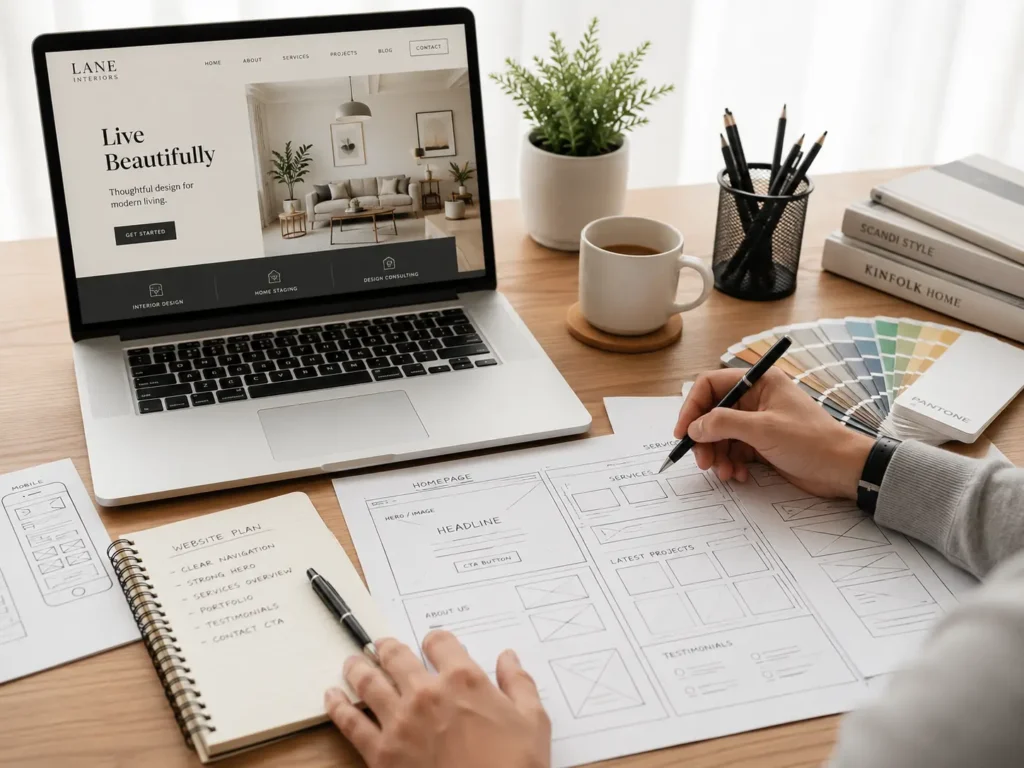
If your current website feels outdated, confusing, slow, or hard to use on mobile, it may be time to work with website design & development services that focus on both appearance and performance.
Why Professional Website Design Matters
Your website is often the first place people check before they call, book, buy, or request a quote. If it looks unfinished, cluttered, or outdated, visitors may wonder if your business is still active or trustworthy.
A professional design helps create confidence before a conversation even starts. It shows that your business pays attention to details, respects the visitor’s time, and takes its online presence seriously.
This matters even more for service businesses. People are not just buying a product. They are choosing someone they may need to trust with their home, business, health, finances, event, or project.
A good website answers these silent visitor questions:
✅ Is this business real?
✅ Can I understand what they offer quickly?
✅ Do they look trustworthy?
✅ Can I find proof of their work?
✅ Is it easy to contact them?
For example, a local contractor with a clean homepage, before-and-after images, service areas, testimonials, and a clear quote form will usually feel more credible than one with blurry photos and broken links. The design supports the sale before the business owner says a word.
Google also recommends creating content and site experiences with users in mind, not only search engines. You can see this in Google’s own SEO Starter Guide, which explains how SEO helps search engines understand your site and helps people decide whether to visit.
What Makes a Website Look Professional
Professional design is built from many small choices that work together. Fonts, colors, spacing, images, buttons, copy, speed, and structure all shape how visitors feel.
The goal is not to make the website look expensive. The goal is to make it look clear, credible, and easy to use.
| Website Element | What Looks Professional | What Looks Unprofessional |
|---|---|---|
| Branding | Consistent colors, logo, and tone | Random colors and mismatched styles |
| Navigation | Simple menu with clear page names | Too many links or confusing labels |
| Images | Real, sharp, relevant visuals | Stock photos that feel generic |
| Copy | Clear benefit-focused messaging | Long text with no direction |
| Mobile Design | Easy to read and tap on phones | Tiny text and broken layouts |
| Speed | Pages load quickly | Large images slow everything down |
The best designs usually feel simple at first glance. Visitors should not have to think hard to understand where they are or what to do.
That is why many effective business websites follow a clear structure: headline, short explanation, main service, proof, process, portfolio, and contact option. This layout works because it matches how real visitors make decisions.
Start With a Clear First Impression
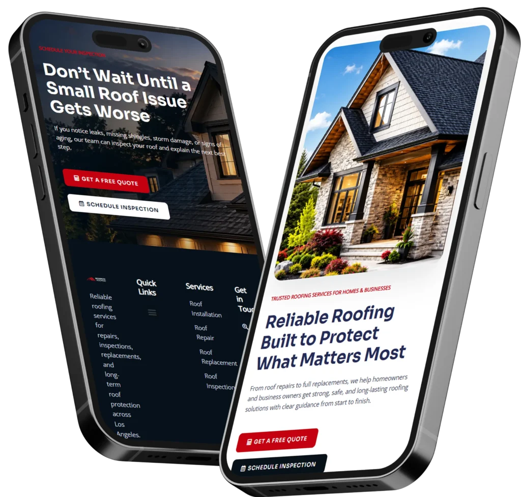
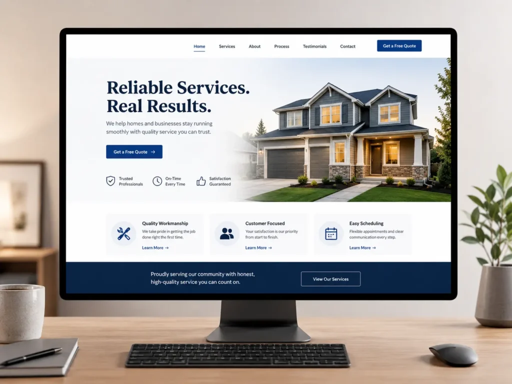
The top section of your website is one of the most important parts of the entire design. Visitors decide quickly whether to stay or leave, so your first screen should explain your value clearly.
A strong homepage hero section should include:
✅ A direct headline
✅ A short supporting sentence
✅ A clear button
✅ A relevant image or visual
✅ A trust signal, such as reviews, years of experience, or location
For example, instead of saying “Creative Digital Solutions,” a web designer could say, “Custom websites for small businesses that need more calls and leads.” The second headline is clearer because it tells visitors who the service is for and what outcome they can expect.
This is also where design and copy must work together. A beautiful layout with vague words will not convert well. A strong message in a messy layout will not feel trustworthy. The best option is to pair a clean visual structure with copy that explains the benefit fast.
If you want to see how finished layouts can build trust, review portfolio highlights and look at how different sections guide the visitor from first impression to action.
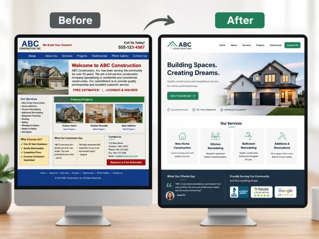
Use Branding That Feels Consistent
Branding is one of the fastest ways to make a website feel professional. It helps visitors remember your business and makes every page feel connected.
Your brand does not need to be complicated. For many small businesses, strong branding starts with a few simple choices: one logo, two or three main colors, consistent fonts, and a clear tone of voice.
If your homepage feels modern but your service pages use different colors, random button styles, and inconsistent spacing, the whole site can feel less polished.
A professional brand system usually includes:
✅ Primary color for buttons and important sections
✅ Secondary color for accents
✅ Easy-to-read heading and body fonts
✅ Consistent photo style
✅ Clear voice that matches your audience
For example, a luxury interior designer may use soft neutral colors, elegant fonts, and large project images. A roofing company may use bold colors, strong headlines, service area pages, and proof-focused sections. Both can look professional, but the design should match the business type.
If your visual identity feels unclear, this guide on branding for a small business website can help you understand how branding supports trust, recognition, and conversions.
Make Navigation Simple
Navigation should feel boring in the best possible way. Visitors should instantly understand where to click.
A professional website does not hide important pages behind clever labels. Use clear menu items like Home, Services, Work, About, Blog, and Contact. These labels work because people already understand them.
The best option for most service businesses is a short top menu with a visible call-to-action button. For example, “Get a Quote,” “Book a Call,” or “Start Your Project.”
Too many menu options can slow people down. If you offer many services, group them under one Services page or use a dropdown only when needed.
| Page Type | Best Use | Why It Helps |
|---|---|---|
| Home | Introduces your business and main offer | Gives visitors a quick overview |
| Services | Explains what you do | Helps people match your service to their need |
| Sample Work | Shows proof and past results | Builds confidence before contact |
| Blog | Answers common questions | Supports SEO and helpful content |
| Contact | Makes reaching you easy | Turns interest into leads |
For practical design, the main rule is simple: make the next step obvious. A confused visitor is less likely to become a lead.
Choose High-Quality Images
Images can make or break the look of a website. Low-quality photos can make even a well-built site feel amateur.
Use images that are sharp, properly sized, and relevant to the page. If possible, use real images from your business, your team, your work, or your process. Real photos often feel more trustworthy than generic stock images.
For web designers, contractors, consultants, photographers, salons, clinics, and other service providers, proof-based visuals are powerful. Show the work, the space, the team, or the transformation.
A practical tip: avoid using huge image files straight from a camera. They can slow down your site. Resize and compress images before uploading them.
Google’s PageSpeed Insights can help you test whether your pages are loading fast on mobile and desktop. Speed is part of the user experience, and slow pages can make a polished website feel frustrating.
Design for Mobile First
Most visitors will likely view your website on a phone at some point. That means professional design must work well on small screens, not just desktops.
A mobile-friendly website should have readable text, buttons that are easy to tap, images that scale correctly, and forms that do not feel annoying to complete.
The best option is to design important sections with mobile behavior in mind. People on phones often scan quickly, so paragraphs should be short, headings should be clear, and buttons should appear at natural decision points.
For example, after explaining a service, add a button that says “Request a Website Quote” or “View Our Work.” Do not make mobile users scroll all the way back to the top just to take action.
Common mobile mistakes include tiny fonts, overlapping sections, menus that do not open properly, buttons too close together, and images that crop important details.
A professional site feels smooth from homepage to contact form, even on a small screen.
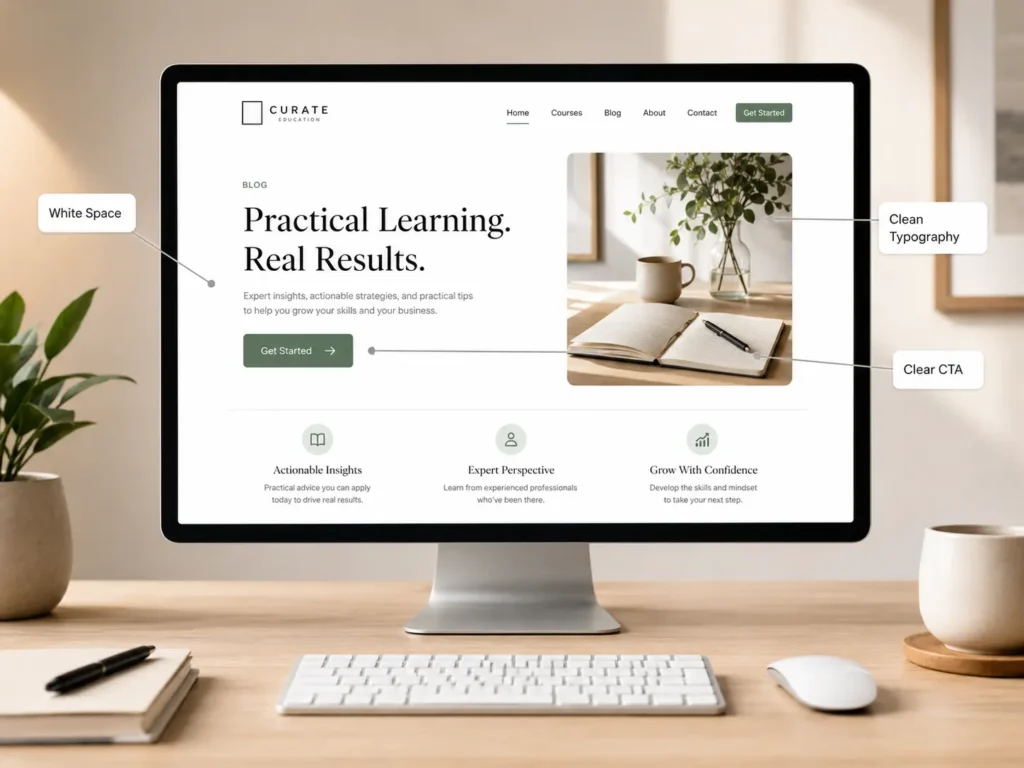
Use White Space and Clean Layouts
White space is the empty space around text, images, buttons, and sections. It does not have to be white. It simply means the design has room to breathe.
Many unprofessional websites feel cluttered because they try to show everything at once. A clean design gives each section a clear purpose.
White space helps visitors focus. It makes headings easier to scan, improves readability, and makes buttons stand out.
A helpful rule is to give every section one main job. One section introduces the offer. Another explains benefits. Another shows proof. Another answers objections. Another invites contact.
This is why professional websites often feel calm and organized. They do not force visitors to search for meaning.
Add Trust Signals Throughout the Website
Trust signals help visitors feel safe taking the next step. They are especially important if someone is comparing multiple web designers or service providers.
Good trust signals include testimonials, reviews, project examples, certifications, clear contact details, case studies, FAQs, and real business information.
Stanford’s web credibility guidelines also recommend showing that a real organization stands behind the site, making contact information easy to find, and designing the site to look appropriate for its purpose through layout, typography, images, and consistency. You can read more from the Stanford Web Credibility Guidelines.
For a web designer, trust signals may include:
✅ Client website examples
✅ Before-and-after redesigns
✅ Clear process
✅ Service packages
✅ Testimonials
✅ Business location or service area
✅ Contact form and email
The best option is to place trust signals near decision points. For example, add testimonials close to a contact form or show sample work before asking visitors to book a consultation.
You can also guide visitors to conversion-focused web design if they are ready to improve the way their website looks, feels, and performs.
Write Copy That Explains the Value
Professional design is not only visual. The words matter too.
Your website copy should explain what you do, who you help, and why it matters. Avoid vague phrases that sound nice but do not say much.
For example, “We build digital experiences” sounds polished, but it may not tell a small business owner what they are getting. “We design websites that help small businesses get more leads” is clearer and more useful.
Good website copy answers the visitor’s real concerns:
✅ What do you offer?
✅ Is this right for my business?
✅ How does the process work?
✅ What makes you different?
✅ What should I do next?
For SEO and AEO, direct answers are also helpful. Search engines and AI tools are more likely to understand your content when your pages answer questions clearly.
This is why blog content matters too. Helpful articles can support topical authority and bring in visitors who are still researching. For example, this guide on how to rank a small business website explains how structure, content, and optimization can support better visibility.
Make Calls to Action Clear
A professional website should guide visitors toward action without sounding pushy.
Your call to action should match the visitor’s stage. Someone ready to hire may click “Request a Quote.” Someone still comparing may prefer “View Our Work” or “See Services.”
Use buttons that are specific. “Submit” is weak. “Get My Free Website Audit” or “Start My Website Project” is clearer.
Place calls to action after important sections, such as your service overview, portfolio, testimonials, and FAQs. This gives visitors natural opportunities to act when they feel ready.
For example, after explaining your design process, you could link to get a free website audit so the visitor has a low-pressure next step.
The best CTA is simple, visible, and connected to a real benefit.
Improve Speed and Technical Quality
A site can look beautiful but still feel unprofessional if it loads slowly, breaks on mobile, or has errors.
Technical quality supports trust. Visitors may not know why a site feels bad, but they will notice delays, broken buttons, layout shifts, or forms that do not work.
Important technical basics include:
✅ Fast-loading pages
✅ Compressed images
✅ Mobile responsive layout
✅ Secure HTTPS connection
✅ Working forms
✅ Clear page titles
✅ Proper heading structure
✅ No broken links
For WordPress websites, themes, plugins, hosting, image sizes, and caching can all affect performance. If your site runs on WordPress, this guide on WordPress SEO for business can help connect design quality with search visibility.
How does this apply to the best option? If you are building a business site, avoid choosing a design only because it looks trendy. Choose a design that can also load fast, scale well, and support SEO.
Which Website Design Option Is Best?
The best option depends on your business stage, budget, and goals.
A template can work if you need something simple and you have a small budget. It is usually faster to launch, but it may feel generic if you do not customize the branding, copy, images, and structure.
A custom website is usually better if your business depends on leads, bookings, credibility, or local competition. It gives you more control over messaging, layout, SEO structure, and conversion flow.
A redesign is best if your current site already exists but feels outdated, slow, confusing, or off-brand. In many cases, improving an existing site can produce better results than starting from zero.
For most small businesses looking to grow, the strongest option is a custom or semi-custom design built around strategy. That means your site is not only attractive, but also made to support user trust, search visibility, and lead generation.
Common Mistakes That Make a Website Look Amateur
Some design issues instantly weaken credibility. The good news is that many are easy to fix.
Common mistakes include cluttered sections, blurry images, too many fonts, weak contrast, no clear button, outdated copyright dates, broken links, missing contact details, and long pages with no structure.
Another common issue is designing for the business owner instead of the customer. Your favorite colors, animations, or phrases may not be what your audience needs. Professional design starts with the visitor’s goal.
For example, someone searching for a web designer wants to know if you can build the kind of site they need. They want proof, process, pricing guidance, and a simple way to reach you. If your site only talks about creativity but does not show results, visitors may leave.
A strong website removes doubt one section at a time.
Practical Tips Before Hiring a Web Designer
Before hiring a web designer, prepare a few important details. This helps the project move faster and gives the designer better direction.
Know your main goal. Do you want more calls, bookings, form submissions, sales, or better credibility? Your goal will affect the layout and content.
Gather brand assets. This may include your logo, colors, photos, testimonials, service descriptions, and existing website logins.
Review competitor sites, but do not copy them. Look for what feels clear, trustworthy, or confusing. This helps you explain your preferences.
Think about your best customers. A website for budget shoppers should feel different from a website for high-end clients.
Finally, ask your designer how they approach strategy, mobile design, SEO basics, speed, and conversions. A good web designer should be able to explain not just what they will create, but why it will help your business.
Final Takeaway: website design that looks professional
A website design that looks professional is the result of clear strategy, consistent branding, simple navigation, strong visuals, mobile-friendly layouts, fast performance, and trust-building content. It should help visitors quickly understand your business and feel confident taking the next step.
If your website no longer reflects the quality of your work, improving the design can make your business look more credible and easier to choose. Start with clarity, then build the visuals around the message. That is how a website becomes more than a digital brochure. It becomes a trust-building sales tool.
Frequently Asked Questions
1. How do I make my website look more professional?
The best way to make your website look more professional is to improve clarity, consistency, and trust. Start with a strong headline, simple navigation, high-quality images, readable fonts, and clear buttons. Make sure your colors match your brand and your pages work smoothly on mobile. Also add testimonials, contact details, and examples of your work so visitors can quickly feel confident about your business.
2. Should I hire a web designer or use a website template?
Hiring a web designer is usually better when your website needs to build trust, generate leads, or stand out from competitors. A template can work for a basic starter site, but it often needs strong customization to look unique and professional. A web designer can plan the structure, messaging, mobile layout, SEO basics, and calls to action around your business goals, not just around a pre-made layout.
3. What pages should a professional business website have?
Most professional business websites should have a homepage, services page, about page, portfolio or sample work page, blog, and contact page. The homepage gives a quick overview, while the services page explains what you offer in detail. A portfolio builds proof, the about page adds personality, the blog answers customer questions, and the contact page makes it easy for people to reach you.
4. Why does my website look outdated even if the information is correct?
A website can look outdated when the design, spacing, images, fonts, or mobile layout no longer match modern visitor expectations. Even accurate information may feel less trustworthy if the page looks cluttered, loads slowly, uses old visuals, or has weak calls to action. Updating the layout, improving images, refreshing copy, and making the site easier to use can make the same business feel more current and credible.