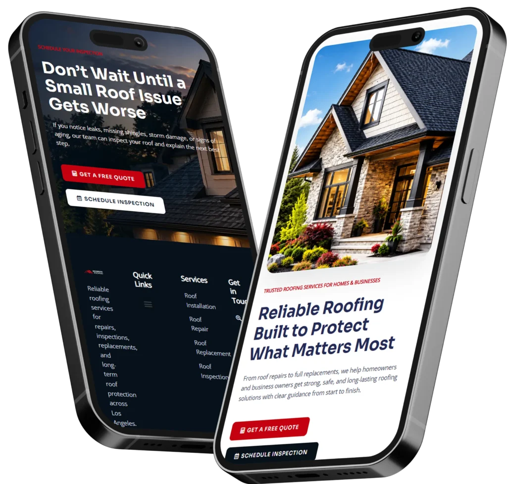
The best homepage call to action examples tell visitors exactly what to do next and clearly explain what they will receive after clicking. For most small business websites, effective choices include “Request a Free Quote,” “Book a Consultation,” “View Our Work,” and “Call for Same-Day Service.”
A call to action, commonly called a CTA, can lead someone toward a phone call, appointment, estimate, purchase, or contact form. The right wording depends on the visitor’s intent, the complexity of the service, and how much trust the business must establish before asking for a commitment.
In this guide, you will see practical CTA ideas for service businesses, local companies, professional firms, and redesigned websites. You will also learn why certain buttons work, where to place them, and which option is best for your business goals.
What Is a Homepage Call to Action?
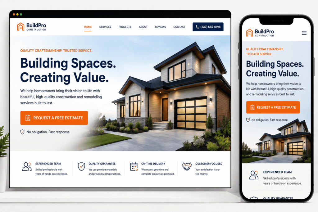
A homepage call to action is a button, link, form, or short instruction that guides a website visitor toward a specific next step. It connects the information on the page with the action the business wants the visitor to complete.
Common actions include:
✅ Requesting a quote
✅ Scheduling a consultation
✅ Calling the business
✅ Viewing services
✅ Browsing past projects
✅ Checking availability
✅ Starting an online booking
✅ Downloading a helpful resource
A CTA should not simply decorate the page. It should reduce uncertainty and help visitors move forward without having to figure out the next step themselves.
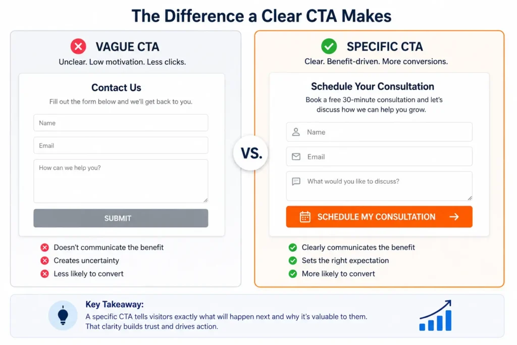
For example, “Submit” only describes what happens to a form. “Request My Free Estimate” explains the benefit, sets an expectation, and makes the action feel more relevant.
A strong homepage also communicates what the company does, who it serves, and what action visitors should take. Nielsen Norman Group identifies prompting users to act as one of the fundamental principles of effective homepage design. You can learn more in its guide to homepage design principles.
Why Your Homepage CTA Matters
Your homepage often receives visitors with different levels of awareness. One person may be ready to hire immediately, while another may still be comparing providers, reading reviews, or trying to understand the service.
A well-designed CTA gives each visitor a logical path.
Without clear direction, people may read the page, scroll briefly, and leave without calling or submitting an inquiry. This does not always mean the service is wrong for them. They may simply be unsure about what to do next.
It Turns Attention Into Action
Headlines and images capture attention, but the CTA turns that attention into a measurable business result. A visitor becomes more valuable when the website helps that person make a call, book an appointment, or request information.
Google describes a conversion as a visitor completing an action that supports the website’s goals, such as making a purchase or signing up. For a small business, the conversion could be a phone call, estimate request, appointment, or consultation.
It Reduces Decision Friction
Visitors hesitate when a button is unclear, overly demanding, or disconnected from the information around it.
“Get Started” may work when the next step is already obvious. On a local contractor’s website, however, “Request a Project Estimate” provides more context and creates less uncertainty.
The best wording answers three questions:
- What will happen after I click?
- What will I receive?
- How much commitment is required?
It Helps Qualify Leads
Your CTA can also influence the type of inquiry you receive.
“Call Now” attracts people who want an immediate conversation. “Complete the Project Questionnaire” may attract prospects who are prepared to provide details. “View Our Website Packages” helps budget-conscious visitors understand their choices before contacting you.
This is why CTA selection should be based on your sales process rather than personal preference.
Quick Comparison of Homepage CTA Types
| CTA Type | Best For | Example Button | Visitor Commitment |
|---|---|---|---|
| Phone call | Local and urgent services | Call for Immediate Help | Medium |
| Quote request | Contractors and project-based services | Request a Free Estimate | Medium |
| Consultation | Professional or customized services | Book a Consultation | Medium to high |
| Portfolio | Designers, builders, and creative businesses | View Our Recent Work | Low |
| Service discovery | Businesses with several offers | Explore Our Services | Low |
| Online booking | Appointment-based businesses | Check Available Times | Medium |
| Lead magnet | Visitors not ready to hire | Download the Free Guide | Low |
| Website audit | Businesses selling expert services | Request a Website Review | Medium |
The best option is usually the CTA that matches the visitor’s natural next step. Asking a first-time visitor to “Buy Now” may be too aggressive for a custom service, while asking an emergency plumbing customer to “Learn More” may be too passive.
21 CTA Ideas for Small Business Homepages
The examples below are grouped by business goal so you can choose wording that supports the action you actually want.
CTAs for Calls and Immediate Inquiries
These options work best for local services, urgent problems, and businesses where a short conversation can quickly determine whether the provider is a good fit.
✅ Call for Same-Day Service
This creates urgency and communicates possible availability. Use it only when same-day service is genuinely offered.
✅ Speak With a Local Expert
This feels more personal than “Contact Us” and can work well for consulting, legal, financial, home improvement, or technical services.
✅ Call for a Free Consultation
This reduces risk by clarifying that the initial conversation does not require payment.
✅ Talk to Our Team
This is friendly and flexible, making it suitable for businesses that want a conversational tone.
Place a clickable phone number near these buttons on mobile devices. Visitors looking for immediate help should not be forced to complete a long form.
CTAs for Quotes and Estimates
Quote-focused buttons are useful when pricing depends on the project’s size, location, condition, materials, or scope.
✅ Request a Free Estimate
This is direct, familiar, and suitable for contractors, cleaners, landscapers, painters, repair companies, and other project-based services.
✅ Get My Custom Quote
The words “my” and “custom” make the action feel personalized.
✅ Tell Us About Your Project
This is less transactional and works well when the business needs project details before providing a price.
✅ Start Your Project Request
This clearly signals that the click begins a process rather than completing a purchase.
Keep the connected form short. Ask only for details needed to respond or determine fit. Longer qualification questions can appear after the initial inquiry or on a dedicated project form.
Businesses planning a conversion-focused redesign can review these website design and development services to understand how copy, layout, forms, and CTA placement work together.
CTAs for Appointments and Bookings
Appointment-based businesses should make the scheduling process feel easy and predictable.
✅ Book Your Appointment
Use this when visitors can choose a specific date and time immediately.
✅ Check Available Times
This has lower perceived commitment because visitors can review availability before confirming.
✅ Schedule a Discovery Call
This works well for consultants, designers, agencies, and professionals who use an introductory call to determine fit.
✅ Reserve Your Consultation
The word “reserve” can add value when appointment availability is limited.
The CTA should lead directly to the scheduling tool or booking page. Avoid sending users to a general contact page that forces them to search for the calendar.
CTAs That Build Trust Before Asking for Contact
Not every visitor is ready to call or complete a form. Trust-building CTAs give cautious visitors a lower-pressure way to evaluate the business.
✅ View Our Recent Work
This is valuable for web designers, remodelers, photographers, architects, landscapers, and other visual service providers.
✅ Read Client Success Stories
Use this when case studies explain the process, challenge, solution, and measurable outcome.
✅ See Before-and-After Results
This works best when transformation is a major selling point.
✅ Meet the Team
This helps professional and local service businesses feel more personal and credible.
A visual CTA can direct visitors to your project gallery so they can judge quality before making an inquiry.
After visitors review proof, repeat the primary contact CTA. Someone who has just seen relevant projects or testimonials may now be ready to take action.
CTAs for Service Discovery
These examples help visitors who know they need assistance but are not yet sure which service applies.
✅ Explore Our Services
This is clear and works for companies with several service categories.
✅ Find the Right Service
This frames the services page as a decision-making tool rather than a basic list.
✅ Compare Your Options
Use this when the website presents packages, plans, or service levels.
✅ See How We Can Help
This offers a friendly transition from the homepage to a detailed service overview.
Service discovery buttons should lead to organized pages that explain who each service is for, what it includes, and what result the customer can expect.
Clear service page copy for small businesses can support these buttons by answering the questions visitors ask before contacting a provider.
CTAs for Website Design Leads
Web design prospects often need proof, clarity, and reassurance before they schedule a call. These options address different levels of readiness.
✅ Request a Website Audit
Best for businesses that already have a website but are unsure why it is not producing leads.
✅ Plan My Website Redesign
Best for owners who have already decided that the current site needs major improvement.
✅ Get a Website Project Quote
Best for prospects actively comparing designers, scope, and pricing.
✅ Start My Website Project
Best when the surrounding copy clearly explains the process and next step.
A business that needs strategic help can begin with conversion-focused web design rather than replacing pages without improving the messaging or customer journey.
Which Homepage CTA Is Best for Your Business?
The strongest option depends on what visitors need before they can confidently move forward.
| Business Situation | Best Primary CTA | Recommended Secondary CTA | Why It Fits |
| Emergency or urgent service | Call Now | View Service Area | Supports immediate action |
| Project-based local business | Request a Free Estimate | View Recent Projects | Combines lead generation with proof |
| Consultant or professional | Book a Consultation | Learn About the Process | Supports a relationship-based sale |
| Appointment-based company | Check Availability | View Services | Makes scheduling convenient |
| Creative or visual service | Start a Project | View Our Work | Balances action and portfolio review |
| New or unfamiliar offer | See How It Works | Ask a Question | Provides education before commitment |
| Website redesign provider | Request a Website Audit | View Portfolio | Identifies problems and builds trust |
For most small service businesses, the best approach is one primary CTA and one supporting CTA.
The primary button should represent the main conversion, such as requesting a quote. The secondary button should help visitors who need more proof, such as viewing projects or reading reviews.
Too many equal-looking buttons can create decision fatigue. When every action is emphasized, visitors may not understand which one matters most.
How to Write CTA Button Text That Gets Clicked
A CTA works best when its wording is specific, relevant, and consistent with the page content.
Start With a Clear Action
Use verbs that tell visitors what they can do:
✅ Request
✅ Book
✅ Call
✅ View
✅ Compare
✅ Check
✅ Download
✅ Schedule
Avoid creative wording that makes people stop and interpret the button.
Add the Result or Benefit
“Get Quote” identifies an action. “Get My Free Project Quote” adds the expected outcome and reduces uncertainty.
Other benefit-focused examples include:
✅ Check My Website
✅ View Available Packages
✅ Plan My Redesign
✅ Find the Right Service
✅ Reserve My Appointment
Match the Visitor’s Readiness
A visitor reading the first section may prefer a low-risk action. A visitor who has reviewed the services, process, testimonials, and portfolio may be ready for a consultation.
This is why the same page can use related but slightly different CTA wording.
Near the top:
See How We Can Help
After services and proof:
Request Your Project Quote
Near the bottom:
Start Your Project Today
For better consistency, define the website’s core promise before writing buttons. This guide to website messaging for small businesses explains how clear positioning supports the rest of the page.
Where Should Calls to Action Be Placed?
CTA placement should follow the visitor’s decision journey.
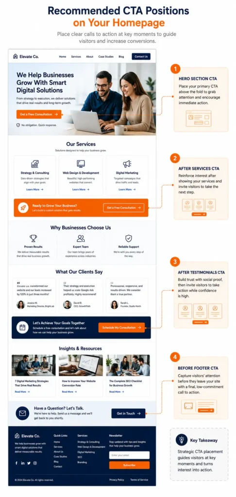
Above the Fold
Place the main CTA in the hero section near a clear headline and brief value statement. Visitors who already know what they need can take action immediately.
Unbounce recommends keeping the headline, value proposition, and primary CTA visible near the top of a landing page. Its landing page best practices also emphasize avoiding unnecessary clutter around the action.
After the Services Section
Visitors who first need to confirm that you offer the right service should see another CTA after the service overview.
Use wording such as:
Find the Right Service
Discuss Your Project
Request a Service Quote
After Testimonials or Project Examples
Social proof can reduce hesitation. Place a contact or booking CTA after testimonials, reviews, recognizable client logos, case studies, or portfolio examples.
At the Bottom of the Homepage
The final section should not end with information alone. Give visitors a clear next step after they finish reviewing the page.
A strong closing section may include:
A short outcome-focused headline
One or two sentences of reassurance
The primary CTA
A phone number or response-time note
Common CTA Mistakes That Cost Small Businesses Leads
One common mistake is using “Learn More” for every button. It can be useful when the destination is clear, but repeated generic wording does not help visitors distinguish between services, projects, and contact options.
Another problem is sending every CTA to the same general contact page. A “View Our Work” button should open the portfolio. A “Book a Consultation” button should lead to the calendar. The destination should match the promise.
Small businesses also lose opportunities when:
✅ Buttons blend into the background
✅ Mobile phone numbers are not clickable
✅ Forms request too much information
✅ The CTA makes an offer the page has not explained
✅ Several buttons compete for attention
✅ The wording changes unpredictably across the website
✅ Visitors cannot tell what happens after clicking
Reviewing common homepage mistakes small businesses make can help identify broader design and messaging issues that prevent CTAs from performing.
How to Test and Improve Your CTA
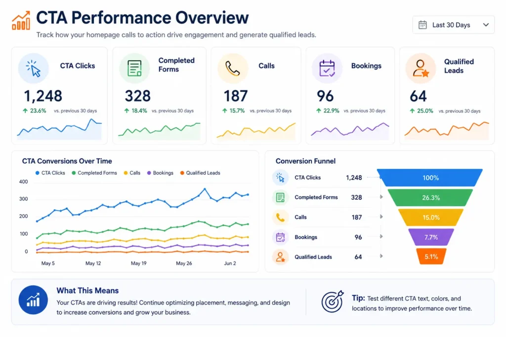
Do not judge a CTA only by whether the wording sounds good. Measure how visitors respond.
Start by tracking:
✅ Button clicks
✅ Contact-form completions
✅ Phone calls
✅ Online bookings
✅ Quote requests
✅ Conversion rate by device
✅ Leads generated from each page
Test one meaningful element at a time. You might compare “Contact Us” with “Request a Free Estimate,” but avoid changing the wording, color, placement, form, and headline simultaneously. Too many changes make it difficult to understand what influenced the result.
Also review lead quality. A button that generates more inquiries is not automatically better if most inquiries are irrelevant, outside the service area, or unable to meet the project requirements.
A useful CTA produces the right action from the right visitor.
Final Takeaway: Homepage Call to Action Examples
Effective homepage call to action examples are clear, specific, and matched to the visitor’s level of readiness. They help people understand the next step without pressuring them into a decision they are not prepared to make.
For most small businesses, “Request a Free Estimate,” “Book a Consultation,” or “Check Availability” can serve as the main conversion button. A supporting option such as “View Our Work” or “Explore Our Services” gives less-ready visitors a useful path.
The CTA should also be supported by persuasive messaging, visible proof, a simple form, and a mobile-friendly design. Changing a button cannot fix an unclear offer or a confusing homepage by itself.
Choose one primary action, make the benefit obvious, place it at logical decision points, and measure whether it produces qualified leads. When the website’s design, message, and CTA work together, visitors are more likely to become calls, bookings, and customers.
Frequently Asked Questions
1. What is the best call to action for a small business homepage?
The best CTA is the one that matches the customer’s most logical next step. A contractor may use “Request a Free Estimate,” while a consultant may use “Book a Consultation.” Appointment-based businesses can use “Check Availability,” and urgent service providers may prioritize a clickable phone button. Choose an action that supports your sales process and clearly tells visitors what will happen after they click.
2. How many CTA buttons should a homepage have?
Most small business homepages should emphasize one primary action and one secondary action. The primary CTA may request a quote, call, or booking. The secondary CTA can direct cautious visitors to services, testimonials, or project examples. The buttons may appear several times as users scroll, but their purpose and wording should remain consistent. Too many unrelated choices can distract visitors and reduce completed inquiries.
3. Can a website redesign improve CTA conversions and lead generation?
A strategic website redesign can improve conversions when it fixes unclear messaging, weak trust signals, poor mobile usability, and confusing visitor paths. Changing colors alone is unlikely to produce lasting results. A redesign should clarify the offer, organize services, strengthen proof, improve page speed, simplify forms, and place relevant CTAs at key decision points. These improvements can help more qualified visitors call, book, or request information.
4. Should I hire a web designer to improve my homepage CTA?
Hiring a professional web designer is helpful when the CTA problem is connected to the entire homepage experience. A designer can review the visual hierarchy, mobile layout, copy, trust elements, form usability, and conversion path instead of treating the button as an isolated feature. Professional help is especially valuable when a website receives traffic but produces few calls, bookings, quote requests, or qualified leads.