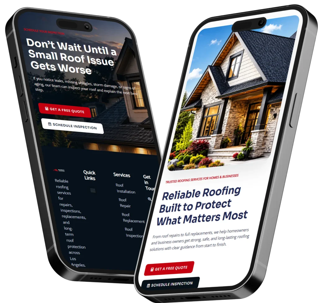
Homepage mistakes small businesses make usually involve unclear messaging, weak calls to action, poor mobile design, slow loading, and missing trust signals. Fixing these problems helps visitors understand your business, trust your company, and take the next step.
Your homepage should quickly explain what you offer, who you serve, and why someone should choose you. When visitors have to search for basic information, they are more likely to leave without calling, requesting a quote, booking an appointment, or visiting another page.
A homepage is not simply an online brochure. It should guide potential customers from interest to action while supporting your search visibility, credibility, and business goals.
This guide explains which homepage problems hurt small businesses, why they matter, and how to correct them.
Why Your Small Business Homepage Matters
Your homepage is often the first page people see after finding your company through Google, social media, a referral, or an advertisement. It creates an immediate impression of your professionalism and relevance.
Visitors usually arrive with a few basic questions:
✅ Does this company provide what I need?
✅ Does it serve my location?
✅ Can I trust it?
✅ What should I do next?
A strong homepage answers these questions without making people scroll through unrelated text or decode vague marketing language.
The homepage also helps search engines understand your business. Clear headings, descriptive content, internal links, service information, and location details give Google more context about the website.
Google recommends creating content primarily for people while making pages easy for search engines to discover and understand. Its SEO Starter Guide explains how logical organization, descriptive links, and useful content support search visibility.
Quick Homepage Problem Checklist
Use this table to identify the issues most likely to affect your website.
| Homepage problem | What visitors may think | Likely business impact |
|---|---|---|
| Unclear headline | “I do not know what this business offers.” | Higher bounce rate |
| Weak call to action | “What am I supposed to do next?” | Fewer calls and inquiries |
| Slow loading | “This website is not working.” | Lost mobile visitors |
| Missing proof | “Can I trust this company?” | Lower conversion rate |
| Too much information | “This feels confusing.” | Decision fatigue |
| Poor mobile layout | “This is difficult to use.” | Fewer bookings and form submissions |
| Generic stock images | “Is this a real local business?” | Reduced credibility |
One problem may not completely stop a visitor from contacting you. Several problems appearing together can create enough doubt for that person to choose a competitor.
1. Using a Headline That Does Not Explain the Business
The main headline should tell visitors what you do, who you help, or what result you provide. Statements such as “Welcome to Our Website,” “Quality You Can Trust,” or “Building a Better Tomorrow” do not provide enough information.
A better headline is specific:
Weak headline: Welcome to Smith Solutions
Improved headline: Residential Plumbing Repairs for Homeowners in Austin
The improved version identifies the service, customer, and location. A visitor can immediately decide whether the company is relevant.
Your supporting sentence can add an important benefit, such as same-day availability, transparent pricing, licensed technicians, or a simple booking process.
Clear wording also helps search engines connect your page with relevant searches. Do not force keywords into every sentence. Focus on describing your business in language that real customers use.
For more guidance, review this article about creating effective website messaging for small business.
2. Failing to Include a Clear Call to Action
A homepage may look professional but still fail to generate leads because it does not tell visitors what to do.
Your primary call to action should match the most valuable next step for your business. Depending on your service, that could be:
✅ Request a quote
✅ Schedule a consultation
✅ Book an appointment
✅ Call now
✅ View available services
Avoid using vague buttons such as “Learn More” as the only option. A descriptive button sets a clear expectation. “Request a Free Estimate” is more useful than “Submit” because visitors know what will happen after clicking.
Place your main action near the top of the homepage and repeat it naturally after important sections. Visitors should not need to scroll back to the beginning when they are ready to contact you.
The best option for a service business is usually one primary action supported by a secondary choice, such as “Request a Quote” and “Call Now.”
3. Trying to Promote Every Service at Once
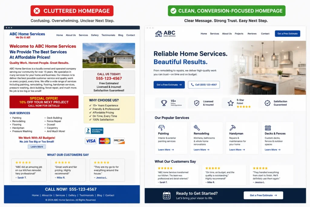
Small businesses often add every service, benefit, promotion, credential, and company update to the top of the homepage. The result is a crowded page with no clear priority.
Your homepage does not need to explain every detail. Its job is to introduce your main services and direct visitors to the right supporting pages.
Select three to six primary services and give each one:
- A descriptive service name
- A short customer-focused explanation
- A link to the relevant page
A landscaping company, for example, might feature lawn maintenance, landscape design, irrigation repair, and seasonal cleanup. Each service can lead to a dedicated page with more detailed information.
This approach improves navigation and creates stronger internal linking. It also gives each service enough space to be understood without overwhelming the visitor.
Businesses that need help reorganizing an outdated site can explore website redesign that converts rather than continuing to add more content to an already crowded homepage.
4. Hiding Important Information Below the Fold
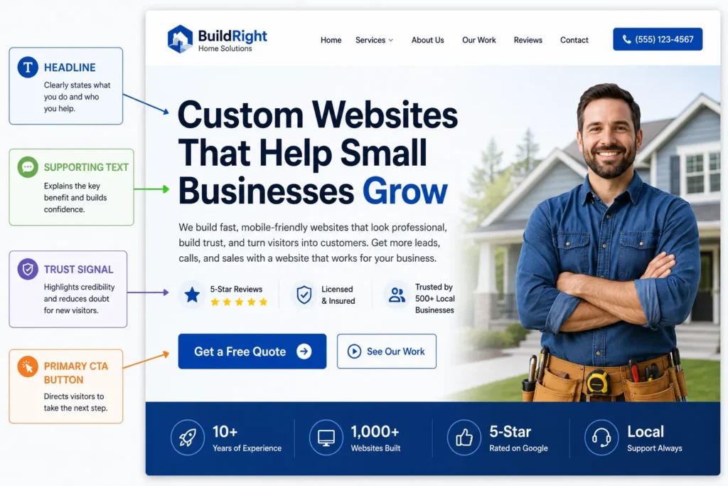
The top part of your homepage should contain the information a new customer needs first. This normally includes your headline, supporting message, main call to action, and a relevant visual.
Do not use the entire opening screen for a decorative image, rotating slideshow, oversized logo, or vague statement. These elements take up valuable space without helping visitors make a decision.
Nielsen Norman Group recommends clearly communicating a homepage’s unique value proposition through descriptive content and a meaningful tagline. Its homepage design principles also emphasize helping users understand what a company offers.
A practical hero section might contain:
Headline: Custom Websites for Local Service Businesses
Supporting message: Build trust, explain your services, and turn more website visits into qualified inquiries.
Primary button: Start Your Website Project
Secondary option: View Recent Work
Keep the top section focused on clarity rather than decoration.
5. Using Weak or Generic Trust Signals
Visitors are cautious when hiring a company they have never worked with. Your homepage should provide evidence that the business is legitimate, experienced, and capable of delivering the promised result.
Useful trust signals include:
- Customer reviews
- Client logos
- Professional certifications
- Years of experience
- Completed project numbers
- Before-and-after examples
- Service guarantees
- Local business information
Specific proof is stronger than unsupported claims. “Trusted by more than 150 local homeowners” is more convincing than “We are the best company in town.”
Testimonials should include enough context to feel real. When possible, show the customer’s name, business, location, service purchased, or measurable result. Avoid publishing several generic comments that all sound alike.
Visual proof is particularly valuable for contractors, designers, photographers, remodelers, landscapers, and other businesses whose results can be shown. Visitors can review these portfolio highlights to see how completed projects can support credibility.
6. Designing the Homepage Only for Desktop Visitors
A homepage may look polished on a large monitor but become frustrating on a phone. Buttons can become too small, text may overlap, images may load slowly, and forms may require excessive zooming.
Mobile visitors often have immediate intent. They may be looking for a phone number, checking service availability, comparing companies, or trying to book an appointment.
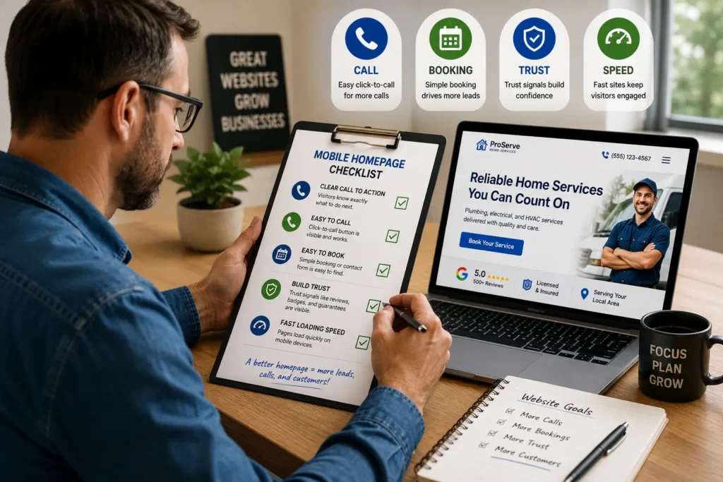
A mobile-friendly homepage should provide:
✅ Readable text without zooming
✅ Buttons that are easy to tap
✅ A visible phone or contact option
✅ Short, simple forms
✅ Properly sized images
✅ Sections with comfortable spacing
Test the page on multiple screen sizes rather than relying only on a website builder’s desktop preview. Complete important actions yourself, including opening the menu, tapping the phone number, submitting a form, and reading testimonials.
The best design is not simply one that shrinks to fit a phone. It should reorganize the content so mobile users can act quickly.
7. Allowing the Homepage to Load Too Slowly
Large images, unnecessary animations, excessive plugins, video backgrounds, and poorly configured hosting can make a homepage slow.
Speed matters because visitors may assume a slow website is broken or unreliable. It can also affect how easily people interact with the page, especially on mobile connections.
Google’s page experience documentation encourages website owners to provide a good overall experience and evaluate performance through measures such as Core Web Vitals.
Practical improvements include:
- Compressing images before uploading them
- Using modern image formats when appropriate
- Removing plugins that provide no clear value
- Limiting autoplay video
- Loading below-the-fold images only when needed
- Choosing reliable hosting
- Keeping themes and plugins updated
A practical rule is to make every visual element justify the loading time it adds. A real project image may strengthen trust. A decorative animation that delays the page may not.
8. Writing About the Company Instead of the Customer
Many homepages begin with a long company history. They explain when the business opened, how passionate the owners are, and what the team believes.
That information can support trust, but it should not come before the customer’s problem.
Compare these two approaches:
Company-focused: We are a full-service agency committed to excellence and innovation.
Customer-focused: Get a professional website that clearly explains your services and makes it easier for customers to contact you.
The second statement connects directly with a desired result.
Use “you” and “your” more often than “we” and “our.” Explain how your process saves time, reduces uncertainty, improves results, or makes the customer’s next step easier.
Your company story can appear later on the page or on a separate About page. First, demonstrate that you understand why the visitor came to the website.
9. Leaving Out Essential Homepage Sections
A homepage needs enough information to answer common questions without becoming a complete archive of the website.
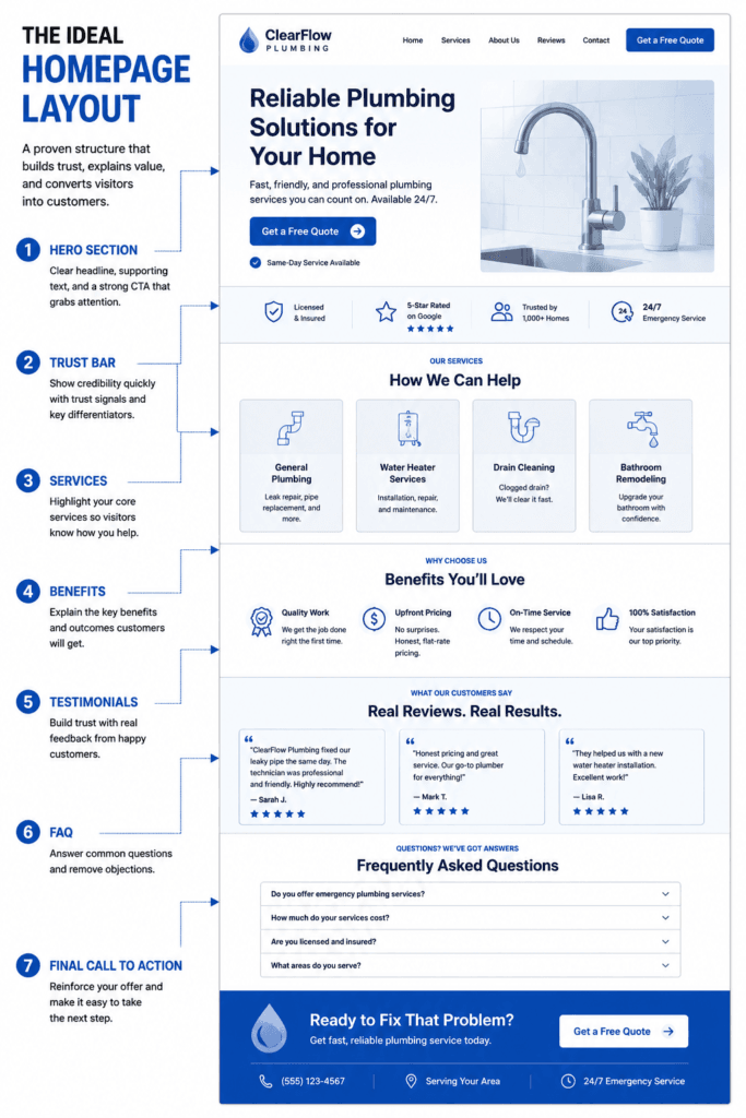
The right sections depend on the company, but most service businesses benefit from a similar structure.
| Homepage section | Purpose | Best content to include |
| Hero section | Establish relevance | Service, audience, location, primary action |
| Trust bar | Reduce immediate doubt | Ratings, credentials, clients, guarantees |
| Services | Show available solutions | Main offers with internal links |
| Benefits | Explain why the service matters | Customer outcomes and differentiators |
| Process | Reduce uncertainty | Three or four simple steps |
| Proof | Support credibility | Reviews, results, and project examples |
| FAQ preview | Answer objections | Concise responses to common questions |
| Final call to action | Encourage contact | One clear next step |
The best structure follows the customer’s decision process. First establish relevance, then explain the solution, provide evidence, answer concerns, and ask for action.
Use this guide to plan the right homepage sections for small business before redesigning the page.
10. Ignoring Local SEO Signals
A local business homepage should make its service area clear. Visitors should not have to search the footer or contact page to determine whether the company works in their city.
Mention your primary location naturally in the headline, introduction, service description, or contact section. Add nearby service areas only when the business genuinely serves them.
Helpful local signals include:
✅ Business name, address, and phone number
✅ Primary city or region
✅ Links to individual location pages
✅ Local testimonials or case studies
✅ Consistent contact information
✅ Embedded map when it helps customers visit
Avoid listing dozens of city names in repetitive paragraphs. That approach creates poor content and may make the business look less trustworthy.
A better option is to create useful location pages that explain the services available in each area. The homepage can briefly introduce the main region and link to those pages.
11. Launching Without Measuring What Visitors Do
A homepage redesign should not end when the new page is published. You need to know whether visitors are clicking, calling, booking, and submitting forms.
At minimum, monitor:
- Contact form submissions
- Phone-number clicks
- Booking-button clicks
- Traffic sources
- Popular landing pages
- Engagement with key sections
- Organic search queries
Measurement helps you identify where people stop. For example, visitors may click a quote button but abandon a long form. They may reach the homepage from Google but leave because the headline does not match their search.
Use the data to make focused improvements. Change one important element at a time, such as the headline, call-to-action wording, form length, or testimonial placement. This makes it easier to understand what affected the result.
Which Homepage Problems Should You Fix First?
Not every business needs a complete redesign. Some websites can improve significantly through targeted changes.
Start with issues that directly prevent visitors from understanding or contacting the business.
Priority 1: Clarity
Fix the headline, service description, location information, and main call to action.
Priority 2: Functionality
Correct broken forms, mobile display problems, slow loading, and difficult navigation.
Priority 3: Trust
Add reviews, credentials, project examples, guarantees, and complete business information.
Priority 4: Search visibility
Improve headings, page titles, internal links, service content, image descriptions, and local relevance.
Priority 5: Visual refinement
Update colors, typography, spacing, images, and decorative details after the page communicates and functions correctly.
A visually impressive homepage cannot compensate for unclear messaging or a broken contact form. Function and clarity should come before decoration.
Practical Homepage Test for Small Business Owners
Ask someone unfamiliar with your company to view the homepage for five seconds. Hide the screen and ask:
- What does the business offer?
- Who does it serve?
- Where does it operate?
- What should a visitor do next?
- Why should someone trust it?
If the person cannot answer the first four questions, the opening section probably needs improvement.
Next, complete the customer journey on a phone. Try to find a service, view proof, call the business, and submit the contact form. Record every confusing step.
This simple review often reveals problems that business owners stop noticing because they already understand the company.
For a professional assessment and a homepage built around clear customer actions, connect with small business web design experts or review what should be included when deciding what should be on a homepage.
Final Thoughts on Homepage Mistakes Small Businesses Make
Correcting homepage mistakes small businesses make starts with clarity. Your visitors should immediately understand what you provide, who you help, why your business is trustworthy, and how to contact you.
Begin with the headline and primary call to action. Then improve mobile usability, loading speed, service navigation, trust signals, and local information. Measure calls, form submissions, and bookings after making changes so you can see whether the homepage is supporting real business growth.
A successful homepage does not need to be complicated. It needs to answer the right questions, remove doubt, and make the next step easy.
Frequently Asked Questions
1. What should a small business homepage include?
A small business homepage should include a clear value proposition, primary call to action, main services, trust signals, customer benefits, and contact information. It should also identify the company’s service area when location matters. Additional sections may include testimonials, a simple process, project examples, and frequently asked questions. The exact layout should reflect what customers need to know before they call, book, request a quote, or visit a service page.
2. How do I know when my small business website needs a redesign?
Your website may need a redesign when it looks outdated, loads slowly, performs poorly on mobile devices, or fails to generate consistent leads. Other warning signs include confusing navigation, broken forms, low-quality visuals, unclear messaging, and services that no longer match what the business offers. Review performance data before redesigning. A professional designer can determine whether targeted improvements are enough or whether the structure and platform should be rebuilt.
3. Can landing pages generate more leads than a homepage?
A focused landing page can generate more leads when it is created for one service, audience, location, or advertising campaign. Unlike a homepage, which introduces the full business, a landing page removes unrelated choices and guides visitors toward one action. However, it still needs clear messaging, proof, mobile usability, and a simple form. The best choice depends on traffic intent. Use a homepage for broad discovery and landing pages for specific campaigns or offers.
4. Is hiring a professional website designer worth it for a small business?
Hiring a professional website designer can be worthwhile when your website must build trust, rank for valuable services, and consistently generate calls or bookings. A designer can improve the page structure, messaging, mobile experience, loading performance, accessibility, and conversion path. Professional support is especially useful when a do-it-yourself website looks acceptable but does not produce inquiries. The value should be measured through stronger credibility, better leads, saved time, and long-term business use.