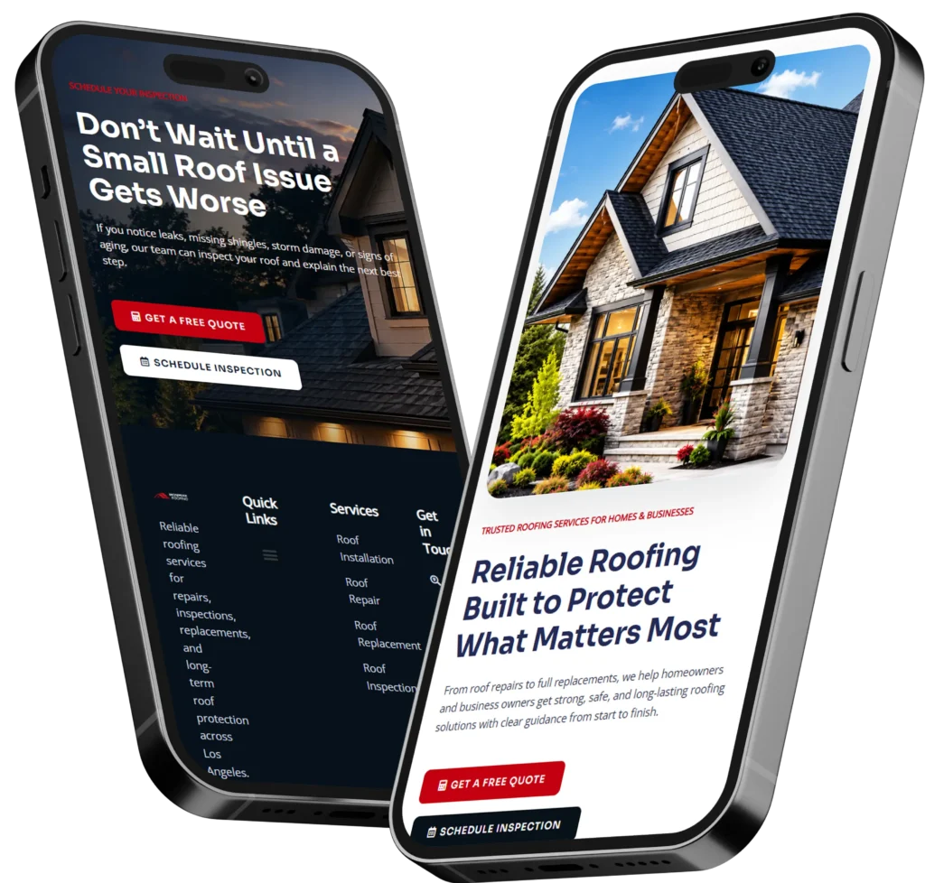
If you are wondering what should be on homepage sections, start with a clear headline, a short explanation of your services, proof that customers can trust you, and one obvious call to action. Your homepage should quickly tell visitors who you help, what problem you solve, why your business is credible, and how they can contact or hire you.
A homepage is not simply an online brochure. It is often the first step between a potential customer discovering your business and deciding whether to call, request a quote, make a booking, or continue searching.
The best homepage does not try to explain every detail about your company. Instead, it guides visitors toward the information and action that matter most.
In this guide, you will learn which homepage sections are essential, why each section matters, how to organize them, and which options work best for different small businesses.
Why Your Homepage Matters for Leads and Trust
Your homepage often receives visitors who know very little about your company. Some may arrive from Google, while others may click through from social media, a local directory, an advertisement, or a referral.
Regardless of where they come from, most visitors are trying to answer a few immediate questions:
✅ Am I in the right place?
✅ Does this business provide what I need?
✅ Can I trust this company?
✅ What should I do next?
Your homepage needs to answer those questions without making people search through several pages.
A visually attractive website may create a positive first impression, but design alone is not enough. Visitors also need clear messaging, useful information, and credible proof.
Research-based homepage guidance from the Nielsen Norman Group recommends communicating a clear value proposition through descriptive messaging and relevant content. Google also encourages website owners to create helpful, people-first content and place important words in prominent areas such as titles, headings, and descriptive links.
A strong homepage brings design, messaging, search visibility, and conversion strategy together.
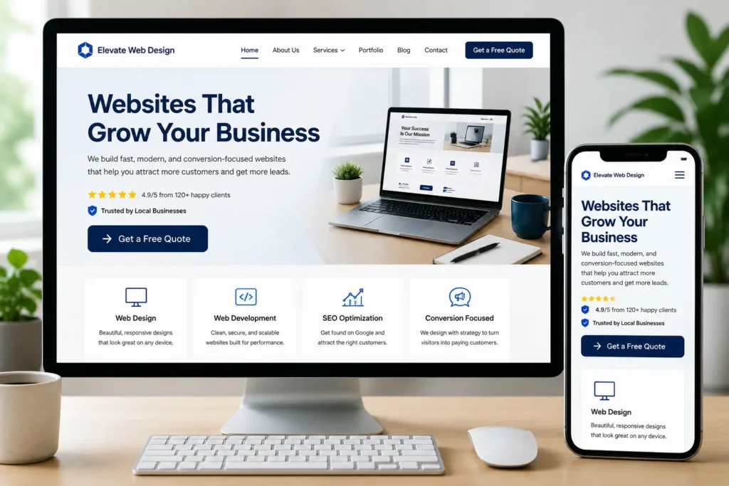
What Should Be on Homepage Sections?
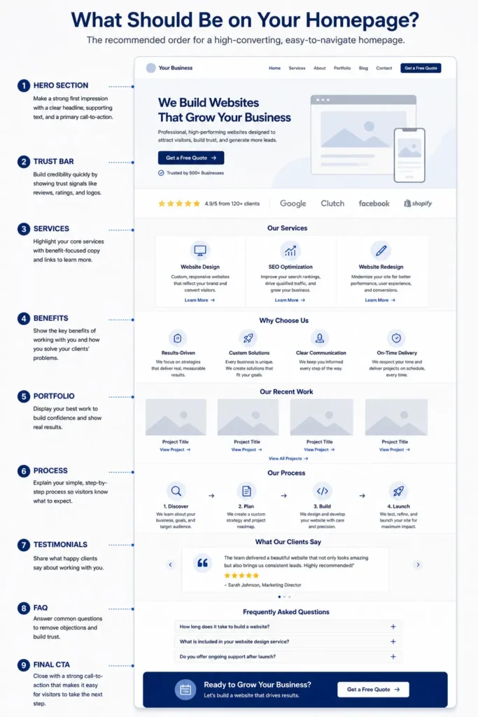
A useful homepage should follow the same order in which a customer naturally makes a decision. Begin with clarity, establish relevance, build trust, explain the offer, and then make the next step easy.
The exact layout can vary by industry, but most service-based small businesses need the following core sections.
A Clear Headline Above the Fold
The first screen should contain a headline that explains what your company does or the result you help customers achieve.
Avoid generic headlines such as:
“Welcome to Our Website”
“Quality You Can Trust”
“We Are Passionate About Excellence”
These phrases sound positive, but they do not tell the visitor what the company sells, who it serves, or why the offer matters.
A stronger headline is specific:
“Custom Kitchen Remodeling for Homeowners in Austin”
“Bookkeeping Services That Help Small Businesses Stay Tax-Ready”
“Conversion-Focused Websites for Local Service Businesses”
The best headline usually combines a service, audience, location, or useful outcome. It should be understandable even when someone sees it without your logo or navigation menu.
A Supporting Statement
The text below your headline should add context without becoming a long paragraph. Use one or two sentences to explain who you serve, how you help, and what makes your approach valuable.
For example:
“We design fast, professional websites that help local businesses earn trust, generate qualified leads, and turn more visitors into paying customers.”
This supporting statement expands the headline and gives visitors a reason to continue scrolling.
For additional guidance on positioning your value clearly, read this guide to website messaging for small business.
One Primary Call to Action
Your homepage should give visitors a clear next step. The primary call to action should reflect the action most valuable to your business.
Common examples include:
✅ Request a Quote
✅ Schedule a Consultation
✅ Book an Appointment
✅ Call Now
✅ View Services
✅ Get a Website Audit
A local plumber may prioritize phone calls. A consultant may prefer scheduled discovery calls. A restaurant may want reservations, while a website designer may want project inquiries.
Choose one primary action and repeat it naturally throughout the page. You can include a secondary action, such as viewing your portfolio, but it should not compete visually with the main button.
Homepage Section Priority Table
The following table shows how each section supports the customer’s decision.
| Homepage Section | Main Purpose | Best Content to Include | Recommended Priority |
|---|---|---|---|
| Hero section | Establish immediate relevance | Headline, supporting statement, main CTA | Essential |
| Trust indicators | Reduce doubt | Reviews, certifications, client logos, ratings | Essential |
| Services overview | Explain available solutions | Three to six service summaries | Essential |
| Benefits or process | Show why and how you help | Outcomes, steps, differentiators | High |
| Portfolio or results | Provide visual proof | Projects, before-and-after examples, results | High |
| About preview | Humanize the company | Short story, team photo, values | Medium |
| FAQ section | Address objections | Pricing, timelines, process, service area | High |
| Final CTA | Encourage action | Contact prompt, booking button, phone number | Essential |
This structure works because it helps visitors move from awareness to confidence without forcing them to make a decision before they understand your offer.
Add Trust Signals Near the Top
Visitors are more likely to contact a company when they see evidence that it is legitimate, capable, and dependable.
Trust signals can include:
✅ Google review ratings
✅ Customer testimonials
✅ Years in business
✅ Professional memberships
✅ Certifications or licenses
✅ Client or partner logos
✅ Warranty information
✅ Secure payment or privacy information
✅ Number of customers served
Place one concise trust signal near the top of the homepage. For example, a row displaying “Rated 4.9 by Local Customers,” “Licensed and Insured,” and “Serving the Area Since 2012” can reinforce credibility before the visitor reaches the detailed sections.
Only use claims you can verify. A smaller but accurate claim is more persuasive than an exaggerated statement with no evidence.
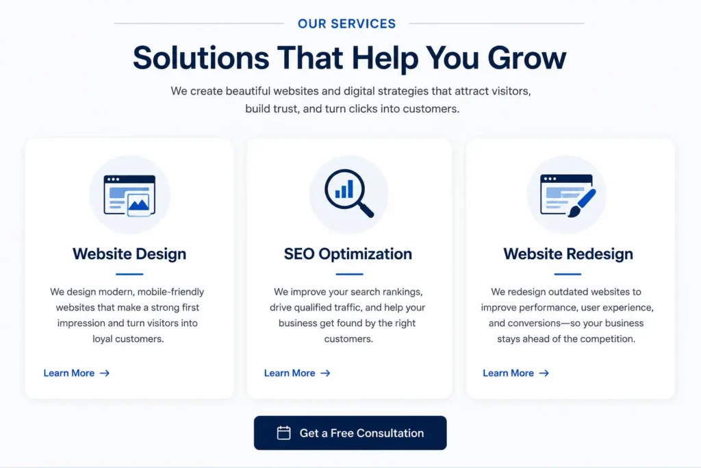
Show Your Main Services Without Overloading Visitors
Your homepage should summarize your most important services, not reproduce every service page in full.
For most small businesses, three to six service cards are enough. Each card can include:
A descriptive service name
A one-sentence explanation
A relevant image or icon
A link to the detailed service page
Use wording that customers understand. For example, “Emergency Roof Repair” is more useful than an internal label such as “Rapid Response Solutions.”
Service descriptions should focus on the customer’s need and expected result. Instead of writing “We offer search engine optimization,” explain that the service helps customers find the business when they search for relevant services.
Businesses preparing a new site or replacing an outdated one can review Salt Web Designer’s website design & development services to see how professional design, messaging, speed, and conversion planning can work together.
Explain the Benefits, Not Only the Features
Features describe what a company provides. Benefits explain why those features matter to the customer.
Consider the difference:
Feature: Mobile-responsive web design
Benefit: Customers can easily browse your services and contact you from their phones.
Feature: Online booking system
Benefit: Customers can schedule appointments at any time without waiting for a callback.
Feature: Search engine optimization
Benefit: Your business has a better opportunity to appear when local customers search for your services.
Your homepage should include both, but benefits deserve more attention because they connect your services to real customer goals.
A practical way to create this section is to identify the three main problems customers want solved. Then explain how your service makes each situation easier, safer, faster, or more profitable.
Include Proof of Your Work
Claims tell visitors what you believe about your business. Proof shows them why they should believe it too.
The right proof depends on your service:
A web designer can show completed websites.
A contractor can show before-and-after photographs.
A consultant can summarize client outcomes.
A photographer can display selected images.
A cleaning company can show service results and customer feedback.
A business coach can include testimonials and short case studies.
Visual examples are especially helpful for services where quality can be seen. Link selected projects to a larger project gallery so interested prospects can explore your capabilities without making the homepage excessively long.
When possible, add context to each example. State the customer’s problem, the work completed, and the result. Even a short caption such as “Redesigned an outdated service website to simplify booking and improve mobile navigation” tells a stronger story than an image alone.
Add Testimonials That Sound Specific and Real
Testimonials can reduce uncertainty when they describe an experience, result, or meaningful detail.
A weak testimonial says:
“Great company. Highly recommended.”
A stronger testimonial says:
“The new website clearly explains our services, looks professional on mobile, and has already helped us receive better-quality inquiries.”
Include the customer’s name, company, photograph, location, or service purchased when permission is available. These details make the feedback easier to trust.
Avoid filling the page with ten long testimonials. Two or three strong reviews are normally enough for the homepage. Additional reviews can appear on a dedicated testimonials or project page.
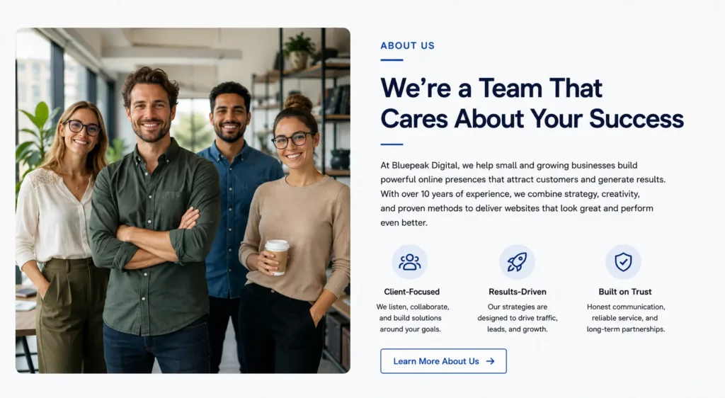
Introduce Your Business and the People Behind It
Customers often want to know who they will be working with, especially when hiring a local service provider, consultant, creative professional, or contractor.
An effective homepage introduction can include:
A brief explanation of your experience
Your approach to customer service
The type of customer you primarily serve
A professional photograph of the owner or team
A link to the full About page
Keep this section focused on the customer. Your company story matters, but visitors are usually more interested in how your background helps them receive a better service.
For example, instead of writing a long history of when the company was founded, explain how your experience helps you recognize problems, recommend the right solution, and complete projects reliably.
Explain Your Process
Many potential customers hesitate because they do not know what happens after they contact a business.
A simple process section removes uncertainty. Most service businesses can explain their approach in three or four steps:
- Contact or book: The customer submits an inquiry or schedules a call.
- Discuss the project: You review their needs, goals, timeline, and budget.
- Receive the service: You complete the work according to the agreed scope.
- Review or continue support: The customer approves the result or receives ongoing assistance.
Keep the descriptions short and realistic. The goal is not to document every internal task. It is to make working with your company feel manageable.
A clear process is especially valuable for higher-cost services because customers may need more reassurance before requesting a proposal.
Homepage Options for Different Business Goals
Not every homepage should give the same elements equal emphasis. Choose the layout based on the action you need visitors to take.
| Business Goal | Homepage Element to Emphasize | Recommended Primary CTA | Supporting Content |
| Generate phone calls | Phone number, service area, availability | Call Now | Reviews, emergency information, trust badges |
| Increase bookings | Availability and booking benefits | Book an Appointment | Process, service details, FAQs |
| Sell professional services | Expertise and results | Schedule a Consultation | Case studies, testimonials, credentials |
| Generate quote requests | Service scope and project examples | Request a Quote | Portfolio, process, expected timelines |
| Build local visibility | Location and service coverage | Get Local Help | Map, local reviews, area-specific content |
| Promote website redesign | Before-and-after improvements | Request a Website Audit | Performance issues, portfolio, redesign process |
A business with several goals should still choose one main conversion. Too many equal buttons can make the page feel confusing and reduce the likelihood that visitors will act.
Support Your Homepage With SEO-Friendly Content
Homepage SEO begins with clarity. Search engines need to understand what the business offers, while visitors need language that matches the problem they are trying to solve.
Include your primary service and location naturally in the page title, main heading, introductory content, and relevant section headings. Avoid repeating the same phrase in every paragraph.
Your homepage should also link to detailed service pages and useful blog content. These internal links help visitors explore related topics while giving search engines clearer information about the relationship between pages.
For example, a short section about improving conversion copy can link to a guide about service page copy for small business. A section about page organization can point readers toward recommended homepage sections for small business.
Google’s Search Essentials recommends using terms people would search for in prominent page locations and making links crawlable so search systems can discover connected pages. Google also states that the same foundational SEO practices remain relevant for AI search features, including helpful content, accessible text, internal links, and strong page experience.
Make the Homepage Easy to Use on Mobile
Many customers will first visit your website on a phone. Your homepage must remain readable, fast, and easy to navigate on a smaller screen.
Check that:
✅ Text can be read without zooming.
✅ Buttons are large enough to tap.
✅ The navigation menu is simple.
✅ Important information appears before decorative content.
✅ Forms do not require unnecessary fields.
✅ Images are compressed and load efficiently.
✅ Phone numbers can be tapped to call.
✅ Pop-ups do not block the main content.
Google uses the mobile version of a website’s content for indexing and ranking, making mobile usability an important part of search visibility as well as customer experience.
Test the page on a real phone rather than relying only on a desktop preview. Look for oversized headings, awkward image crops, buttons placed too close together, and sections that require excessive scrolling.
What Should You Leave Off the Homepage?
Adding more content does not automatically make a homepage more useful. Remove elements that distract visitors or weaken trust.
Avoid long welcome messages that do not explain the service. Do not use automatic music, excessive animation, unreadable text over images, or sliders that hide important information.
Other common problems include:
Unverified awards or vague claims
Stock photographs that feel unrelated to the business
Several competing call-to-action buttons
Long forms asking for unnecessary personal information
Service descriptions filled with industry jargon
Outdated copyright dates or promotions
Broken links and missing images
Prices that no longer match the actual offer
A homepage should feel focused. Every section should either explain the offer, establish credibility, answer a concern, or move the customer toward a useful next step.
A Practical Homepage Review
Imagine a homeowner searching for a local landscaping company. They arrive on a homepage and see a large photograph with the headline “Creating Beautiful Spaces.”
The page looks attractive, but the visitor still does not know whether the company provides lawn maintenance, landscape design, hardscaping, or commercial services.
A stronger version could say:
“Landscape Design and Installation for Homeowners in Raleigh”
The supporting text might explain that the company plans and builds low-maintenance outdoor spaces. A “Request a Consultation” button appears below, followed by a 4.9-star review rating, three service cards, recent projects, and a short process.
The second version works better because every section reduces uncertainty. The visitor knows the service, location, expected result, credibility, and next step.
This same principle applies across industries. Clarity usually converts better than clever wording.
Final Thoughts on What Should Be on Homepage Content
Understanding what should be on homepage content becomes easier when you view the page as a guided customer journey. Start with a specific promise, introduce your services, demonstrate credibility, answer common concerns, and finish with a clear action.
The best option for most small businesses is a focused homepage with one primary conversion goal, concise service summaries, genuine proof, helpful internal links, and a mobile-friendly design.
Do not add sections simply because another website uses them. Choose each section based on what your customers need to know before they feel comfortable calling, booking, or requesting a quote.
For professional help turning these elements into a clear and conversion-focused website, connect with small business web design experts.
Frequently Asked Questions
1. What information should a small business homepage include?
A small business homepage should immediately explain the service, audience, value, credibility, and next step. Include a clear headline, short supporting statement, primary call to action, service overview, testimonials or reviews, examples of completed work, a brief About section, and contact details. The exact order may vary, but visitors should understand what the business does within the first screen and find a simple path toward calling, booking, or requesting a quote.
2. How can a homepage help a small business generate more leads?
A homepage generates more leads by reducing confusion and making the next action easy. Use a specific headline, benefit-focused copy, visible contact options, trust signals, and repeated calls to action. Remove unnecessary distractions and ask only for essential information in forms. Businesses can also increase conversions by matching the call to action to customer intent, such as “Book an Appointment” for scheduled services or “Request a Quote” for customized projects.
3. How often should a small business redesign its homepage?
A homepage should be redesigned when it no longer reflects the business, performs poorly on mobile, loads slowly, or fails to generate qualified inquiries. There is no fixed redesign schedule that applies to every company. Review the page regularly and update outdated services, images, testimonials, contact details, and calls to action. A complete redesign may be appropriate when the brand, customer audience, technology, or business goals have changed significantly.
4. Should I hire a web designer to create my business homepage?
Hiring a professional web designer is often worthwhile when the website must build trust and consistently produce calls, bookings, or leads. A designer can organize the page, improve mobile usability, clarify messaging, strengthen calls to action, and create a more credible visual presentation. Business owners using a template may build a basic site themselves, but professional support is usually the better option when the service is competitive, high-value, or dependent on strong first impressions.