A booking-ready fitness website should help visitors choose a service, pick a time, and secure a spot without confusion. When the process feels simple on mobile and desktop, more visitors turn into real appointments, class sign-ups, and paid consultations.
Most fitness brands do not lose leads because people are not interested. They lose them because the next step is unclear. A visitor lands on the site, likes the offer, then has to hunt for pricing, scroll for availability, or click through a platform that feels disconnected from the brand. That gap is where conversion drops.
If your site is already bringing in traffic, the better move is not always more traffic. It is a cleaner path from interest to action. That is where your website design & development services page, your service layout, and your booking experience need to work together as one system.
Why Fitness Website Booking Matters
A good fitness site should answer the visitor’s biggest questions in the right order. What do you offer? Who is it for? How much does it cost? What happens next? Once those answers are easy to find, booking feels like the natural next step instead of a risky commitment.
That matters even more in fitness because many visitors are comparing options quickly. They may be looking at a local gym, a boutique studio, a personal trainer, or an online coaching brand in the same browsing session. If your site forces them to leave the page before they feel ready, you create hesitation. If your site guides them step by step, you create momentum.
There is also a trust factor. People booking a class, consultation, or training package want reassurance before they commit. A polished site, visible reviews, a clear process, and a smooth scheduler make the business feel organized. That feeling matters just as much as the offer itself.
For local and service-based brands, the strongest sites usually do three things well. They reduce friction, they answer objections early, and they make the booking action visible more than once without making the page feel pushy.
| What visitors want to know | What your site should show |
|---|---|
| Is this right for me? | A clear promise, niche, and who you help |
| What can I book? | Distinct services, class types, or programs |
| How much is it? | Transparent pricing, starting rates, or plan options |
| How do I book? | A visible CTA and a simple calendar or inquiry step |
| Can I trust this brand? | Reviews, results, trainer bios, and photos |
One of the easiest ways to improve performance is to treat your booking flow like part of your sales page, not an add-on. That means your messaging, design, and scheduler should all feel like they belong to the same customer journey. When they do, the site works harder without needing more complexity.
What a High-Converting Booking Page Should Include
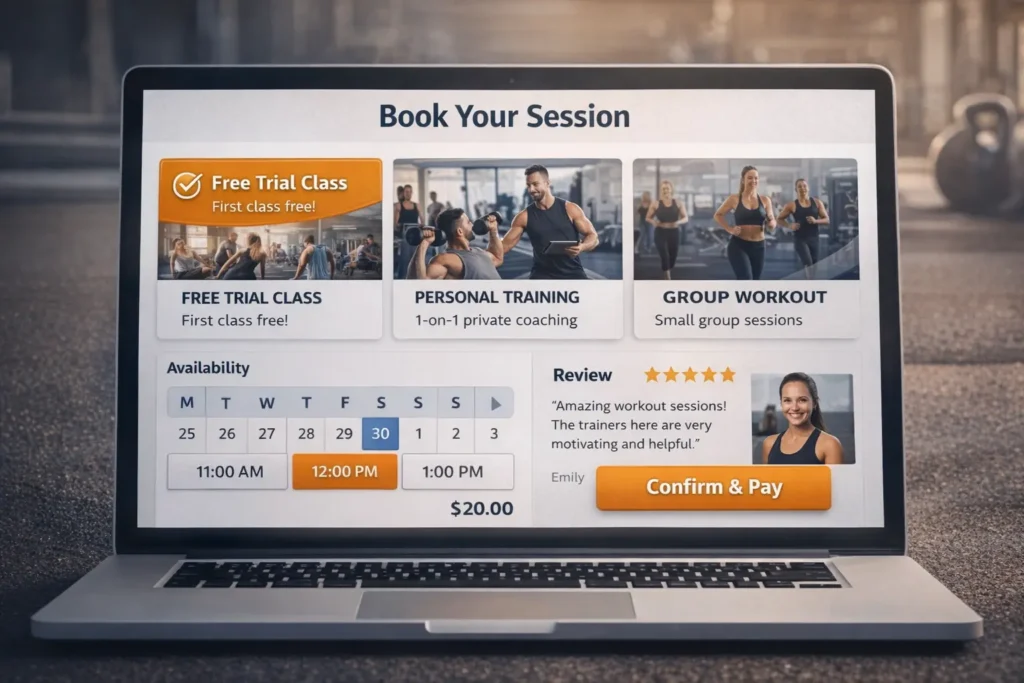
A strong booking page is not just a calendar. It is a decision page. It should reassure, guide, and close.
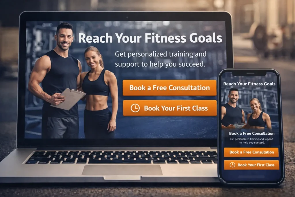
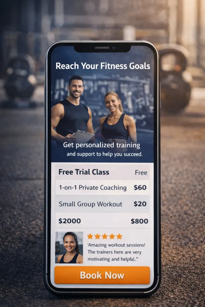
Start with a headline that states exactly what the visitor is booking. “Book a trial class” is clearer than “Get started.” “Schedule your strategy call” is clearer than “Contact us.” Specific language reduces uncertainty and helps the visitor commit faster.
Next, keep the service selection tight. If you offer too many options at once, booking slows down. A boutique studio may need categories like classes, intro visits, and private sessions. A personal trainer may need only three paths: consultation, one-on-one training, or online coaching. A gym may want to separate memberships from coached sessions. The point is to simplify the choice, not showcase everything at once.
The page should also explain what happens after the booking. Tell the visitor whether they will receive a confirmation email, waiver, intake form, or payment prompt. Tell them whether the session is in person, virtual, or hybrid. When you explain the next step clearly, you lower the mental resistance that often blocks conversion.
Trust signals should sit close to the CTA. That could be a short testimonial, trainer certifications, “as seen in” mentions, transformation snapshots, or a short line like “Trusted by busy professionals in San Diego.” You do not need a wall of proof. You need the right proof in the right place.
Studying real portfolio highlights can help you see how the highest-performing pages blend service copy, social proof, and booking intent without making the design feel crowded.
| Booking element | Why does it improve conversion |
|---|---|
| Clear CTA button | Removes guesswork and directs attention |
| Short service descriptions | Helps visitors choose faster |
| Live availability | Creates immediacy and confidence |
| Simple mobile layout | Prevents drop-off from smaller screens |
| Reviews near the form | Supports trust at the decision point |
| Payment or deposit option | Qualifies leads and reduces no-shows |
When your setup needs an external scheduler, make it feel native to the site. Match brand colors where possible, remove extra distractions, and send people to the most relevant calendar instead of a generic homepage. If your tools already live inside Google, Google Calendar appointment booking is a useful reference for how simple booking pages, reminders, and payments can be structured for service-based appointments. Google says booking pages can let clients book directly and automatically place the appointment on the calendar, while some plans also support payments and reminders.
How to Build a Booking Flow That Turns Interest Into Action
The best booking journeys usually begin before the visitor reaches the scheduler. They begin on the homepage, service page, and offer sections.
On the homepage, your primary CTA should reflect your business model. A boutique studio may lead with “Book a Trial Class.” A trainer may lead with “Book a Consultation.” A gym may lead with “Claim a Free Pass” or “Book a Tour.” That first CTA should match the easiest high-intent action, not the most complicated one.
From there, each major service page should support one booking decision. If the page is about strength coaching, its CTA should lead to the strength coaching booking flow. If the page is about recovery sessions, it should not force the visitor to sort through personal training options first. Relevance improves speed, and speed improves conversion.
This is where internal content can support search and user experience at the same time. If you want stronger topical relevance around this space, your supporting content should connect naturally. For studio brands, this fitness studio website guide is a smart internal link because it reinforces design intent around class-driven websites. For growth-focused facilities, this gym website that gets leads piece supports the broader conversation around turning visits into inquiries and bookings.
Mobile deserves special attention because that is where a lot of booking friction shows up. Buttons need breathing room. Date selectors should be easy to tap. Prices and durations should appear before the user starts filling in details. If a mobile visitor has to pinch, zoom, or open four tabs to figure out what they are booking, conversion suffers.
A clean flow often looks like this:
- The visitor lands on a page with a clear promise
- They choose one relevant service or offer
- They see price, availability, and a short explanation
- They book or pay without leaving the brand experience
- They receive confirmation and know what happens next
That flow sounds simple because it should be. Complexity is usually added by the business, not requested by the customer.
Which Option Is Best for Your Business
The best setup depends on what you sell and how your clients buy. There is no single booking format that works for every fitness business, but there is usually one that makes the most sense for each model.
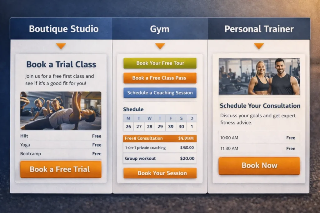
For a boutique fitness studio, the strongest option is often a class-based booking system connected to a dedicated landing page. Visitors want to see schedules, instructors, and introductory offers quickly. A page that explains the experience and then routes users into a class calendar usually works better than dropping them into a raw schedule first.
For a personal trainer or small coaching team, the best option is usually a dedicated service page with a focused scheduler. One service, one promise, one CTA. In this model, too many choices can hurt conversion. If your offer is high touch or high ticket, you may convert better with a consultation-first flow than with direct payment.
For a gym with multiple offers, a mixed model often works best. Memberships, tours, coaching sessions, and class bookings should not all fight for the same button. The homepage can direct users into the right lane, and each lane can have its own booking or inquiry logic.
For hybrid coaches and online fitness brands, the best option is usually a short qualification step before booking. This helps filter the right leads, protect your calendar, and steer visitors toward the right package instead of letting them self-select poorly.
| Business type | Best booking approach | Why it fits |
|---|---|---|
| Boutique studio | Dedicated landing page plus class scheduler | Visitors want schedule visibility and a low-friction trial offer |
| Personal trainer | Service page plus consultation calendar | Best for high-trust, high-intent sales |
| Multi-offer gym | Split CTAs by membership, tour, and coaching | Reduces confusion between different buyer intents |
| Online coach | Qualification form plus strategy call | Protects time and improves lead quality |
When local discovery matters, it is also smart to think beyond the website itself. Reserve with Google allows users to book through Google Search and Maps with supported providers, which can make it easier for people to save a spot without starting from your homepage. Google also notes that eligible Business Profiles can manage bookings through a provider or add their own link.
That does not replace your website. It strengthens the ecosystem around it. The site still needs to persuade. The external booking channels simply make the action easier once the intent already exists.
The Mistakes That Quietly Hurt Conversions
One common mistake is hiding the booking button until the bottom of the page. Visitors should not need to finish every section before they are allowed to act. Give them a primary CTA near the top, another after the offer explanation, and one more near reviews or FAQs. Repetition works when it is helpful, not aggressive.
Another mistake is sending every visitor to the same generic scheduler. A person looking for a class pass should not land on a trainer consultation page. A person looking for one-on-one coaching should not have to decode a weekly class calendar. Relevance matters more than convenience.
The third mistake is weak offer framing. “Book now” is not enough if the user still does not understand the value. The page should explain the result, not just the activity. Instead of “Book a mobility session,” try explaining who it is for and what it helps with. Instead of “Join now,” show what the first week looks like.
Many fitness businesses also forget to address no-shows and low-intent leads. A small deposit, a required confirmation email, or a simple intake question can improve booking quality without making the process feel heavy. Booking should be easy, but it should still protect your time.
Finally, do not overlook visual consistency. When the site looks premium, and the scheduler looks outdated, trust dips. That disconnect can be subtle, but visitors feel it immediately. Your page design, photography, copy tone, and booking interface should all point in the same direction.
How to Make the Page Stronger for SEO and RankMath
If the goal is higher rankings and better on-page performance, your booking article or service page should cover the real decision points users care about. That means speaking to appointments, class schedules, trial sessions, online payments, availability, mobile UX, booking software, confirmations, deposits, and local search intent in natural language.
It also helps to keep the structure clean. A descriptive title, a direct opening answer, semantic subheadings, short paragraphs, and tables all make the page easier to scan for both users and search engines. This is one reason your uploaded template works well. It answers early, then expands naturally.
Internal linking should support the journey instead of feeling forced. Link to relevant service pages when the reader is close to making a decision. Link to related blog content when the reader still needs education. Link to your main conversion-focused web design offer once the reader understands the value of fixing the booking flow. That sequence tends to feel more natural and more useful.
External links should do the same. Use them to reinforce helpful context, not to distract. One good reference about scheduling tools and one good reference about booking visibility is enough. Anything more can pull attention away from the page’s main action.
A well-optimized article should also be practical. That means examples, use cases, and clear advice, not just theory. The more specific the page feels, the more likely it is to satisfy both the searcher and the algorithm that is trying to match useful results to user intent.
A Smarter Next Step for Your Site
The strongest fitness websites do not just look polished. They make action easy. When your pages clearly explain the offer, reduce friction, and route people into the right scheduler, more visitors become leads, trials, and paying clients.
That is the real goal. Not just traffic, but movement. Not just clicks, but confirmed sessions. If your site already has demand, refining the path to action can unlock more value from the traffic you already worked hard to earn.
Frequently Asked Questions
1. What should a gym or studio booking page include?
A high-converting gym or studio booking page should include one clear action, visible availability, simple offer details, and proof that builds trust. Visitors should immediately understand what they are booking, what it costs, and what happens after they complete the form. Add short service descriptions, reviews, trainer photos, and a clear CTA near the top. If you offer classes and coaching, separate those paths so people do not have to sort through unrelated options before they commit.
2. Is it better to embed a scheduler or send people to an external booking tool?
The best choice depends on how much trust your page builds before the click. If your website already explains the offer well, an embedded scheduler often keeps momentum because the visitor never feels like they are leaving your brand. If your booking platform is stronger on a standalone page, sending users there can still work, but it should feel intentional and relevant. In most cases, a dedicated landing page that leads into a branded scheduler gives the best balance of clarity, control, and conversion.
3. Should clients be able to pay online when they book?
Online payment usually improves booking quality because it turns casual interest into real commitment. This is especially helpful for consultations, intro offers, private sessions, and limited-capacity classes. Payment does not need to mean a full upfront package every time. Sometimes a deposit is enough to reduce no-shows and protect your time. What matters most is setting clear expectations about pricing, cancellation terms, and what the client receives after payment is completed.
4. How do I get more bookings from my fitness website without redesigning everything?
The fastest conversion gains usually come from tightening the journey, not rebuilding the whole site. Start by improving the CTA language, simplifying service choices, and making the booking button easier to find on mobile. Add pricing context, place one strong testimonial near the calendar, and remove unnecessary steps before confirmation. If the website already gets traffic, even small changes to the booking path can increase the number of people who actually finish the process.