
Website messaging for small business is the clear copy on your site that tells visitors what you do, who you help, and why they should contact you. Strong messaging turns your homepage, service page, or landing page into a sales tool because it answers questions fast and guides people toward calls, bookings, or quote requests.
Most small business websites do not fail because the owner has a bad service. They fail because visitors land on the page and still feel unsure. They ask, “Is this for me?”, “Can I trust this business?”, and “What should I do next?”
In this guide, you’ll learn why messaging matters, how to write it, which approach is best for your type of website, and how better copy can support SEO, trust, and conversions.
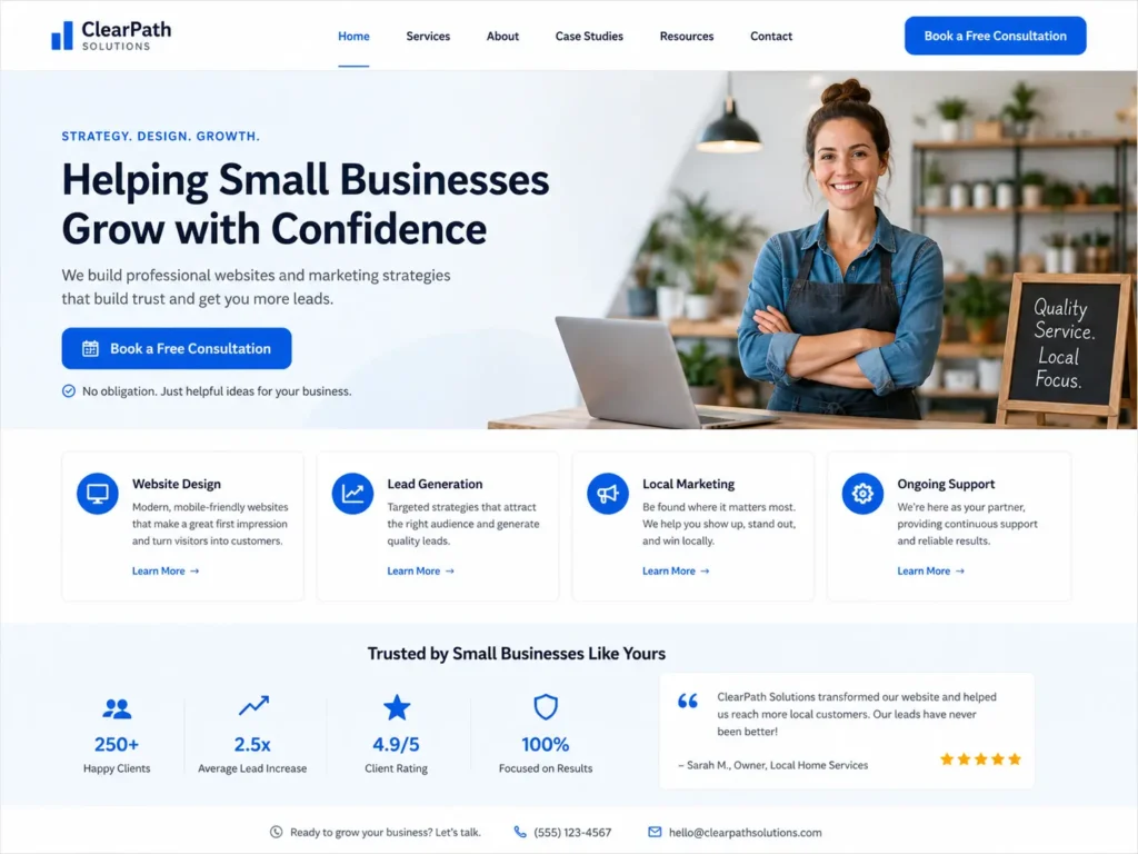
Want your site to sound clearer and look more professional? Start with conversion-focused web design built around your offer, audience, and goals.
Why Website Messaging Matters for Small Businesses
Your website has only a few seconds to explain your value. If a visitor has to dig through paragraphs to understand what you offer, they may leave before reading your services.
Good messaging helps your website do three jobs at once:
✅ Explain what you do in simple language
✅ Build trust with proof, examples, and clear details
✅ Move visitors toward the next step, such as calling, booking, or requesting a quote
This matters even more for small businesses because people often compare local providers quickly. A homeowner looking for a remodeler, a clinic patient checking availability, or a business owner searching for a web designer wants a clear reason to choose you.
Google also encourages website owners to create content that helps users and search engines understand the page. That is why your message should be specific, useful, and easy to follow, not just stuffed with keywords. Learn more from Google’s SEO Starter Guide.
What Strong Website Messaging Includes
Strong messaging is not just a catchy headline. It is the full path visitors follow from first impression to decision.
| Website Area | What the Message Should Do | Example |
|---|---|---|
| Homepage headline | Say what you do and who it is for | “Professional Websites for Service-Based Small Businesses” |
| Subheadline | Explain the result or benefit | “Get a clear, modern site built to earn trust and generate leads.” |
| Service section | Show what visitors can hire you for | Website design, redesign, SEO pages, landing pages |
| Proof section | Reduce doubt | Reviews, project photos, case studies, years in business |
| CTA section | Tell visitors what to do next | “Book a website consultation” or “Request a free audit” |
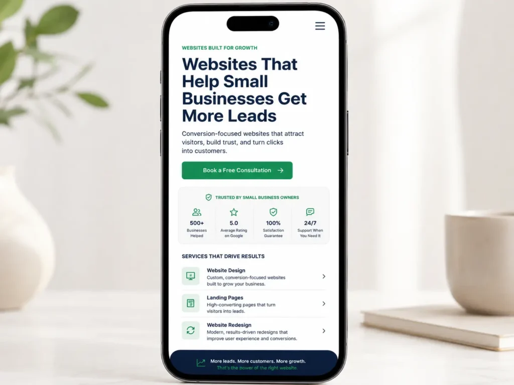
A good test is simple: read only your headline, subheadline, and first button. If a visitor can understand your offer from those three items, your messaging is already stronger than most small business sites.
If your current site feels unclear or outdated, explore website design & development services that connect design, copy, structure, and conversion goals.
How to Write a Clear Homepage Message
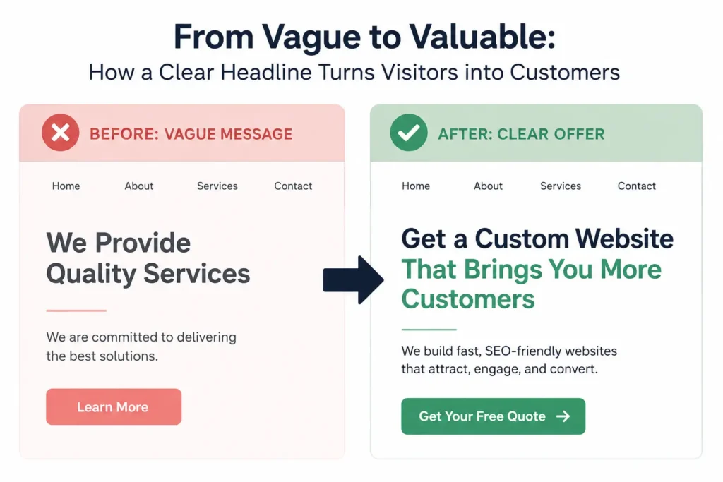
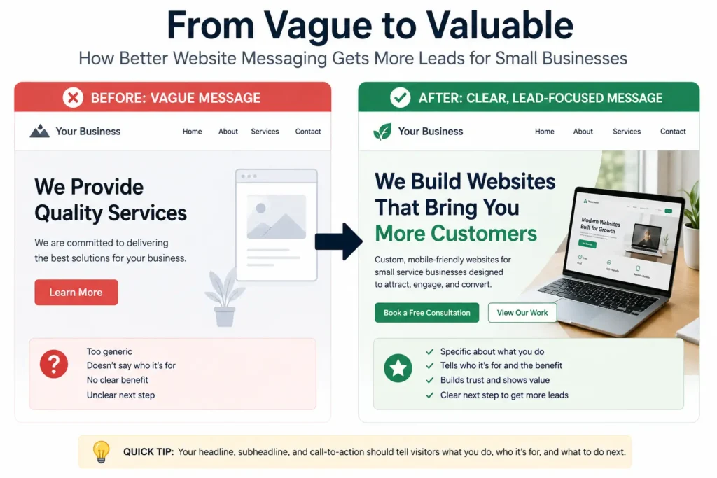
Your homepage should not start with a vague line like “We help you grow” or “Solutions for your business.” Those phrases sound nice, but they do not explain enough.
A better homepage message uses this simple formula:
We help [type of customer] get [main result] with [service].
For example:
✅ “We help local service businesses get more calls with clean, conversion-focused websites.”
✅ “We design landing pages for small businesses that need more quote requests.”
✅ “We redesign outdated websites so visitors can trust your business faster.”
This formula works because it answers the visitor’s top questions right away. Who is this for? What result can I expect? What service do they provide?
After the headline, add a short supporting sentence. This should explain how you help, what makes your process different, or what action the visitor should take next. Keep it short enough to read on mobile.
A practical tip: ask three people outside your business to read your homepage for five seconds. Then ask what your business does. If they cannot explain it clearly, your message needs work.
Which Messaging Option Is Best for Your Website?
Different pages need different messaging. A homepage should introduce the business. A service page should explain one offer in detail. A landing page should focus on one action.
| Page Type | Best Messaging Style | Best CTA |
|---|---|---|
| Homepage | Broad but clear overview of your business | “Start your project” |
| Service page | Detailed copy about one service and its benefits | “Request a quote” |
| Landing page | Focused message for one offer, ad, or campaign | “Book a call” |
| About page | Trust-building story and credentials | “Meet the team” |
| Portfolio page | Proof through results and visuals | “View similar projects” |
The best option depends on the visitor’s intent. Someone on your homepage may still be learning. Someone on a service page is closer to hiring. Someone on a landing page usually needs a fast reason to act.
For small businesses that rely on calls, forms, and bookings, service pages often deserve the strongest copy. These pages can target specific search intent, explain your process, answer objections, and include proof. For more help, read this guide to service page copy for small business.
How Messaging Builds Trust Before the First Call
People rarely contact a business just because the website looks pretty. They contact the business when the site feels clear, credible, and low-risk.
Trust-building messaging includes details like:
✅ Who you serve
✅ What your process looks like
✅ What results people can expect
✅ What makes you different
✅ What happens after someone fills out the form
For example, instead of saying “We offer quality website design,” say, “We design clean, mobile-friendly websites for small service businesses that need more calls, bookings, and quote requests.”
That message is stronger because it is specific. It tells the visitor the type of business, the service, and the result.
Design also affects trust. Nielsen Norman Group explains that trust can be communicated through design quality, clear disclosure, current content, and connection to the rest of the web. That means your copy, layout, portfolio, contact information, and reviews all work together. Read more about trustworthiness in web design.
Want to show trust visually? Add real projects, testimonials, and industry-specific examples from your portfolio highlights.
Messaging for Website Redesign Projects
A redesign is not only about changing colors, fonts, or layout. It is a chance to fix unclear messaging that may be costing leads.
Before redesigning your site, review these questions:
✅ Does the homepage explain the business in the first screen?
✅ Are the services easy to understand?
✅ Does every page have one clear next step?
✅ Are trust signals visible before the contact form?
✅ Does the content sound like a real business owner, not generic filler?
A redesign should improve both appearance and clarity. If the old website says too much but explains too little, the new version should simplify the message.
For example, a local contractor may have a page that lists “renovations, remodels, repairs, upgrades, installations.” That list is helpful, but it is not enough. Stronger copy would organize those services by customer need, such as “Kitchen Remodeling,” “Bathroom Updates,” and “Home Repair Services.”
This makes the site easier for visitors and search engines to understand.
If you are unsure what your site is missing, use this small business website content checklist before planning a redesign.
Messaging for Landing Pages That Need Leads
Landing pages need tighter copy than regular website pages. The visitor usually arrives from an ad, email, social post, or specific search. They need to know they are in the right place immediately.
A strong landing page should include:
✅ One main offer
✅ One primary audience
✅ One clear CTA
✅ Proof near the top
✅ Short sections that handle objections
For example, if you are promoting a free website audit, the landing page should not distract visitors with every service you offer. It should focus on the audit, what they get, who it is for, and why it is worth booking.
A simple landing page structure looks like this:
Headline: “Free Website Audit for Small Business Owners”
Subheadline: “Find out why your site is not getting enough calls, leads, or bookings.”
CTA: “Request Your Free Audit”
Proof: Portfolio, testimonials, or quick wins
FAQ: What is included, how long it takes, who it is best for
Landing page messaging works best when every section supports one decision.
Common Messaging Mistakes That Hurt Conversions
Many small business websites make the same copy mistakes. These mistakes may seem small, but they can weaken trust and reduce inquiries.
The first mistake is being too broad. Phrases like “full-service solutions” or “we care about quality” do not tell visitors enough. Replace them with clear service names, customer types, and outcomes.
The second mistake is hiding the CTA. If someone has to scroll too far to contact you, they may leave. Add a clear button near the top and repeat it after important sections.
The third mistake is focusing only on the business. Visitors want to know what is in it for them. Instead of writing only about your experience, connect that experience to customer benefits.
The fourth mistake is missing proof. Claims feel stronger when supported by reviews, project photos, examples, or numbers. Even simple proof like “serving local businesses since 2018” can help.
The fifth mistake is writing too much without structure. Short paragraphs, clear headings, and helpful tables make your website easier to scan.
For more context on choosing the right expert, read this guide on hiring a website designer for U.S. small business.
Practical Tips to Improve Your Website Copy
Start with your customer’s problem, not your company history. Most visitors are looking for a solution. Tell them what you fix first, then explain why you are qualified.
Use real words your customers use. If customers say “I need more calls,” use that language. Do not replace it with complicated marketing terms unless your audience already understands them.
Place your strongest proof close to your offer. A testimonial near the CTA can reduce hesitation. A project example near a service description can help people picture the result.
Keep buttons action-focused. “Submit” is weak. “Book a Consultation,” “Get a Website Audit,” or “Request a Quote” is clearer.
Make mobile copy easy to read. Many visitors will view your site from a phone. Short sentences, clear buttons, and simple sections help them move faster.
Add FAQs near the bottom of service pages. This helps answer objections before a call and gives search engines more context about the page.
Smarter Next Step: website messaging for small business
Better messaging can make your website easier to understand, easier to trust, and easier to act on. The goal is not to sound clever. The goal is to make the right visitor feel confident enough to call, book, or request a quote.
If your website is not bringing in enough leads, do not start by changing everything. Start by fixing the message. Clarify your headline, simplify your service pages, add proof, and make the next step obvious.
A professional web designer can help connect your copy, design, layout, SEO, and calls to action so the entire site works together.
Frequently Asked Questions
1. What is website messaging on a small business website?
Website messaging is the clear written message that explains your offer, audience, value, and next step. For a small business website, this includes the homepage headline, service page copy, call-to-action buttons, testimonials, FAQs, and trust-building sections. Good messaging helps visitors understand what you do quickly, why your business is credible, and how to contact you without confusion.
2. How can better website copy help my business get more leads?
Better website copy helps visitors make faster decisions. When your site clearly explains your services, benefits, pricing direction, process, and proof, people feel more comfortable reaching out. Strong copy also supports SEO because it gives each page a clear topic. For service businesses, this can lead to more calls, quote requests, appointment bookings, and form submissions from qualified visitors.
3. Should I fix my messaging before redesigning my website?
Yes, fixing the message before redesigning the website usually leads to a stronger final result. Design can make your site look better, but copy explains why someone should choose you. If the message is unclear, a new layout may still fail to convert. A good redesign should begin with your offer, audience, services, proof, and calls to action before visual styling begins.
4. When should I hire a professional website designer for messaging and layout?
You should hire a professional website designer when your site looks outdated, feels unclear, or does not generate enough leads. A designer can help organize your pages, improve your copy flow, add trust sections, create stronger CTAs, and structure your content for SEO. This is especially helpful if you rely on calls, bookings, or quote requests to grow your small business.