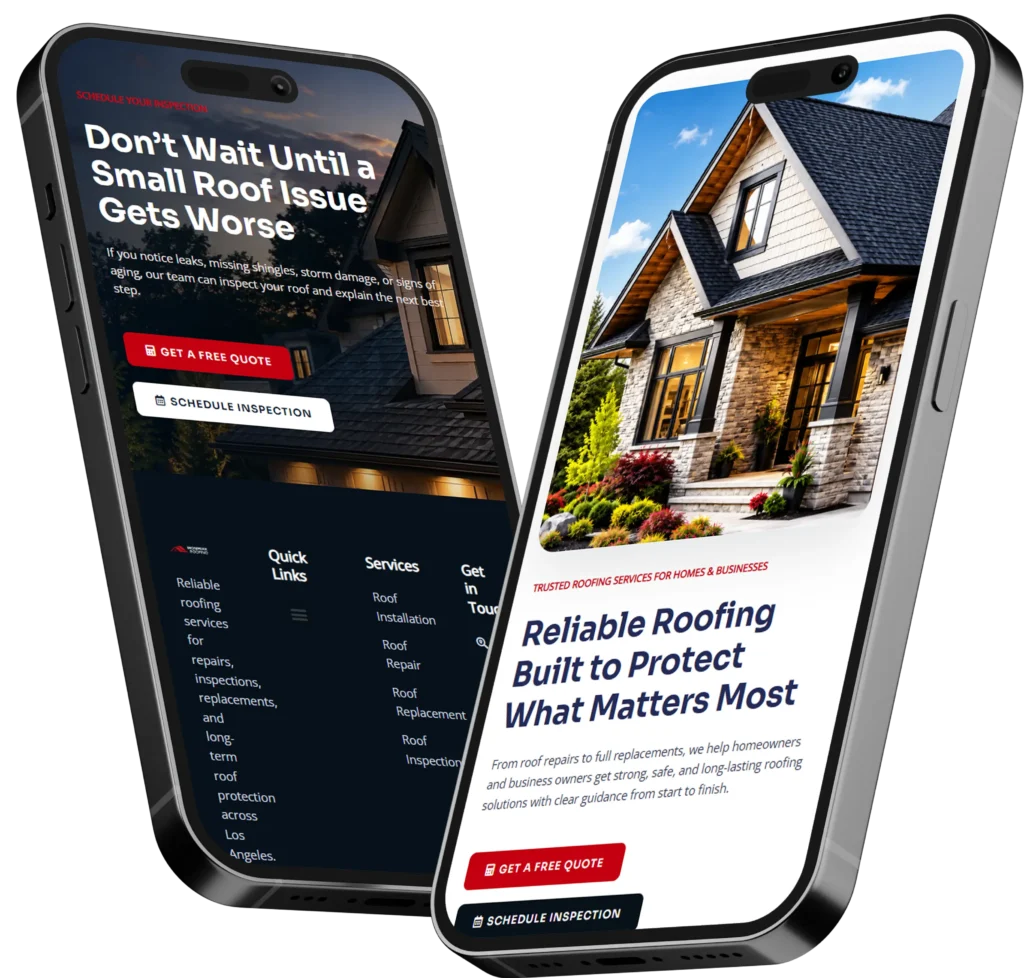
The best small business homepage tips focus on a clear message, visible contact options, convincing proof, fast mobile performance, and one primary call to action. Your homepage should tell visitors what you do, who you help, and what they should do next within a few seconds.
A good homepage is not simply an attractive introduction to your company. It is a sales and navigation tool that helps potential customers decide whether they trust your business enough to call, book, request a quote, or explore your services.
This guide explains what your homepage should include, why each element matters, how to arrange the content, and when hiring a professional designer is the better option.
Why Your Small Business Homepage Matters
Your homepage is often the first page people visit after finding your company through Google, social media, a referral, or a local directory. Visitors may not know your reputation, services, pricing, or process yet.
They are usually trying to answer four questions:
✅ Am I in the right place?
✅ Does this business solve my problem?
✅ Can I trust this company?
✅ What should I do next?
A useful homepage answers those questions without forcing visitors to search through multiple pages. Clear information reduces uncertainty, while strong proof gives people a reason to continue.
This is why effective conversion-focused web design balances appearance with usability. A visually impressive page may still lose leads when the headline is vague, the phone number is hidden, or the visitor cannot identify the next step.
What Should a Homepage Include?
The exact content depends on your business, but most service-based companies need the following sections.
| Homepage Section | Question It Answers | Recommended Content |
|---|---|---|
| Hero section | What does this company do? | Clear headline, short explanation, primary CTA |
| Services | Can they solve my problem? | Main services with outcome-focused summaries |
| Trust section | Are they credible? | Reviews, results, credentials, client logos |
| About preview | Who will I work with? | Brief company story and real team photo |
| Final CTA | What should I do next? | Call, booking, quote, or consultation option |
The order can change, but the visitor should receive enough information to make a confident decision.
Start With a Clear Homepage Hero Section
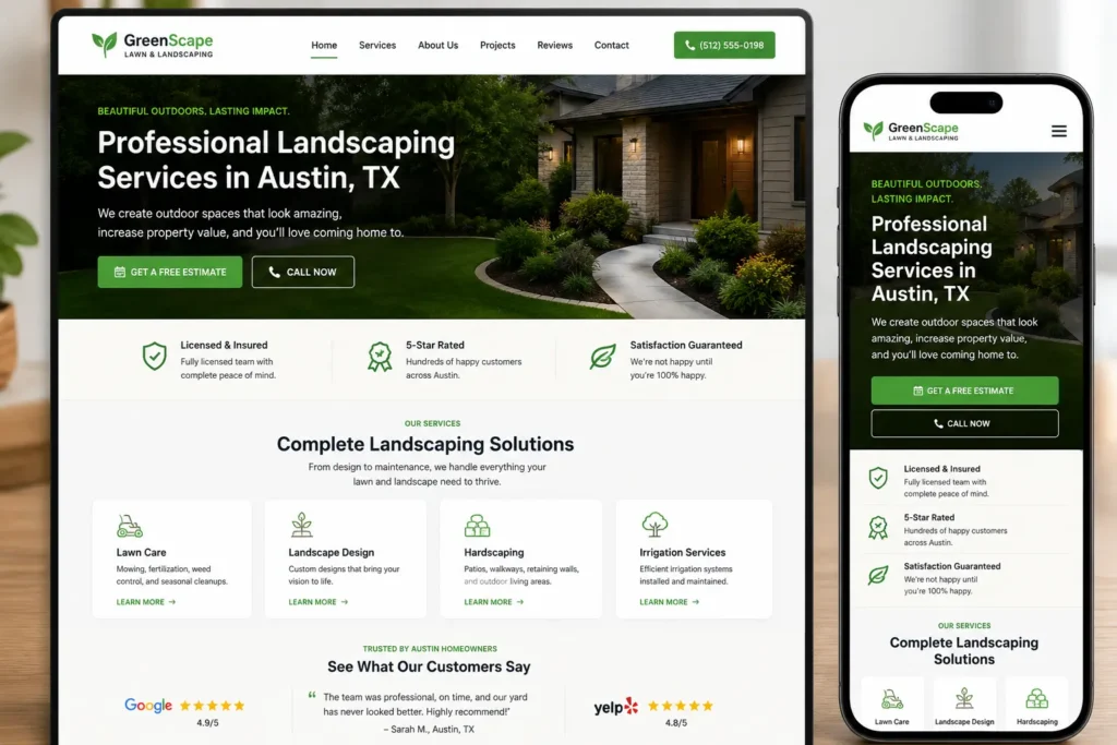
The hero section is the first visible area of the page. It normally includes your main headline, supporting text, a call-to-action button, and an image.
Your headline should communicate a useful outcome rather than a generic slogan.
For example:
Weak headline: Solutions designed for your future.
Stronger headline: Professional Landscaping Services for Homes and Businesses in Austin.
The stronger version works because it identifies the service, audience, and location. Visitors do not have to interpret what the company offers.
Supporting text can then explain the main benefit:
Create a cleaner, healthier outdoor space with reliable lawn care, landscape maintenance, and seasonal cleanup.
Keep this section focused. Too many buttons, animations, announcements, or competing messages can distract visitors from the main action.
Choose One Primary Call to Action
The best call to action depends on how customers normally hire your business.
A restaurant may use “Reserve a Table.” A contractor may use “Request a Free Estimate.” A consultant may use “Book a Consultation.” An emergency service may prioritize “Call Now.”
Choose one primary action and repeat it throughout the page. A secondary option can help people who are not ready to act, but it should not compete visually with the main button.
Use specific button text instead of general phrases such as “Submit,” “Enter,” or “Learn More.” Clear options tell visitors exactly what will happen after they click.
Present Your Services Without Overwhelming Visitors
Your homepage does not need to explain every service in full. Its purpose is to introduce the most important solutions and direct visitors to the appropriate service page.
For each main service, include:
✅ A clear service name
✅ A one-sentence customer benefit
✅ A link to more detailed information
Three to six service summaries are usually enough for the homepage. Businesses with many offerings can group related services into broader categories.
For example, a cleaning company could feature residential cleaning, commercial cleaning, and move-in or move-out cleaning instead of listing every individual task.
Your service pages should provide the details visitors need before contacting you. That may include the process, ideal customer, common problems, expected outcomes, service area, pricing approach, and frequently asked questions.
Review this guide to service page copy for small business when planning the supporting pages behind your homepage. Businesses preparing for a new site can also explore professional website design & development services.
Add Trust Signals Near Important Decisions
Visitors are more likely to contact a company when they see evidence that other people have received good results. Do not save all your proof for a testimonial page that few visitors will open.
Place trust signals near service descriptions, forms, pricing information, and calls to action.
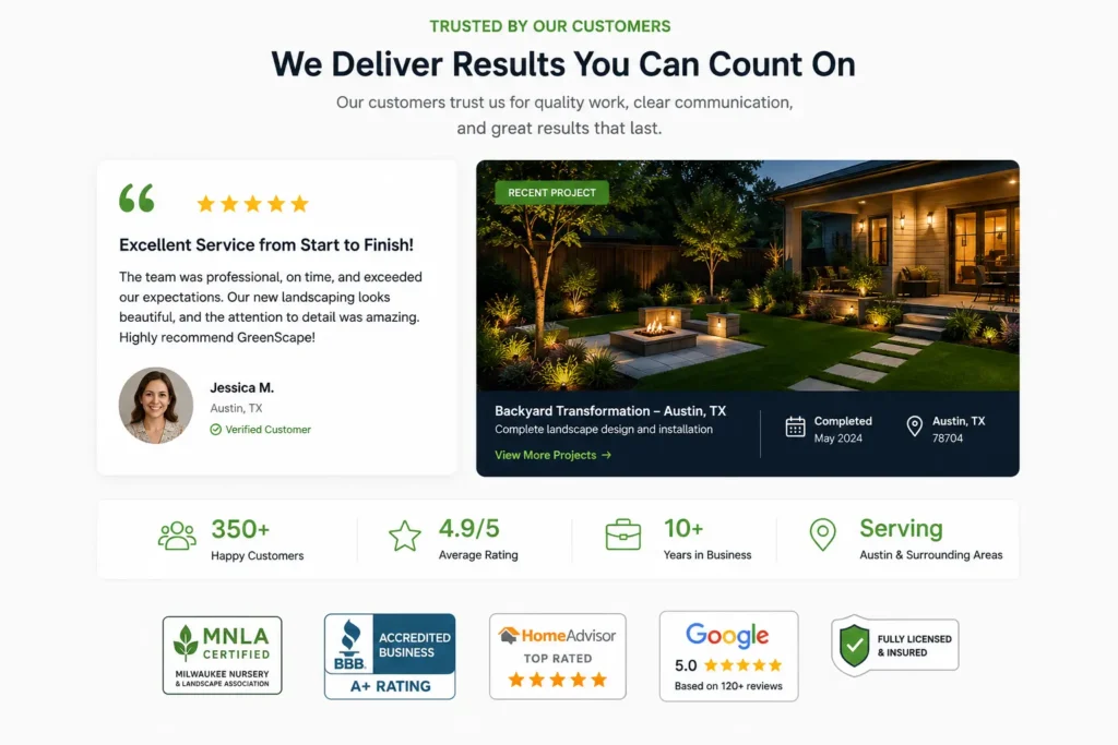
Useful proof may include customer reviews, project photos, relevant certifications, years of experience, guarantees, case study results, media mentions, or the number of customers served. Only use claims that are accurate and easy to verify.
A short testimonial is usually more persuasive when it describes a specific experience. “Great company” provides less useful information than a review explaining that the team arrived on time, communicated clearly, and completed the project within budget.
Real project examples also help visitors picture the result. A visitor considering professional design can review portfolio highlights to understand the quality and style available.
Make Your Website Messaging Specific
Good homepage messaging is based on the customer’s situation, not only the company’s history.
Visitors want to know whether you understand their problem and can deliver the result they need. Speak directly to those concerns before providing a long company biography.
A practical messaging structure is:
Problem: Explain the challenge the customer is experiencing.
Solution: Introduce the service that solves it.
Outcome: Describe how life or business improves afterward.
Difference: Explain why your approach is a better fit.
For example, a bookkeeping company could replace “We provide comprehensive financial solutions” with:
Stop spending evenings sorting receipts and correcting spreadsheets. Our monthly bookkeeping service keeps your records organized, so you can make confident decisions and focus on running your business.
Specific language is easier to understand and more memorable. For additional planning help, read the guides to website messaging for small business and website content strategy for small business.
Build a Homepage That Supports SEO
Homepage SEO begins with clarity. Search engines and visitors should be able to identify the company name, primary service, location, and main website sections.
Use one descriptive H1 heading, logical H2 headings, concise paragraphs, descriptive image alt text, and internal links to important service pages. Your title tag and meta description should accurately summarize the business rather than repeat a long list of keywords.
Google recommends creating useful, organized content and using descriptive links that help people and search engines understand connected pages. Its SEO Starter Guide provides additional information about crawlability, page organization, titles, images, and useful content.
Avoid adding every city, service, and keyword to the opening paragraph. Forced repetition makes the copy difficult to read and rarely helps customers make a decision.
For local businesses, naturally mention your primary service area and link to dedicated location pages when those pages provide unique information. Keep your business name, address, and phone information consistent across the website and business listings.
Design for Mobile Visitors and Fast Loading
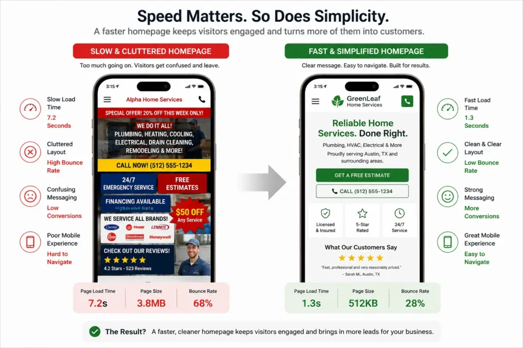
Your mobile homepage should not feel like a smaller, crowded version of the desktop page. It should be designed around the actions mobile visitors are most likely to take.
Keep headlines readable, buttons easy to tap, forms short, and phone numbers clickable. Test menus, pop-ups, booking tools, and contact forms on a real mobile device.
Google uses the mobile version of a website’s content for indexing and ranking, which makes mobile content and functionality especially important.
Page speed also affects the experience. Oversized images, excessive animations, unnecessary plugins, and poorly configured hosting can make visitors wait before they see useful information.
Google’s recommended “good” Core Web Vitals thresholds include an LCP within 2.5 seconds, an INP of 200 milliseconds or less, and a CLS score of 0.1 or less. These measurements cover loading, responsiveness, and visual stability. The official Core Web Vitals guidance explains how the metrics work and how they are measured.
Accessibility matters too. Use readable font sizes, sufficient color contrast, keyboard-friendly navigation, form labels, and meaningful alternative text for informative images. These improvements make the website easier to use for more people.
Make Calls, Bookings, and Lead Forms Easy
Do not make interested visitors search for a way to contact you.
Place your phone number or main CTA in the header, include a contact option after key sections, and finish the homepage with a clear invitation. Mobile service businesses may benefit from a persistent call button, while appointment-based businesses may prioritize online booking.
Keep initial lead forms short. Ask only for the information needed to respond or determine whether the inquiry is relevant. A name, contact method, service selection, and short message may be enough.
Long forms can be appropriate for complex projects, but explain why the additional information is needed. A progress indicator can also help when the form has several steps.
After submission, confirm that the request was received and tell the visitor what happens next. For example:
Thank you. A member of our team will review your request and contact you within one business day.
This simple message removes uncertainty and sets a clear expectation.
When Should You Redesign Your Homepage?
A homepage does not need a complete redesign every year. It does need attention when it no longer represents the business or supports customer decisions.
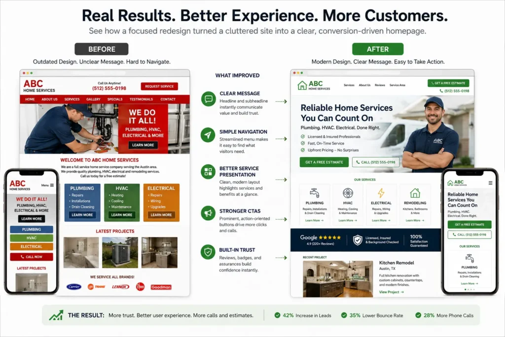
Common warning signs include an unclear headline, outdated service information, weak mobile usability, slow loading, broken forms, difficult navigation, or low-quality visuals. A redesign may also be necessary after changing your target audience, branding, pricing model, service area, or lead-generation process.
Review performance before changing the entire site. Analytics, form submissions, phone calls, booking data, heatmaps, and customer feedback can reveal whether the problem is traffic, messaging, usability, or the offer itself.
Which Website Option Is Best?
| Option | Best For | Main Limitation |
|---|---|---|
| DIY website builder | New businesses with a small budget and simple needs | Requires time, design judgment, and technical troubleshooting |
| Customized template | Established businesses needing a faster launch | May limit layouts, features, and future changes |
| Professional web designer | Businesses relying on leads, calls, or bookings | Requires a larger initial investment |
| Full custom development | Complex platforms or specialized functionality | Higher cost and longer production process |
A DIY site may be suitable when you are validating a new idea and need a simple online presence. A customized template can work for businesses with clear content and straightforward functionality.
Professional design is normally the better option when the website plays a major role in sales, paid advertising, local SEO, hiring, or customer trust. It is also useful when the current site receives traffic but produces few inquiries.
Quick Homepage Review Checklist
Before publishing, review the page from the perspective of a first-time visitor.
✅ The opening section explains the service and audience.
✅ The main call to action is specific and visible.
✅ Services link to detailed supporting pages.
✅ Reviews and project examples appear near decision points.
✅ The phone number, form, and booking tools work on mobile.
✅ Images are compressed and have appropriate alt text.
✅ The final section gives visitors a clear next step.
Ask someone unfamiliar with the business to review the page for five seconds. Then hide the screen and ask what the company does, who it helps, and what action they would take. Unclear answers usually indicate that the opening message needs improvement.
Final Thoughts for a Better Small Business Homepage
Apply these small business homepage tips by prioritizing clarity, trust, mobile usability, and one meaningful next step. Every section should either answer a customer question, demonstrate credibility, explain a service, or help the visitor take action.
The best homepage is not necessarily the one with the most content or visual effects. It is the one that helps the right customer understand your value and confidently contact your business.
Frequently Asked Questions
1. What should a small business homepage include to generate more leads?
A lead-generating homepage should include a clear value proposition, service summaries, trust signals, and a visible call to action. It should also explain who the business serves, what problem it solves, and why a visitor should choose it. Include customer reviews, real project examples, contact information, and links to detailed service pages. Keep the design focused so visitors can call, book, or request a quote without searching through the website.
2. How often should a small business redesign its homepage?
A homepage should be redesigned when it no longer supports the company’s goals or customer needs, not simply because it is a few years old. Consider a redesign when the site looks outdated, performs poorly on mobile, loads slowly, contains old services, or produces few calls and bookings. Businesses should review messaging and performance at least annually. Smaller content, image, and CTA updates can often improve results without requiring a complete rebuild.
3. Does a landing page replace a small business homepage?
A landing page does not usually replace a complete homepage because the two pages serve different purposes. A homepage introduces the business, helps visitors explore services, builds overall trust, and provides several navigation options. A landing page focuses on one audience, offer, or campaign and normally has one conversion goal. Use landing pages for advertisements or promotions, while keeping the homepage as the main introduction to your company and services.
4. Should a small business hire a web designer or use a website builder?
Hiring a professional web designer is usually best when the website is expected to generate consistent leads, calls, bookings, or sales. A website builder may be enough for a new business with limited content, a small budget, and time to manage the project. A designer becomes more valuable when you need custom messaging, conversion planning, SEO structure, mobile optimization, integrations, or a professional appearance that strengthens customer trust.