Animal hospital website design should make it easy for pet owners to trust your clinic, find answers quickly, and book care without friction. The best U.S. veterinary sites combine clear service pages, local SEO signals, fast mobile performance, and strong calls to action so more visitors become real appointments.
Running a veterinary clinic website is not only about having a modern homepage. It is about helping worried pet owners act fast, especially when they need urgent care, routine wellness visits, or a new long-term provider. A strong site reduces hesitation. It answers practical questions, shows proof that your team is credible, and moves visitors toward calling, requesting an appointment, or visiting your location.
That is why the best clinic websites do not start with visual effects. They start with user intent. A pet owner might search for vaccinations, surgery, dental cleanings, emergency help, or a nearby veterinarian they can trust with a senior dog or a new kitten. Your website has to meet that moment with the right page, the right message, and the right next step.
If you want to see how strong service-led websites are structured, browse project gallery and compare how the clearest pages keep navigation, offers, and calls to action simple.
Why a Better Clinic Website Matters in the U.S.
In the U.S. market, veterinary websites need to do more than look professional. They need to work for local search, mobile visitors, and high-intent users who often arrive with urgency. Google’s guidance emphasizes mobile-first indexing and recommends keeping mobile content equivalent to desktop content, while Google Business Profile guidance reinforces the importance of accurate local business details.
For animal hospitals, that means your website should quickly confirm four things:
Your clinic is real and reputable
You offer the service the visitor needs
You are located nearby and easy to contact
There is a clear path to book, call, or visit
When any of those are weak, conversions drop. A slow homepage, buried hours, vague service descriptions, or missing trust signals can push potential clients toward another clinic within seconds. Pet owners rarely want to decode a complicated site when their pet is uncomfortable or when they are comparing providers during a short break at work.
This is also where content quality matters. Google Search guidance recommends using words people actually search for in prominent places like titles, headings, alt text, and link text, while also making internal links crawlable and useful. That aligns perfectly with veterinary websites because pet owners search in practical language. They search for “pet vaccinations near me,” “dog dental cleaning,” “spay and neuter clinic,” or “emergency vet open now.” Your pages should reflect those real questions.
What High-Converting Veterinary Sites Usually Include
The strongest clinic websites are built around clarity. They do not overload visitors with too many options at once. Instead, they organize the site so each page has a job.
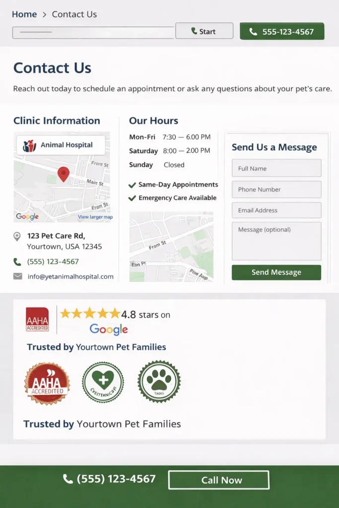
The homepage should introduce your clinic, show your main services, display trust signals, and direct visitors to appointment actions. Service pages should explain who the service is for, what the process looks like, and when a pet owner should contact your team. Local pages should support nearby searches if you serve multiple cities. About pages should build confidence through real team photos, credentials, and care philosophy. Contact pages should remove friction with maps, hours, parking info, and multiple contact methods.
Here is a simple framework that works well for U.S. clinics:
| Website Section | What It Should Do | Best Practice |
|---|---|---|
| Homepage | Build trust fast and take direct action | Lead with services, location, reviews, and CTAs |
| Service Pages | Rank for intent-driven searches | One service focus per page with FAQs and next steps |
| About Page | Show credibility and warmth | Add doctor bios, clinic values, and real photos |
| Reviews Section | Reduce hesitation | Feature recent testimonials and review platform links |
| Contact Page | Help users act quickly | Click-to-call, map, hours, parking, and booking form |
A website like this supports both SEO and AEO because it gives search engines and AI systems a clearer structure to understand. It also makes your content easier to extract into direct answers.
To strengthen that structure even more, review website design & development services and notice how offer-driven pages keep benefits and next actions close together.
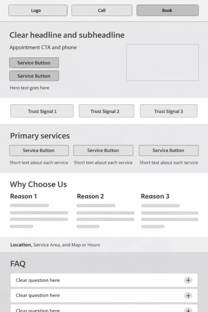
The Best Layout for U.S. Veterinary Visitors
The best layout for an animal hospital website in the U.S. is usually a conversion-first service layout. This means the page hierarchy is built around what people need most, not what the clinic wants to say first.
A strong order often looks like this:
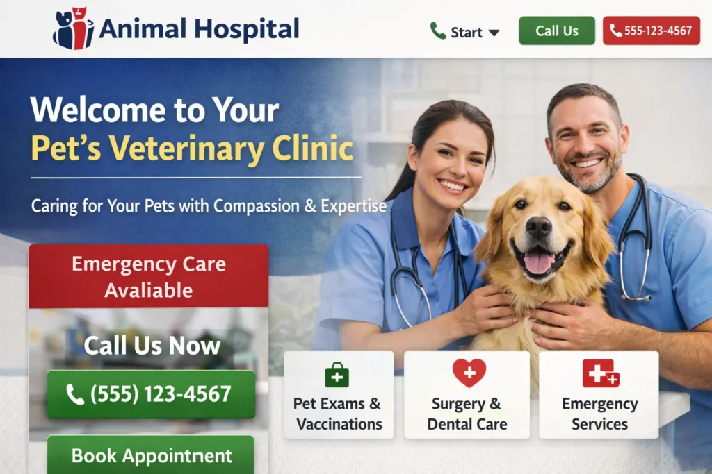
Hero section with headline, subheadline, appointment CTA, phone number
Trust signals such as reviews, accreditations, years in practice, or doctor credentials
Primary services in clickable cards
Brief “why choose us” section
Location and service area details
Frequently asked questions
Final call to action
This layout works because it follows how visitors think. First, they want to know if they are in the right place. Then they want proof. After that, they want the simplest possible action.
A more brand-heavy layout can still look beautiful, but if the main message is too abstract, users may not know what to do next. Phrases like “compassionate care for every stage of life” are helpful only when they are followed by specifics such as wellness exams, surgery, diagnostics, urgent care, and online appointment options.
| Layout Option | Best For | Watch Out For |
|---|---|---|
| Conversion-first service layout | Most animal hospitals | Needs strong copy, not just design |
| Brand/story-led layout | Boutique or specialty clinics | Can hide key services too far down |
| Multi-location local SEO layout | Regional groups | Needs location pages done well |
| Emergency-first layout | ER and urgent care clinics | Must keep directions and phone highly visible |
For most clinics, the conversion-first service layout is the best option because it balances trust, usability, and search performance.
How to Build a Site That Attracts More Local Clients
Local growth usually comes from the overlap of good design, useful service pages, and consistent business information. A clinic cannot rely on design alone. It also needs strong local relevance.
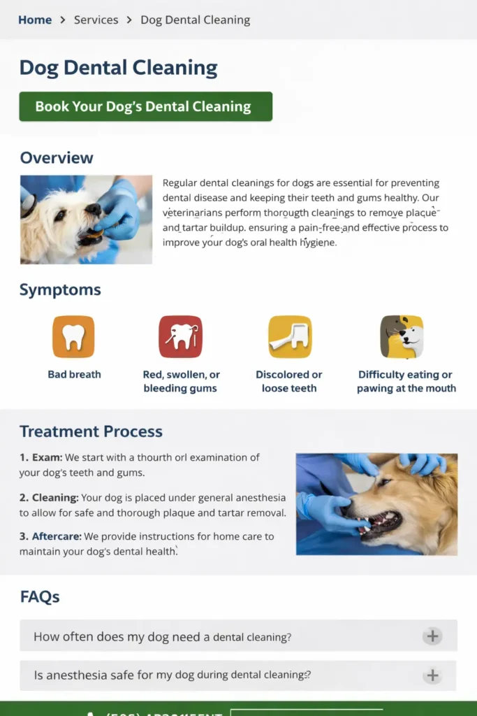
Start with your core service pages. Instead of one generic “Services” page, break out your high-value offerings into dedicated pages for preventive care, vaccinations, diagnostics, dental care, surgery, urgent care, puppy and kitten care, senior pet care, and boarding if relevant. This gives you more opportunities to rank for intent-rich searches and match what pet owners are actually asking.
Then strengthen your local trust layer. Your clinic name, address, phone number, hours, and map details should be accurate and easy to find. Google’s Business Profile documentation stresses keeping business information accurate and compliant, especially for local visibility. When your website and local listings align, your local SEO foundation gets much stronger.
You should also think like a nervous pet owner, not only like a marketer. A first-time visitor often wants reassurance about your process. Do you accept walk-ins? How do appointments work? What animals do you treat? What payment options do you offer? Do you have same-day slots? Can they call after hours? Those answers often decide whether someone contacts you.
This is where educational blog content can help. A relevant internal article, such as vet website design can support topical relevance, while a conversion-focused piece, like small business sales funnel website can reinforce how visitor flow affects bookings.
Features U.S. Pet Owners Expect to See
Many clinic websites lose leads not because they are ugly, but because they are incomplete. Visitors expect useful basics, and when those basics are missing, trust drops quickly.
The most effective features are often simple:
A click-to-call phone number in the header
A visible “Book Appointment” button
Service pages for each core treatment area
Emergency instructions if you offer urgent care or referrals
Doctor and staff bios with real photos
Accepted pet types and patient categories
Insurance or payment details if relevant
Maps, parking, and hours
Forms or new patient instructions
Client reviews and testimonials
If your site has these features but buries them, the issue is still design. Layout and placement matter as much as the content itself. Important actions should be visible without forcing users to hunt through a menu.
Why Mobile Experience Carries So Much Weight
Pet owners are often searching on phones. They may be at work, in the car with a family member, or sitting next to an uncomfortable pet while trying to find help quickly. Google Search Central states that indexing is based on the mobile version of content and recommends that the primary content remain equivalent across mobile and desktop.
For your clinic site, that means mobile design is not a secondary polish item. It is the main experience. Important actions need to be thumb-friendly. Buttons need enough contrast and size. Phone numbers should be tappable. Long walls of text should be broken into digestible sections. Images should support trust, not slow the page down into frustration.
A good mobile layout also improves AEO. When content is organized into concise sections, clear questions, short explanatory paragraphs, and service-led headings, AI systems have a much easier time extracting useful answers from the page.
External Resources You Can Blend Naturally
For extra authority and better Rank Math balance, these two external links fit naturally inside the article or on supporting pages:
Google Business Profile guidelines for keeping your clinic’s local business information accurate and eligible for visibility on Google.
Google’s mobile-first indexing best practices for understanding why mobile content, usability, and structure affect discoverability.
You can place those links in a section about local visibility and mobile usability without making the article feel forced.
What Usually Hurts Rankings and Conversions
A surprising number of veterinary websites struggle with the same few issues. The homepage tries to say everything. Service pages are thin. Calls to action are inconsistent. The review proof is weak or outdated. Navigation is crowded. Mobile spacing is tight. The site talks about the clinic, but not enough about the pet owner’s actual concerns.
Another issue is using generic copy. Every clinic says they are compassionate. Every clinic says they provide high-quality care. Those lines are not wrong, but they are not enough on their own. Better copy explains how your clinic helps, what care looks like, who it is for, and why someone should choose you today.
A useful test is this: if a pet owner lands on one service page from search, can they understand the service, trust the team, and take the next step within a minute? If not, the page likely needs a clearer hierarchy and better conversion design.
Practical Tips That Improve Performance Fast
If you want upgrades that make an immediate difference, start with your highest-intent pages. Usually, that means your homepage, contact page, and top three service pages.
Rewrite your hero section so it says what the clinic does, who it serves, and what action to take next. Add real clinic photography if your current images feel generic. Make one primary CTA consistent sitewide. Improve service page headings so they reflect real search language. Add FAQ sections beneath major services. Pull recent reviews into key pages. Tighten forms so they ask only for essential information.
If you need inspiration from a more focused veterinary angle, our studio and the article on veterinary clinic website both pair well with this topic and help strengthen internal topical relevance.
A Better Closing Perspective
Done well, animal hospital website design becomes more than a branding project. It becomes a growth tool that helps the right pet owners find your clinic, trust your team faster, and book the care they already need.
The strongest websites in this space are not the busiest or the flashiest. They are the clearest. They answer urgent questions, present services in a simple structure, support local visibility, and make booking feel easy on any device. When your site does those things consistently, rankings usually have a better foundation, and conversions become easier to improve over time.
Frequently Asked Questions
1. Why does a strong veterinary website matter for clinics in the USA?
Trust and clarity drive action. In the U.S., pet owners often compare providers quickly, especially when they are looking for urgent care, preventive services, or a new long-term veterinarian. A strong clinic website helps them confirm your location, understand your services, and feel confident about contacting your team. When your site is easy to use, mobile-friendly, and clear about next steps, it reduces hesitation and increases the chances that a visitor becomes a booked client rather than clicking back to search results.
2. What features should a veterinary clinic website include for U.S. visitors?
The essentials should be visible right away. U.S. visitors usually expect appointment buttons, a phone number, clinic hours, service pages, maps, and clear directions on what to do next. They also want trust signals such as reviews, doctor bios, real photos, and answers to common questions about pet types, payment options, and emergency situations. The best websites combine those basics with simple navigation and strong mobile usability so visitors can move from question to action without confusion.
3. How does a better clinic website help attract more local clients?
Local relevance turns visibility into leads. A well-structured veterinary website supports local SEO by connecting your services with your city, neighborhood, and nearby search intent. Dedicated service pages, accurate location details, embedded maps, and consistent contact information all help search engines understand where you operate and what you offer. Just as important, a clear site experience helps real people trust your clinic once they arrive. Local traffic only matters if the visitor feels ready to call or book.
4. What layout works best for an animal hospital website in the U.S. market?
A conversion-first layout usually performs best. Most U.S. clinics benefit from a homepage that starts with a clear headline, a short explanation of services, visible calls to action, and immediate trust signals such as reviews or credentials. From there, visitors should be able to reach focused service pages, doctor bios, FAQs, and a contact page without friction. This layout works because it mirrors the way pet owners search and decide. It helps them confirm fit quickly, then move toward scheduling care with confidence.