Contractor website design works best when it builds trust fast, explains services clearly, and moves visitors toward one simple next step. The strongest sites do not try to impress with fluff. They make it easy for a homeowner to understand what you do, where you work, why they should trust you, and how to contact you right now.
That difference matters more than most contractors realize. A nice-looking site can still underperform if the layout is vague, the messaging is broad, or the visitor has to hunt for proof. A high-converting contractor website should feel clear, local, and practical from the first scroll.
Why This Matters for Contractors
A homeowner visiting your site usually has a real problem to solve. They may need a roof repair, plumbing help, a remodel quote, or a team they can trust with a bigger project. They are not looking for abstract branding language. They want reassurance, proof, and a smooth path to action.
That is why the best sites for builders and trades businesses focus on three things first. They show what you do. They show the kind of jobs you have completed. They show how to get in touch without friction.
When those basics are in place, the website starts working like a sales tool instead of a digital brochure. It filters the right traffic, answers common objections, and shortens the time between first visit and first inquiry. It also supports your sales conversations, because prospects arrive already understanding your process, your service scope, and the quality of your work.
This is also where smart internal linking helps. A visitor who wants more confidence can browse your portfolio highlights before reaching out. Someone comparing scopes and deliverables can review your website design & development services to understand how the build is handled.
What Good Contractor Website Design Actually Needs
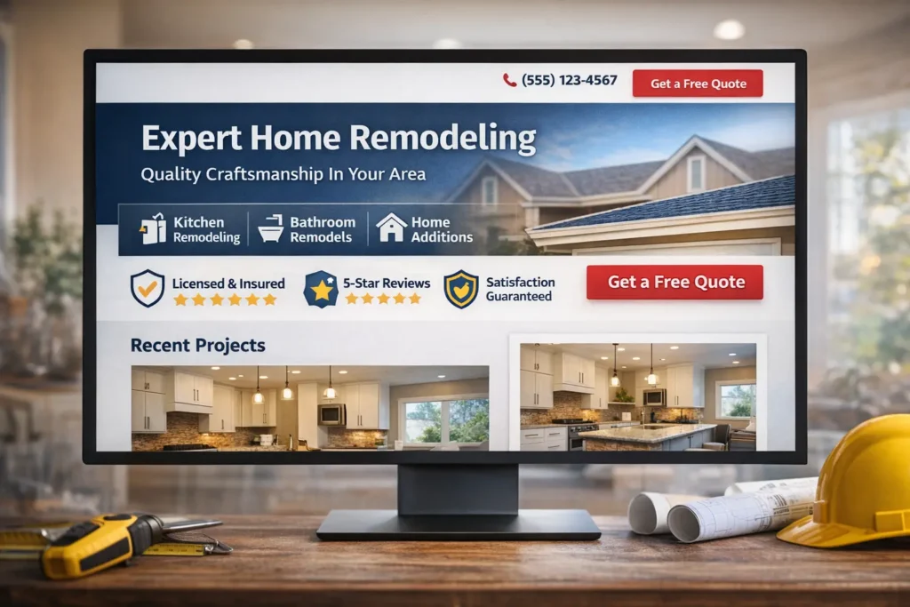
The strongest contractor sites usually share the same foundations. They are simple to navigate, specific in their messaging, and built around buyer questions instead of generic design trends. If a visitor lands on the homepage, they should know within seconds what type of contractor you are, what area you serve, and what action you want them to take.
Here is the easiest way to think about it.
| Site Element | Why It Matters | What It Should Show |
|---|---|---|
| Clear headline | Removes confusion fast | Service, location, and core promise |
| Primary call to action | Turns interest into action | Quote form, call button, or consultation request |
| Project proof | Builds trust visually | Before and after work, finished jobs, galleries |
| Service pages | Supports search visibility and conversions | One focused page per core service |
| Reviews and trust signals | Reduces hesitation | Testimonials, certifications, warranties, affiliations |
| Mobile-friendly layout | Keeps users moving | Tap-to-call buttons, readable text, and short forms |
A lot of underperforming sites miss the first row of that table. Their headline talks about excellence, commitment, or craftsmanship, but says very little about the actual service. Stronger copy is more direct. It names the work, names the location, and gives the visitor a reason to stay.
The same applies to trust. Reviews matter, but they work even better when paired with job photos, service-area clarity, and a visible process. If your team is licensed, insured, certified, or backed by a workmanship warranty, that information should not be buried in the footer. It should support the main conversion path.
How to Structure the Site So It Brings Leads, Not Just Clicks
A strong contractor site does not need dozens of pages, but it does need the right pages. The homepage should act like a guided introduction, not a dumping ground. It should direct visitors toward the service they need, the area they are in, and the proof that supports your claims.
For most contractors, the best starting structure looks like this: a focused homepage, individual service pages, a project or gallery section, an about page that builds confidence, and a contact page that removes friction. That gives enough depth for both search visibility and human decision-making.
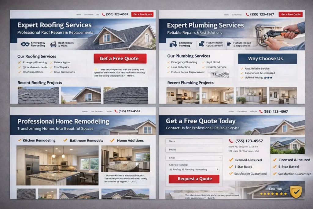
Service pages are especially important. A single page that lists roofing, plumbing, remodeling, concrete, and siding all at once usually stays too shallow. Separate pages create a better message match. A visitor searching for one service lands on one page, sees examples related to that service, reads the right FAQs, and takes the next step without distraction.
You can see this kind of relevance more clearly when content is built around specific industries and user paths, like in this roofing company website example and this plumber website design guide. Both topics show how niche-specific messaging changes what needs to appear above the fold, in the project section, and near the call to action.
Another smart move is tightening your quote path. Long forms often reduce momentum. In many cases, a name, contact method, service needed, and a short project note are enough for the first conversion. You can gather the rest during follow-up. The easier it feels to raise a hand, the more qualified conversations you can create.
Build for Clarity First, Then Support Search Visibility
Good search visibility usually follows good structure. Pages that are easy to understand are easier to optimize. Pages that solve one problem well are easier to rank for specific intent.
That does not mean stuffing keywords into every paragraph. It means aligning each page with a clear purpose. Your homepage targets your broad service offer and local positioning. Your service pages support specific intent. Your project pages reinforce trust. Your FAQ section answers buyer concerns that often slow down conversions.
This is also where external guidance can help without making the article feel forced. Linking to Google’s SEO Starter Guide makes sense when discussing clean site structure and people-first content. Referencing PageSpeed Insights fits naturally when talking about performance checks before launch.
Speed matters because a contractor site is often visited on a phone, sometimes by a user who is between tasks, in a hurry, or comparing multiple businesses. Slow image loading, bloated layouts, and cluttered mobile menus create friction that has nothing to do with your actual service quality. That is why performance should be part of the design conversation from the start, not something you try to patch later.
Trust Signals That Move a Visitor Closer to Contact
Contractor websites do not need flashy effects to feel premium. They need believable proof. That usually comes from real project photos, plainspoken testimonials, clear process language, and visible service area information.
A homeowner is often asking silent questions while scrolling. Have you done this kind of work before? Do you work near me? Are you easy to contact? Will I get a real response? The site should answer all of that before the visitor has to ask.
One of the best ways to do this is to place trust signals near action points. For example, next to a quote button, you might show a short line about response time, licensing, or workmanship guarantees. Under a service intro, you might add two recent project examples. Beneath a form, you might include a short testimonial from a past customer in the same service category.
The strongest sites also use photos strategically. Instead of relying on stock imagery everywhere, they mix project shots, team photos, trucks, jobsite details, and closeups of finished work. That makes the business feel real. For home services, realism often converts better than polish alone.
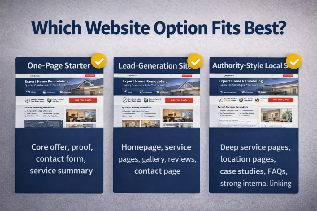
Which Website Option Fits Best
Not every contractor needs the same build. The right option depends on stage, service breadth, market competition, and how aggressively you want the site to generate leads.
| Website Type | Best For | What It Includes | Best Choice When |
|---|---|---|---|
| One-page starter site | Newer businesses or very small service areas | Core offer, proof, contact form, service summary | You need a clean online presence quickly |
| Small lead-generation site | Most local trades businesses | Homepage, service pages, reviews, gallery, contact page | You want better organic visibility and stronger conversions |
| Authority-style local site | Established contractors with multiple services or cities | Deep service pages, location pages, case studies, FAQs, strong internal linking | You want to compete across more searches and own more local intent |
For most contractors, the middle option is the best balance. It is large enough to target real search intent and build trust, but not so large that it becomes hard to maintain. A well-built small lead-generation site usually outperforms a larger weak site because every page has a job.
The authority option becomes the right move when your business already has proof, multiple services, and enough operational capacity to handle broader demand. It works especially well when you want to expand into nearby cities, support more service categories, or create content that answers pre-sale questions in more depth.
A one-page starter site can still work for a new contractor, but only when the messaging is tight. It should never feel like a placeholder. Even a simple site should communicate service, location, proof, and contact path with confidence.
Common Design Mistakes That Quietly Hurt Conversions
Many contractor sites lose leads for reasons that are easy to fix. The messaging is often too broad, the navigation is too busy, or the call to action is too passive. Sometimes the site looks polished, but the visitor still has no clear sense of what to do next.
A common mistake is treating the homepage like a company profile instead of a conversion page. Another is hiding the best proof several clicks deep. Some sites also overload visitors with too many menu options before they have earned enough attention to justify them.
There is also the issue of visual hierarchy. If every section is styled with equal weight, the visitor cannot tell what matters most. A stronger layout guides attention. It uses spacing, section order, contrast, and repetition of action points to create momentum.
One more mistake is forgetting that reassurance matters as much as design. A site can look modern and still feel risky if it does not show process, experience, service area, or expected next steps after inquiry.
Signs It Is Time for a Redesign
You probably need a redesign when the site no longer reflects the quality of your work, when visitors land but do not contact you, or when the business has changed but the website has not caught up. That includes adding services, shifting markets, or moving from referral-only growth into a more intentional lead generation strategy.
It is also time when the site feels hard to update, weak on mobile, or disconnected from how prospects actually buy. If your best sales conversations start after someone sees project proof, reads reviews, and understands the job process, your site should lead with those elements.
A good redesign is not about making things look newer. It is about making the next decision easier for the visitor. That is why design, structure, copy, and proof all need to work together.

A Smarter Long-Term Move for Contractor Website Design
The best-performing contractor sites are not the busiest. They are the clearest. They make your offer easy to understand, your proof easy to trust, and your next step easy to take.
That is the standard worth aiming for if you want the website to support real business growth instead of sitting online as a static asset. Explore our portfolio highlights to see how this approach looks in practice, review our website design & development services for the build options, or start your project here when you are ready to turn your site into a stronger lead source.
Frequently Asked Questions
1. How much does it usually cost to hire a web designer for a contractor business?
The real answer is that cost depends on scope, not just design. A simple site with a few pages, clear calls to action, and a contact form will cost less than a lead-focused build with service pages, project galleries, copywriting, SEO structure, and speed work. Contractors should look beyond the upfront price and ask what is included, how the site will support lead generation, and whether the build can grow with the business over time.
2. How long does it take to build a high-converting website for a contractor?
A strong contractor site is usually built in phases, not in one rushed step. The timeline often depends on content collection, number of pages, revisions, photo quality, and how quickly decisions are made. A smaller site can move faster, while a more strategic build with multiple service pages, portfolio organization, and conversion-focused copy takes longer. The goal is not just to launch quickly, but to launch with the right structure.
3. What pages should a contractor website have if the goal is to get more leads?
The best lead-focused setup starts with the right core pages. In most cases, that means a homepage, dedicated service pages, a project or gallery section, an about page that builds credibility, and a contact page with a short form or clear call button. Many contractors also benefit from FAQs, reviews, and service-area sections because those pieces reduce hesitation and answer questions before a prospect contacts you.
4. Do contractors need SEO if they already have a professionally designed website?
Yes, because design alone does not guarantee visibility. A polished layout helps with trust and conversion, but SEO helps the right people discover the site in the first place. For contractors, that usually means well-structured service pages, local relevance, internal linking, useful supporting content, and a technically sound mobile experience. The best results happen when web design and SEO are planned together, not treated as separate tasks.