Fitness business website strategy should focus on clear offers, trust signals, and easy booking so gyms, trainers, and studios can turn more visitors into leads. A well-built site helps potential clients understand your services fast and take action from the first screen.
A strong site for a gym, trainer, or studio should clearly explain the offer, prove results, and make booking easy from the first screen. The best ones turn local search visitors into inquiries by combining sharp messaging, mobile-friendly design, trust signals, and a simple next step.
Most fitness brands do not lose leads because people are not interested. They lose them because the site feels confusing, slow, generic, or incomplete. When someone lands on your homepage, they should instantly understand who you help, what you offer, where you serve, and what they should do next.
That is why a high-performing site is not just about looks. It is about clarity, trust, and action. It should work for the person comparing three gyms on their phone, the parent looking for class schedules after work, and the motivated lead who wants to book today.
Need help building the strategy behind those pages? Explore our website design & development services.
Why this matters for growth
Your website is often the first sales conversation a lead has with your brand. Before they tour your space, send a DM or ask about rates; they are already deciding whether your business feels trustworthy, organized, and worth their time.
For fitness brands, that decision happens fast. A visitor usually wants answers to a few simple questions: What kind of training is this? Is it for someone like me? How much does it cost? Can I book or contact someone easily? If the site makes those answers obvious, you lower friction. If it hides them, you raise doubt.
A strong site also helps your business in ways social platforms cannot fully control. Your Instagram may create attention, but your site turns attention into action. Your Google Business Profile may get the click, but your pages decide whether that click becomes a lead. That is why the site should not feel like an online brochure. It should feel like a guided path.
The most effective pages speak directly to a specific audience. A boutique studio can lean into community and class experience. A personal trainer can lean into transformation and accountability. A gym can lean into equipment, schedule flexibility, and location convenience. Different offers need different emphasis, but the goal stays the same: make the next step feel easy and worthwhile.
What every strong site should include
A high-converting site does not need dozens of pages. It needs the right blocks in the right order.
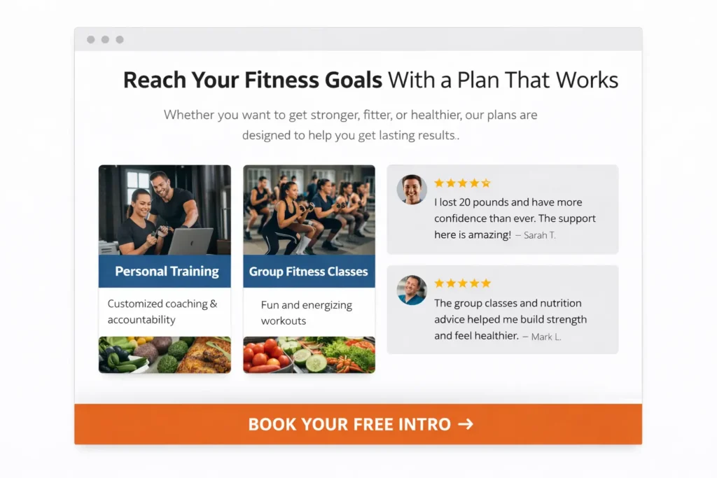
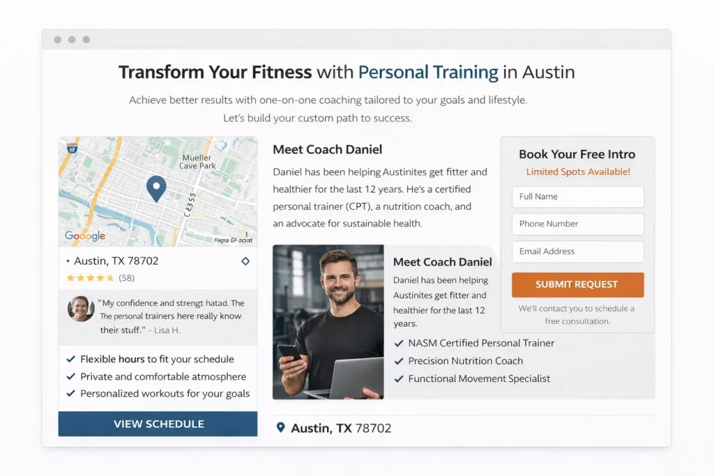
The homepage should open with a clear value proposition. That means a headline that says what you do, who it is for, and why it matters. “Transform your body” is too vague. “Small-group strength training for busy professionals in Austin” is far clearer. It tells the reader exactly what business they are looking at.
Right below that, your site should show a primary call to action. This could be “Book a Free Intro,” “Claim a Trial Class,” or “Talk to a Coach.” One clear action beats five competing buttons.
Then come the trust builders. This is where many fitness businesses either win or lose attention. Show real photos of your space, real coaches, real members, and real outcomes. Add short testimonials that sound natural. Include certifications, years of experience, and any recognizable partnerships. If you have before-and-after permission, use it carefully and ethically. If you have a strong community angle, show that through photos and copy.
You also need pages that answer the practical questions people have before they commit. Pricing does not always need full numbers on the homepage, but your visitor should never feel trapped. Even if your rates vary, explain how your plans work. Say whether you offer drop-ins, memberships, private coaching, or consultation-based packages.
Here is a clean way to think about the must-have pieces:
| Page or Section | Why It Matters | Best Practice |
|---|---|---|
| Hero section | Creates the first impression | Use a specific headline, short support text, and one main CTA |
| Services or programs | Explains what people can buy | Group offers by goal, not just by feature |
| About our coach bios | Builds trust and relatability | Include credentials, personality, and training philosophy |
| Testimonials | Reduces doubt | Use real names, photos, and outcome-focused quotes |
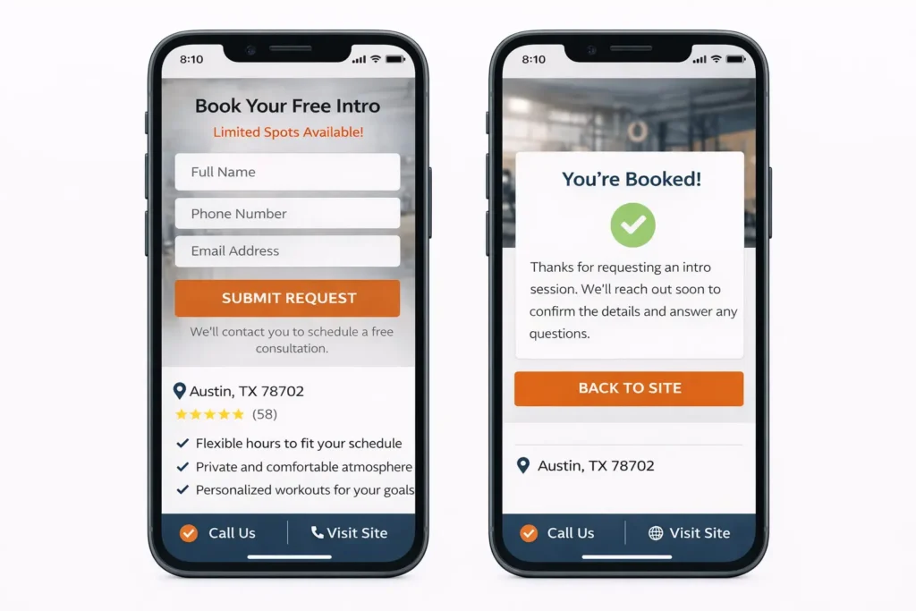
| Contact or booking | Captures demand | Keep forms short and make booking visible on mobile |
| FAQ | Handles objections | Answer pricing, beginner concerns, schedule, and personalization |
A good site also needs local relevance. Include your city, service area, nearby landmarks, and location details naturally across the page. If you run both online and in-person offers, separate them clearly so the user does not have to guess.
For inspiration on how design and conversion blocks come together visually, browse our project gallery.
How to build it so it converts
The easiest mistake is to think design comes first. In reality, the message comes first. Before layout, decide on the business goal of the page. Are you trying to get a phone call, a free trial signup, a membership inquiry, or a consultation booking? The answer should shape the page.
Start with the audience’s pain point. A gym visitor may want convenience and equipment variety. A trainer lead may want accountability and a custom plan. A studio lead may want atmosphere and class identity. Once that core need is clear, your headline, subheading, imagery, and CTA become much easier to write.
A simple homepage flow often works best:
- Clear offer and CTA
- Social proof and quick wins
- Programs or services
- Why choose you
- Reviews
- FAQ
- Final booking section
That structure works because it mirrors decision-making. First, the user understands the offer, then they trust it, then they act.
Your service pages deserve extra care. Each major offer should have its own page if it targets a different kind of intent. Personal training, group classes, online coaching, and nutrition coaching should not all live in one vague paragraph. Separate pages give you clearer messaging and stronger relevance for search.
Example: a personal training page can speak to private coaching, customized plans, and accountability. A class page can highlight schedule, community, intensity, and beginner-friendliness. An online coaching page can focus on remote support, app check-ins, and a flexible structure.
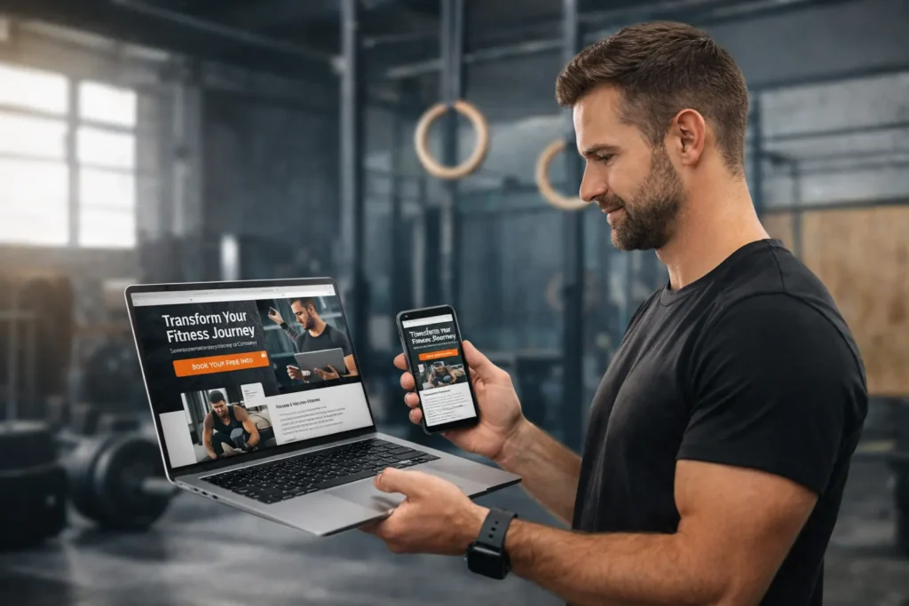
Just as important is the mobile experience. Many prospects will find you on their phone between errands, during lunch, or while comparing options after a workout. Make sure buttons are easy to tap, text is readable, and contact actions stay visible without forcing the user to hunt for them.
Your images should support the sale, not just decorate the page. Avoid generic stock photos when possible. Real training photos outperform polished but disconnected imagery because they make the experience feel believable. If your studio is bright and calm, show that. If your gym is performance-driven, show real sessions. If your coaching is high-touch, show the face behind the service.
This is also where search visibility comes in. Helpful page titles, descriptive headings, clean URL structure, and useful content all make the site easier to understand. Google’s SEO Starter Guide is a good reference point when you want to tighten structure without stuffing keywords, and W3C’s introduction to web accessibility is worth reviewing so your forms, buttons, and page layout are easier for more people to use.
Which site style works best for your business
There is no single perfect layout for every fitness brand. The best version depends on the offer, buying cycle, and client mindset.
A personal trainer usually benefits from a personal-brand structure. That means coach-led messaging, transformation proof, and a strong consultation CTA. People are buying the coach as much as the program.
A traditional gym usually benefits from a location-first structure. Visitors want to know where you are, what equipment you have, what hours you keep, and whether the membership feels worth it. Trust comes from facilities, flexibility, and convenience.
A niche studio, such as yoga, Pilates, or HIIT, often benefits from an experience-first structure. Here, the vibe matters. Class style, community, instructor energy, and the feel of the space are major selling points.
This table makes the difference easier to spot:
| Business Type | Best Site Angle | Most Important Sections | Best CTA |
|---|---|---|---|
| Personal trainer | Coach-led authority | Bio, transformation stories, method, FAQ | Book a consultation |
| Gym | Facility and convenience | Membership options, amenities, hours, reviews, map | Start a trial |
| Boutique studio | Experience and community | Class styles, instructor profiles, schedule, testimonials | Reserve a class |
| Online coach | Results and flexibility | Program details, check-in process, client wins, pricing | Apply now |
The best option is the one that matches how your customer buys. If the decision depends on trust in the expert, lead with the expert. If it depends on convenience, lead with logistics. If it depends on the atmosphere, lead with experience.
For niche-specific ideas, review these personal trainer website ideas and CrossFit gym website examples. They show how different offers need different messaging and page emphasis.
The content details that quietly improve rankings
Good rankings usually come from usefulness, not tricks. That means your copy should answer real questions instead of filling space with broad promises. A page that explains class levels, onboarding steps, membership options, and who the offer is best for will usually help both the reader and the search engine more than a page full of vague marketing lines.
This is where practical content matters. Add a short section that explains what happens after someone books. Add a beginner note that says what to bring, how long sessions last, and whether modifications are available. Add mini FAQs directly on service pages so the user does not need to jump around.
For local visibility, create dedicated pages when your business genuinely serves different locations or service categories. A gym with one location should not fake city pages. But a business serving multiple nearby areas can build helpful landing pages as long as each page has unique, useful details.
Internal linking helps too. When one page naturally leads to another, you strengthen the site structure. A homepage can link to service pages. A service page can link to a relevant blog. A blog can link back to Booking. That creates a smoother path for both users and search engines.
Common mistakes that weaken performance
One common mistake is trying to sound impressive instead of sounding clear. Phrases like “unlock your highest potential” or “elevate your lifestyle journey” do not explain enough. Clear beats clever almost every time.
Another mistake is hiding important information. If someone cannot quickly find your location, schedule, contact method, or offer details, they are likely to leave. You do not need to overwhelm the page, but you do need to remove friction.
Some sites also lean too hard on aesthetics and forget conversion. A stylish site with weak headlines, tiny buttons, and no visible next step may look polished but still underperform. Design should guide action, not distract from it.
Slow-loading pages, oversized videos, unclear mobile layouts, and long forms can also hurt lead flow. Keep the journey short. Ask only for the information you truly need. For many businesses, name, email, phone, and goal are enough for a first contact form.
A final mistake is publishing without review. Check every page for broken links, inconsistent button text, outdated offers, weak spelling, and thin copy. Even small issues can make a business feel less professional than it really is.
Final take
A smart fitness business website does not need flashy tricks to perform well. It needs the right message, the right page flow, and the right conversion points so visitors know exactly why they should trust you and what to do next.
When your copy reflects the real offer, your images feel authentic, and your booking path is simple, the site starts doing what it should have done from the start: turn interest into inquiries. If you want a stronger foundation for that growth, start with our studio and map the site around how your best clients actually buy.
Frequently Asked Questions
1. What fitness services do you offer?
The best answer is to be specific, not broad. A strong fitness brand should clearly list the services it offers, such as personal training, small-group coaching, group classes, online coaching, nutrition support, or recovery-focused sessions. On your site, each service should explain who it is for, what results it helps with, how it works, and what the next step is. That clarity helps users self-select faster and makes the page easier to rank for the right search intent.
2. Do I need to be fit before joining?
No, you do not need to be fit before getting started. This is one of the most important objections to answer on a fitness site because many people are interested but intimidated. Good website copy should say clearly that beginners are welcome, workouts can be scaled, and coaches can adapt the plan to current ability. When you remove that fear early, you make the brand feel safer and more approachable, especially for first-time visitors comparing local options.
3. How often should I work out to see results?
Consistency matters more than intensity at the beginning. A practical website answer usually explains that the right frequency depends on goals, schedule, recovery, and training level. For many beginners, a realistic weekly routine works better than an aggressive one that they cannot sustain. Your site should frame this around personalized guidance rather than promising unrealistic timelines. That makes the messaging feel more trustworthy and helps leads understand that progress comes from structure, not pressure.
4. Do you offer personalized fitness plans?
Personalization is often the deciding factor for serious leads. If your business offers custom coaching, your website should explain what that actually includes: goal setting, movement assessment, training progression, check-ins, nutrition support, schedule flexibility, or accountability tools. If you do not offer full personalization for every service, say which programs are customized and which follow a set format. Clear expectations reduce confusion and make the offer feel more professional from the first visit.