A personal trainer website helps you turn search traffic, referrals, and social clicks into real inquiries by showing your services, proof, pricing direction, and a clear next step. The best sites do two jobs at once: they rank for local intent and make it easy for the right client to book.
If your site looks generic, loads slowly, or hides the action you want people to take, you will lose leads before the conversation even starts. A stronger setup gives visitors confidence fast, answers the most common buying questions, and guides them toward a consultation, assessment, or package inquiry.
For fitness businesses, this is not just about having an online presence. It is about owning a digital sales page that works when you are training clients, sleeping, or offline. People often compare multiple trainers before reaching out. The site that feels clear, trustworthy, and easy to act on usually gets the first message.
A high-performing site should show who you help, how you help them, what outcomes they can expect, and how to get started. It should also support local SEO. Google says complete business information improves local visibility in Search, and local business structured data helps Google understand details like hours, location-related information, and reviews.
Need a benchmark for structure and execution? Explore our portfolio highlights and see how strong service pages support both SEO and conversions.

Why a Website Matters More Than Social Media Alone
Social media can attract attention, but a website closes the gap between interest and action. On Instagram or TikTok, someone may enjoy your content without ever understanding your packages, specialties, or process. Your site lets you control the story from first impression to inquiry.
That matters because most visitors are trying to answer practical questions fast. Can this trainer help with fat loss, strength, postpartum recovery, or online coaching? Are they local? Do they train in-home, in-gym, or virtually? Do they seem credible? Is there an easy way to book?
Without a clear website, people start guessing. Guessing reduces trust. Trust is what gets inquiries.
Here is where the strongest trainer sites win:
| Website element | What it does for conversions |
|---|---|
| Clear positioning | Helps the right client know they are in the right place |
| Service overview | Removes confusion about what you actually offer |
| Testimonials and results | Builds trust through proof |
| Local SEO signals | Improves visibility for nearby searches |
| Strong call to action | Moves visitors toward booking |
A trainer who specializes in busy professionals, for example, should say that immediately. A trainer focused on strength training for women over 40 should not hide that message three sections down. Specificity converts better than broad fitness language because it helps visitors feel seen.
This is also where design quality matters. People associate a polished, easy-to-use site with professionalism. Clean layouts, readable text, real imagery, and visible calls to action signal that your business is established and reliable. Google also recommends focusing on helpful, people-first content rather than content built mainly to manipulate rankings.
For service-first builds that focus on both UX and business growth, see our website design & development services.
What a High-Converting Trainer Site Should Include
A trainer site does not need dozens of pages. It needs the right pages, written in the right order, with the right intent.
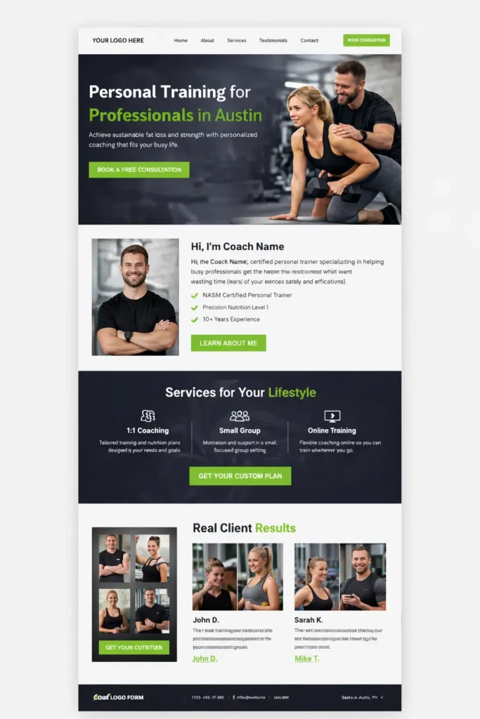
Start with a homepage that answers four questions quickly: who you help, what you offer, where you work, and what to do next. Your hero section should not say something vague like “Transform Your Life Today.” It should say something concrete like “Personal training for busy professionals in Austin who want sustainable fat loss and strength.”
Then build supporting sections that reduce friction.
Core pages that matter most
Homepage
This is the summary page. It should introduce your niche, strongest benefits, social proof, and the primary next step.
About page
People hire people. Your About page should explain your background, certifications, approach, and why you care about this work. Keep it personal, but still focused on the client.
Services page
Spell out options clearly. One-on-one coaching, group training, online coaching, nutrition support, or hybrid packages should each have enough detail for a visitor to understand fit.
Results or testimonials page
Before-and-after stories, transformation highlights, reviews, and screenshots of client wins help reduce hesitation.
Contact or booking page
Make action simple. A short inquiry form, consultation scheduler, or assessment application works better than a vague email address buried in the footer.
A practical structure looks like this:
| Page | What to include |
|---|---|
| Homepage | Niche, promise, proof, CTA |
| About | Bio, credentials, philosophy, trust builders |
| Services | Offer details, pricing direction, FAQs, CTA |
| Results | Testimonials, case studies, client stories |
| Contact | Simple form, calendar, location, response expectations |
The best sites also use section-based persuasion. That means each section handles one stage of the buyer’s journey. First comes clarity. Then proof. Then process. Then action. This makes the site feel easy to move through.
How to Make the Content Feel Trustworthy
Trust is not built with hype. It is built with evidence and specificity.
Instead of saying you deliver “amazing results,” explain your process. Tell visitors what onboarding looks like, how workouts are tailored, how accountability works, and what type of client tends to succeed with your method. This removes uncertainty and makes your service feel real.
Examples of good trust builders include:
✅ Certifications and relevant education
✅ Real testimonials with specific outcomes
✅ Clear service boundaries and expectations
✅ Photos of you training actual clients
✅ Frequently asked questions that reduce objections
✅ Transparent next steps after inquiry
You can also improve trust by making your offers easy to compare. For example, a visitor deciding between online coaching and in-person sessions should immediately see the difference in support, frequency, and ideal fit.
Many personal trainers miss this. They assume visitors will message them to ask. Most do not. They leave instead.
Helpful content also improves search performance over time. Google’s documentation emphasizes content that satisfies user needs and is created primarily for people.
To study a related niche that uses service clarity well, review our guide to gym website design.
Can It Help with Local SEO?
Yes, and this is where a personal trainer website becomes more than a brochure.
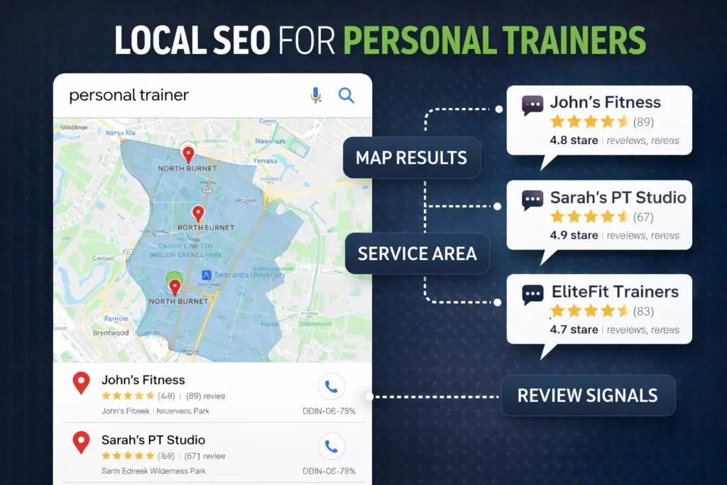
Local SEO is what helps you appear when someone searches for phrases like “personal trainer near me,” “online fitness coach in Tampa,” or “strength coach for women in Denver.” Your site supports that visibility by connecting your services with a location, a niche, and clear business signals.
That means your pages should include city or service-area references naturally, not stuffed into every paragraph. A page can mention your studio location, the neighborhoods you serve, or whether you offer in-home or virtual coaching. A footer with your business name, service area, and contact information also helps with consistency.
The site should work together with your Google Business Profile. Google says complete and accurate business information helps customers understand what you do, where you are, and when they can visit, and that complete profiles are more likely to show in local results.
You should also consider structured data. Google’s local business documentation notes that structured data can help Google understand business details such as hours, departments, and reviews on eligible pages.
Here are two helpful resources you can naturally reference in your article or strategy stack:
A good local SEO setup for a trainer usually includes a homepage, a focused services page, a location signal, strong on-page copy, review proof, and FAQs that reflect real search intent. You do not need dozens of thin city pages. One well-built service site often outperforms scattered content.
How to Improve Conversions Without Making the Site Feel Pushy
The highest-converting trainer sites guide people. They do not pressure people.
That starts with the call to action. Your CTA should match your sales process. If you close best on a discovery call, say “Book a Free Consultation.” If you pre-qualify leads, say “Apply for Coaching.” If you want low-friction inquiries, use “Get a Custom Plan Recommendation.”
What matters is consistency. The same CTA should appear in the hero, mid-page, service sections, and footer.
You should also remove unnecessary friction. Common issues include long forms, unclear pricing direction, buried contact buttons, generic copy, and too many menu options. The easier it is to understand your offer, the easier it is to say yes.
A few practical conversion upgrades work especially well for trainers:
Show who your offer is for and not for
This saves time and increases lead quality.
Include a simple process section
For example: Book consultation → Get assessment → Start custom plan.
Add pricing direction
You do not have to publish exact rates if you prefer not to, but giving a starting range or package framing helps filter serious inquiries.
Use testimonial placement strategically
Put one near the top, one near services, and one near the final CTA.
Add trust elements near forms
A quick note like “We reply within 1 business day” or “No pressure, just a fit check” lowers anxiety.
Site speed matters here, too. Google’s PageSpeed Insights and Core Web Vitals guidance are useful because they help site owners identify performance issues that affect user experience.
For another relevant structure example, our article on fitness studio website shows how offering clarity and layout choices influences inquiries.
Common Mistakes That Hold Trainer Websites Back
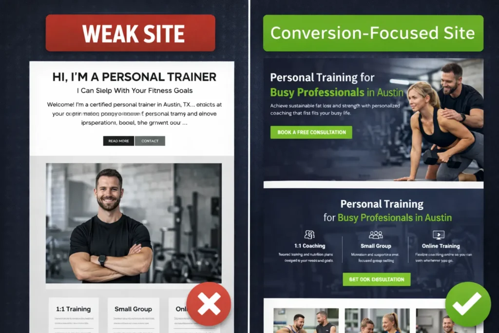
Many trainer sites look decent at first glance, but still underperform. Usually, the issue is not one big flaw. It is a collection of small misses that weaken trust and clarity.
One common mistake is writing for everyone. When your copy tries to appeal to beginners, athletes, weight loss clients, rehab clients, and corporate wellness leads all at once, it becomes forgettable. A focused message usually ranks better and converts better.
Another issue is hiding service details. Visitors should not need to message you just to understand what you offer. Unclear services create hesitation, and hesitation kills inquiries.
Weak proof is another problem. Saying you are passionate is nice. Showing client outcomes is stronger.
There is also a technical side. Slow loading pages, cluttered mobile layouts, broken buttons, and inconsistent information can quietly drain results. Google’s SEO Starter Guide explains that SEO is about helping search engines understand content while helping users decide whether to visit through search.
If you want a stronger overall build, start with fundamentals: clear message, clean structure, real proof, fast pages, and visible next steps. That alone can move a site from passive presence to an active lead source.
Best Option for Most Fitness Businesses
For most independent trainers and small studios, the best option is a conversion-focused service website with local SEO baked in from the start.
That means:
a clean homepage, one strong services page, testimonial proof, a visible booking path, local trust signals, a mobile-first layout, and content that sounds like a real coach instead of a generic marketing page.
You do not need a bloated site. You need a strategic one.
This is why so many small fitness brands do better with focused service pages than with complicated websites full of unnecessary extras. A site that clearly explains the offer, answers objections, and creates a smooth booking path usually outperforms a site that tries to impress with features but forgets to sell.
If that is the direction you want, start with Salt Web Designer and build around message clarity, search visibility, and conversion flow from day one.
Final Take: Build a Site That Books, Not Just Browses
A personal trainer website should help people understand your offer, trust your expertise, and take the next step without confusion. When the messaging, local SEO, proof, and calls to action all work together, the site becomes one of your most consistent client acquisition assets.
Instead of treating your website like a digital business card, treat it like your best salesperson. That shift is usually what separates a trainer who gets occasional inquiries from one who gets qualified leads on a steady basis.
Frequently Asked Questions
1. Why does a personal trainer’s website matter for getting clients?
It matters because your website turns attention into action. A lot of potential clients will discover you through referrals, Instagram, Google, or local searches, but they usually need one place where everything makes sense before they reach out. Your site gives them your services, proof, process, and contact path in one place. That clarity reduces hesitation, builds trust faster, and helps the right person inquire instead of bouncing to another trainer.
2. What should a personal trainer website include?
It should include the pages and proof that make decisions easier. At minimum, you want a homepage, About page, services page, testimonials or results, and a simple contact or booking page. It should also explain who you help, what type of training you offer, where you work, and how someone can get started. Good photos, FAQs, location signals, and visible calls to action make the site feel complete and much more credible.
3. Can a personal trainer website help with local SEO?
Yes, it can support local visibility in a major way. When your pages clearly mention your services, location, and business details, they become more relevant for local intent searches. Pair that with a complete Google Business Profile, consistent contact information, reviews, and useful location-specific copy, and you give search engines stronger signals. This can improve how often you appear for nearby prospects who are actively looking for coaching or training support.
4. How do I make my personal trainer website convert better?
You improve conversions by making the next step obvious and low-friction. Start with a clear headline that explains who you help and what outcome you offer. Add testimonials near key sections, simplify your menu, shorten your form, and use one consistent CTA across the site. It also helps to show your process, give some pricing direction, and answer common objections before the visitor has to ask. Small clarity upgrades often create a big lift in inquiries.