Gym website design helps fitness brands get more leads, build trust, and turn visitors into paying members. A strong gym website should make it easy for visitors to understand your offer, explore membership options, and take action on any device.
A high-performing gym website should make it easy for people to see your offer, trust your brand, and take action fast. The best sites do this by combining clear messaging, strong visuals, local SEO, simple navigation, and a friction-free path to book a class or start a trial.
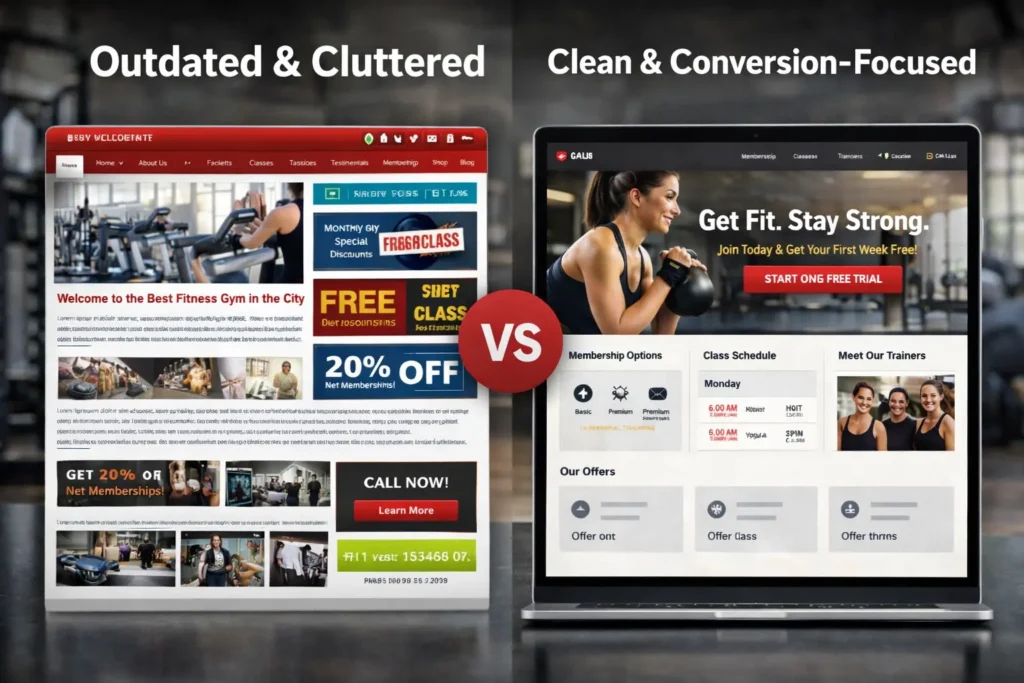
Most gyms do not lose leads because people hate fitness. They lose leads because the site feels confusing, slow, outdated, or incomplete. When a visitor lands on a homepage and cannot immediately tell who the gym is for, what the membership options are, where the gym is located, or how to join, that visitor often leaves and keeps searching.
That is why your website is not just a digital brochure. It is part sales page, part trust-builder, part local discovery tool, and part conversion engine. A strong fitness site should support your business at every stage of the customer journey, from awareness and comparison to booking and retention.
If your brand is planning a refresh, review the available website design & development services to see how the right build can support growth without adding unnecessary complexity.
Why a High-Converting Fitness Website Matters
People searching for a gym are usually comparing multiple options in a short window. They want answers quickly. They want to know pricing, class styles, coaching quality, schedule flexibility, parking, reviews, and whether the gym feels like a place where they belong.
A weak website creates hesitation. A strong one reduces it.
When your site is built well, it helps in several ways. First, it improves first impressions. Visitors often decide within seconds whether your brand feels current and trustworthy. Second, it increases lead quality because people arrive better informed. Third, it saves staff time by answering routine questions before someone calls or messages. Finally, it supports local search visibility when your pages are structured clearly and align with search best practices like descriptive content, useful pages, and crawlable site architecture, which Google recommends in its SEO Starter Guide.
For gym owners, this matters even more because the service is both emotional and practical. People are not only choosing equipment. They are choosing identity, accountability, comfort, and routine. Your site has to sell that feeling before they ever walk in.
What a Gym Site Should Include to Win More Members
The strongest fitness websites are simple on the surface but strategic underneath. They guide users in a natural order: understand the offer, build trust, compare options, and take the next step.
Here is a clear snapshot of the elements that usually matter most:
| Website Element | Why It Matters | Best Practice |
|---|---|---|
| Clear hero section | Sets expectations immediately | Show who the gym helps, what makes it different, and one primary CTA |
| Membership or pricing page | Reduces hesitation | Be transparent, even if pricing starts from a range |
| Class schedule or service overview | Helps visitors self-qualify | Make it easy to scan on mobile |
| Trainer or coach profiles | Builds trust | Include credentials, specialties, and friendly photos |
| Location and contact details | Supports local conversion | Add map, hours, parking notes, and contact options |
| Reviews and proof | Lowers risk | Feature real testimonials and transformation stories |
| Lead capture CTA | Drives action | Use a free trial, intro session, or consultation offer |
| Fast mobile experience | Prevents drop-off | Keep key actions visible and pages lightweight |
The real difference is not whether these pieces exist. It is how clearly they are presented.
For example, a pricing page should not feel defensive or vague. A class page should not bury the details that matter. A coach bio should not read like a resume only. Every page should move the visitor one step closer to confidence.
A smart way to study execution is to compare your current site against your own goals, then review relevant examples from your project gallery to see how layout, calls to action, and page structure can be improved.
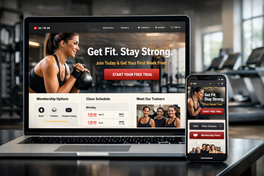
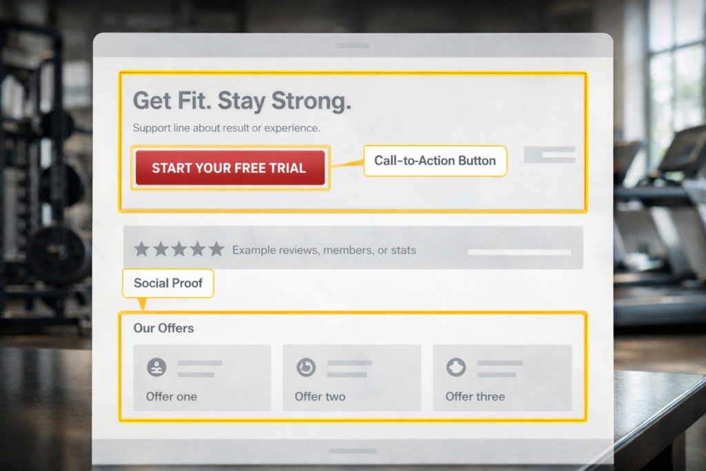
The Homepage Should Answer Four Questions Fast
The homepage is where many gym sites fail. They look energetic, but they do not communicate enough. Or they communicate too much and overwhelm the visitor.
A better approach is to make sure the top section answers four questions almost immediately:
Who is this for?
What do you offer?
Where are you located?
What should I do next?
That might sound basic, but it is powerful. A local strength gym, boutique Pilates studio, boxing gym, or family fitness center should each frame these answers differently. The more specific your homepage feels, the more likely the right visitor is to keep reading.
A practical homepage formula often looks like this:
A sharp headline that speaks to the target audience.
A short supporting line that explains the result or experience.
A visible CTA such as Start Your Trial, View Classes, or Book a Tour.
A trust strip with reviews, location, years in business, or member count.
A short section introducing the main offers.
A section showing social proof and outcomes.
A final CTA for action.
This structure works because it mirrors how people evaluate service businesses online. It reduces the mental work required to understand your offer.
Design Choices That Build Trust Instead of Friction
The visual side matters, but not for vanity. It matters because design shapes trust.
A fitness brand does not need the flashiest site in the market. It needs the most believable one for the right audience. A premium training facility should feel polished and confident. A community gym should feel approachable and real. A woman-only studio may need warmth, privacy, and reassurance. A youth sports facility may need energy, safety, and parent-friendly clarity.
Good design choices usually include:
✅ readable typography
✅ strong contrast
✅ clean spacing
✅ consistent button styles
✅ real photography
✅ clear page hierarchy
The biggest mistake is using visuals that look impressive but do not support decision-making. Heavy sliders, cluttered navigation, auto-play distractions, and generic stock fitness images can make a site feel less trustworthy, not more.
Real photos are especially important. People want to see the actual space, classes, equipment, staff, and members. That helps visitors picture themselves there. It also makes your business feel authentic, which is crucial in a category where comfort and belonging matter so much.
What Content Helps a Gym Website Rank Better
A site does not rank well just because it looks good. It needs useful, well-organized content that matches what people search for.
That means your website should not rely only on a homepage and contact page. It should also include supporting content that helps search engines understand the business and helps users answer real questions.
Useful core pages often include:
A dedicated memberships page
A class or training services page
Location pages if you serve multiple areas
About and coach pages
A contact page with full business details
Relevant blog content that supports trust and intent
This is where internal linking becomes valuable. It helps both users and search engines move through related topics more naturally. For example, if you serve health-related businesses or appointment-driven brands too, content patterns from articles like clinic website that builds trust and patient booking website can inspire how you structure trust sections, service explanations, and booking flows.
Google’s guidance also emphasizes making content helpful, clear, and easy for search engines to understand, rather than stuffing pages with repetitive terms.
That is why strong gym websites tend to perform better when they focus on topics like:
membership options,
class types,
personal training,
beginner guidance,
local location intent,
and common joining questions.
Local SEO Is a Major Part of the Strategy
Most gyms depend heavily on local demand. That means local SEO is not an add-on. It is central to performance.
A gym site should make it obvious where the business operates and which audience it serves. This includes consistent name, address, and phone details, location-specific copy, embedded maps, local schema where appropriate, and a well-maintained Google Business Profile. Google states that a verified Business Profile helps businesses appear across Google Search and Maps and allows owners to keep details accurate for customers.
This matters because many gym searches come with local intent, even when users do not type the city name. Searchers often expect Google to infer location and show nearby options. Your website should support that expectation by aligning your pages with your service area, nearby landmarks, parking details, neighborhood references, and local proof.
A practical tip is to mention concrete location cues naturally. For example, instead of saying “conveniently located,” say “two minutes from the high street” or “near the central business district with evening parking available.” Specificity improves clarity for users and can strengthen local relevance.
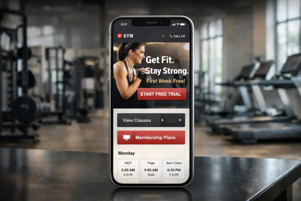
Speed, Mobile UX, and Technical Basics Cannot Be Ignored
Many gym visitors first land on a site from mobile search, social media, or map listings. If the site is slow, unstable, or awkward to use on a phone, conversion drops fast.
Google and web.dev both highlight the importance of user experience and Core Web Vitals as meaningful performance signals for real users.
For a gym website, that means:
buttons should be easy to tap,
pricing should be readable without pinching,
contact options should be visible,
forms should be short,
and images should not slow the page.
Below is a practical comparison of common build paths.
| Approach | Best For | Strengths | Watchouts |
|---|---|---|---|
| Template-based site | New or budget-conscious gyms | Faster launch, lower upfront cost | Can feel generic if not customized well |
| Custom website | Established gyms with growth goals | Stronger brand fit, better conversion planning | Higher investment and longer build time |
| Hybrid approach | Gyms need flexibility and speed | Balances performance, branding, and cost | Needs strategic planning to avoid compromises |
A good website does not have to be complicated. It has to be focused. In many cases, reducing bloated scripts, compressing images, simplifying layouts, and tightening page goals can have a bigger impact than adding more features.
How to Choose the Best Option for Your Business
The best website structure depends on the business model behind it.
A boutique studio with limited class capacity may need to emphasize scheduling, brand personality, and urgency. A large commercial gym may need to prioritize memberships, amenities, and location proof. A coach-led training facility may need stronger authority, transformation stories, and consultation funnels.
The right decision starts with three questions:
What is the primary conversion goal?
Who is the ideal member?
What information must be clear before someone is ready to act?
Once those answers are defined, you can shape the site around them.
For example, a gym focused on beginners may need educational copy and reassurance. A high-ticket private training brand may need a stronger consultation journey. A 24-hour gym may need convenience, access, equipment details, and local proof.
This is also where copy matters just as much as design. Strong websites are persuasive because they make visitors feel understood. Instead of generic lines about excellence, they explain the actual outcomes people care about: confidence, consistency, coaching, accountability, flexibility, community, and results.
Practical Tips That Usually Improve Conversions
The highest-performing fitness sites often share a few subtle habits.
They keep one main CTA visible on every important page.
They show real member reviews near decision points.
They place FAQs where hesitation typically appears.
They avoid forcing users to dig for pricing or schedules.
They write headings that sound human, not robotic.
They reduce friction in lead forms by asking only what is needed.
Another useful tactic is to match your CTA to the commitment level of the audience. Someone new to fitness may not be ready to “Join Now,” but may happily click “Book a Free Intro” or “Try Your First Class.” That small shift can increase response because it lowers perceived risk.
It also helps to audit the site through the eyes of a first-time visitor. Open the homepage on mobile, set a timer for 20 seconds, and ask:
Do I understand the offer?
Do I trust the brand?
Do I know what to do next?
If the answer is not immediate, the site likely needs refinement.
Content, Design, and SEO Work Better Together
The most effective websites do not treat design, copy, and SEO as separate jobs. They work together.
A fast page with weak messaging will still lose leads. Strong copy on a cluttered layout will still confuse users. Local SEO without convincing proof will still struggle to convert. What works is alignment.
That is why the strongest fitness websites are built around one idea: remove doubt and increase action.
Your site should make it easy for the right prospect to say yes. That includes the emotional yes of “this place feels right for me” and the practical yes of “I know what to click next.”
Wrapping It Up With the Right Priorities
The best gym website design is the one that clearly explains your offer, builds trust quickly, works smoothly on mobile, and supports both local discovery and lead generation. When those pieces come together, your website becomes a growth asset instead of an online placeholder.
Frequently Asked Questions
1. What should a gym website include?
A gym website should include clear conversion paths, trust signals, and essential business details. That means a strong homepage, membership or pricing information, class or service pages, coach bios, reviews, contact details, location information, and a clear next step such as a free trial or consultation. It should also be easy to use on mobile and answer practical concerns like hours, parking, amenities, and who the gym is best for. The goal is to remove hesitation and help visitors make a confident decision.
2. Why is website design important for getting more members?
Website design matters because it shapes first impressions and directly affects conversion. When a gym site feels modern, easy to navigate, and trustworthy, more visitors stay long enough to understand the offer and act on it. Good design also supports credibility by presenting testimonials, transformation proof, and clear service details in a way that feels organized rather than overwhelming. In short, better design reduces friction, increases trust, and gives more visitors a reason to book, call, or join.
3. How do I choose the best website setup for my fitness business?
The best option depends on your audience, offer, and growth goals. Start by identifying your primary conversion goal, such as membership sign-ups, trial bookings, or consultation leads. Then choose a website structure that supports that action without extra noise. A smaller studio may benefit from a simpler, brand-led site, while a larger gym may need deeper content and stronger local SEO support. The right choice is the one that helps ideal members understand your value and take action quickly.
4. Does website design affect SEO and Google rankings?
Yes, website design can influence SEO through usability, structure, speed, and content clarity. Search performance is not only about keywords. It also depends on whether pages are easy to crawl, helpful to users, mobile-friendly, and fast enough to create a good experience. A well-designed site helps search engines understand page intent while helping visitors stay engaged and convert. That combination can improve visibility over time, especially for local businesses competing in map and organic results.