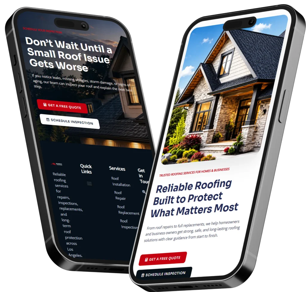
Homepage trust signals are visible proof points that show visitors your business is legitimate, experienced, reliable, and safe to contact. The strongest examples include customer reviews, real project results, professional credentials, clear contact details, guarantees, and a secure website.
For a small business, these elements reduce uncertainty before a visitor calls, requests a quote, books an appointment, or submits a form. They are most effective when placed near important decision points rather than grouped together at the bottom of the page.
In this guide, you will learn which credibility elements belong on a homepage, why they matter, where to place them, and how to use them without making your website look cluttered or overly promotional.
What Are Homepage Trust Elements?
Homepage trust elements are visual, written, or technical details that help visitors feel confident about a company. They answer the questions people silently ask when they arrive on a website:
✅ Is this a real business?
✅ Does this company understand my problem?
✅ Have other customers had a good experience?
✅ Can this team deliver what it promises?
✅ Is it safe to provide my information?
A trust element does not have to be an official certification badge. A specific headline, authentic photograph, recognizable client logo, detailed testimonial, or clearly displayed phone number can all strengthen credibility.
The key is proof. General claims such as “We provide excellent service” are less persuasive than evidence showing how the business delivers excellent service.
For example, compare these two statements:
“We create high-quality websites for small businesses.”
“See how we redesigned a local service company’s website and increased qualified estimate requests.”
The second statement is stronger because it gives visitors something concrete to evaluate. The business is not only describing its ability. It is demonstrating it.
Why Website Trust Matters for Small Businesses
A small business website often needs to build confidence without the instant recognition enjoyed by a national brand. A potential customer may be discovering the company for the first time through Google, a referral, an advertisement, or a social media post.
That visitor has limited information and may be comparing several businesses at once. If the website feels outdated, vague, impersonal, or difficult to verify, the visitor can leave without making contact.
Nielsen Norman Group identifies design quality, clear disclosure, useful current content, and connections to outside sources as important website credibility factors. This means trust is influenced by the complete experience, not by one badge or testimonial alone. Read Nielsen Norman Group’s website credibility guidance.
A credible homepage can help a business:
✅ Keep qualified visitors on the page longer
✅ Reduce hesitation before a call or form submission
✅ Support higher-value services that require careful consideration
✅ Make paid advertising traffic more likely to convert
✅ Create a stronger first impression before a sales conversation
Trust is especially important for service businesses because customers are often purchasing expertise, access, time, or a future result. They cannot inspect the finished service before hiring the provider. The website must therefore communicate competence and reduce perceived risk.
Which Trust Signals Are Most Important?
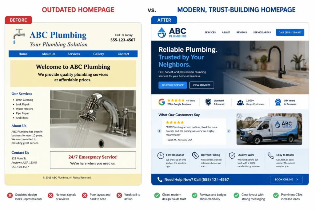
Not every proof element has equal value. The best choice depends on the business, the visitor’s concerns, and the action the homepage is asking someone to take.
A medical practice may emphasize professional credentials, privacy, and patient reviews. A contractor may focus on licensing, insurance, service areas, guarantees, and completed projects. A web designer may feature portfolio examples, client testimonials, a clear process, and measurable results.
The following table compares common options.
| Trust Element | What It Proves | Best Placement |
|---|---|---|
| Customer reviews | Other people had a positive experience | Near the first call to action or service overview |
| Portfolio or project examples | The business can perform the work | Middle of the homepage after services |
| Certifications and licenses | The company meets professional standards | Near service descriptions or contact forms |
| Client or partner logos | Recognizable organizations have worked with the business | Below the opening section |
| Guarantees | The business accepts some responsibility for the result | Beside pricing, booking, or quote requests |
| Team photographs | Real people operate the company | About section or near contact details |
| Address and phone number | The company is reachable and established | Header, footer, and contact section |
| Secure website indicators | Information is transmitted through a protected connection | Sitewide, especially around forms |
| Results and statistics | The service creates measurable outcomes | Case studies or project highlights |
| Clear policies | Customers know what to expect | Near forms, checkout steps, or footer links |
For many small businesses, the best starting combination is a strong testimonial, real work examples, a recognizable credential, clear contact information, and a low-friction call to action.
These elements cover the visitor’s main concerns without overwhelming the page.
Customer Reviews and Testimonials
Reviews are among the most familiar forms of social proof, but quality matters more than quantity displayed on the homepage.
A useful testimonial should identify the customer, explain the original problem, describe the experience, and mention a meaningful outcome. Statements such as “Great company!” provide little context and could apply to almost any business.
A stronger testimonial might say:
“We had an outdated website that generated very few calls. After the redesign, customers could understand our services more quickly, and we began receiving better-qualified quote requests.”
This example communicates the problem, the service, and the result.
Whenever possible, include the customer’s first and last name, company name, location, photograph, or link to an independent review profile. Use only details the customer has approved for publication.
The Federal Trade Commission advises that reviews should reflect honest opinions from real customers. Businesses should not create fake testimonials, hide negative feedback, or offer incentives only in exchange for positive reviews. Review the FTC’s guidance for businesses using customer reviews.
Where Should Testimonials Go?
Place one of your strongest testimonials near the first major call to action. This gives visitors reassurance at the moment they are deciding whether to continue.
Additional reviews can appear:
✅ After the services section
✅ Beside a featured case study
✅ Near a booking or quote form
✅ Before the final call to action
Avoid placing every testimonial in a slider that automatically rotates. Some visitors may not wait long enough to see the most relevant quote. A static testimonial with a clear result is easier to notice and read.
Real Work, Case Studies, and Portfolio Examples
Prospective clients want to know whether you have completed work similar to what they need. A portfolio provides visual proof, while a case study explains the thinking and outcome behind the work.
For website design services, do not show screenshots without context. Briefly explain:
- What problem the client had
- Which changes were made
- Why those changes were appropriate
- What improved after launch
A restaurant, for example, may need clearer mobile navigation and faster access to reservations. A home-service company may need prominent service areas, click-to-call buttons, and shorter estimate forms. A professional consultant may need stronger messaging and clearer authority signals.
Visitors can review Salt Web Designer’s portfolio highlights to see how completed projects are presented as practical evidence rather than unsupported claims.
A good project example helps a potential customer say, “This company has solved a problem like mine.”
Professional Design Is a Trust Signal
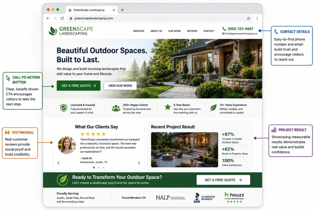
Visitors often judge a company’s reliability through its website before reading every word. A polished layout does not guarantee excellent service, but poor design can create immediate doubt.
Common credibility problems include:
✅ Broken layouts on mobile devices
✅ Stock photographs that feel unrelated to the business
✅ Small text or weak color contrast
✅ Confusing menus
✅ Missing service information
✅ Old copyright dates or outdated announcements
✅ Forms that request unnecessary information
✅ Buttons that do not explain what happens next
Professional design supports trust by making the website feel organized, intentional, and easy to use. Consistent colors, spacing, typography, and button styles show attention to detail.
For businesses dealing with an aging or confusing site, a website redesign that converts can improve credibility while also addressing messaging, mobile usability, page speed, and lead flow.
The goal is not to make the website look expensive for its own sake. The goal is to help visitors understand the offer and confidently take the next step.
Clear Website Messaging Builds Confidence
A beautiful homepage can still lose leads when visitors cannot understand what the business does.
The opening section should explain:
- What service or product is offered
- Who it is for
- Which location or market is served
- What result the customer can expect
- What action the visitor should take
A vague headline such as “Solutions Designed for Your Future” forces the visitor to interpret the offer. A specific headline such as “Mobile-Friendly Websites for Local Service Businesses” communicates the service and audience immediately.
Supporting copy should address the visitor’s real concerns instead of filling the page with generic company language. The guide to website messaging for small business explains how clear positioning can help visitors recognize that they are in the right place.
Good messaging is a credibility tool because clarity suggests competence. When a company explains its work simply, customers are more likely to believe the company understands its own process.
Contact Information and Business Transparency
Visitors should not have to search for basic company details. Display a working phone number, professional email address, service area, and relevant business hours where appropriate.
For a location-based company, include the city or region served. For a remote provider, clearly state that services are available online or across specific markets.
An About section should also introduce the person or team behind the business. Real names and photographs generally feel more trustworthy than anonymous descriptions or generic stock images.
Transparency can include:
✅ Who will perform the work
✅ How the process begins
✅ Typical project stages
✅ Expected response time
✅ Starting prices or pricing approach
✅ Cancellation, refund, or warranty policies
A business does not need to reveal every internal detail. It should provide enough information for a visitor to understand who is responsible and what working together will involve.
Security, Privacy, and Low-Risk Forms
Every modern business website should use HTTPS. It protects information transmitted between the visitor and the website and prevents browsers from labeling the connection as insecure.
Google includes HTTPS among the page-experience considerations website owners should evaluate. See Google Search Central’s page experience guidance.
Security messaging should be accurate and specific. Do not add decorative “100% secure” badges that are not connected to a real security provider or policy.
The contact form also affects trust. Asking for too much information too early may discourage inquiries. A first-contact form usually needs only the details required to respond, such as:
✅ Name
✅ Email or phone number
✅ Service needed
✅ Short project description
More sensitive or detailed information can be collected after the business establishes contact.
Add a short privacy statement near the form, such as: “We will use your information only to respond to your request.” Link that statement to a complete privacy policy when appropriate.
Guarantees, Credentials, and Professional Memberships
Credentials can be powerful when customers understand why they matter. A license, certification, insurance status, award, or professional membership may reduce concerns about safety, quality, or accountability.
Do not display a row of unexplained logos. Add a short label so visitors understand each credential.
For example:
“Licensed and insured in Florida”
“Google Business Profile verified”
“Certified accessibility specialist”
“Member of the local chamber of commerce”
Guarantees can also reduce risk, but they must be clear and realistic. Avoid absolute promises that the business cannot consistently honor.
A useful guarantee explains what is covered, what the customer must do, and how the company will respond. A web maintenance provider might promise to acknowledge urgent support requests within one business day. A contractor might offer a defined workmanship warranty.
Specific commitments feel more credible than broad claims such as “Your satisfaction is guaranteed.”
Where to Place Trust Elements on a Homepage
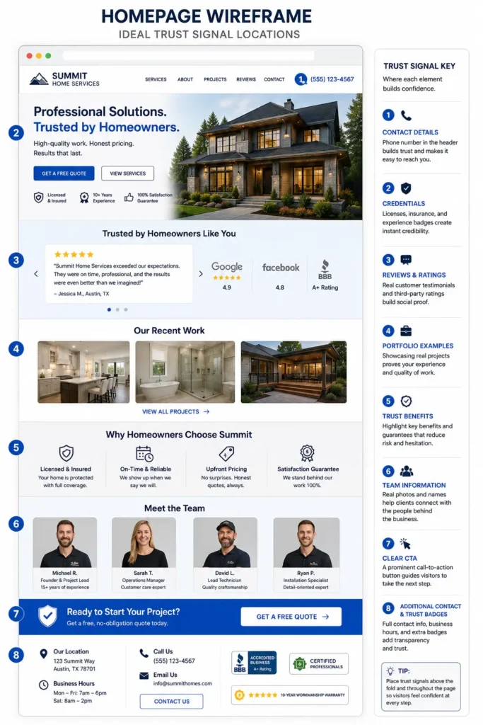
Credibility evidence should appear throughout the visitor’s journey. Do not expect one group of badges in the footer to overcome uncertainty created earlier on the page.
Use the following placement framework.
| Homepage Area | Visitor’s Main Question | Helpful Proof |
| Header and opening section | Am I in the right place? | Clear offer, location, phone number, review rating |
| Below the opening section | Is this company established? | Client logos, years of experience, certifications |
| Services section | Can they solve my problem? | Relevant benefits, process details, service-specific proof |
| Project section | Have they done this successfully? | Portfolio examples, case studies, measurable results |
| About section | Who will I work with? | Team photos, names, experience, local connection |
| Form or booking section | Is it safe to contact them? | Privacy note, response expectation, guarantee |
| Footer | Can I verify the business? | Address, policies, social profiles, contact information |
This distributed approach gives visitors reassurance when new questions arise.
For example, a review near the top may create initial interest. A case study confirms ability. A clear process reduces uncertainty. A privacy note makes the contact form feel safer.
How to Add Trust Without Cluttering the Homepage
More proof does not always create more confidence. Too many badges, counters, logos, popups, and testimonials can compete with the main message.
Start by identifying the visitor’s three biggest concerns. A new contractor’s customers may care about licensing, local experience, and workmanship. A business coach’s prospects may care about relevant experience, client results, and the structure of the program.
Choose proof that answers those concerns directly.
A practical homepage may include:
✅ One review or rating near the main call to action
✅ Three client or credential logos below the opening section
✅ Two or three featured projects
✅ A short About section with a real photograph
✅ One final testimonial beside the contact form
Every element should support a decision. Remove counters or badges that are difficult to verify, unrelated to the service, or visually distracting.
Which Trust Option Is Best for Your Website?
The best option depends on how customers evaluate your service.
For local service businesses: Use location information, Google reviews, licensing, insurance, real team photographs, completed local projects, and a visible phone number.
For professional services: Prioritize credentials, industry experience, a clear process, case studies, client logos, and thought-leadership content.
For appointment-based businesses: Show staff qualifications, availability information, customer reviews, booking expectations, privacy details, and cancellation policies.
For ecommerce websites: Emphasize secure checkout, delivery information, returns, product reviews, payment options, and accessible customer service.
For new businesses with few reviews: Use founder experience, work samples, transparent processes, guarantees, memberships, and detailed service explanations. Do not invent social proof. A new business can still appear credible through honesty and professional presentation.
When your website needs a stronger structure, clearer proof, or better lead flow, working with small business web design experts can help turn scattered credibility elements into a consistent customer journey.
Calls to Action Should Feel Safe and Specific
A call to action tells visitors what to do next. It also sets expectations, which can either strengthen or weaken trust.
Generic buttons such as “Submit” or “Click Here” provide little reassurance. Use wording that describes the action:
✅ Request a Website Quote
✅ Schedule a Discovery Call
✅ Check Project Availability
✅ Book Your Consultation
✅ Get a Website Review
Supporting text can reduce additional uncertainty:
“No-pressure 20-minute consultation”
“Receive a response within one business day”
“Tell us about your project. No payment is required.”
The article on homepage call-to-action examples provides practical ways to match button wording to the visitor’s level of readiness.
The page copy around the button matters too. A strong CTA cannot repair an unclear offer. Visitors need to understand the service, believe the company can deliver, and know what will happen after they click.
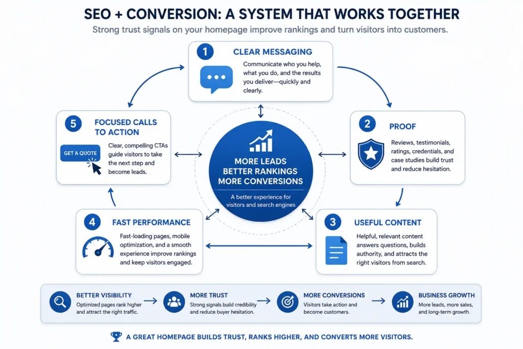
Trust Signals and SEO
Credibility elements are primarily designed for people, but they can also support a stronger search presence.
Detailed service descriptions help search engines understand the business. Case studies demonstrate first-hand experience. Clear author or company information provides context about who created the content. Helpful internal links guide visitors and search engines to relevant pages.
Google says its systems aim to prioritize helpful, reliable, people-first content. It encourages site owners to demonstrate first-hand expertise, provide clear sourcing, and help readers understand who created the content.
Trust badges alone do not guarantee higher rankings. The full website still needs useful content, crawlable pages, good technical performance, natural internal linking, and a satisfying visitor experience.
Service-page content is especially important because it connects the company’s expertise to the exact problem a potential client is searching for. The guide to service page copy for small business explains how to communicate value without relying on vague promotional language.
Common Trust-Building Mistakes
One common mistake is using proof that cannot be verified. Anonymous reviews, unsupported statistics, and unfamiliar badges may create more suspicion than confidence.
Another mistake is relying heavily on stock photography. Stock images can support a design, but they should not replace real photographs of the team, location, process, or work when those visuals are available.
Outdated information is also damaging. Old promotions, broken social links, inactive phone numbers, and team members who no longer work at the company suggest neglect.
Avoid these problems:
✅ Do not claim awards without naming the organization and year
✅ Do not use client logos without permission
✅ Do not publish customer details without consent
✅ Do not hide important conditions in tiny text
✅ Do not promise guaranteed rankings, revenue, or results
✅ Do not copy testimonials from another platform without confirming accuracy
Review the homepage every three to six months. Confirm that contact information, services, staff details, policies, project examples, and testimonials remain current.
Final Thoughts on Homepage Trust Signals
Effective homepage trust signals give visitors credible reasons to call, book, request a quote, or continue exploring the website. Reviews, real work, professional credentials, clear messaging, transparent contact details, secure forms, and specific calls to action are strongest when they address genuine customer concerns.
Begin with the proof your audience needs most. Place it near the decision it supports, explain why it matters, and keep every claim accurate. A smaller number of relevant, verifiable elements will usually perform better than a crowded page filled with generic badges.
Frequently Asked Questions
1. What should a small business put on its homepage to build trust?
A small business should show clear contact information, real customer feedback, relevant credentials, completed work, and a simple explanation of what happens next. These elements help visitors confirm that the company is legitimate and capable. Place the strongest review or credential near the first call to action, then add project examples and team information farther down the page. Use real names, photographs, locations, and specific outcomes whenever customers have approved them.
2. Can a website redesign help a small business get more leads?
A strategic redesign can improve lead generation when it removes confusion, strengthens credibility, and makes contacting the business easier. Changing colors alone is unlikely to create a meaningful improvement. The redesign should clarify the offer, improve mobile usability, shorten forms, strengthen calls to action, and add relevant proof near decision points. Track form submissions, calls, bookings, and qualified inquiries before and after launch to evaluate whether the new website supports business goals.
3. Where should reviews be placed on a service business website?
Place a strong, relevant review near the first major call to action and additional testimonials beside services, case studies, or the contact form. Visitors need reassurance at different stages of the page. Use reviews that describe a specific problem, experience, or result instead of generic praise. Include the customer’s name, business, location, photograph, or independent review source when permission allows. Avoid hiding every review inside an automatic slider that visitors may never see.
4. Should I hire a professional web designer to improve website trust?
Hiring a professional web designer is helpful when your current site looks outdated, communicates an unclear offer, performs poorly on mobile devices, or fails to generate qualified inquiries. A designer can organize messaging, proof, navigation, forms, and visual hierarchy into one consistent experience. Before hiring, review relevant work, ask about strategy and measurement, clarify ownership and ongoing costs, and choose someone who understands both design quality and the customer actions your business needs.