A crossfit gym website should help local athletes understand your offer, trust your coaching, and book a free intro without friction. The best-performing sites combine clear messaging, fast mobile performance, local proof, and a simple path from homepage to membership inquiry.
A lot of gyms lose leads because their website looks active, but does not answer the questions people ask before joining. Visitors want to know who you help, what makes your box different, what the schedule looks like, how to get started, and whether your coaching style fits their goals. If that information is buried, slow to load, or unclear on mobile, you lose momentum before the conversation even starts.
That is why your site should do more than just “look good.” It should work like a coach at the front desk. It should greet the visitor, explain the program, reduce uncertainty, and guide the next step.
Why your gym website matters more than most owners think
People rarely join a gym the first time they hear the name. They search, compare, scan reviews, open two or three tabs, and make a fast judgment based on what they see. For a CrossFit box, that judgment is often emotional. They are asking themselves whether this gym feels welcoming, serious, results-driven, and worth the price.
A strong site shapes that decision in three ways.
First, it creates trust. Real photos, clear coaching bios, transparent class info, and visible testimonials reduce the fear that often comes with trying CrossFit for the first time.
Second, it improves discovery. Google recommends focusing on overall page experience, including mobile usability, HTTPS, and Core Web Vitals, as part of creating pages that succeed in Search.
Third, it increases action. Your pages should make it easy to book a trial, request pricing, or start a conversation. For local businesses, Google Business Profile also plays a major role in how customers find and learn about your business on Search and Maps.
If your website is vague, outdated, or hard to use on a phone, it can quietly undercut your ads, referrals, social media, and word of mouth.
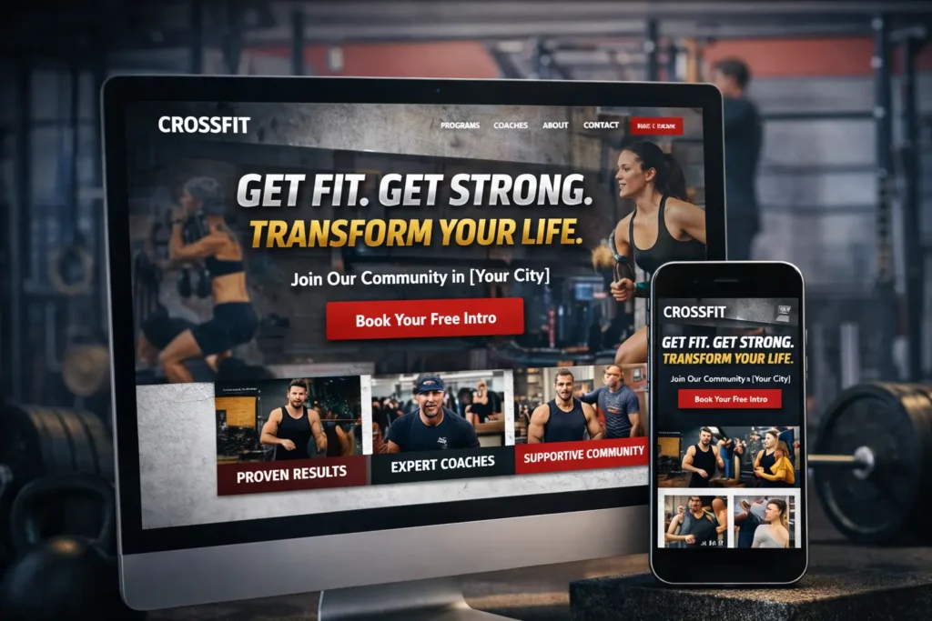
What a high-converting gym homepage should include
Most gym homepages fail because they try to say everything at once. A better approach is to answer the right questions in the right order.
Start with a headline that tells people exactly what you do and who it is for. Instead of a generic line about fitness, say what transformation your gym supports. That might be beginner-friendly strength coaching, structured group training, weight loss support, or competitive programming.
Right below that, place one clear call to action. “Book a Free Intro” usually works better than “Learn More” because it is specific and low friction.
Then support that CTA with a short sequence:
who you help, what members can expect, why your coaching is different, and how to start.
Here is a simple homepage flow that tends to work well.
| Homepage Section | What It Should Do | Why It Matters |
|---|---|---|
| Hero section | State the offer and show one primary CTA | Gives visitors immediate direction |
| Social proof | Display testimonials, reviews, or member wins | Builds trust quickly |
| Program overview | Explain your main services in simple terms | Helps visitors self-identify |
| About the coaches | Show credentials and personality | Reduces fear and increases credibility |
| Getting started steps | Explain the first visit or intro session | Removes uncertainty |
| FAQ or objections | Address pricing, experience level, and schedule concerns | Keeps users from leaving to “think about it” |
This structure also matches how people scan. They do not read every line. They look for proof, clarity, and ease.
For inspiration on positioning and local service structure, review website design & development services and how a polished project gallery can reinforce credibility through visual examples.
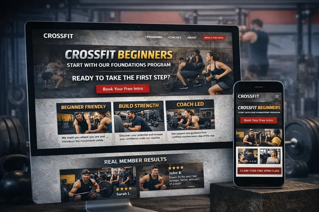
How to structure service pages for better rankings and better leads
Your gym site should not rely on one homepage alone. It needs supporting pages that target intent clearly.
That usually means separate pages for your key offers, such as:
CrossFit classes, personal training, nutrition coaching, beginner foundations, youth training, or open gym.
Each page should explain:
who the offer is for, the result it aims to create, what the process looks like, how often members attend, and what the next step is.
This matters because a person searching for “beginner CrossFit classes near me” is different from someone searching for “personal training for weight loss.” When those users land on a generic page, the message feels weaker. When they land on a focused page, conversions improve because the fit is obvious.
A good service page should include a short intro, benefit-driven subheadings, proof, and a relevant call to action. It should not read like a brochure. It should read like a conversation with a prospect who is close to taking action.
One helpful reference for niche positioning is this guide on gym website design, especially if you want ideas for how to frame member outcomes on key pages. You can also study fitness studio website examples for layout and conversion ideas that translate well to boutique fitness businesses.
The local SEO pieces that help a box get found
Many gym owners think SEO starts with blogging. It does not. It starts with the basics being done well.
Your gym needs consistent local signals across the site. That includes your city, service area, business name, contact details, class type, language, and real location-based relevance throughout the content.
Your contact page should not be an afterthought. It should include your full address, phone number, embedded map, hours, and an easy inquiry method. Your footer should repeat core business info in a clean format. Your title tags and headings should connect the service with the location naturally.
Google also emphasizes keeping a Business Profile accurate and updated so customers can find details like hours, contact info, and photos.
That means your local visibility works best when your site and your profile support each other.
Local SEO checklist for a CrossFit box
| SEO Element | Best Practice | Common Mistake |
|---|---|---|
| Page titles | Include service + city naturally | Stuffing multiple cities awkwardly |
| Contact page | Add address, phone, map, and inquiry CTA | Hiding contact info |
| Location signals | Mention local relevance in copy and headings | Writing pages with no city context |
| Reviews | Feature testimonials from real members | Using vague or anonymous quotes |
| Business Profile alignment | Match core business info with site details | Inconsistent hours or services |
| Mobile speed | Keep pages fast and simple to load | Heavy images and cluttered sections |
If you want a deeper official reference on performance and search visibility, a natural external resource to mention is Google’s page experience documentation, which explains why mobile usability and site performance matter. Another strong supporting source is Google’s Business Profile help content, which outlines how customers discover local businesses through Search and Maps.
For Rank Math-friendly external linking, these are two strong additions you can blend naturally into the article or supporting posts:
Design choices that help visitors trust your gym faster
CrossFit brands often lean hard into grit, intensity, and dark visuals. That can work, but only when clarity stays intact. A site can feel strong without feeling chaotic.
The best design choices for gym websites usually come down to five things.
Strong photography. Use real members, real coaches, and real training sessions. Stock photos weaken trust.
Readable hierarchy. Your headlines should stand out, your paragraphs should breathe, and your buttons should be easy to spot.
Simple navigation. Keep the menu clean. Too many choices can slow decisions.
Mobile-first layouts. Most visitors will check your site on a phone. If schedules, buttons, and forms are awkward on mobile, conversions drop.
Clear CTA repetition. Do not make users hunt for the next step. Place the booking action in the hero, mid-page, and lower on the page where intent builds.
One of the easiest wins is replacing generic copy with specifics. Instead of “transform your life,” say “Start with a free intro and a coach-led plan built around your current fitness level.” Specific language feels more credible because it gives the reader something concrete to picture.
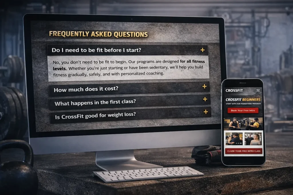
What content helps the most with GEO and AEO
To improve visibility in search and answer engines, your site should be easy to extract answers from. That means your content needs a clean structure and direct responses.
Use headings that match what people search for. Build short answer-led intros under key sections. Add FAQ content that addresses fear, timing, pricing style, experience level, and results expectations.
This is especially useful for gym buyers because many are not ready to join immediately. They are researching first. They want simple answers to practical questions like:
Do I need to be fit before I start?
How much does it cost?
What happens in the first class?
How often should I train?
Is this good for weight loss?
When your content answers those directly, it becomes more useful for both people and machines.
You can also create supporting topical articles that connect to the main gym page. For example, a box that offers personal coaching could internally support the main service pages with educational content, like personal trainer website to inform structure ideas around coaching offers, consultation flows, and trust-building content.
Common mistakes that make gym websites underperform
A lot of poor performance comes from avoidable issues, not from lack of effort.
One common mistake is trying to impress instead of clarifying. Flashy motion, hard-to-read fonts, and long intro videos often get in the way.
Another is hiding pricing context too aggressively. You do not always need to publish exact membership rates, but you should explain how people get pricing and what the onboarding process involves. Visitors dislike feeling trapped in a form with no idea what comes next.
Another issue is weak proof. A few generic testimonials are not enough. Better proof includes:
before-and-after progress stories, Google reviews, coach qualifications, event photos, and specific wins from members.
Slow pages are also a problem. Google’s documentation continues to recommend strong Core Web Vitals and good page experience as part of building a successful search presence.
Finally, many sites fail because they are not written for beginners. Remember that a large share of your leads are not experienced CrossFit athletes. They are nervous first-timers. Your site should welcome them clearly.
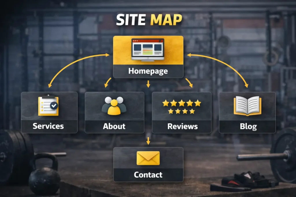
Which pages should your site have first
If you are building or rebuilding from scratch, do not start with twenty pages. Start with the pages that support discovery and conversion first.
A practical first version should include:
Homepage, About, Programs or Services, Schedule, Contact, Reviews, and a simple Getting Started page.
After that, expand into location pages, blog content, coach pages, and specialized landing pages for local campaigns.
A crossfit gym website becomes much stronger when every page has a job. Your homepage introduces. Your service pages qualify. Your reviews page reassures. Your contact page converts. Your blog supports discovery.
Final take
The best crossfit gym website is not just attractive. It is clear, local, trustworthy, and built to move people from curiosity to action. When your site answers real questions, loads well on mobile, supports your Google presence, and gives people a confident first step, it becomes one of the strongest growth assets your gym has.
Frequently Asked Questions
1. What should a gym website focus on first to get more leads?
Clarity comes first. Before adding advanced SEO tactics or extra pages, a gym website should clearly explain who the gym helps, what programs it offers, what makes it different, and how a new member gets started. Most leads do not disappear because a site lacks features. They leave because the message is confusing. A strong homepage, visible call to action, real testimonials, and a clean mobile experience usually make the biggest difference early on.
2. Is it better to show gym pricing on the website or not?
Context matters more than full numbers alone. Some gyms publish complete pricing, while others prefer to invite visitors into a free intro first. Both can work. What matters is reducing uncertainty. If you do not list exact rates, explain what the pricing process looks like, what is included, and what a beginner should expect next. That way, visitors feel informed instead of blocked, which helps trust and improves conversions.
3. How important is local SEO for a CrossFit box?
Local SEO is essential for most gyms. A CrossFit business usually serves a limited geographic area, so ranking for local intent matters far more than broad national traffic. Your site should connect services with your city naturally, maintain consistent business details, and support a well-managed Google Business Profile. When those pieces align, your gym becomes easier to discover for people actively searching nearby and ready to join.
4. How often should a gym update its website content?
Consistent updates are better than random overhauls. You do not need to rewrite the whole site every month, but you should review core pages regularly. Update class schedules, coach bios, photos, testimonials, promotions, and outdated information as needed. Blog content can be added on a steady schedule based on real search questions from prospects. Fresh, accurate content helps both user trust and overall website quality.