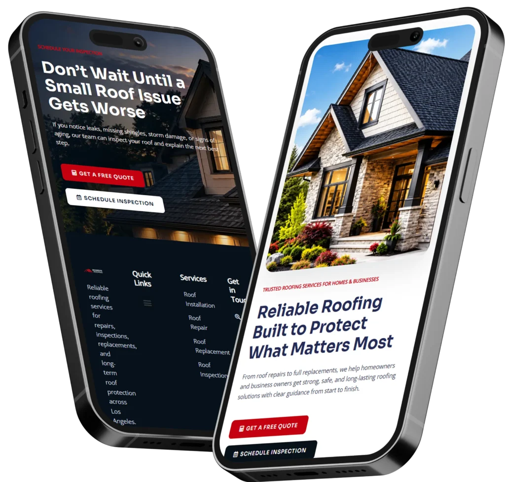
The best business homepage examples quickly explain what the company offers, who it serves, and what visitors should do next. A strong homepage combines clear messaging, professional design, trust signals, and focused calls to action that encourage people to call, request a quote, book an appointment, or explore a service.
A homepage should not simply look attractive. It should guide potential customers toward a useful next step while answering their biggest questions about your company.
In this guide, you will discover which homepage styles work for different small businesses, why certain layouts produce better results, and how to apply these ideas when designing or redesigning your own website.
What Makes a Business Homepage Effective?
An effective homepage gives visitors confidence that they have reached the right company. It communicates the business offer before asking people to search through several sections or menu pages.
Visitors should understand three things within the first few seconds:
✅ What your business does
✅ Who your business helps
✅ What action they should take next
Google recommends creating helpful, people-first content and placing words customers use in prominent areas such as titles, headings, link text, and descriptive page elements. This supports both search visibility and user understanding. You can review these principles in the Google Search Essentials guide.
Your homepage should also make the highest-priority customer tasks easy to identify. Clear starting points help visitors move forward instead of becoming distracted by too many competing choices.
Clear Homepage Messaging
Your main headline should describe the result your customer wants, not simply state your company name.
For example, a local plumber could use:
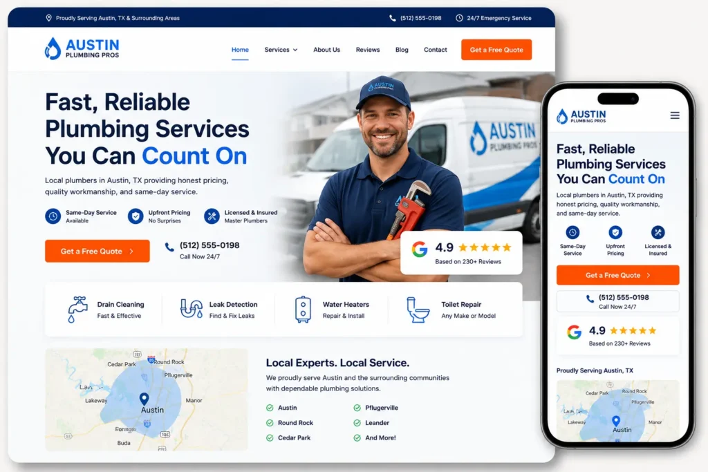
Fast, Reliable Plumbing Repairs for Austin Homeowners
This headline is more useful than:
Welcome to Smith Plumbing
The first version explains the service, location, and target customer. The second version makes the visitor work harder to understand the offer.
Supporting text beneath the headline should provide one or two additional details. It might mention years of experience, availability, specialization, or a meaningful customer benefit.
A Focused Call to Action
A call to action tells visitors what to do after reading your message. Useful options include:
✅ Request a Free Quote
✅ Schedule Your Consultation
✅ Call for Same-Day Service
✅ View Our Recent Projects
✅ Book Your Appointment
The best option depends on how customers normally hire your business.
A landscaping company may benefit from a quote request. A dental clinic may need an appointment button. A restaurant may prioritize reservations or online ordering.
Avoid using several equally prominent buttons in the first section. Too many choices can weaken the page’s main goal.
Specific button labels also create clearer expectations than vague text such as “Get Started.” Descriptive links help visitors understand exactly what will happen after they click.
Trust Signals Near the Top of the Page
Visitors may hesitate to contact a company they do not recognize. Trust signals reduce that uncertainty.
Useful trust elements include:
✅ Customer ratings
✅ Review totals
✅ Industry certifications
✅ Years in business
✅ Service guarantees
✅ Recognizable client logos
✅ Secure payment or privacy information
✅ Professional association badges
Place your strongest proof near the first call to action. For example, a contractor might display “4.9 Stars From 180 Local Customers” beneath the quote button.
Business Homepage Styles by Industry
There is no single homepage layout that works for every company. The best design depends on what you sell, how customers make decisions, and which questions must be answered before they contact you.
The examples below explain which approach is most applicable to different business models.
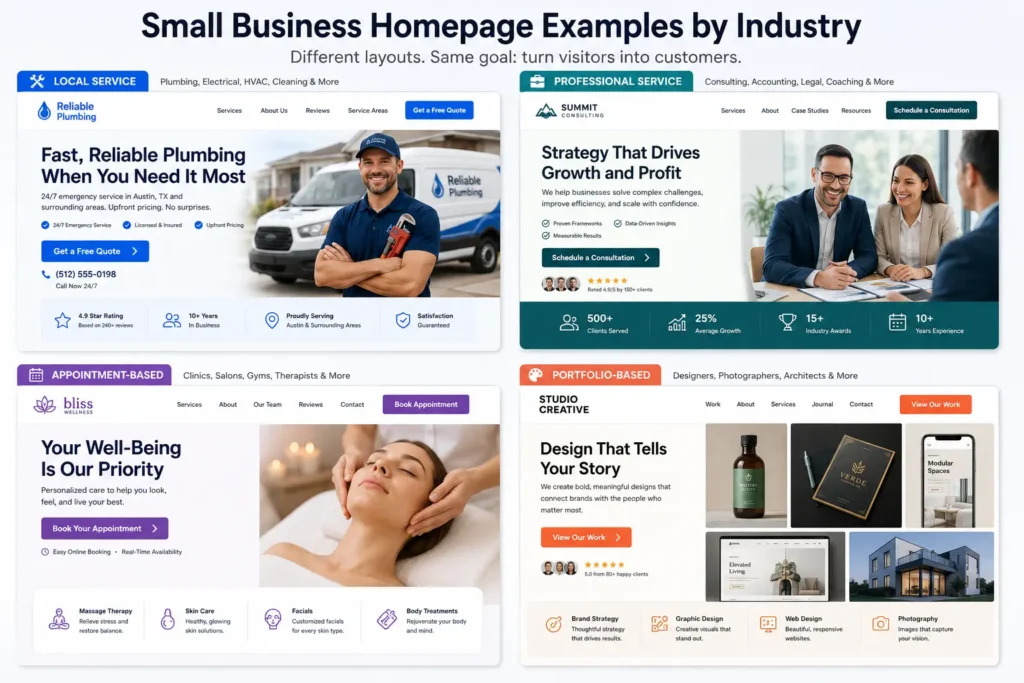
1. Local Service Business Homepage
Local service companies include plumbers, electricians, cleaners, roofers, landscapers, HVAC contractors, and pest control providers.
Their visitors often need quick answers:
Is this company available in my area?
Does it provide the service I need?
Can I trust its technicians?
How soon can someone help me?
How do I request an estimate?
A strong local-service homepage should feature the service area, phone number, primary services, reviews, licenses, and a visible quote button.
Best homepage structure:
- Service-focused headline
- Call or quote button
- Ratings and credentials
- Main service categories
- Before-and-after work
- Service-area information
- Customer testimonials
- Final contact section
Practical example: A roofing company should lead with the homeowner’s problem and location. “Roof Repair and Replacement for Tampa Bay Homes” communicates more value than “Quality Roofing Solutions.”
2. Professional Service Homepage
Professional service companies include accountants, consultants, attorneys, financial advisors, architects, and business coaches.
Their customers usually need more information before making contact. The homepage should communicate expertise without overwhelming visitors with technical language.
A useful layout includes a specific positioning statement, the problems the company solves, service categories, credentials, client results, and a consultation invitation.
Visitors should be able to tell why the professional is different from other providers. This difference could be industry specialization, local experience, a unique process, or a particular client type.
For help improving the words visitors see first, read this guide to website messaging for small businesses.
3. Appointment-Based Business Homepage
Salons, spas, dental offices, therapists, fitness studios, photographers, and wellness providers depend on appointments.
Their homepage should make booking simple. The most important button should lead directly to a booking page, scheduling tool, or contact form.
Include service durations, starting prices when appropriate, availability expectations, location details, and staff information. Real photographs of the location and team can also reduce uncertainty.
A mobile visitor should not need to pinch, zoom, or search through a menu to schedule. The booking button should remain easy to find throughout the page.
4. Restaurant or Hospitality Homepage
Restaurants, cafés, hotels, venues, and catering businesses sell an experience as much as a product.
Their homepages benefit from strong photography, but visuals should not replace essential information. Visitors still need opening hours, location, menu access, reservation details, pricing expectations, and contact information.
A restaurant homepage might prioritize:
✅ View the Menu
✅ Reserve a Table
✅ Order Online
✅ Get Directions
The most important action depends on the business. A takeout-focused restaurant should emphasize ordering. A fine-dining restaurant may prioritize reservations.
5. E-Commerce Homepage
An online store homepage should help visitors discover products without displaying every item at once.
Use clear product categories, featured collections, customer reviews, shipping details, return information, and current promotions. The search bar should be prominent when the store carries a large catalog.
Avoid filling the first screen with competing popups, discount wheels, videos, and multiple promotional bars. These elements can distract people before they understand the products.
6. Portfolio-Based Business Homepage
Designers, photographers, builders, architects, and creative agencies must demonstrate the quality of their work.
A portfolio-led homepage should show a small selection of strong projects rather than every completed job. Each example should include context such as the customer’s goal, the work completed, and the result.
You can review Salt Web Designer’s portfolio highlights to see how project examples can help potential customers evaluate design quality and fit.
Homepage Design Comparison Table
The following table can help you choose the most applicable layout for your company.
| Business Type | Main Visitor Goal | Best Primary CTA | Most Important Trust Signal |
|---|---|---|---|
| Local contractor | Solve an urgent property problem | Request a Quote | Reviews, license, service guarantee |
| Consultant | Evaluate expertise and fit | Schedule a Consultation | Results, credentials, case studies |
| Medical or wellness practice | Find care and availability | Book an Appointment | Qualifications, reviews, insurance details |
| Restaurant | View options or make plans | Reserve or Order Online | Photos, ratings, location details |
| Online store | Find and purchase products | Shop the Collection | Reviews, shipping, returns |
| Creative professional | Review work quality | View Projects | Portfolio, testimonials, recognizable clients |
| Home service company | Confirm availability and pricing | Call Now | Local reviews, years in business |
| B2B service provider | Understand capabilities | Request a Proposal | Client logos, measurable outcomes |
Essential Sections Every Small Business Homepage Needs
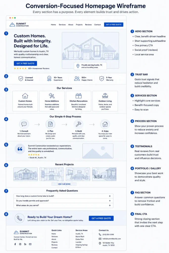
The number of sections may vary, but most effective homepages include several core components.
Hero Section
The hero is the first major section visitors see. It should contain a strong headline, brief explanation, primary call to action, and relevant visual.
Do not place a long company history in this section. Its job is to confirm relevance and direct visitors forward.
Services Overview
Show your main services in an easy-to-scan format. Each service should have a short explanation and a link to a dedicated page.
Dedicated service pages allow you to explain pricing factors, processes, benefits, common questions, and service-specific proof. They can also target more focused search terms than a general homepage.
Explore these website design and development services for an example of how a primary services page can guide visitors toward suitable solutions.
Why Choose Your Company
This section should explain meaningful reasons to hire your business.
Avoid unsupported phrases such as:
“Best quality”
“Excellent customer service”
“Industry-leading solutions”
Replace them with evidence:
“Every installation includes a five-year labor warranty.”
“Our team responds to new inquiries within one business day.”
“We have completed more than 350 kitchen renovations.”
“Your project is managed by one dedicated point of contact.”
Specific proof feels more credible than general claims.
Testimonials and Customer Results
Testimonials should describe an outcome, not simply say that the company was great.
A stronger testimonial explains the original problem, the experience, and the final result.
For example:
“Our old website generated only a few inquiries each month. After the redesign, customers could understand our services immediately, and qualified quote requests increased.”
Include the customer’s name, company, photograph, or location when you have permission. These details make testimonials feel more authentic.
About Preview
Your homepage does not need to contain your full company story. A short introduction can explain who you are, why you started the company, and what customers can expect.
Link this preview to a complete About page for visitors who want additional details.
Contact or Conversion Section
End the homepage with a direct invitation to act. Repeat the primary button and explain the next step.
For example:
“Tell us about your project. We will review your goals and recommend the most suitable website plan.”
A short explanation reduces uncertainty about what happens after someone submits the form.
Which Homepage Elements Generate Leads?
A lead-generating homepage removes obstacles between visitor interest and customer action.
The strongest elements usually include a clear promise, a relevant call to action, visible proof, useful service information, and an easy contact method.
Calls and Mobile Visitors
Local business websites should make phone numbers clickable on mobile devices. A sticky call button may be appropriate for urgent services such as plumbing, towing, electrical repair, or restoration.
For businesses with longer sales cycles, a consultation form may produce better inquiries than a call-first layout.
Forms That People Will Complete
Only request information your team needs for the first conversation.
A simple form might ask for:
✅ Name
✅ Email or phone number
✅ Service needed
✅ Brief project details
Long forms can be useful when qualification is essential, but every added field creates more work for the visitor.
Booking Tools
Direct scheduling works well when availability can be standardized. It can reduce back-and-forth communication for consultations, salon services, discovery calls, and routine appointments.
However, complex projects may require a shorter inquiry form first. A custom home builder, for example, may need to review budget, location, and project scope before offering a meeting time.
Lead Generation Element Comparison
| Element | Best For | Why It Works | When to Avoid It |
| Click-to-call button | Urgent local services | Creates immediate contact | When calls cannot be answered consistently |
| Short quote form | Contractors and agencies | Captures essential project details | When instant pricing is expected |
| Online booking | Clinics and appointment businesses | Removes scheduling friction | When every request needs qualification |
| Live chat | Businesses with active support staff | Answers quick questions | When responses will be delayed |
| Downloadable guide | B2B companies | Captures early-stage leads | When visitors need immediate service |
| Pricing preview | Standardized services | Helps visitors self-qualify | When every project is highly customized |
| Project gallery | Visual and creative services | Demonstrates quality quickly | When images lack context or explanation |
| Customer review section | Nearly every small business | Reduces perceived risk | Never hide strong, verifiable proof |
Common Homepage Mistakes to Avoid
A homepage can look modern and still fail to produce leads. The following problems frequently weaken otherwise professional websites.
Making the Company Name the Main Headline
Your company name does not explain why a visitor should stay. Use the headline to communicate the service and result.
The logo already identifies the company.
Using Stock Photos Without Context
Generic images of smiling office workers rarely prove that your company can solve a customer’s problem.
Use actual team photos, project images, location photography, products, or customer outcomes whenever possible.
Stock photography may still support a design, but it should not create a misleading impression of your staff, office, or work.
Hiding Contact Information
Do not make visitors search for a phone number or contact page. Place important contact options in the header, main section, and final conversion area.
Writing Too Much About the Company
Visitors care about your business, but they first want to know whether you can help them.
Translate company-focused statements into customer-focused benefits.
Instead of:
“We use advanced design processes.”
Try:
“You receive a clear, mobile-friendly website that helps customers understand your services and contact you.”
Adding Too Many Calls to Action
A homepage with five different primary actions can leave visitors unsure where to begin.
Choose one main conversion and one secondary action. For example, “Request a Quote” could be primary, while “View Our Work” is secondary.
Ignoring Page Speed
Large images, autoplay videos, unused scripts, and excessive plugins can slow down a homepage.
Core Web Vitals evaluate important aspects of user experience, including loading performance, responsiveness, and visual stability.
Compress images, use appropriate file formats, remove unnecessary tools, and test your website on real mobile connections.
How to Redesign an Underperforming Homepage
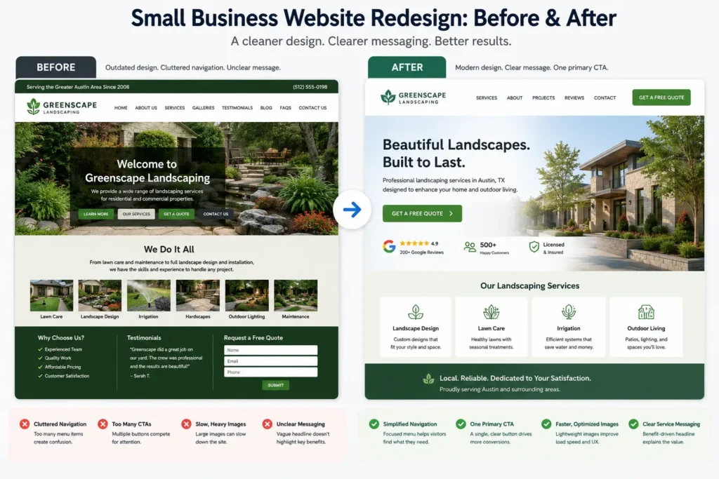
A redesign should address a business problem, not simply change colors and fonts.
Start by identifying where the current homepage fails.
Common warning signs include:
✅ Visitors leave without viewing another page
✅ Customers repeatedly ask what services you provide
✅ Mobile users struggle to contact the business
✅ The website attracts traffic but produces few inquiries
✅ The design no longer reflects your current services
✅ Important pages are difficult to find
✅ The company has strong reviews but does not display them
Review your calls, forms, booking data, search performance, and customer questions. These sources can reveal what information visitors cannot find.
Next, clarify the page’s main goal. Decide whether you want more calls, estimate requests, bookings, store visits, or consultation inquiries.
Then reorganize the content around that goal.
A typical redesign process includes:
- Reviewing visitor behavior and lead quality
- Clarifying the offer and target customer
- Updating homepage messaging
- Simplifying navigation
- Improving mobile usability
- Adding stronger proof
- Reducing unnecessary distractions
- Testing forms, buttons, speed, and tracking
Use this homepage design checklist to review essential content and usability elements before publishing a redesign.
How Homepage Copy Supports SEO
Homepage copy helps search engines and visitors understand the company’s primary purpose.
Use your main service, location, and audience naturally. Do not repeat the same phrase in every heading or paragraph.
A local web designer might reference website design, redesign services, small businesses, service areas, and lead generation where those terms genuinely clarify the offer.
Your links should also use meaningful anchor text. Google explains that descriptive, crawlable links help people and search engines understand the relationship between pages.
For assistance writing service sections that explain value and encourage inquiries, see this guide to service page copy for small businesses.
Does a Homepage Need a Lot of Text?
The right amount depends on the business.
A simple local service may need enough copy to explain its main services, coverage area, advantages, process, reviews, and contact options.
A company offering several complex B2B services may need more detail.
The goal is not to reach an arbitrary word count. Include the information customers need to decide whether to contact you, then remove repetition and filler.
Hiring a Professional Website Designer
A template may be enough for a new business with a limited offer and a small budget. Professional support becomes more valuable when the website must generate leads, support advertising, rank for competitive services, or represent an established company.
A website designer should help you decide:
✅ Which information belongs above the fold
✅ How visitors should move through the page
✅ Which calls to action match customer intent
✅ How the site will perform on mobile devices
✅ Where reviews and proof should appear
✅ How service pages connect to the homepage
✅ How forms, analytics, and conversion tracking will work
Ask potential designers to explain the reasoning behind their recommendations. A professional should connect design decisions to user needs and business goals rather than relying only on visual preferences.
You can discuss your goals with a local website design team if your current homepage looks outdated, communicates the wrong message, or fails to generate consistent leads.
Final Thoughts on Business Homepage Examples
Studying business homepage examples is most useful when you examine why each layout works instead of copying its colors or visual style.
The right homepage for your company should reflect how customers choose, contact, and hire you. A local emergency service needs fast access to a phone number. A consultant needs authority and case studies. A photographer needs strong project visuals. A clinic needs clear booking information and reassuring trust signals.
Focus on clarity before decoration. Explain your service, show evidence, answer common questions, and make the next step easy.
A well-designed homepage cannot guarantee rankings or leads by itself. However, it creates a stronger foundation for SEO, paid advertising, referrals, and every marketing campaign that sends potential customers to your website.
Frequently Asked Questions
1. What should a small business homepage include?
A small business homepage should include a clear value proposition, primary call to action, service overview, trust signals, testimonials, and contact information. It should quickly tell visitors what the company does, who it serves, and why the company is a credible choice. Local businesses should also display their service area, phone number, business hours, and relevant credentials. Every section should support the page’s main goal, whether that is generating calls, bookings, quote requests, or store visits.
2. How can I redesign my homepage to get more leads?
Start by simplifying your message and making one conversion action more prominent. Review whether visitors can immediately identify your service, location, ideal customer, and next step. Add customer reviews, project results, guarantees, or credentials near important buttons. Shorten confusing forms and test the page on mobile devices. A professional website designer can also review visitor behavior, page speed, messaging, and conversion tracking to identify problems that visual changes alone may not solve.
3. Should my homepage be a landing page for Google Ads?
A dedicated landing page is usually better when an advertisement promotes one specific service, location, or offer. Your homepage can work for broader brand campaigns, but it may contain too many navigation choices for a focused advertising campaign. A landing page can match the advertisement’s wording, answer service-specific questions, provide relevant proof, and feature one clear call to action. This creates a more consistent experience for visitors and makes campaign performance easier to measure.
4. How do I know when to hire a professional web designer?
Consider hiring a professional when your website no longer represents your business or consistently fails to generate calls, bookings, and qualified inquiries. Professional help is also valuable when you are rebranding, adding services, running paid ads, competing in local search, or struggling with mobile usability and page speed. A designer should improve more than appearance. The project should clarify your messaging, organize content, strengthen trust, and create a practical path from first visit to customer inquiry.