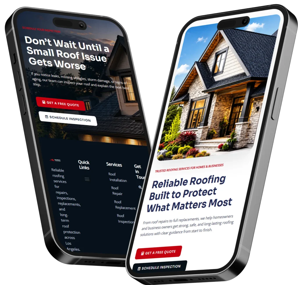
A homepage design checklist helps you confirm that visitors can quickly understand what your business offers, why they should trust you, and what action they should take next. An effective homepage needs clear messaging, simple navigation, visible trust signals, helpful content, fast performance, and focused calls to action.
Your homepage should not simply look attractive. It should guide potential customers toward calling, requesting a quote, booking an appointment, visiting a service page, or taking another valuable action.
This guide explains what to include, why each element matters, how to improve weak sections, and which homepage choices work best for small businesses that depend on local leads.
Why Your Homepage Design Matters
Your homepage is often the first page potential customers see after finding your business through Google, a referral, an advertisement, or a social media profile.
Within a short visit, people usually want answers to a few basic questions:
✅ What does this company offer?
✅ Does it serve someone like me?
✅ Is the business trustworthy?
✅ What should I do next?
A well-planned homepage answers those questions without forcing visitors to search through several pages. It combines design, copy, navigation, SEO, and conversion strategy into one clear customer journey.
Google also recommends creating websites primarily for people, organizing content logically, using descriptive links, and helping search engines understand the purpose of each page. You can review these principles in the Google SEO Starter Guide.
A homepage that is confusing, slow, outdated, or overly promotional can cause potential customers to leave before learning what makes your business different. In contrast, a clear homepage can support stronger first impressions, better engagement, and more qualified inquiries.
What Should a Small Business Homepage Include?
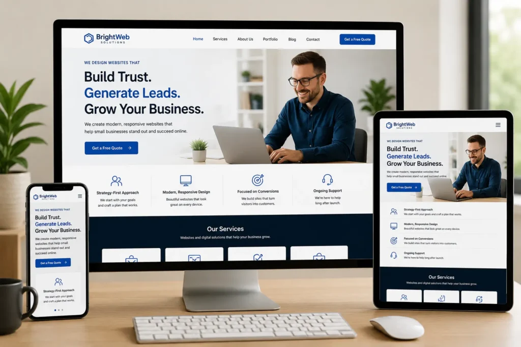
A small business homepage should include enough information to help visitors understand the offer and confidently take the next step. However, it should not attempt to explain every detail about the company on one page.
The strongest homepages usually include:
✅ A clear headline and supporting message
✅ A primary call-to-action button
✅ A brief overview of services
✅ Trust signals and customer proof
✅ A simple explanation of the process
✅ Information about the business or team
✅ Answers to common customer concerns
✅ Contact details and an easy next step
The order of these elements matters. Visitors should first understand the offer, then see why it is relevant, find evidence that the company is trustworthy, and finally receive a clear invitation to act.
Quick Homepage Section Guide
| Homepage Section | Main Purpose | Best Content to Include |
|---|---|---|
| Hero section | Explain the offer immediately | Headline, supporting text, primary call to action |
| Services overview | Show how the business helps | Three to six primary services with short descriptions |
| Trust section | Reduce uncertainty | Reviews, credentials, results, affiliations |
| Process section | Make hiring feel simple | Three or four clear steps |
| About section | Humanize the business | Short story, photograph, experience |
| FAQ section | Address objections | Pricing, timeline, service area, next steps |
| Final call to action | Encourage conversion | Contact button, booking form, or phone number |
This structure gives visitors enough information to make progress without overwhelming them with large blocks of text.
Start With a Clear Hero Section
The hero section is the first major area visitors see. It normally includes the headline, introductory copy, an image, and a primary button.
Its job is not to welcome people with a generic message. Its job is to communicate value.
Write a Specific Homepage Headline
Avoid headlines such as:
“Welcome to Our Website”
“Quality Service You Can Trust”
“Your Success Is Our Priority”
These statements sound positive, but they do not explain what the company does, who it serves, or why visitors should continue reading.
A stronger headline may follow this structure:
Primary service + target customer + meaningful outcome
For example:
“Professional Landscaping for Beautiful, Low-Maintenance Houston Yards”
“Family Dentistry That Makes Appointments Easier for Busy Parents”
“Conversion-Focused Websites for Service-Based Small Businesses”
The best option is usually a headline that describes the service clearly while connecting it to an outcome the customer wants.
Add Supporting Copy
The supporting text should clarify the headline in one or two short sentences. It can mention the service area, specialization, process, or main difference.
For example:
“We design fast, professional websites that help local service businesses build trust and generate more calls, quote requests, and bookings.”
This statement tells visitors what the business provides, who it helps, and why the service matters.
Strong homepage copy begins with a clear understanding of the customer. Read this guide to website messaging that connects with small business customers before writing individual homepage sections.
Choose One Primary Call to Action
The main button should represent the most important action a qualified visitor can take.
Common choices include:
✅ Request a Quote
✅ Schedule a Consultation
✅ Book an Appointment
✅ Call for Availability
✅ Start Your Project
Avoid vague buttons such as “Submit,” “Click Here,” or “Learn More” when a more specific phrase is available.
You can include secondary actions, but the primary button should remain visually dominant. Too many equally prominent buttons force visitors to make unnecessary decisions.
Make Navigation Simple and Predictable
Your navigation menu helps visitors move from general information to the details they need.
For most small business websites, the main menu should contain a limited number of clear options, such as:
Home | About | Services | Work | Blog | Contact
Dropdown menus may be useful when the company offers several distinct services. However, deeply nested menus can become difficult to use, especially on mobile devices.
Descriptive navigation labels are usually better than creative labels. “Services” is easier to understand than “What We Do,” while “Portfolio” or “Our Work” is clearer than an abstract phrase such as “Explore.”
The homepage should also link naturally to important pages. Visitors who need detailed information can review your website design and development services without making the homepage unnecessarily long.
Navigation Checks
Confirm that:
✅ The logo links back to the homepage
✅ The menu works on mobile devices
✅ The contact option is easy to find
✅ Important service pages are not hidden
✅ Button labels describe what happens next
✅ Visitors can reach essential information within a few clicks
Simple navigation communicates organization and professionalism. Nielsen Norman Group also identifies clear navigation, concise communication, and prioritization as fundamental homepage design principles. You can explore its homepage usability recommendations for additional guidance.
Present Your Services Clearly
Many small business homepages mention services without explaining them. A row of service names may help existing customers, but first-time visitors often need more context.
For each primary service, include:
✅ A descriptive service name
✅ A short explanation of the problem it solves
✅ A relevant image or icon
✅ A link to the detailed service page
Keep the descriptions concise. The goal is to help visitors choose the correct path, not replace your full service pages.
For example:
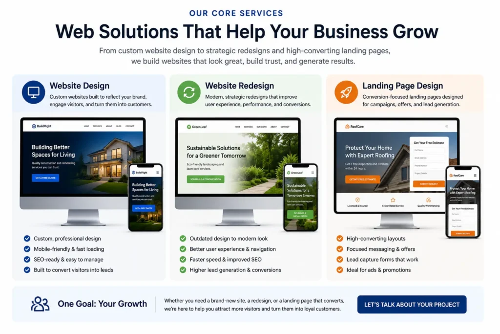
Website Design
Custom, mobile-friendly websites created to communicate your value clearly and turn more visitors into inquiries.
Website Redesign
Strategic improvements for outdated, confusing, or underperforming websites that are no longer supporting the business.
Landing Page Design
Focused pages built around one campaign, service, location, or offer to generate a specific action.
A small business with several services may feature the three most profitable or commonly requested options. Less important services can appear on the main services page.
Build Trust Before Asking for the Sale
People may hesitate to contact a business they have never worked with. Your homepage should reduce that uncertainty by showing credible evidence.
Trust signals can include:
✅ Customer testimonials
✅ Average review ratings
✅ Before-and-after examples
✅ Professional certifications
✅ Years of experience
✅ Client or association logos
✅ Guarantees or clear policies
✅ Real photographs of the team
✅ Business address and service area
Testimonials are most useful when they mention a specific problem, experience, or result. A statement such as “Great service” provides less useful information than a review explaining that the company communicated clearly, finished on schedule, and helped generate more inquiries.
Place trust signals near important decision points. For example, a testimonial can appear after the service overview, while ratings or credentials may appear close to the main call to action.
Read this guide to homepage trust signals that reassure potential customers for additional placement ideas.
Which Trust Signals Work Best?
| Trust Signal | Best Use | Why It Helps |
| Customer reviews | Local and service businesses | Shows real customer experiences |
| Case studies | Higher-cost services | Demonstrates the process and outcome |
| Certifications | Regulated or technical industries | Confirms qualifications |
| Client logos | B2B companies | Shows relevant experience |
| Team photos | Relationship-based services | Makes the company feel more approachable |
| Guarantees | Competitive services | Reduces perceived risk |
| Clear contact details | Every small business | Confirms that the business is accessible |
The best trust signal is the one that addresses the customer’s biggest concern. For a contractor, that may be licensing and project photographs. For a consultant, it may be case studies and client results. For a healthcare practice, it may be credentials, reviews, and clear appointment information.
Explain How Your Process Works
Customers are more likely to contact a business when the next steps feel simple.
A process section can show what happens after someone submits a form or schedules a call. Three or four steps are usually enough.
For example:
1. Tell Us About Your Project
Complete a short form with your goals, challenges, timeline, and current website information.
2. Receive a Clear Recommendation
We review your needs and explain the most practical website approach.
3. Approve the Direction
You receive a defined scope, timeline, and plan before the main work begins.
4. Launch With Confidence
Your website is tested, refined, and prepared for customers across desktop and mobile devices.
This section removes uncertainty and gives visitors a realistic picture of the working relationship.
Avoid making the process sound more complicated than necessary. Detailed technical information can be discussed during the consultation or shown on a dedicated service page.
Use Calls to Action Throughout the Homepage
A call to action should appear whenever a visitor may be ready to move forward.
Useful placements include:
✅ In the hero section
✅ After the service overview
✅ Near testimonials or case studies
✅ After the process section
✅ At the bottom of the homepage
The wording can change slightly based on context, but the overall action should remain consistent.
For example, the hero button might say “Request a Website Consultation,” while a later button says “Discuss Your Project.” Both lead toward the same conversion goal.
A homepage for an appointment-based business may prioritize booking. A home service company may prioritize calls and quote requests. A professional service provider may prefer a consultation form.
The best option depends on how customers normally make decisions and how quickly the business can respond.
Ready to improve an outdated website? Explore our website redesign that converts and choose a practical service path for your business.
Make the Homepage Mobile-Friendly
Many customers will first visit your website from a phone. Mobile design should therefore be considered from the beginning rather than treated as a smaller version of the desktop page.
Check whether:
✅ Text is readable without zooming
✅ Buttons are easy to tap
✅ Forms use only necessary fields
✅ Images resize correctly
✅ Menus open and close reliably
✅ Phone numbers can be tapped to call
✅ Important information appears early
✅ Popups do not block the entire screen
Test the homepage on multiple screen sizes. Pay special attention to headings, multi-column sections, forms, maps, image galleries, and sticky buttons.
A mobile visitor may be looking for quick information such as service availability, directions, operating hours, or a phone number. Make those details easy to reach.
Improve Homepage Speed and Performance
Large images, unnecessary plugins, video backgrounds, animations, and poorly configured hosting can slow down a homepage.
A slow page creates friction before visitors even read the message.
Practical improvements include:
✅ Compressing images before uploading them
✅ Using modern image formats when supported
✅ Removing unnecessary scripts and plugins
✅ Limiting autoplay videos and heavy animation
✅ Loading below-the-fold images only when needed
✅ Using reliable hosting and caching
Visual quality still matters, but every design element should have a purpose. A large background video may appear impressive, yet a fast-loading photograph with a clear headline may create a better experience and stronger response.
Add Search-Friendly Homepage Content
Homepage SEO begins with clarity. Search engines and visitors should understand the company, services, audience, and location without interpreting vague marketing language.
Include relevant information naturally in:
✅ The page title
✅ Main heading
✅ Introductory copy
✅ Service descriptions
✅ Image alternative text
✅ Internal link anchor text
✅ Contact and service-area information
Do not repeat keywords unnaturally. Write useful content that accurately represents the business.
Internal links should also describe the destination. A link labeled “service page copy for small businesses” provides more context than a generic “read more” link. Review these practical tips for writing service page copy for small businesses.
Local businesses should mention the locations they genuinely serve, but they should avoid inserting long lists of cities that make the content difficult to read.
Show Real Examples of Your Work
Potential customers often want to see what you have created before deciding whether to contact you.
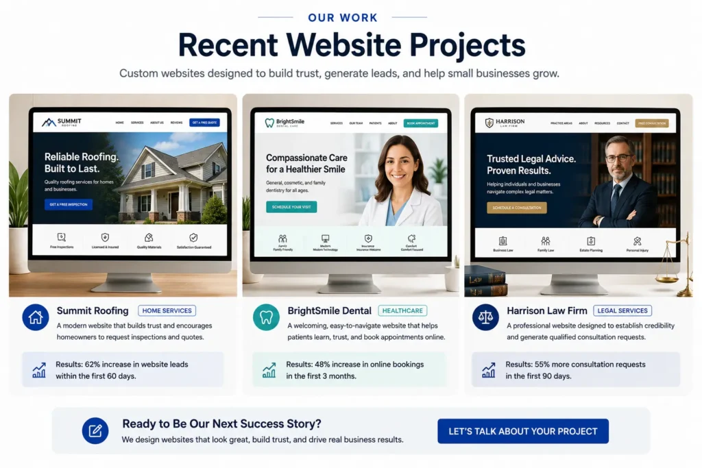
A homepage portfolio section may include three to six selected projects. Each example can show:
✅ The customer’s industry
✅ The original problem
✅ The service provided
✅ A screenshot or project image
✅ A short result or improvement
✅ A link to a full case study
Choose examples that resemble the types of customers you want to attract. A company focused on small local businesses should not fill the homepage exclusively with unrelated experimental designs.
See our portfolio highlights for examples of clear, conversion-focused website work.
Include an Effective Contact Section
The final homepage section should make contacting the business straightforward.
Include the contact method customers are most comfortable using, such as:
✅ A short inquiry form
✅ A booking calendar
✅ A clickable phone number
✅ An email address
✅ Business hours
✅ Service-area information
Keep forms focused. Asking for too much information before the first conversation can reduce inquiries.
A web design inquiry form may request:
Name
Email address
Business name
Current website
Main project goal
Optional message
Additional details such as budget, content requirements, integrations, and technical preferences can be discussed after the initial inquiry.
For direct assistance, connect with our local website design team to discuss the goals and current performance of your website.
Common Homepage Design Mistakes
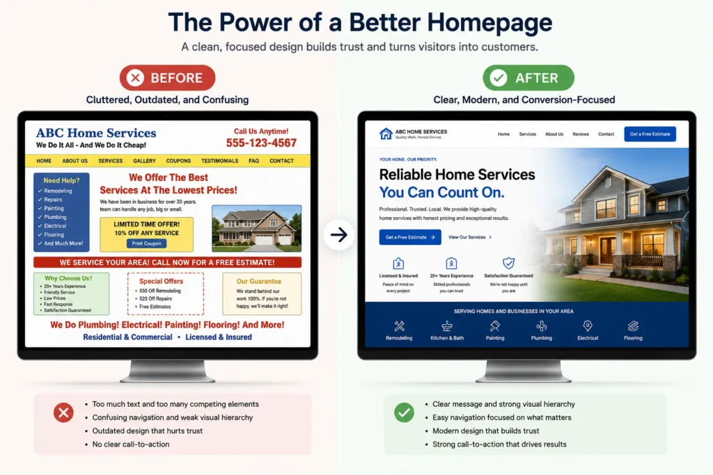
A homepage may look polished while still making it difficult for visitors to act.
Common mistakes include:
✅ Using a vague headline
✅ Hiding the main contact option
✅ Showing too many competing buttons
✅ Writing long paragraphs without clear sections
✅ Using stock photos that feel unrelated
✅ Adding sliders that rotate before visitors can read them
✅ Making the menu overly complicated
✅ Failing to explain the service area
✅ Showing testimonials without names or context
✅ Designing only for desktop screens
✅ Linking every button to the same general page
✅ Allowing old promotions or outdated details to remain visible
Review the homepage as a first-time customer. Ask what is clear, what creates doubt, and what information is missing.
An outside review can also uncover issues the business owner no longer notices because they are already familiar with the company.
How to Review Your Homepage Before Launch
Before publishing, complete a final review across content, design, functionality, and search visibility.
Check the following:
✅ The headline explains the primary service
✅ The opening section includes a clear action
✅ Important services are easy to find
✅ Contact information is accurate
✅ Forms send notifications correctly
✅ Links open the intended pages
✅ Images include descriptive alternative text
✅ Testimonials have permission and correct details
✅ The menu works on mobile devices
✅ The homepage loads without broken elements
✅ Spelling and grammar have been reviewed
✅ The page title and meta description are complete
✅ Legal and privacy links appear where required
✅ Analytics and conversion tracking are configured
Ask someone unfamiliar with the business to review the homepage for 10 to 15 seconds. Then ask them what the company offers, who it serves, and what they would do next.
Their answers can reveal whether the main message is working.
Final Thoughts: Using Your Homepage Design Checklist
A homepage design checklist helps small business owners review more than visual style. It ensures that the homepage communicates the offer, establishes trust, supports search visibility, and gives potential customers a simple path toward calling, booking, or requesting information.
Start with the areas that most directly affect customer understanding: the headline, service descriptions, trust signals, navigation, and primary call to action. Then improve mobile usability, page speed, internal links, contact options, and supporting content.
The best homepage is not necessarily the one with the most animation or the longest copy. It is the one that helps the right customer understand the business and confidently take the next step.
Frequently Asked Questions
1. What should be included on a small business homepage?
A small business homepage should clearly explain the service, target customer, main benefit, and next step. It should also include a focused headline, service overview, customer proof, an easy-to-understand process, contact information, and calls to action. The exact sections may vary by industry, but visitors should never have to guess what the business does or how to request help.
2. How do I redesign my homepage to generate more leads?
Begin by fixing unclear messaging and removing obstacles between visitors and the primary conversion action. Review the headline, button wording, form length, mobile layout, page speed, testimonials, and service descriptions. Keep one main goal, such as requesting a quote or booking a call. A professional web designer can also review customer behavior and rebuild the page around the questions prospects ask before contacting the business.
3. Does homepage design affect local SEO?
Homepage design can support local SEO when the content clearly identifies the business, services, location, and related website pages. Search-friendly headings, descriptive internal links, accurate contact details, fast performance, mobile usability, and helpful service information make the page easier for visitors and search engines to understand. Design alone does not guarantee rankings, but poor usability or unclear content can weaken the value of otherwise strong SEO work.
4. When should I hire a professional website designer?
Consider hiring a professional when your website looks outdated, performs poorly on mobile devices, receives traffic without generating leads, or no longer represents your services accurately. Professional support is also useful when you need clearer messaging, custom landing pages, better trust signals, stronger calls to action, or a complete redesign. Hiring a designer can prevent expensive trial and error when the website is an important source of calls, bookings, and revenue.