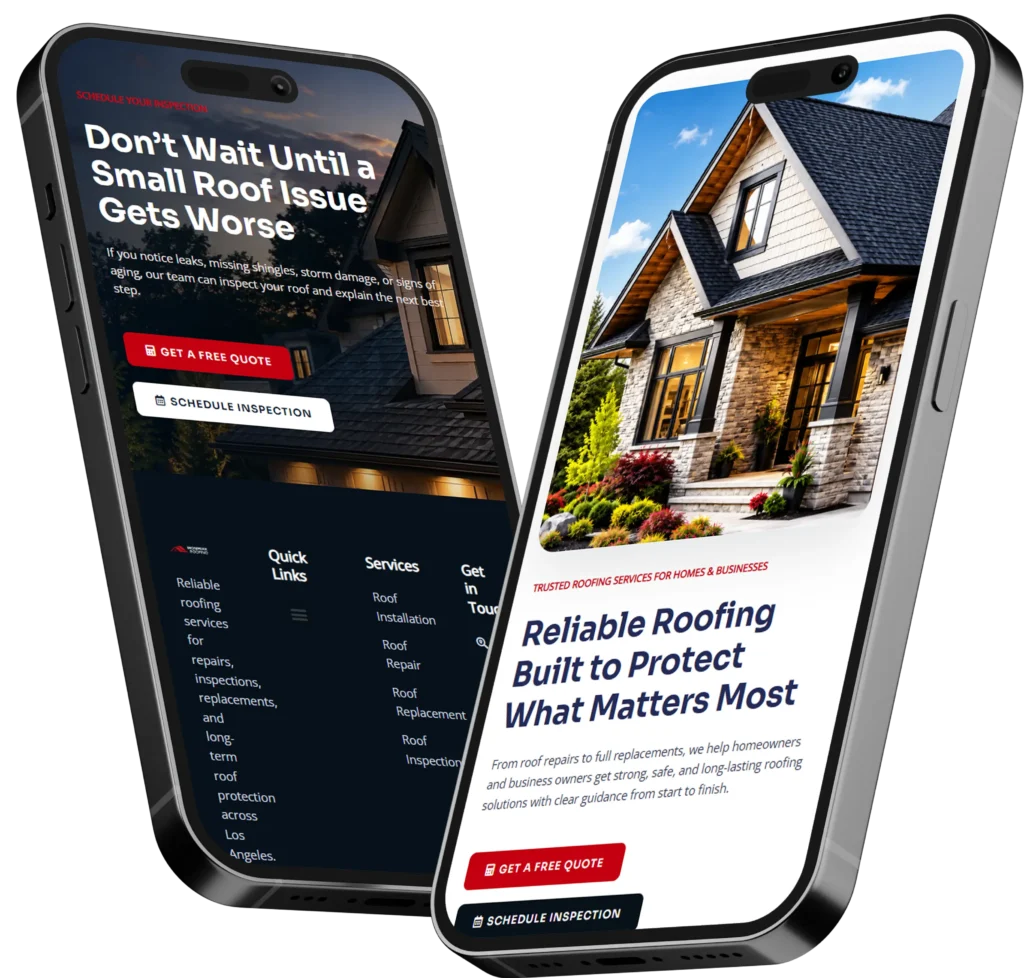
Learning how to improve your homepage starts with making your offer immediately clear, showing visitors why they should trust your business, and giving them one obvious action to take. A successful homepage quickly explains who you help, what you provide, and how customers can contact, call, book, or request a quote.
Your homepage should not act like a digital brochure filled with general company information. It should guide the right visitor from curiosity to confidence and then toward a meaningful next step.
Small businesses often redesign their homepages because the existing page looks dated. However, appearance is only one part of the problem. Strong homepage design combines useful messaging, simple navigation, mobile usability, fast loading, trust signals, search optimization, and conversion-focused calls to action.
This guide explains why each element matters, how to improve it, and which option is best for different types of small businesses.
Why Your Homepage Matters to Your Business
Your homepage is often the first place potential customers evaluate your business. Even when someone discovers you through a service page, social media post, referral, or Google Business Profile, they may visit the homepage before contacting you.
Visitors commonly use the page to answer several questions:
✅ Is this business relevant to what I need?
✅ Does it appear trustworthy and professional?
✅ Does it serve my location or type of customer?
✅ Can I quickly find services, examples, and contact information?
✅ What should I do next?
A homepage that leaves these questions unanswered creates uncertainty. The visitor may continue searching, even when your service is a good fit.
Website credibility is influenced by design quality, transparent information, useful content, and clear connections to the real organization behind the site. These factors make professional design more than a cosmetic investment. They help visitors feel comfortable taking action.
Start With a Clear Homepage Message
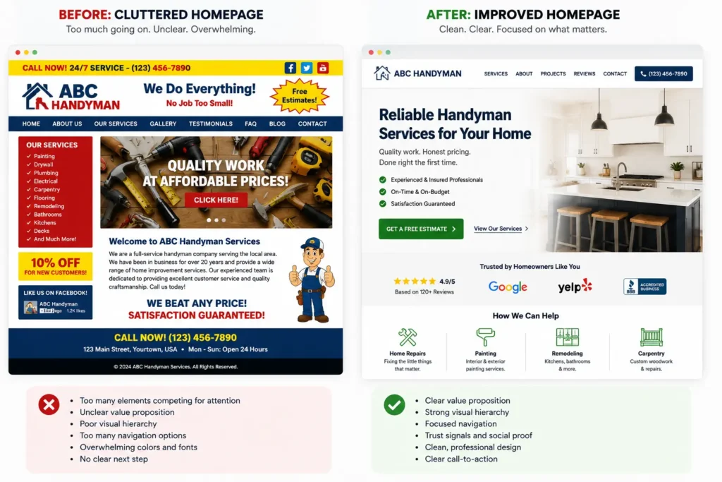
The first visible section of your homepage is commonly called the hero section. It should tell visitors what the business does before they need to scroll.
Avoid opening with vague headlines such as:
“Welcome to Our Website”
“Quality You Can Trust”
“Building Better Futures”
“Your Success Is Our Priority”
These statements can apply to almost any company. They do not identify the service, customer, location, or outcome.
A stronger headline combines specific information. For example:
Residential Plumbing Services for Homeowners in Tampa
Custom Websites That Help Local Service Businesses Generate Leads
Family Dental Care With Same-Week Appointments in Austin
The supporting sentence can then explain the main benefit, service area, process, or difference.
A Simple Homepage Messaging Formula
Use this structure when writing the top section:
Headline: What you provide and who it is for
Supporting text: The problem you solve or result you help create
Primary button: The most valuable next action
Trust detail: A review rating, experience statement, guarantee, certification, or service area
Here is a practical example for a landscaping company:
Professional Lawn Care for Busy Orlando Homeowners
Keep your property healthy and presentable with scheduled mowing, seasonal maintenance, and straightforward monthly service.
Button: Request a Lawn Care Estimate
Trust detail: Locally owned and serving Orlando homeowners since 2014
Businesses struggling to explain their value can use this website messaging guide for small businesses to develop clearer customer-focused copy.
Choose One Primary Homepage Goal
A homepage can provide several navigation options, but it should have one primary conversion goal. When every button is treated as equally important, visitors must decide what the business wants them to do.
The best primary action depends on how customers usually buy your service.
| Business Type | Best Primary Action | Helpful Secondary Action |
|---|---|---|
| Home service company | Request an estimate | Call the business |
| Medical or wellness practice | Book an appointment | View services |
| Consultant or agency | Schedule a consultation | Review case studies |
| Restaurant | Reserve a table | View the menu |
| Local retailer | Shop products | Find the store |
| High-ticket contractor | Request a project quote | View completed work |
Use specific button wording. “Submit” and “Learn More” provide little context. Action-oriented labels tell visitors what will happen after they click.
Better options include:
✅ Get My Free Estimate
✅ Schedule a Consultation
✅ View Website Services
✅ Book an Appointment
✅ Check Project Availability
The primary button should appear near the top and again after important sections. Repetition is helpful when it supports the same conversion path. It prevents visitors from having to scroll back to take action.
Organize Your Homepage Around Visitor Questions
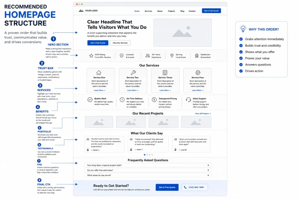
A homepage should present information in the order a potential customer needs it. The exact arrangement can vary, but most service businesses benefit from a logical progression.
Recommended Homepage Section Order
| Homepage Section | Question It Answers | What to Include |
| Hero section | What does this business do? | Clear headline, benefit, CTA |
| Trust bar | Can I trust this company? | Ratings, credentials, experience |
| Services | Can it solve my problem? | Main service categories |
| Benefits or process | Why choose this company? | Differentiators and steps |
| Work examples | Can it deliver good results? | Projects, case studies, photos |
| Testimonials | Have others had a good experience? | Specific customer feedback |
| FAQ | What concerns might stop me? | Pricing, timing, service questions |
| Final CTA | What should I do now? | Contact, quote, call, or booking |
This structure moves visitors from understanding to reassurance. It also gives search engines clearer context about the business, services, and relationships between pages.
Google recommends creating websites for users and making content easy for both people and search engines to understand. Descriptive page organization and helpful internal links support that goal.
For a more detailed planning resource, use this homepage design checklist before changing your layout.
Improve Homepage Trust Signals
Visitors cannot inspect your office, meet your team, or experience your service while viewing a webpage. Your homepage must replace that missing reassurance with credible evidence.
Strong trust signals include:
✅ Customer reviews with names or identifying details
✅ Original photos of your team, location, work, or customers
✅ Professional licenses and relevant certifications
✅ Years of experience stated accurately
✅ Clear service areas
✅ Recognizable client or partner logos
✅ Guarantees explained in plain language
✅ Secure contact and booking forms
✅ Links to policies, contact details, and business information
Place trust signals near decisions. A review rating beside the first call-to-action can reassure a new visitor. A project testimonial near the services section can demonstrate relevant experience. A guarantee near the final form may reduce hesitation.
Avoid adding a row of badges without context. A visitor should understand what each badge means and why it matters. A label such as “Licensed Florida Electrical Contractor” is more useful than an unexplained seal.
Original photography is particularly valuable for local businesses. Generic stock images may fill space, but they rarely prove that your business performs the service. A genuine project photo, team image, treatment room, storefront, or completed installation provides stronger evidence.
Businesses considering professional help can review the portfolio highlights to see how messaging, visual hierarchy, and trust elements can work together.
Make Your Services Easy to Understand
Do not force visitors to search menus or read long paragraphs to identify what you offer. Present your main services on the homepage using short summaries linked to dedicated pages.
Each service summary should contain:
Service name: Use the wording customers recognize.
Short explanation: Describe the need, customer, or result.
Relevant link: Send visitors to the full service page.
A contractor might feature kitchen remodeling, bathroom remodeling, additions, and whole-home renovations. A law firm might feature estate planning, probate, business law, and real estate services.
Avoid listing every minor task. Homepage service sections should help visitors choose the right direction, not replace detailed service pages.
Internal links also help search engines discover pages and understand how website content relates. Use descriptive anchor text instead of repeated phrases such as “click here.” Google’s SEO guidance recommends link text that helps users and search engines understand the destination.
Explore these website design and development services when your service structure, page hierarchy, or conversion journey needs professional planning.
Strengthen Your Homepage With Proof
Claims become more convincing when they are supported by evidence.
Instead of saying:
“We provide excellent customer service.”
Show:
“Rated 4.9 based on 126 verified customer reviews.”
Instead of saying:
“We create effective websites.”
Show:
A project example explaining the client’s original problem, the changes completed, and the result measured after launch.
Effective proof can take several forms:
Testimonials: Use feedback that describes a particular problem or result.
Case studies: Explain the challenge, solution, and outcome.
Before-and-after examples: Show visible improvements when appropriate.
Numbers: Include accurate response times, completed projects, ratings, or measurable outcomes.
Process details: Explain what customers can expect after contacting you.
Specificity makes proof stronger. “They were great” is positive but weak. A review explaining that the company responded within one day, communicated throughout the project, and finished on schedule addresses real buying concerns.
Browse these business homepage examples to study different ways service businesses can present offers, social proof, and conversion paths.
Improve Mobile Homepage Design
Many potential customers will experience your homepage on a phone. A desktop design that is simply compressed into a smaller screen may create unreadable text, crowded buttons, awkward forms, or oversized images.
Review the mobile homepage separately and check:
✅ Is the headline readable without zooming?
✅ Does the first screen explain the service?
✅ Is the main button easy to tap?
✅ Does the navigation remain simple?
✅ Are phone numbers clickable?
✅ Do images load without shifting the page?
✅ Are forms short enough to complete on a phone?
✅ Is important content visible without excessive scrolling?
For local service businesses, a sticky call or booking button can be useful. However, it should not cover content or compete with several other popups.
Keep forms focused on the information needed to start the conversation. A first-contact form may only require a name, email or phone number, service selection, and brief message. Detailed project questions can be collected later.
Improve Homepage Speed and Stability
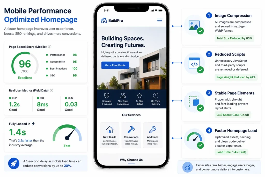
A beautiful homepage can still lose visitors when it loads slowly, jumps while loading, or responds poorly to taps.
Google’s Core Web Vitals evaluate loading performance, interaction responsiveness, and visual stability using real-world experience metrics. Google recommends achieving good results because page experience supports both visitors and search success.
Common homepage performance problems include:
✅ Oversized hero images
✅ Autoplay background videos
✅ Too many animation effects
✅ Multiple font families and weights
✅ Unnecessary plugins or tracking scripts
✅ Large image galleries loading at once
✅ Poor-quality hosting or caching
Start by compressing images, using modern formats, removing decorative scripts, limiting animation, and testing the page on a normal mobile connection.
Do not remove every visual feature solely to chase a perfect score. The best choice is a balance between communication, brand presentation, accessibility, and performance. A short optimized video may help a venue or tourism business, while a plumber may convert better with a lightweight photo and immediate call button.
Improve Homepage SEO Without Stuffing Keywords
Homepage SEO should help Google and potential customers understand the business. It should not turn the page into a repetitive block of city names and service phrases.
Focus on these elements:
SEO title: Describe the primary service, brand, and location when relevant.
Meta description: Summarize the offer and encourage the right searcher to visit.
Main heading: Clearly state the central service or value proposition.
Supporting headings: Organize services, benefits, proof, process, and FAQs.
Internal links: Connect the homepage to important service and informational pages.
Image alt text: Describe meaningful images accurately.
Business information: Keep names, services, locations, and contact details consistent.
Helpful copy: Answer real customer questions rather than writing solely for search engines.
Google describes SEO as helping search engines understand content while helping users decide whether they should visit. The page should therefore remain useful, readable, and designed for people.
Avoid adding long blocks of invisible text, repeating the same phrase unnaturally, or creating dozens of near-identical location links. These practices reduce readability and can make the business appear less trustworthy.
Remove Common Homepage Conversion Problems
Homepage redesigns often become more effective by removing friction rather than adding more sections.
Watch for these frequent problems:
Competing calls to action: Five different buttons near the top make the next step unclear.
Large sliders: Rotating banners hide information and divide attention.
Vague copy: Visitors cannot identify the service or customer.
Stock-heavy design: The page looks polished but provides little evidence.
Hidden contact details: Phone, booking, or quote information is difficult to find.
Long forms: Visitors are asked for too much information before trust is established.
Outdated content: Old promotions, team members, copyright dates, or service details weaken confidence.
Weak accessibility: Low contrast, tiny text, missing labels, and keyboard issues create barriers.
When deciding what to remove, ask whether each element helps a visitor understand the offer, trust the company, select a service, or take action. If it does none of these, it may be unnecessary.
Test Your Homepage Instead of Guessing
A redesign should not end when the new page is published. Track whether visitors are taking the actions that matter.
Useful homepage measurements include:
✅ Calls from website visitors
✅ Contact form submissions
✅ Appointment bookings
✅ Quote requests
✅ Clicks to service pages
✅ Clicks to project examples
✅ Mobile conversion rate
✅ Page loading performance
Record a baseline before major changes. Then review results after the revised page receives enough comparable traffic.
For example, suppose a landscaping company receives 1,000 homepage visits and 12 estimate requests in one month. Its conversion rate is 1.2%. After clarifying the headline, adding local project photos, shortening the form, and repeating one estimate button, it receives 24 requests from 1,050 visits. The redesign did not merely look better. It improved the measured business outcome.
Change major elements in a controlled way when possible. If the headline, navigation, offer, form, and traffic source all change at once, identifying the reason for improvement becomes harder.
When Should You Hire a Web Designer?
Small text and image updates can often be completed internally. Professional help becomes more valuable when the problem affects strategy, structure, technology, or conversions across the site.
Consider hiring a designer when:
✅ Visitors regularly misunderstand what the company offers.
✅ The website is difficult to use on mobile devices.
✅ Pages load slowly or break after updates.
✅ The homepage generates traffic but few inquiries.
✅ Services have changed and the navigation no longer fits.
✅ The site looks inconsistent or outdated.
✅ Staff cannot update content safely.
✅ The redesign requires SEO migration or URL planning.
The best option for a new business with limited content may be a focused website package built around essential pages. An established company with traffic, rankings, and many service pages may need a redesign and migration plan that protects existing search visibility.
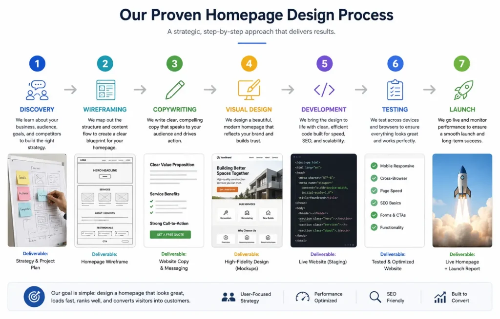
A designer should ask about your audience, sales process, most profitable services, current analytics, service areas, competitors, and conversion goals before recommending a layout. A visually attractive mockup is not a complete strategy.
Start with conversion-focused web design when your homepage needs stronger messaging, a clearer customer path, or a professional redesign tied to business goals.
Final Thoughts on How to Improve Your Homepage
Understanding how to improve your homepage means treating the page as a guided customer journey rather than a company introduction. Begin with clear messaging, choose one main conversion goal, organize information around visitor questions, and support every important claim with credible proof.
Then improve the mobile experience, loading performance, internal links, service descriptions, and calls to action. Measure calls, bookings, forms, and quote requests after launch so you can judge the redesign by business results rather than appearance alone.
A strong homepage does not need excessive animation or dozens of sections. It needs to help the right visitor understand the business, trust the offer, and confidently take the next step.
Frequently Asked Questions
1. What should a small business homepage include?
A small business homepage should include a clear offer, trust signals, primary services, proof of results, and one main call to action. Visitors should immediately understand what the company provides, who it serves, and what they should do next. Add customer reviews, authentic photographs, service links, contact information, and a short FAQ. The page should also work properly on mobile devices and load quickly enough that potential customers can act without unnecessary delays.
2. Can redesigning my homepage improve SEO and lead generation?
A strategic homepage redesign can improve search visibility and lead generation when it fixes content, usability, speed, and conversion problems. A new visual style alone does not guarantee better rankings or more inquiries. The redesign should clarify services, strengthen headings, improve internal links, reduce loading issues, and create a simpler path to calls, forms, or bookings. Existing URLs, metadata, analytics, and ranked content should be reviewed before changes are launched.
3. Should my homepage or a landing page target my main service?
Your homepage should represent the overall business, while a dedicated landing or service page should target a specific offer, location, or campaign. For example, a roofing company homepage may introduce residential and commercial services, but a separate roof replacement page can answer detailed questions about materials, cost factors, timelines, and estimates. This gives visitors more relevant information and allows each page to match a clearer search intent without forcing the homepage to target every phrase.
4. How do I know whether I need to hire a professional web designer?
You may need a professional web designer when your website receives traffic but produces few calls, bookings, or qualified leads. Other signs include unclear messaging, poor mobile usability, slow loading, outdated visuals, broken forms, confusing navigation, or difficulty updating content. A professional should connect design decisions to measurable goals, explain the recommended page structure, consider SEO during the redesign, and create a practical plan for maintaining the site after launch.